


Architecture has been able to grasp and express the historical significance of a revolutionary phenomenon such as the arrival of underground transport almost from the very beginning. The underground lines that lightened circulation in the newly born industrial city, first steam-powered then electric, needed a visual definition of their presence in urban space: this is how Hector Guimard’s Art Nouveau kiosks and Otto Wagner’s Jugendstil stations were born. Technology then evolved – up to magnetic levitation trains and automatic guidance systems – and the lines expanded. This growth has from time to time had unified characteristics or adopted a more diversified lexicon (as can still be seen in the Paris metro lines).
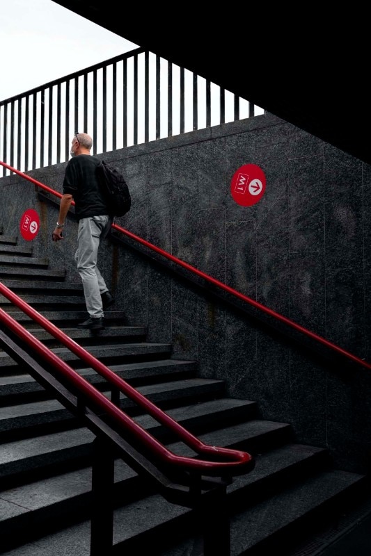
Over time, however, the focus on subway design has suffered setbacks: the indifference to design quality generated non-places of passage, in which to experience the loneliness and degradation of contemporary urban systems, amid clumsy experiments in decorative features, cosmetic interventions and blatant neglect.
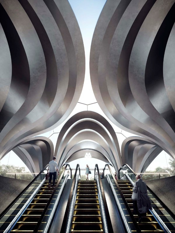
The need for infrastructures that are, on the one hand, strongly characterised and, on the other hand, efficient in terms of distributional simplification, increased safety, psychological well-being, and reduced maintenance costs has become more urgent again since the 1960s. Architecture has responded to these needs in different ways.
On the one hand, it has looked at the network of routes and stops as a unitary corpus in which each aspect – from the configuration of the environments, to the selection of materials and furnishing elements, to the lighting – contributes to the definition of an identity understandable in a “system” logic, with intuitive information codes and a univocally defined design: examples of this are, firstly, the visual identity project of the Milan lines (Albini and Noorda) and the map of the New York underground (Vignelli et al.) and subsequently more recent realisations – involving the lines in a partial or integral way depending on the circumstances – such as the stations on Line 2 in Warsaw (AMC), Line 9 in Barcelona (Garcés de Seta Bonet), DOHA (UNStudio) and Dnipro (Zaha Hadid Architects).
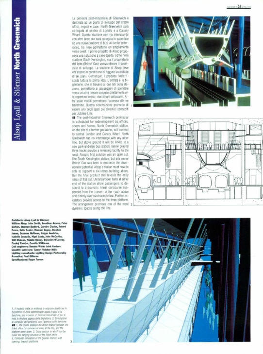
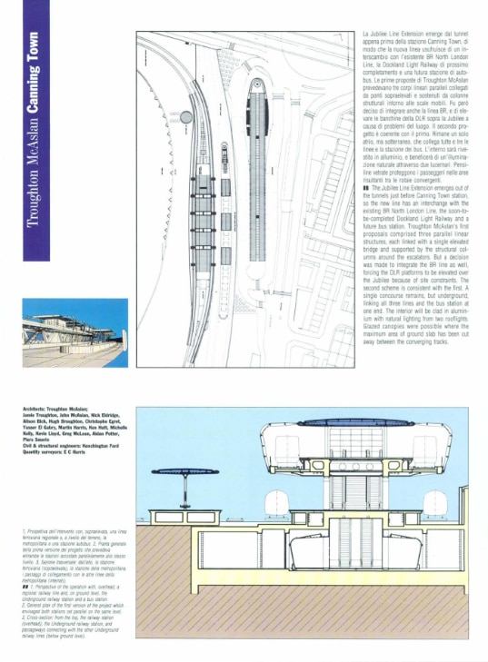
On the other hand, the networks have been conceived as composite systems, in which celebrated authors from the fields of architecture, design and art have been called upon to contribute their specific approach in individual interventions: this is the case of the extension of the Jubilee Line in London, where internationally renowned architects have designed several stations, and the “Stations of Art” in Naples, where previously anonymous and dysfunctional transit places have been transformed into strategic epicentres of urban regeneration and into nodes of a “diffused museum”.
Even though the daily demands of increasingly hurried travel might sometimes anaesthetise the traveller’s attention towards quality of spaces, the conditions of usability and psycho-physical wellbeing offered by certain interventions can help reduce idiosyncrasies linked to underground transit and reawaken an often-dormant intellectual curiosity, transforming the ordinary experience of transit in the metro into a sometimes extraordinary journey.
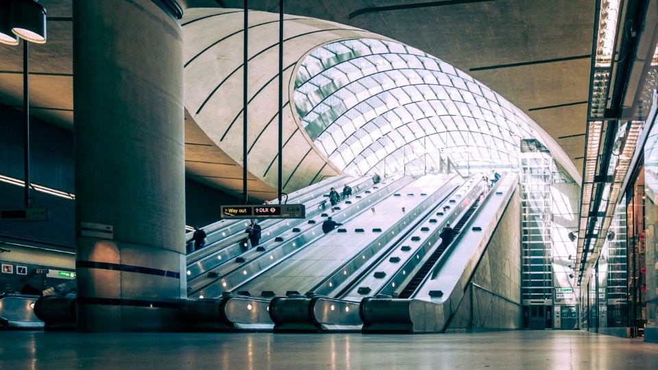
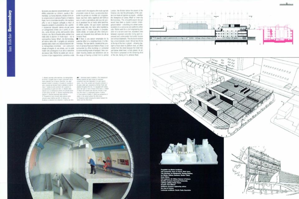
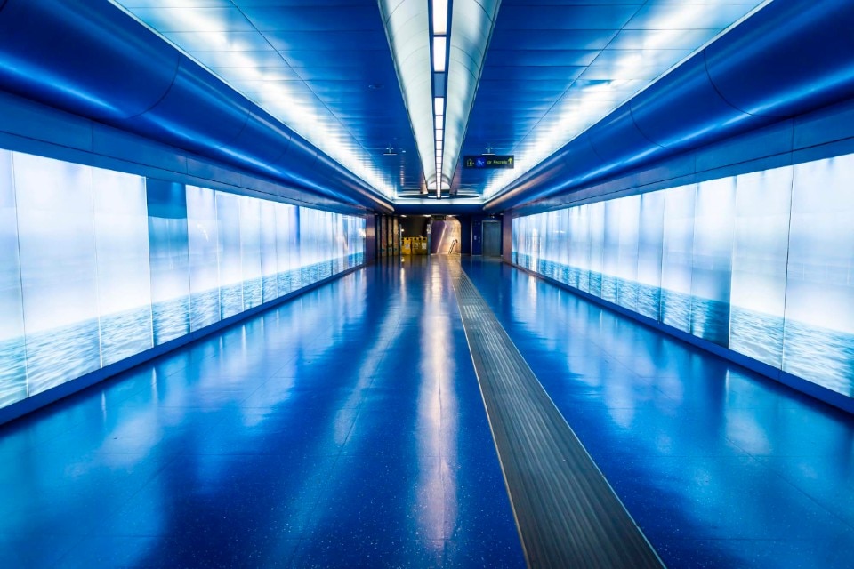
Jubilee Line extension, London Underground

.png.foto.rmedium.png)
.png.foto.rmedium.png)
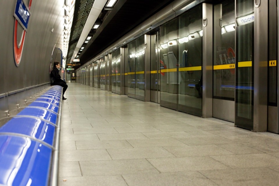
The 1999 extension of London's Jubilee Line from Green Park station to Stratford is recognized as one of the highest examples of architectural patronage in postwar United Kingdom, thanks to London Underground's political and cultural decision to involve some highly relevant names of architecture in building 11 new stations. The common approach to the works – based on precisely defined guidelines that established the abandonment of all decorative velleity typical of some pre-existing underground sections in favour of a bare and functional lexicon resistant to neglect and vandalism, and the simplification of circulation to encourage psychological wellbeing and safety – has not compromised the sometimes highly evocative character of the spaces (among the designers: Foster + Partners, Alsop, Lyall & Störmer, Troughton McAslan, Ritchie Studio).
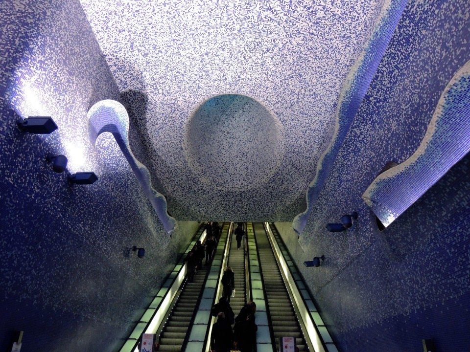
Naples metro
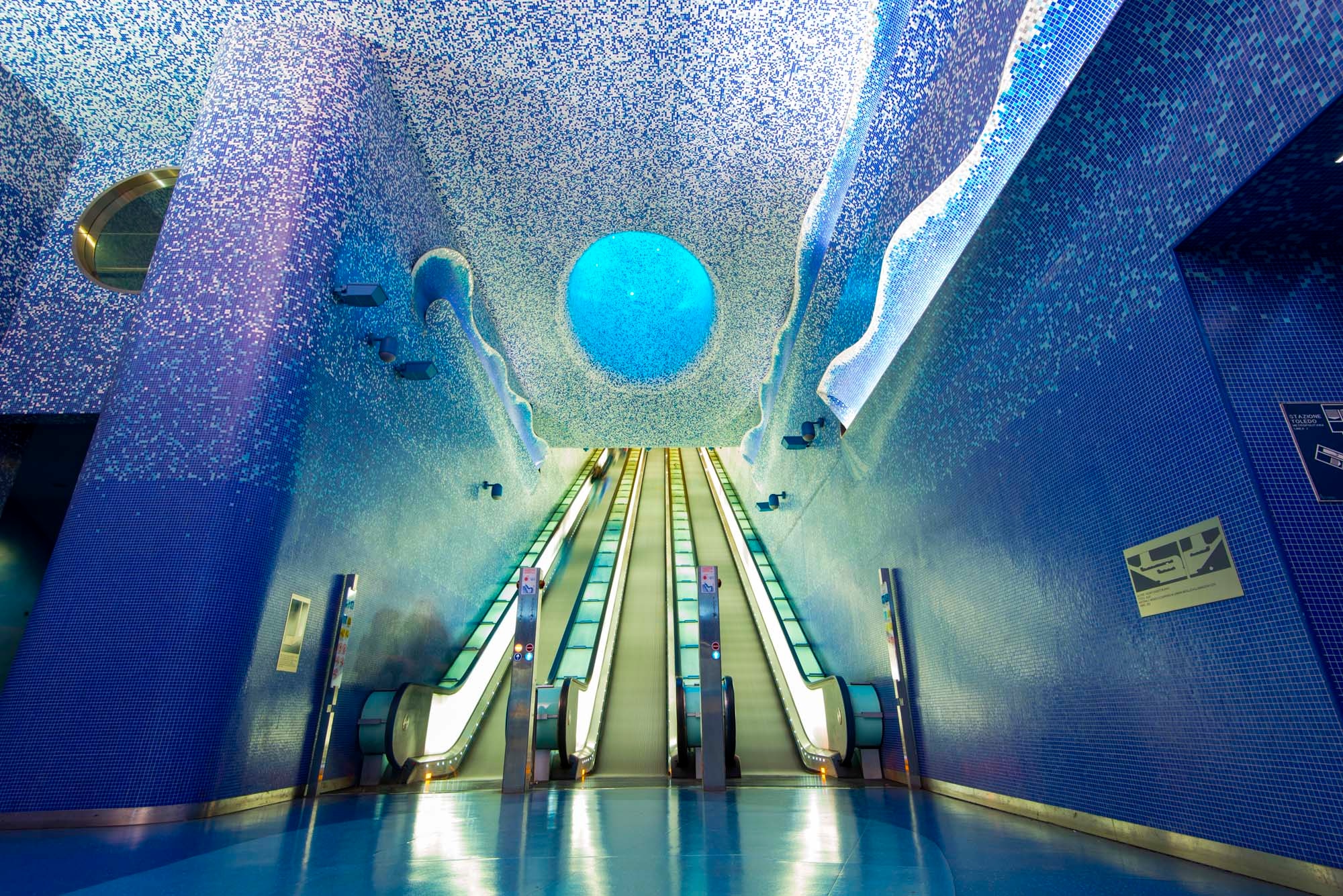
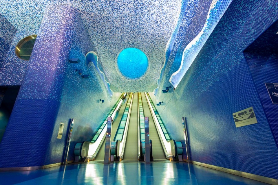

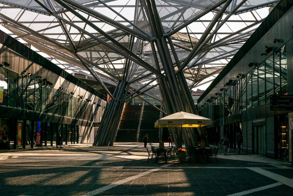
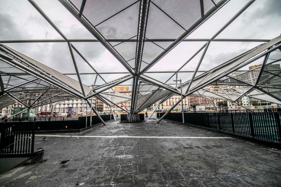
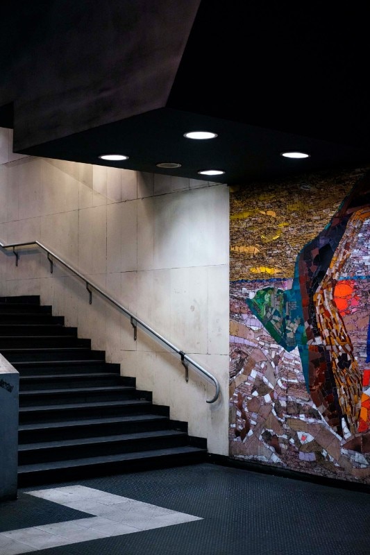
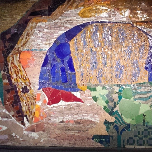
The Naples Metro, considered to be the oldest in Italy, was inaugurated in 1925 as Italy's first urban railway service and connected Bagnoli to via Gianturco, passing through the key points of the city. The infrastructure was constantly modified during the 20th century. In particular, the Stations of Art project, launched in 1995 under the coordination of Achille Bonito Oliva, was one of the most remarkable international architectural and public art projects of recent decades. The initiative aimed at redeveloping vast areas of the urban fabric and enhancing the places of public mobility by contradicting the consolidated perception of underground stations as merely functional transit places and transforming them into strategic and highly recognisable nodes of a "diffused museum". The design of the underground stations along lines 1 and 6 and the corresponding surface interventions between 2005 and 2013 is characterised by a plurality of languages, depending on the sensitivity of the designer and the specific characteristics of the context.
Bund sightseeing tunnel, Shanghai
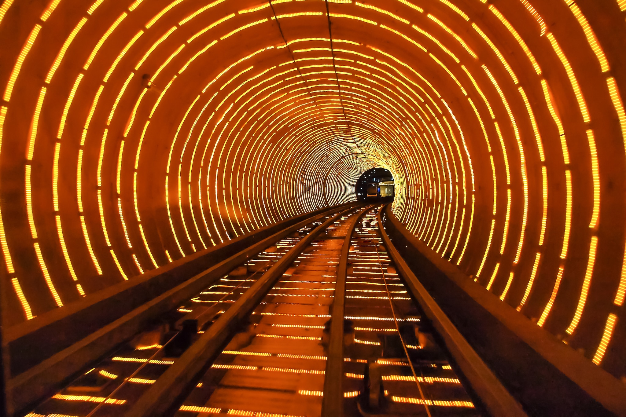
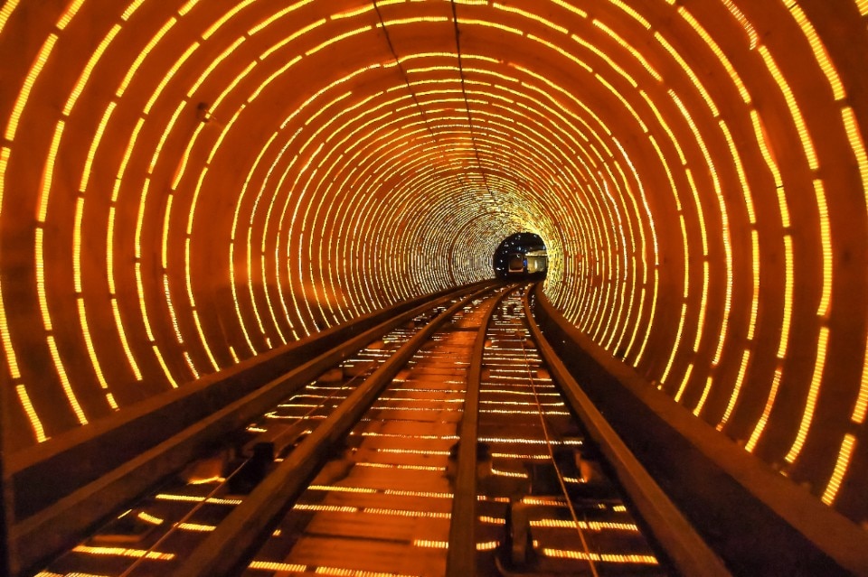
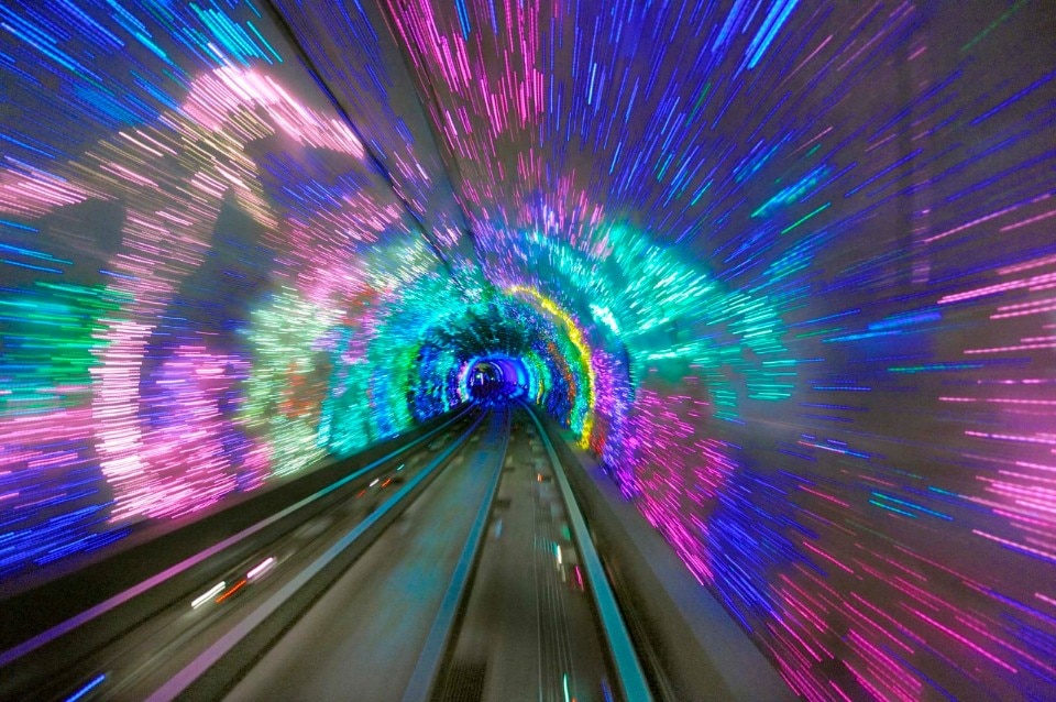
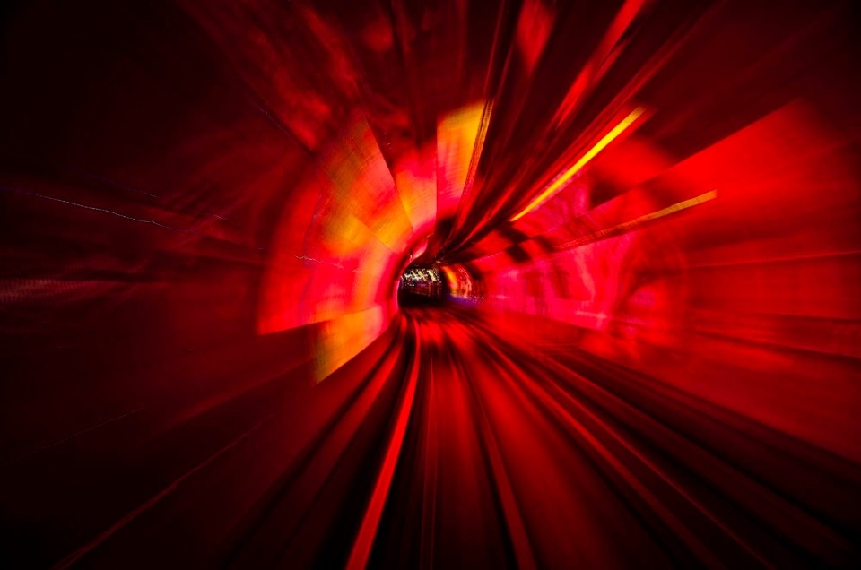
Riding the metro in Shanghai can sometimes be an ecstatic experience, or a disturbing one, depending on your point of view. This is the case with the Bund sightseeing tunnel (2001), a tourist attraction known for its special effects, which combines both characters: from the train with transparent compartments one can admire a changing kaleidoscope of neon lights with musical accompaniment, for an almost psychedelic experience.
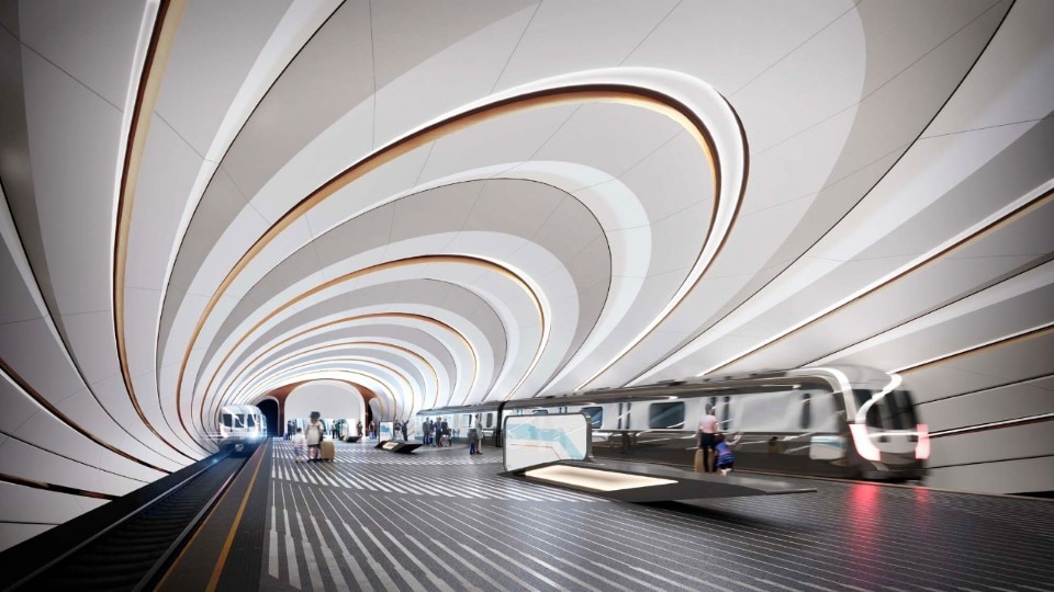
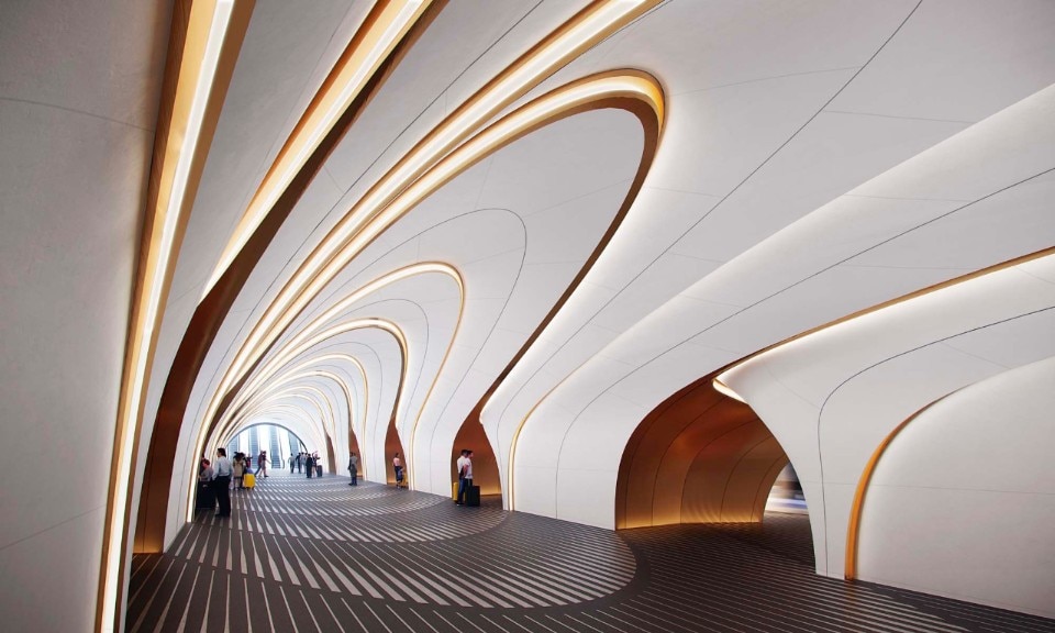
DOHA metro, UNStudio

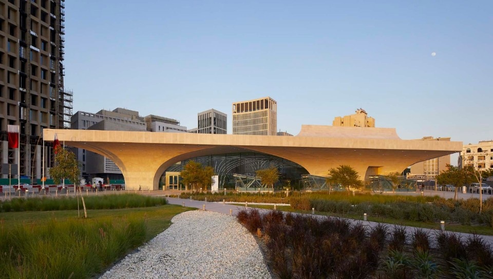
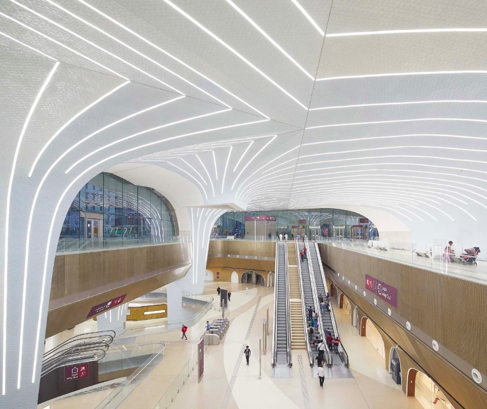
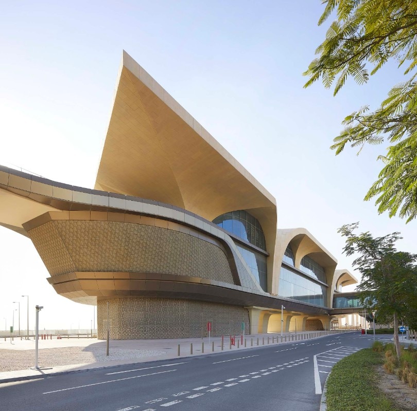
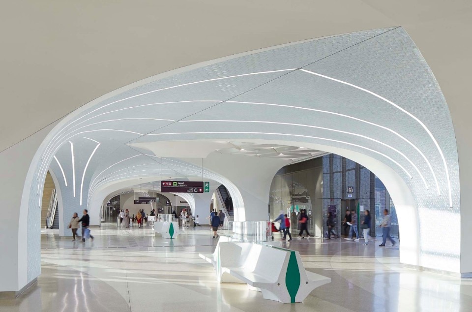
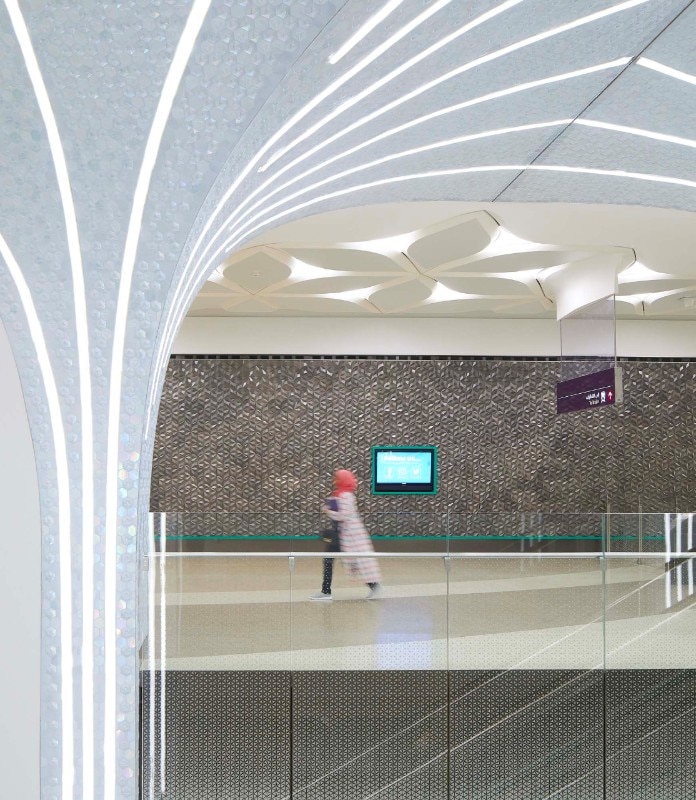
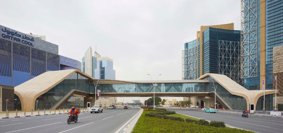
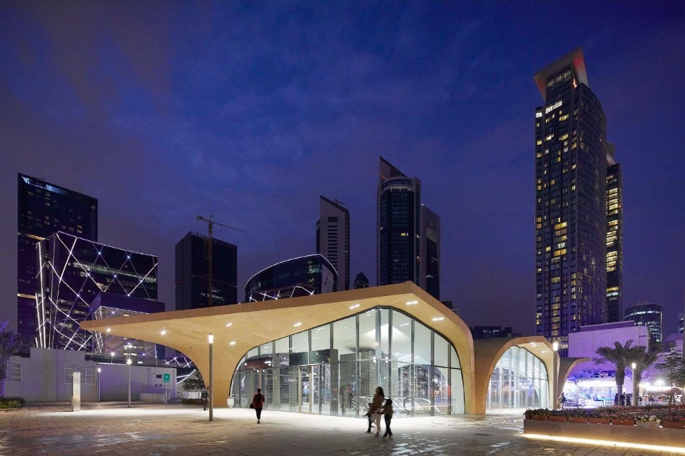
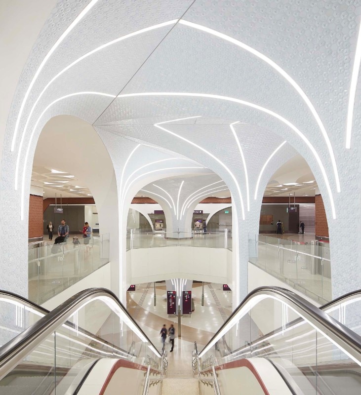
Within the framework of the Qatar Integrated Railway Project, in 2016 UNStudio was commissioned to realise the concept design and "Architectural Branding Manual" for the Doha metro network that went into operation in 2019, in collaboration with Qatar Rail's architecture department, providing design guidelines, architectural details and material schemes to realise the metro stations in a unified and identity-based network perspective. The architectural language blends suggestions of traditional local architecture with contemporary expressions: the large, vaulted spaces refer to historical Qatari architecture, nomadic tents and the sails of the dhow, the traditional local boat. In the stations, essential, monolithic exteriors dialogue with interiors with a fluid, radiant spatiality, enriched by a palette of materials and decorations in pearly tones.
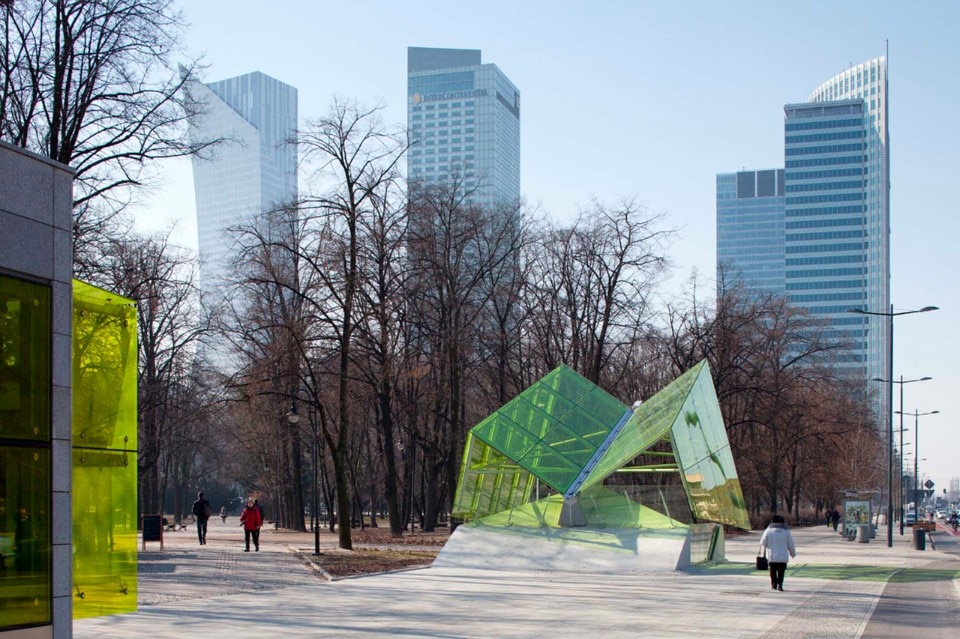
Dnipro metro extension, Zaha Hadid Architects


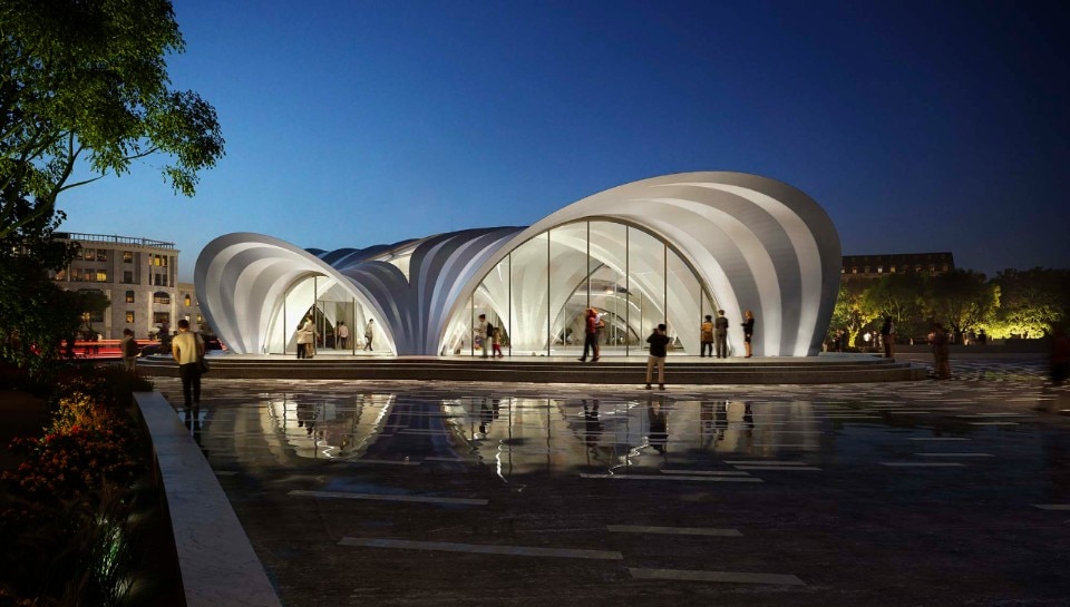
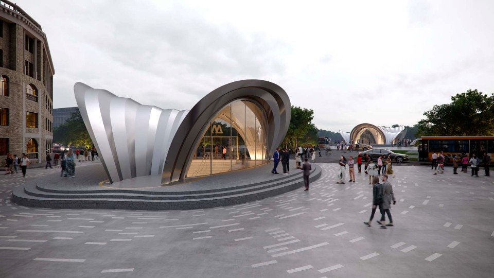
Zaha Hadid Architects has designed the extension of the metro line in Dnipro, Ukraine's third largest city, with the construction of the new Teatralna, Tsentalna and Muzeina stations. The design of the stations honours the rich metallurgical and manufacturing traditions of the city, recalled in the sculptural pavilions – placed in a new public square – that mark the recognisable entrance to the metro: the structures are composed of self-supporting shells made of recycled steel sheets from local foundries. The design of the ticket offices is unique for each station, while the lobbies, corridors and platforms share a unified language that gives the network a strong identity. The works are now underway.
Barcelona metro stations, Garcés - de Seta - Bonet arquitectes
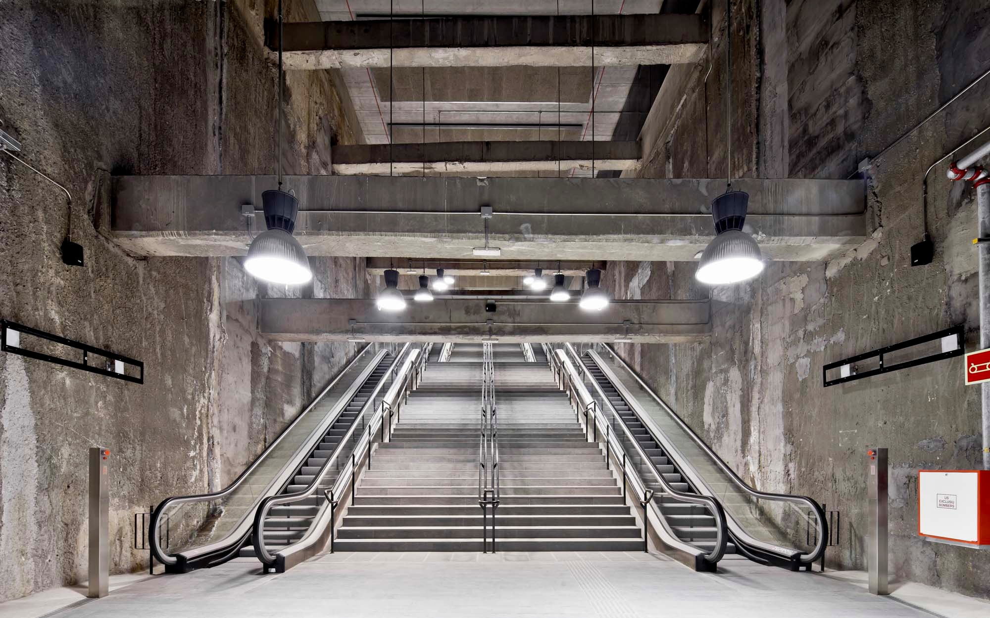

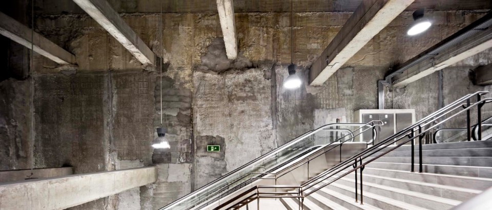
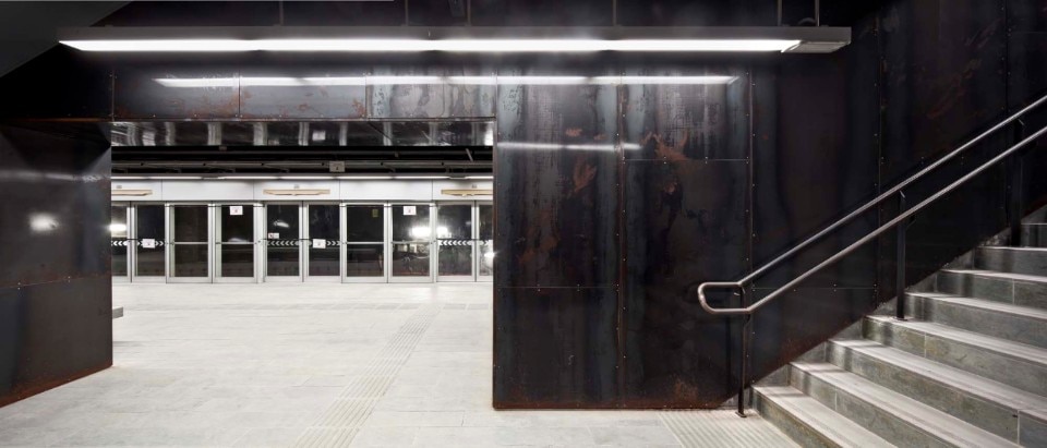
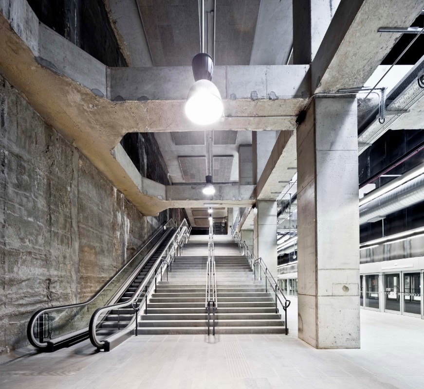
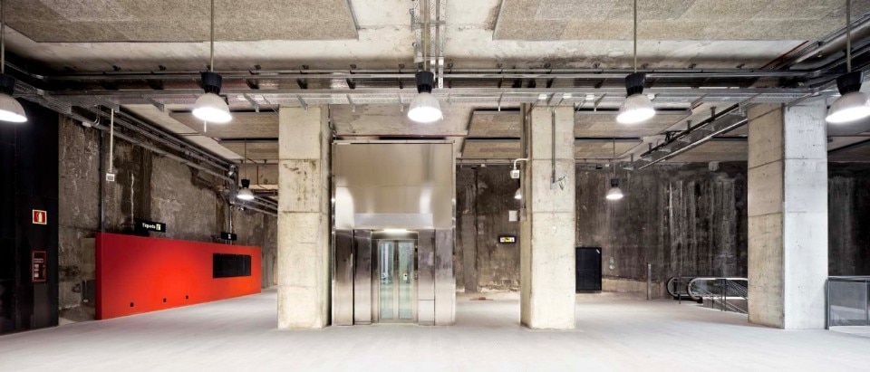
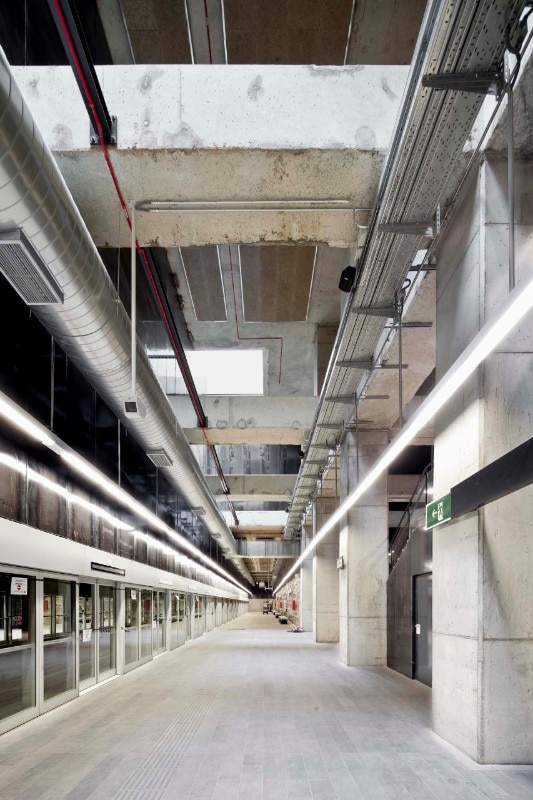
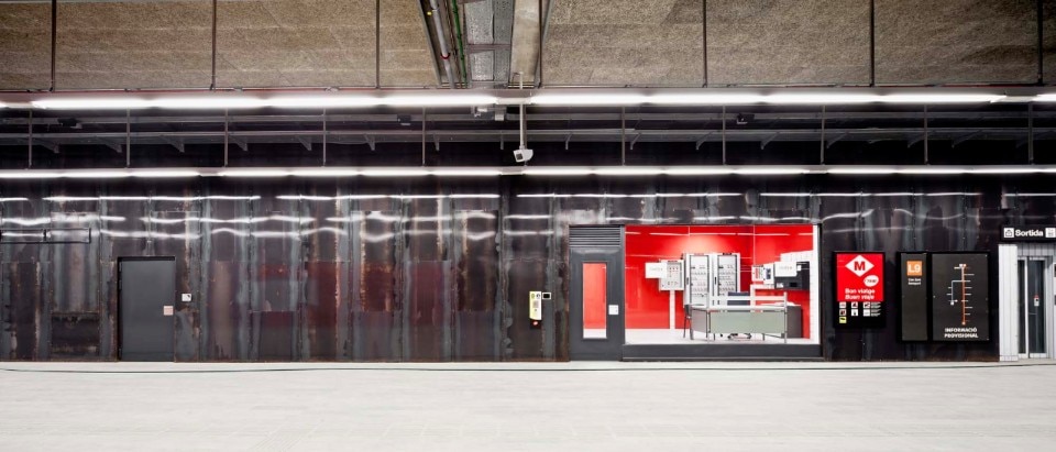
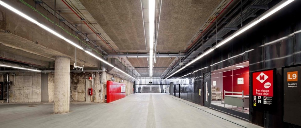
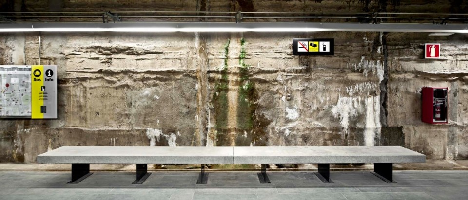
The design of the Europa-Fira, Parc Logístic and Mercabarna metro stations on Line 9 (2016) proposes to maximise the fruitive and perceptive quality of the underground spaces, with a minimum effort in terms of maintenance and economic resources: the use of a reduced number of materials, including exposed walls, metal slabs, stone floors, industrial lighting and elements recovered from structural work (retaining walls, prefabricated slabs) gives the interventions a timeless character, durable and indifferent to mutating fashion. Another project theme is the total closure of the doors in the absence of the train, in an exercise in façade design, with the aim of absolute control over the space (accesses, lobbies, platforms and the metro area): the convoy arrives through an interior connected to the public platforms, which open at the time of stopping.
Warsaw metro, AMC-Andrzej M. Chołdzyński

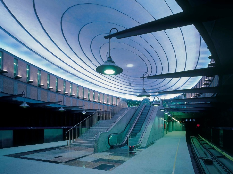
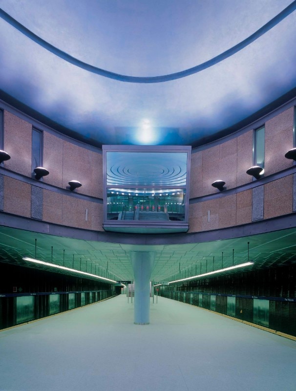
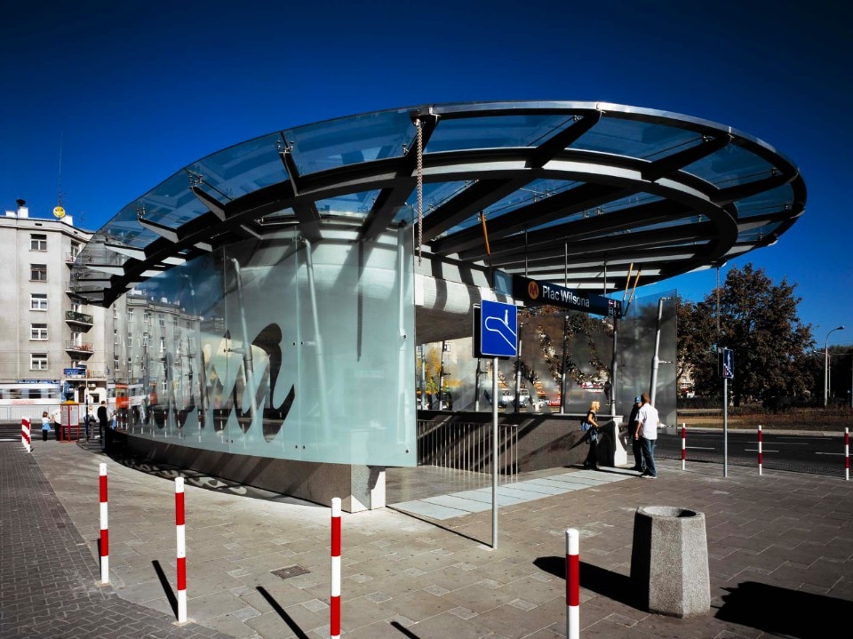
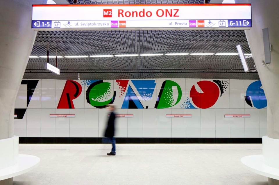
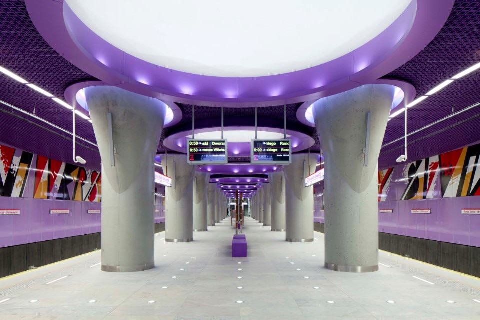
The intervention, over a period of 20 years, covered three stations of the first line of the Warsaw Metro (Plac Wilsona, Wawrzyszew, Młociny), all 7 stations of the central part of the second line (Rondo Daszyńskiego, Rondo ONZ, Świętokrzyska, Nowy Świat, Centrum Nauki Kopernik, Stadion Narodowy, Wileńska) and two stations in the western part of the second line (Ulrychów and Bemowo). In 2015, AMC studio developed the design concept and general guidelines to be applied in all stations. A common feature is the intention to create highly functional spaces from a maintenance and distribution point of view thanks to durable materials and clear routes. Vibrant artistic narratives embellish the spaces and wink at various pictorial currents, from Impressionism to Fauvism, from Symbolism to Metaphysics.
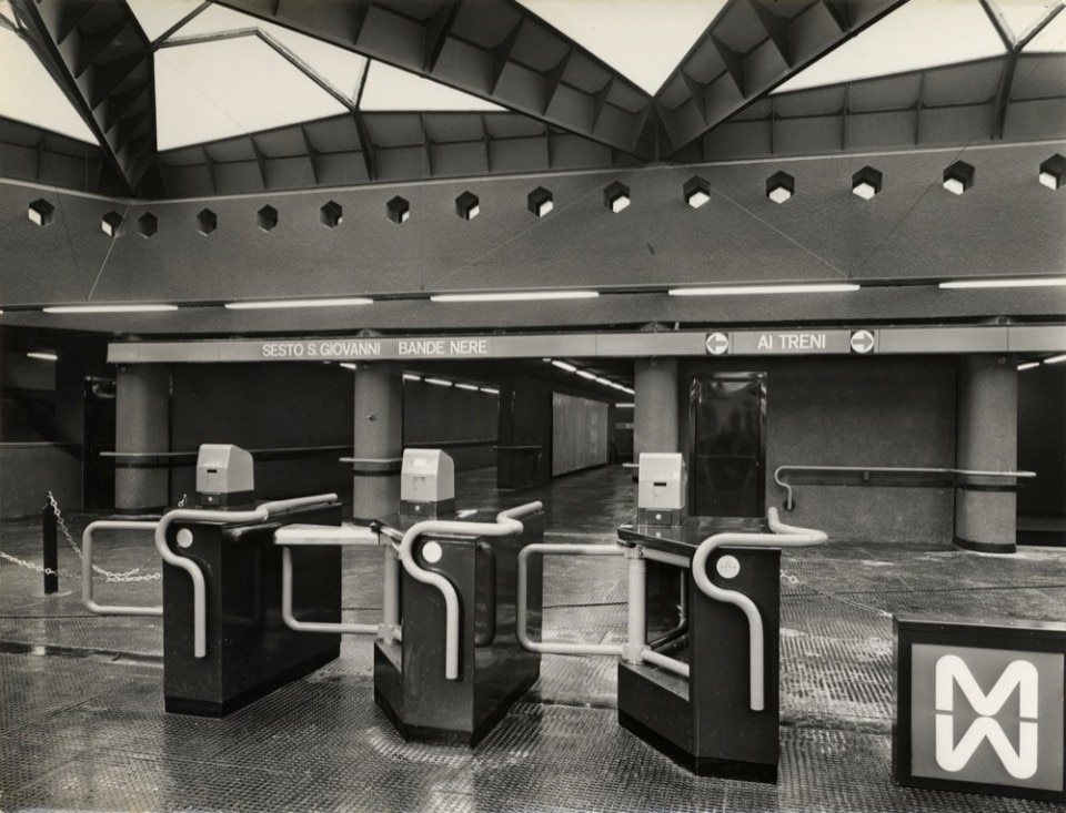
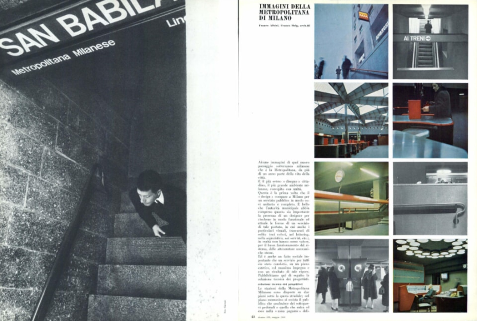
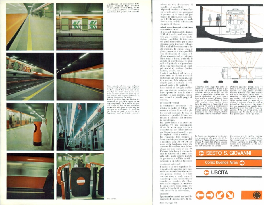
Milan metro, Franco Albini, Bob Noorda

.jpeg.foto.rmedium.png)
.jpeg.foto.rmedium.png)
The visual communication project for the Milan metro aimed to give a clear and intuitively recognisable identity to Milan's first line, the MM1. The design team formulated a unified code of signage, furnishings and fittings (from the signage, to the design of the tubular handrails, to the use of black rubber stamps for the pavements, to the clocks, to the colour component of the details and trains). After Line 1 (characterised by the colour red) in 1963 and Line 2 (characterised by green) in 1969, the model was repeated, though with other colours and languages, on the other lines in the following decades.
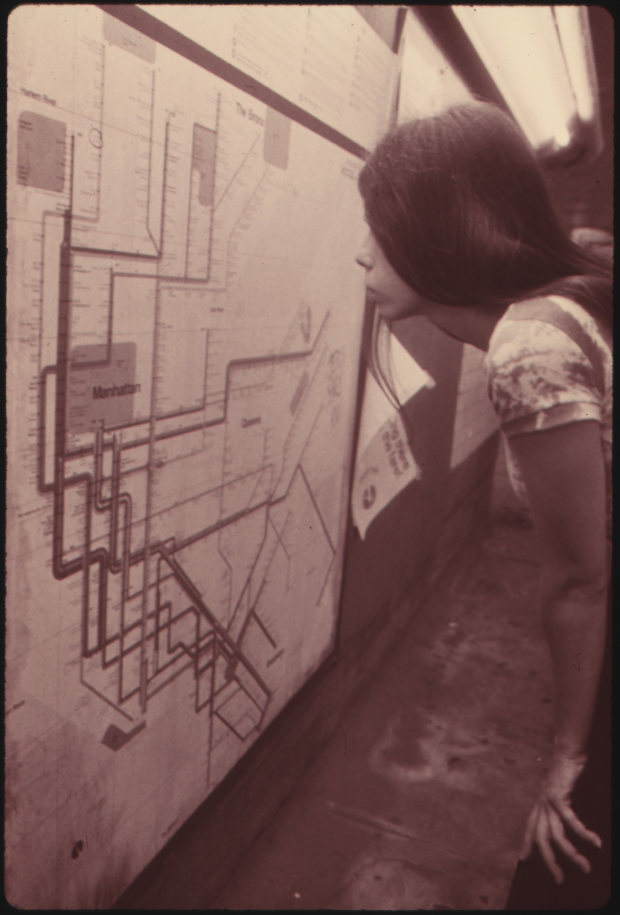
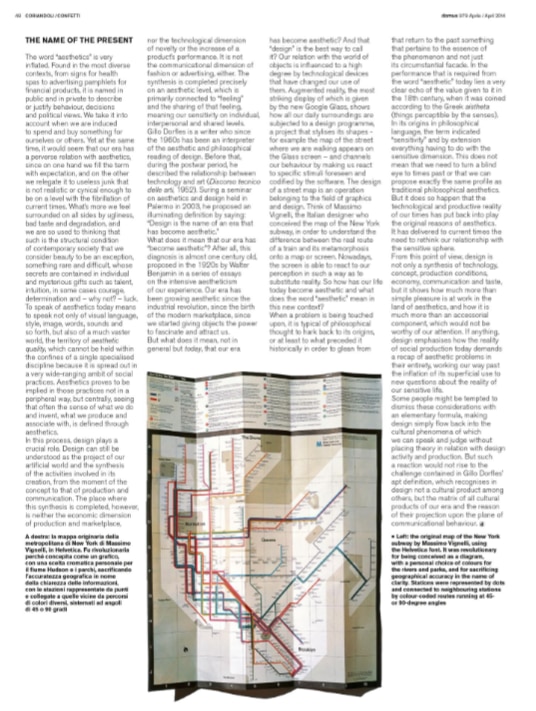
New York subway, Massimo Vignelli, Joan Charysyn, Bob Noorda, Unimark International Corporation

.jpeg.foto.rmedium.png)
.jpeg.foto.rmedium.png)
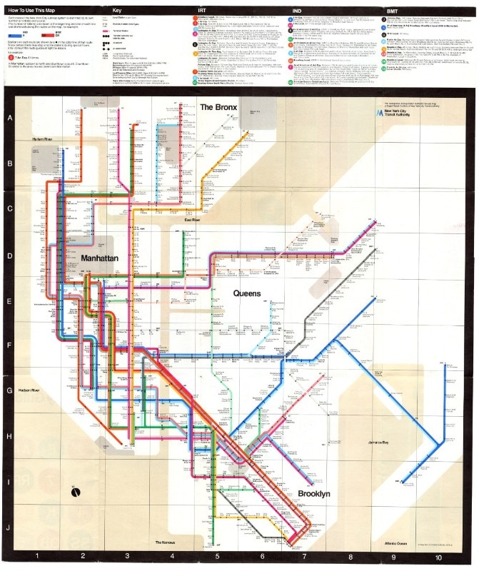
When New York City's previously independently operated underground lines came under centralised government control, the need of efficiently and simply directing ever-increasing transit flows became imperative. The task of defining an intuitive and comprehensive map of the network's routes was given to a team of designers who conceived a pioneering graphic design and visual identity project in 1972, outlining the New York underground map that became the benchmark for the network's subsequent evolutions. The map uses an effective graphic synthesis and represents a diagram of the underground network separated from any topographical reference where each line, described by 45- or 90-degree segments, is identified by a different colour, and each stop is indicated by a simple dot.
Métropolitain, Paris
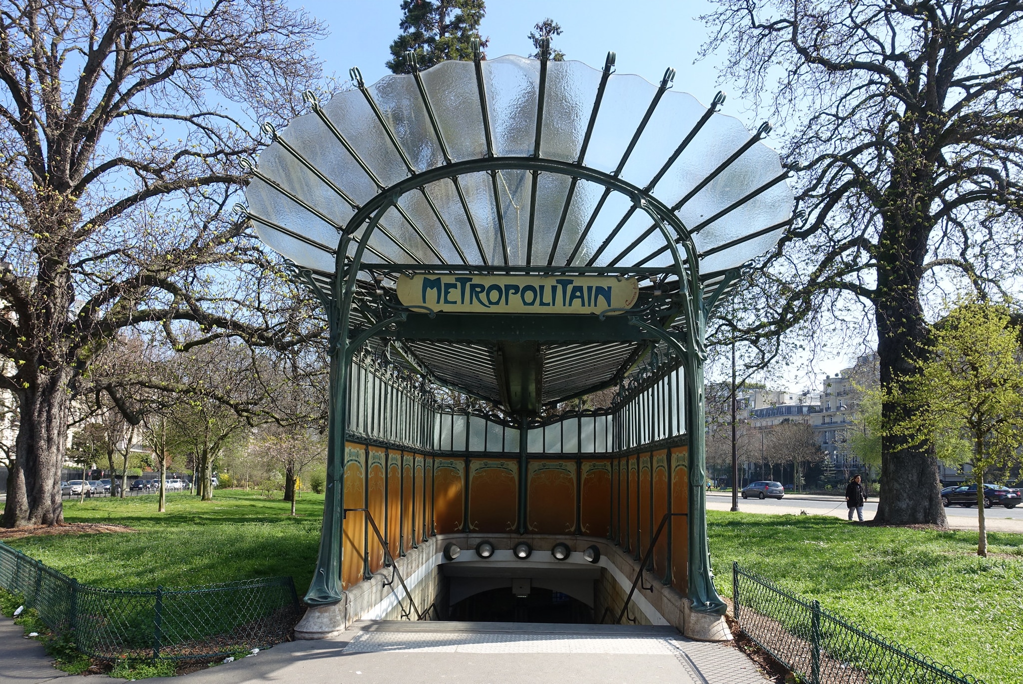
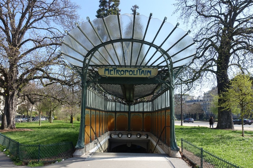
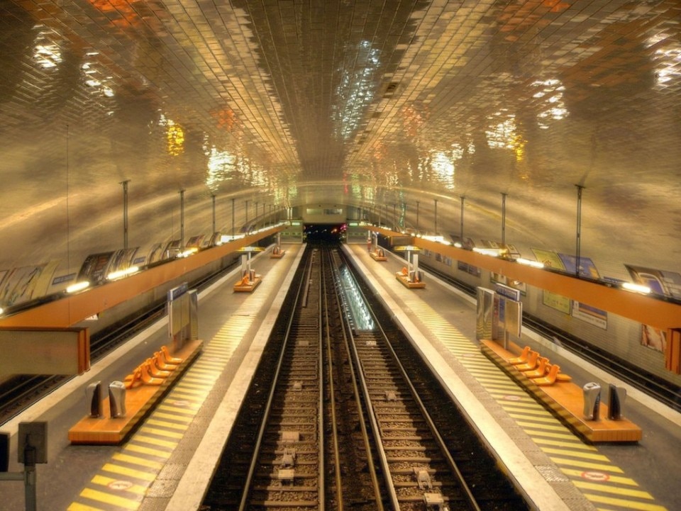
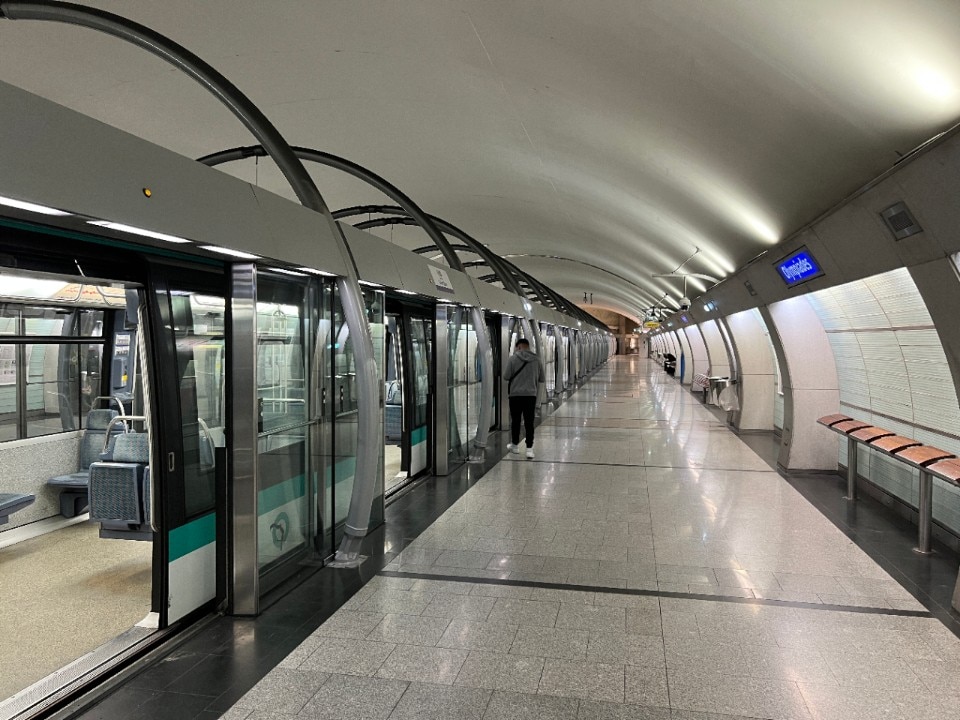
From the first Art Nouveau style kiosks by Hector Guimard (among those that remain, the Abbesses, Porte Dauphine and Châtelet stations of the early 1900s), to the metal structures of the 1960s, to the orange tiled “Mouton” style of the 1970s, to the white tiling enlivened by bright colours in the lights and benches according to the Andreu-Motte style (from the 1970s to the 1990s: Pont Neuf, Ledru–Rollin, Voltaire), to the luminous and functional stations of recent decades (line 14), the architecture of the Paris metro has evolved extensively, in a plurality of languages and styles expressing the change in eras and needs.
Vienna metro, Otto Wagner

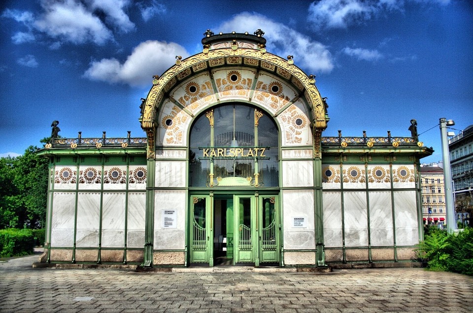
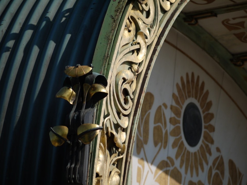
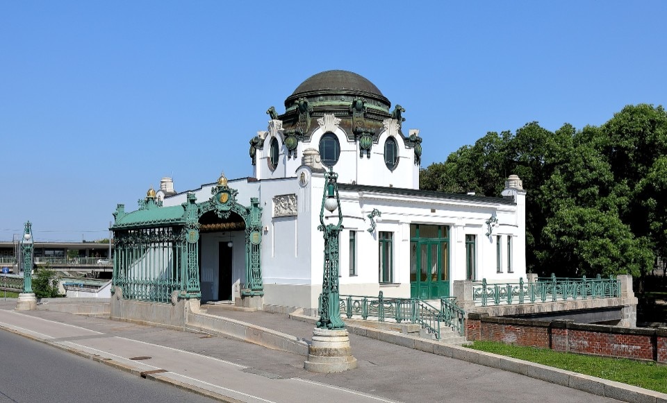
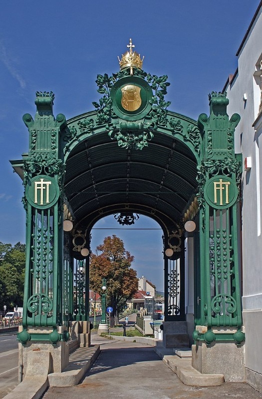
Otto Wagner was an emblematic figure in the design of the stations of the emerging Vienna underground. For the various Jugendstil stations he designed (including Hofpavillon in Hietzing in 1898 and Karlsplatz in 1901), Wagner conceived a functional architecture, capable of representing the yearning for innovation of his time through a repeatable, unified, and identifiable language, expressing a research on monumental urban decoration at the same time.