


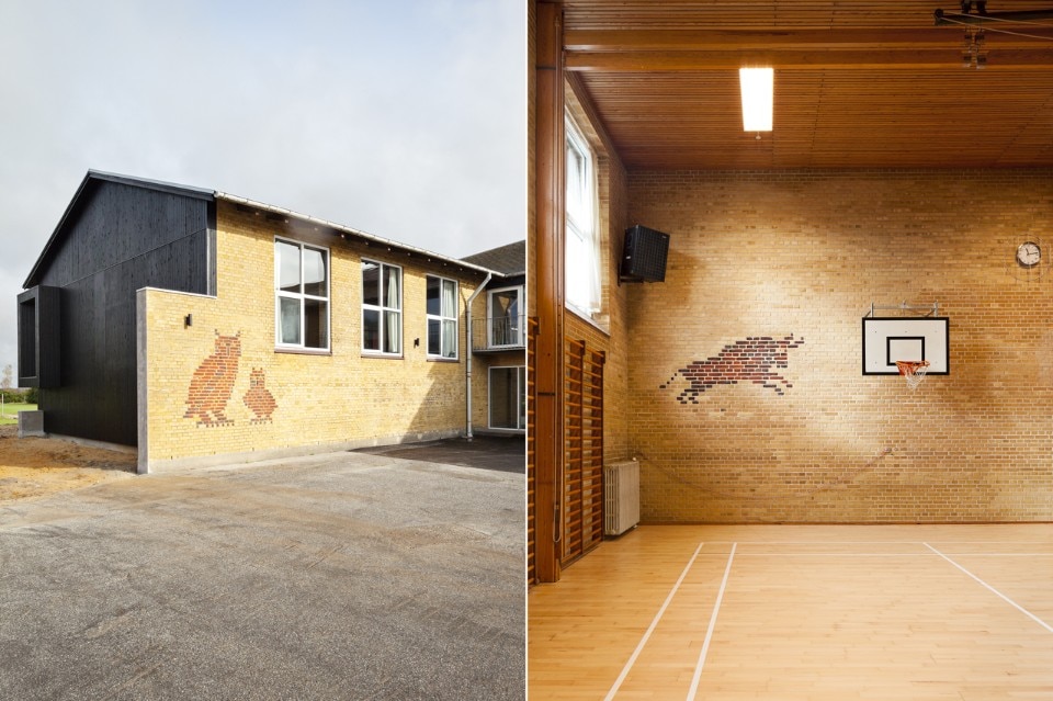
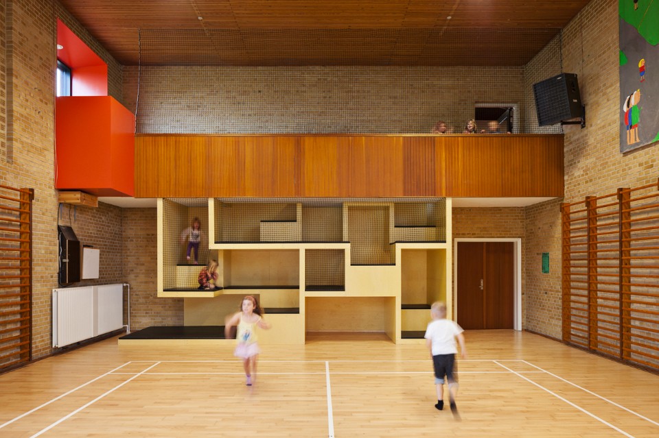
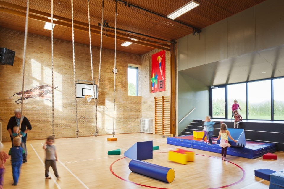
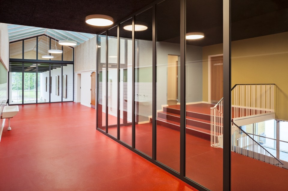
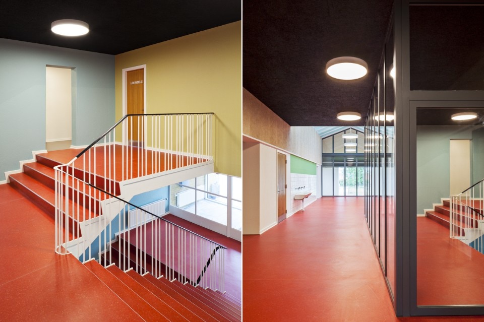
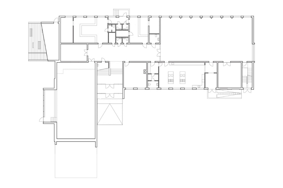
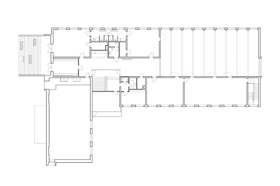
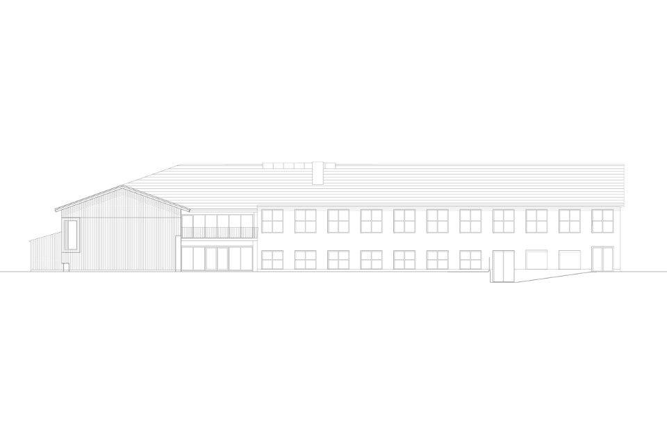
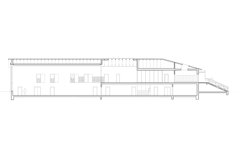
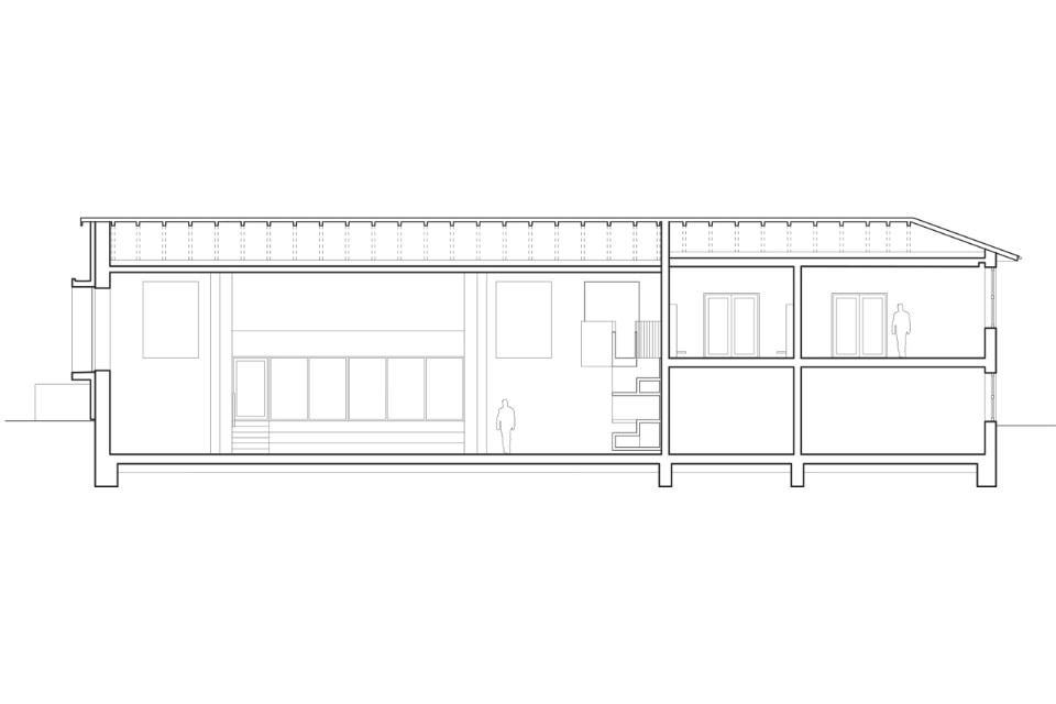
The interventions are concentrated on developing infrastructure, spaces and dynamic relationships between the building’s functions. The multi-hall is the radical intervention of the project, which has introduced a significant and spacious space that has been “stored” in the old school and brings space and activities in contact with each other.

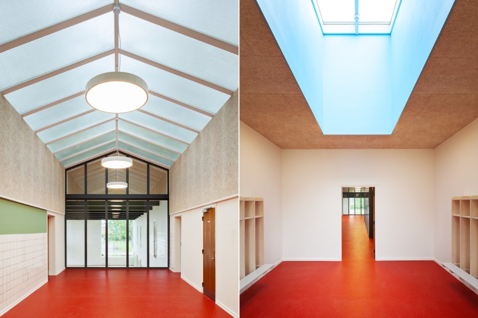

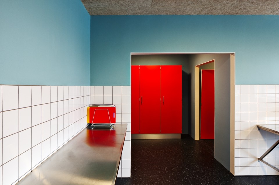
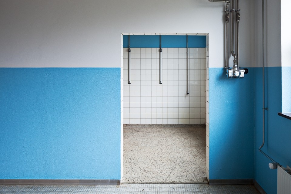
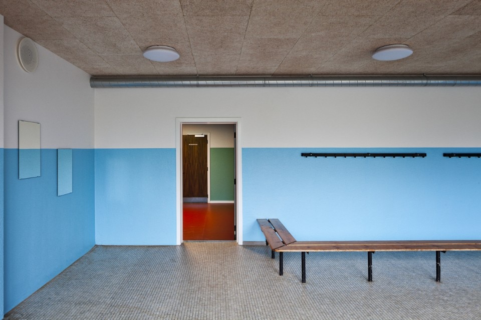
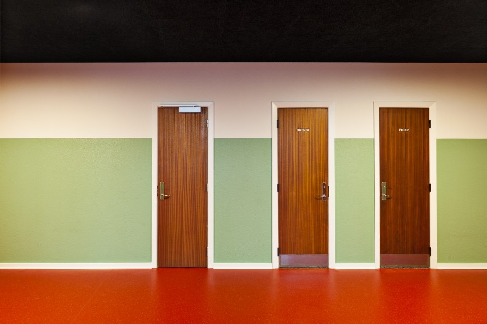
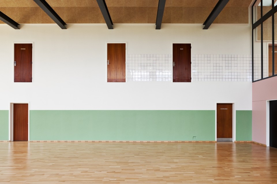
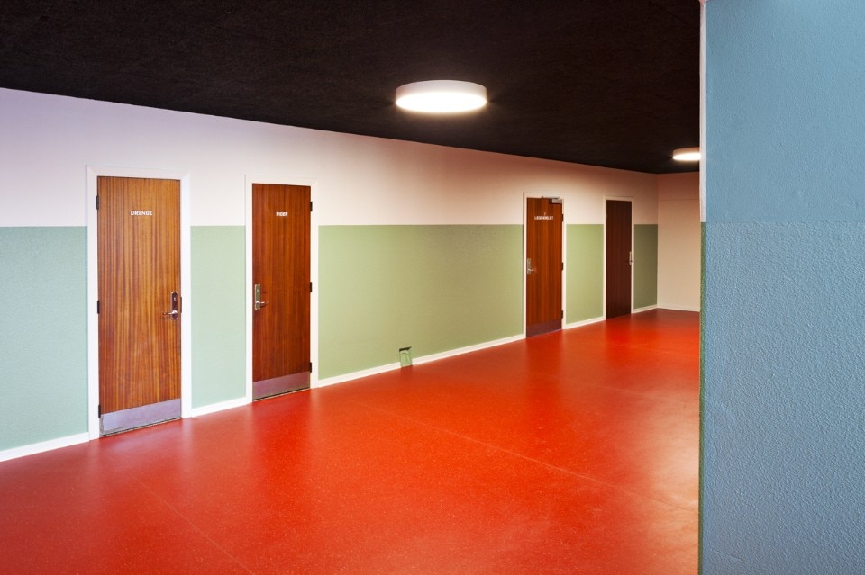
The colour scheme emphasizes the design of the rooms, inspires creativity and movement and counselor for use and orientation in the Village of the School. Development of the color project has been done in close cooperation with the developer, users and stakeholders. The color palette refers to color in the school that has been against color cards from the 60’s. Green, blue and yellow are the wearing colors. Ceilings and parts of the upper wall are covered with troldtekt left black or natural without a fence. Linoleum floors are red in circulation areas, while groups in the nursery have their own color.

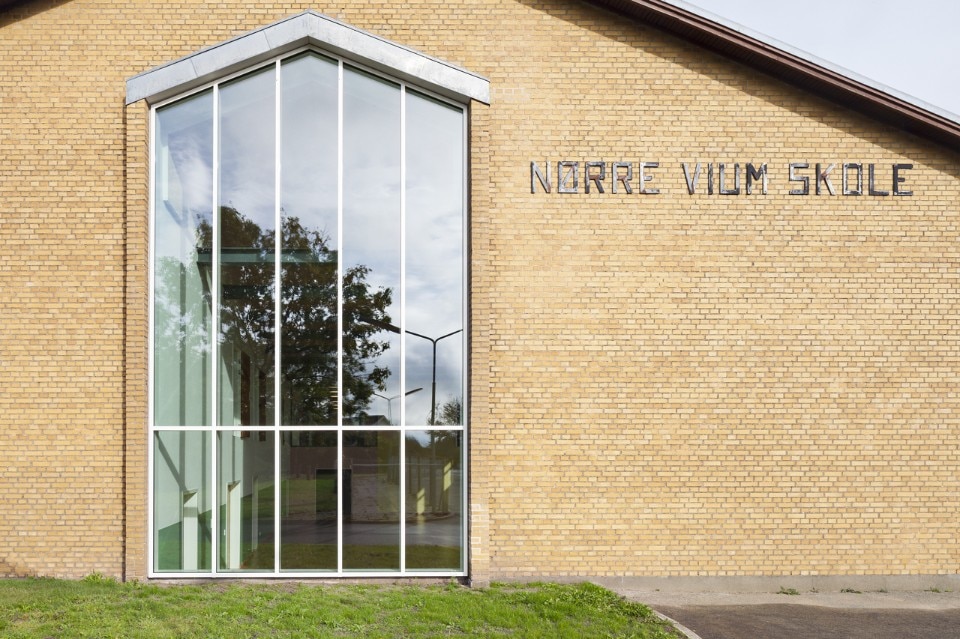
The village in the school, Videbæk, Denmark
Program: public building
Architects: Erik Brandt Dam architects and Cornelius+Vöge
Colour scheme: Visual Artist Malene Bach
Engineer: Ingeniørgruppen Vestjylland
Completion: 2017