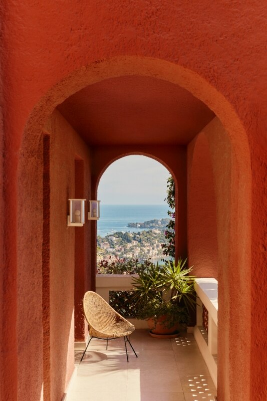


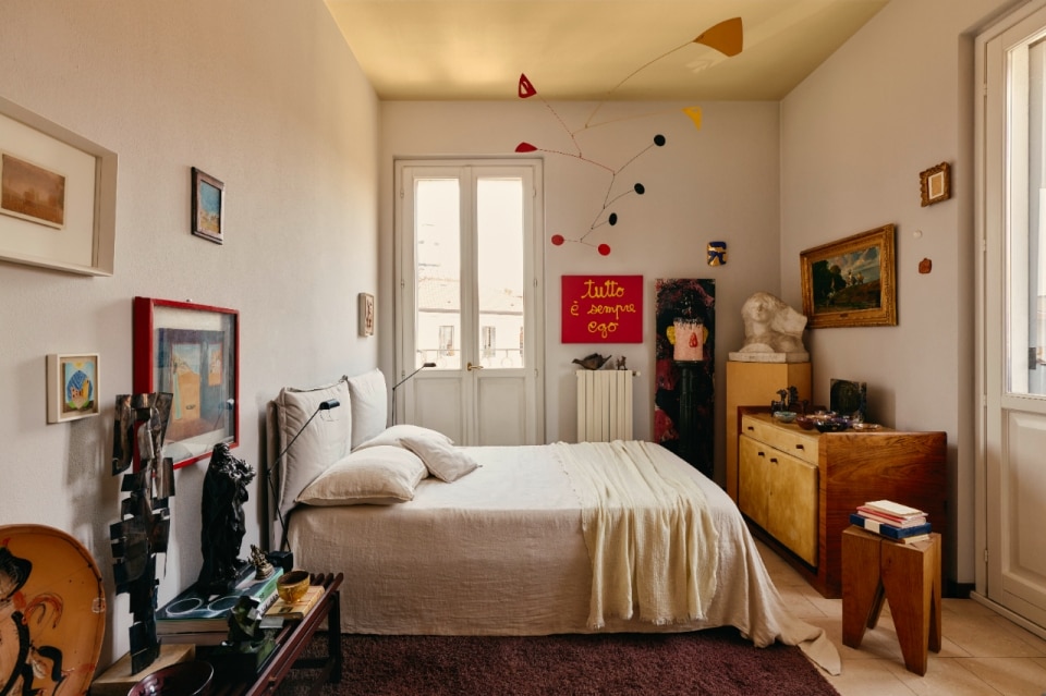
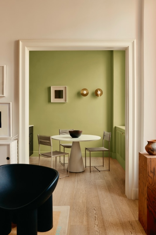
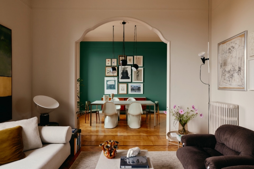
If, as Wassily Kandinsky said, the soul is a piano with many strings, colour is the key, and the artist is the hand that makes the soul vibrate, it is no surprise that the creative world of architecture and design increasingly chooses colour as the tool to make the soul of a space and those who live in it resound.
This is a principle that Kerakoll, a multinational colossus in the construction industry with an integrated range of products and services (from waterproofing to adhesives, coatings to enamels and much more), has made its own, viewing colour as a key design tool capable of influencing and transforming spaces and landscapes (both external and internal) beyond a purely decorative function.
Rooted in the past and looking to the future
This “colour-enthusiastic” spirit emanates from the Kerakoll Design Lab in Sassuolo (Modena), where the “colourful heart” of the company beats: here, in the exhibition stands, the expressive language of colour in the field of decoration is narrated in its various forms and technical solutions, combining meticulous coding and cataloguing tools with the pride of a past in research that never ceases to point to the future, with the aim of making the company the benchmark in this market sector.
And today, the future is represented by Kerakoll Colors, the most comprehensive and ambitious colour project dedicated to interior and exterior decoration ever developed by Kerakoll: not just paints and coatings, but an integrated system of specific solutions for additional segments – decorative and technical resins, varnishes, fillers and sealants – coordinated in a single palette of 1,500 colours.
The project is a continuation of Kerakoll's path in the world of colour. The first “spark” was ignited in the mind of the brand's founder, Romano Sghedoni, back in the 1960s, in a paint factory, but it only came to life in 2000: with the acquisition of Società Lombarda Colle (SLC), the company entered the market of adhesives and parquet coatings; in 2006, with the purchase of Rankover spa (Kerakover and Keradecor since 2008), it expanded into the field of natural paints and varnishes.
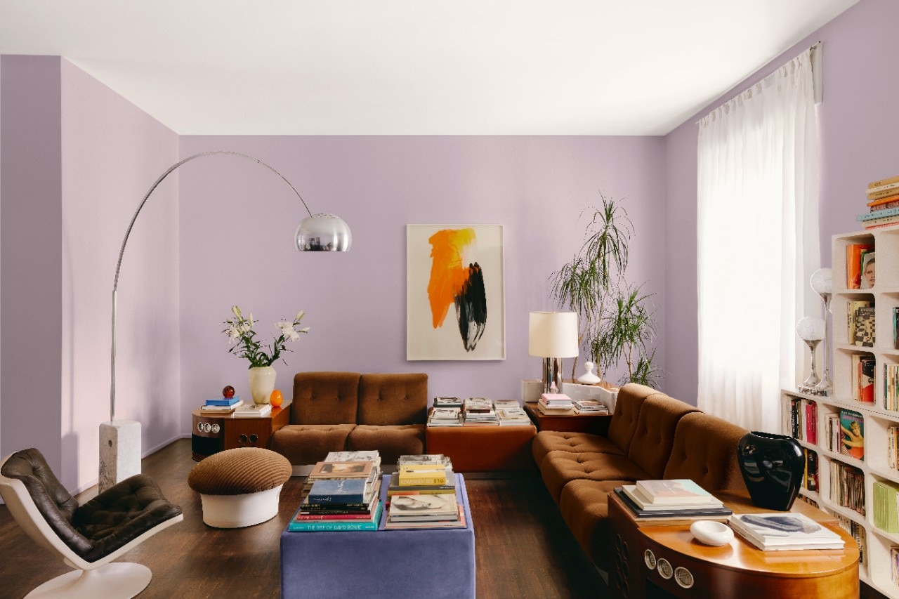
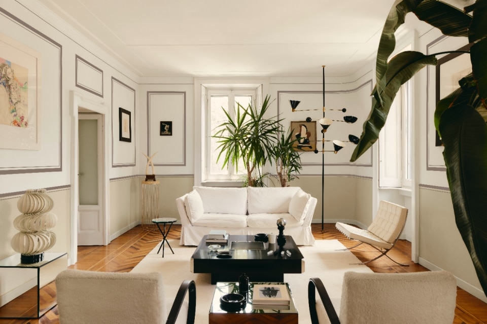
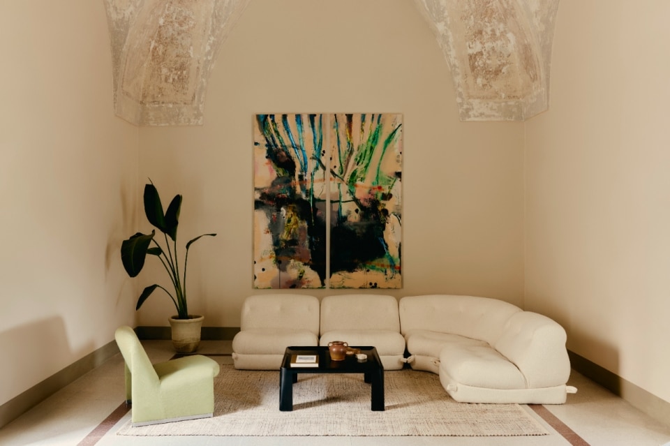
But 2014 was the year that marked a change of pace in the company's entrepreneurial vision. With the launch of the Kerakoll Design House project, the company expanded its scope from construction to the world of design, simultaneously systematising its own “grammar” of colour: the collaboration with Piero Lissoni gave birth to the Warm Collection, a range of 10 colours in neutral and dusty tones that paint soft and essential surfaces.
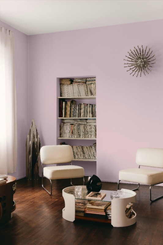
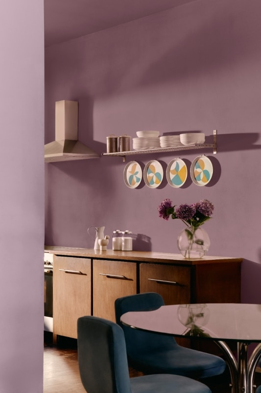
A leap in scale (and depth of range) came in 2021 when, with the Kerakoll Colour Collection, the company expanded Lissoni's palette of 10 colours to 150 colours for interiors, until 2025 when, with Kerakoll Colours, the 150 colours became 1,500 and “overflowed” from interiors to exteriors: a multiplicative process that is not merely mathematical but the result of experimental and artisanal research that blends the colour scales of Munsell (the father of the three-dimensional colour concept) and Johannes Itten (who introduced the notion of temperature in his Bauhaus course, distinguishing between warm and cool tones). The result, obtained over more than a year of empirical testing and not without a bit of serendipity, is a range of colours that cannot be categorised using traditional standardised NCS and RAL colour coding systems, and which distinguishes Kerakoll's colour vocabulary from that of all its competitors.
Kerakoll Colors
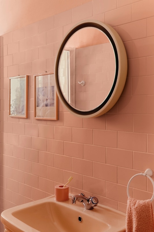
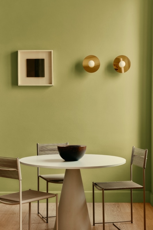
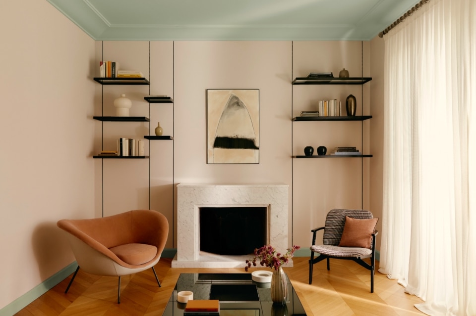
With four product ranges – Colour Collection (150 colours for technical and decorative resins, microfilm and parquet), Colour Fill (50 colours for decorative fillers and sealants), Color Interior and Color Exterior (respectively for interior decoration, 1,500 colours, and exterior decoration, 1,000 colours) – a single palette organised into 8 Colour Charts – Neutral, Blue, Green, Brown, Yellow, Terracotta, Magenta and Purple – in four shade scales (Light, Mid, Deep and Bright), Kerakoll Colours is presented as a complex mosaic that requires a compass to avoid getting lost. This is provided by the synoptic atlas – which stands out on the wall of the Kerakoll Design Lab to help guide customers, suppliers and the company team itself – and which visualises the complexity by reducing it to a Cartesian diagram: the eight families are represented vertically for reading from top to bottom from light to dark, and horizontally for reading from left to right from cold to warm, while colours of equal intensity and saturation are arranged on the same line, from the most opaque to the most brilliant. This mapping helps to understand the various technical and figurative possibilities in relation to materials and furnishing elements, giving designers maximum freedom of action.
From concept to real life
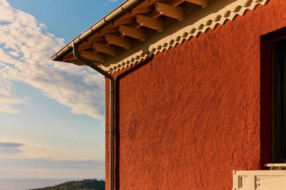
After immersing in the sea of colours, the perceptive experience becomes “desaturated” where every creative seed springs forth, at the Kerakoll Green Lab which, not far from the Kerakoll Design Lab, houses the research and development laboratories where all kinds of innovative products are conceived, tested and validated. The building, designed by Studio Biòs Associati from Florence in 2014 and inspired by local anthropic and natural forms (from ceramics to the Vulcanetti of the Salse di Nirano), stands out like a UFO in the Sassuolo area with its generous enveloping roof and immaculate surfaces (reminiscent of Gaudí's trencadis). Inside, the company's white finishes and large glass surfaces accentuate the rarefied, almost ascetic atmosphere of the completely neutral space, perhaps implying an implicit assumption: if a colourless Hyperuranium belongs to Ideas in their germination, development and validation phase before they are put into practice, then a world of colours belongs to the real life of concrete matter and emotions.
To “immerse the soul in colours”, “swallow the sunset” and “drink the rainbow” – as Khalil Gibran said – the spectrophotometer gives way to human sensitivity.