

Are there colors that actually help us work better? That’s a difficult question to answer. Theories of color – shaped by figures like Johann Wolfgang von Goethe, Michel Eugène Chevreul, and Josef Albers – have long explored both the physiological and cultural aspects of our responses to color, often tying them to specific contexts and patterns of use. While cognitive psychology is gradually shedding light on how different shades interact with brain function, the fields of communication and marketing often take a more experimental approach, treating color as a spatial narrative tool that aligns with a company’s identity and values.
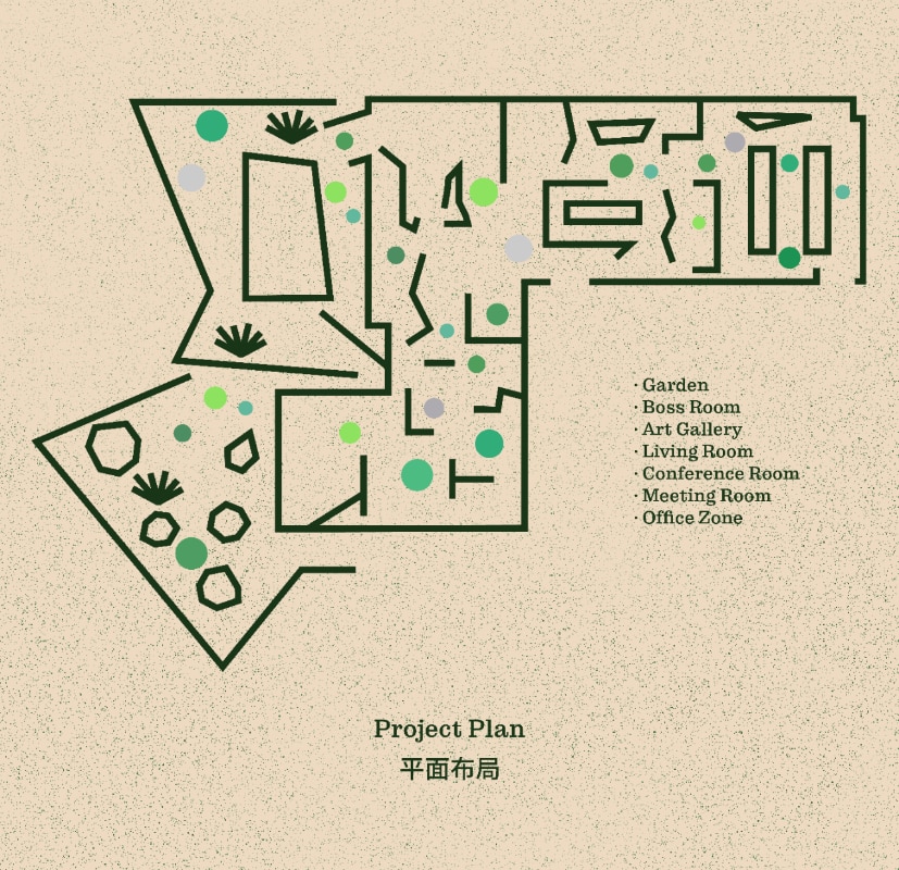
Instead of searching for fixed answers – since there really aren’t any – it’s more fruitful to look at some notable interior design projects that showcase both exemplary application of color and cheerful subversions of the standard rules. One commonly held belief, almost ergonomic in nature, is that office environments should be dominated by neutral tones, as a way to reduce visual overload, focus attention, and maintain concentration. Mitsubishi Electric’s open-plan office in Yokohama, Japan, designed by Yohak Design Studio has recently made news.
The space is organized around a restrained palette of three neutral colors, gray, beige, and white, used across surfaces and furnishings. This exemplifies how color is not as a mere intangible superficial coating to be applied to things around us, but as a material presence, something within the objects that interacts with texture and form. To prevent monotony, in addition to a combination of shape effects and partitions, the designers introduced more vivid elements, like a blue carpet or a soft powder pink accent – the latter often seen as a calming, welcoming, and personal choice.
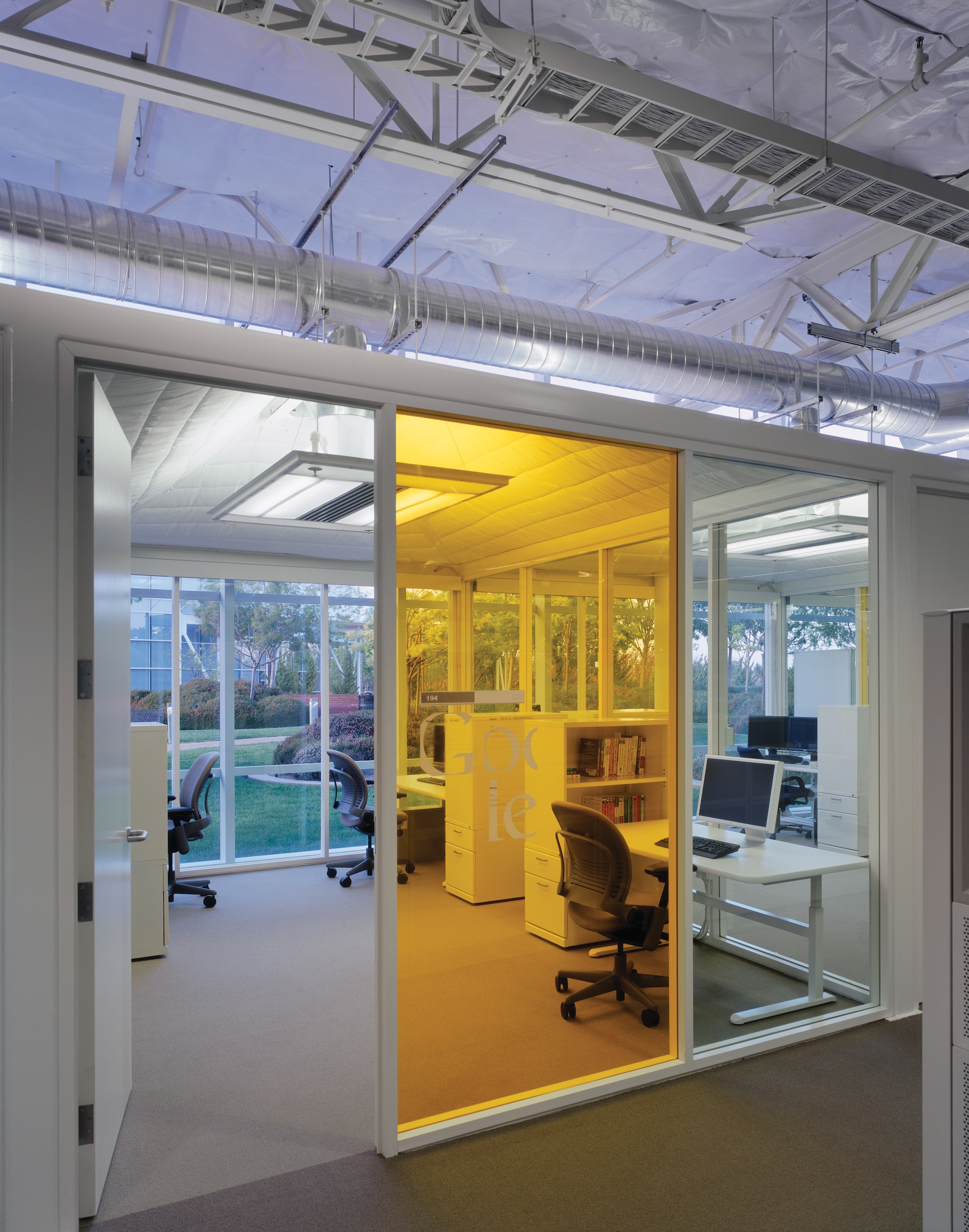
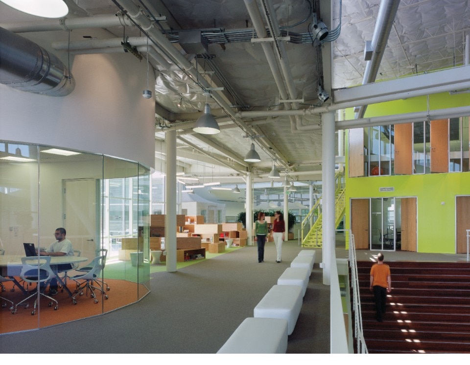


Big Tech company offices, by contrast, have long served as testbeds for radical design ideas. In environments where jobs are more lucrative and knowledge and talent are at the heart of fierce competition, companies spare no effort in improving workers’ wellbeing by making workspaces more appealing. One iconic example is the 2005 redesign of Google’s Mountain View headquarters by Clive Wilkinson Architects, which inaugurated a period of free experimentation with bold and vivid colors. Still very relevant today and winner of several awards, including an AIA Honor Award, the project embraced colors like the iconic red – traditionally avoided for allegedly encouraging aggressivity – yellows, oranges, greens, and purples applied to see-through glass surfaces to create an interplay between color and light.
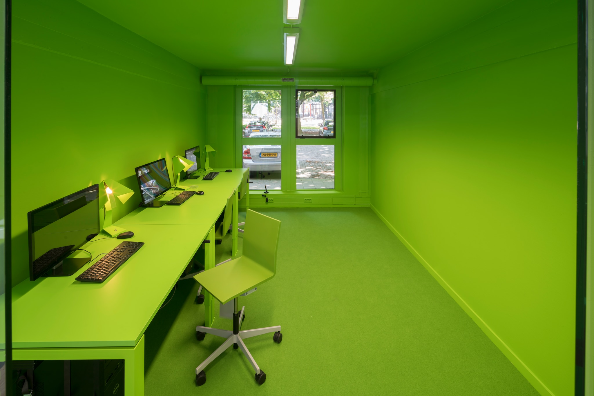
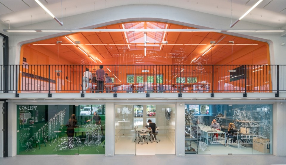

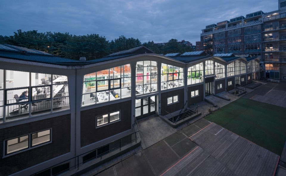
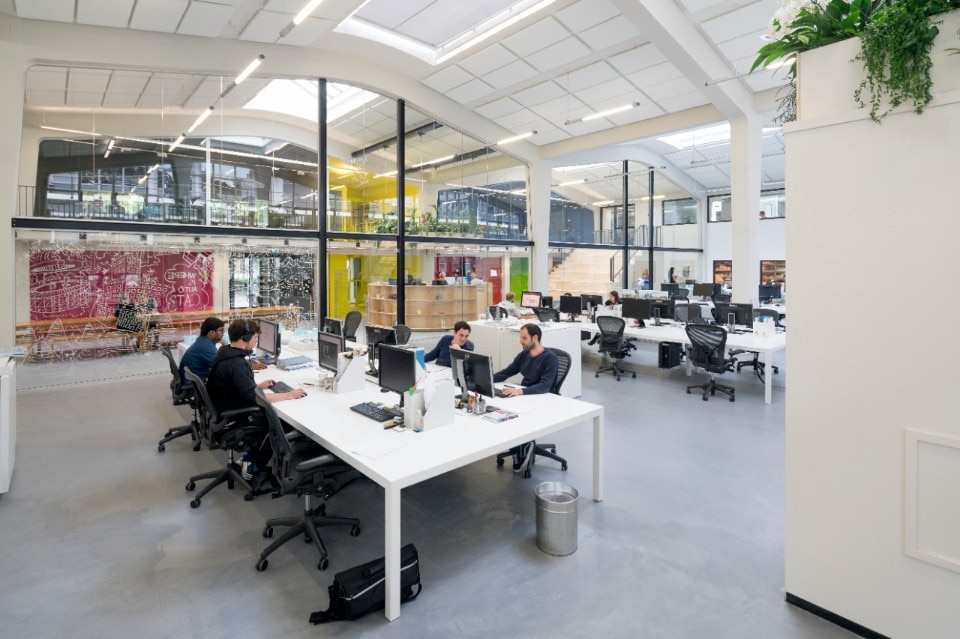
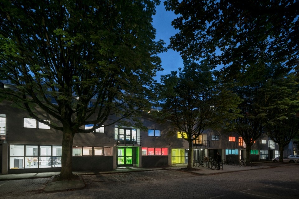
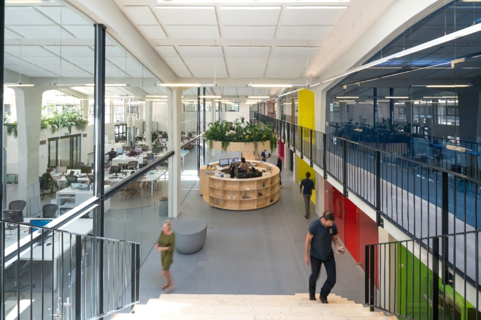
What if, within a similarly neutral and modern shell, color could be used to express the very identity of a company, overcoming old taboos? That’s exactly the approach MVRDV took in its 2016 redesign of its own headquarters, housed in a 1952 building by Dutch architect Hugh Maaskant. The firm used vibrant blocks of color ranging from orange, red, green, even fluorescent yellow to entire sections of the space. With partition walls replaced by floor-to-ceiling windows, the interplay of hues isn’t confined to the interior but becomes tangible from the outside as well, with glass panes acting as a medium for projecting the office’s colors onto the street.

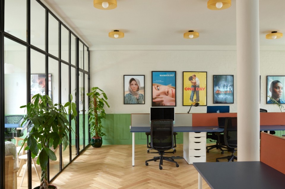
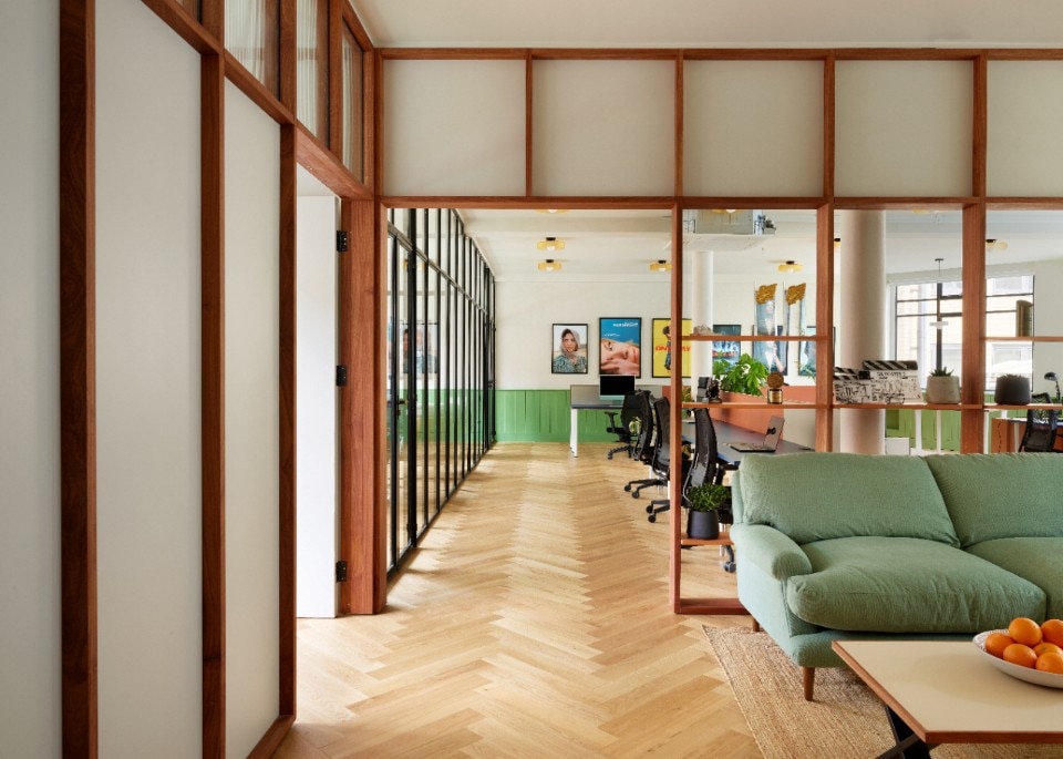
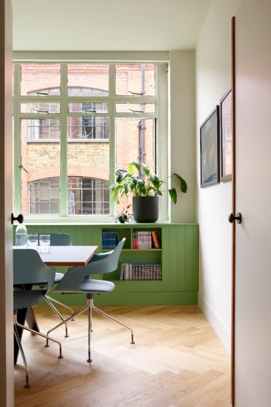
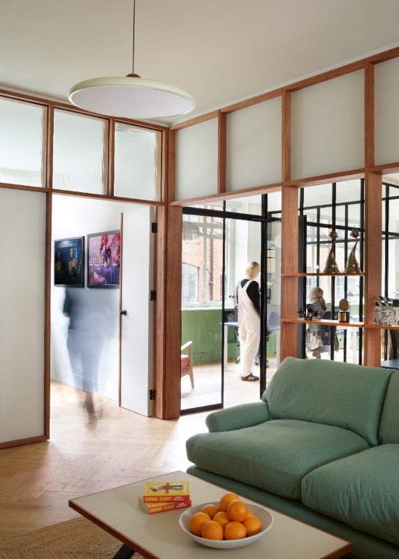
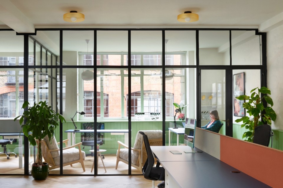
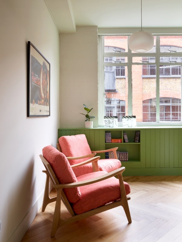
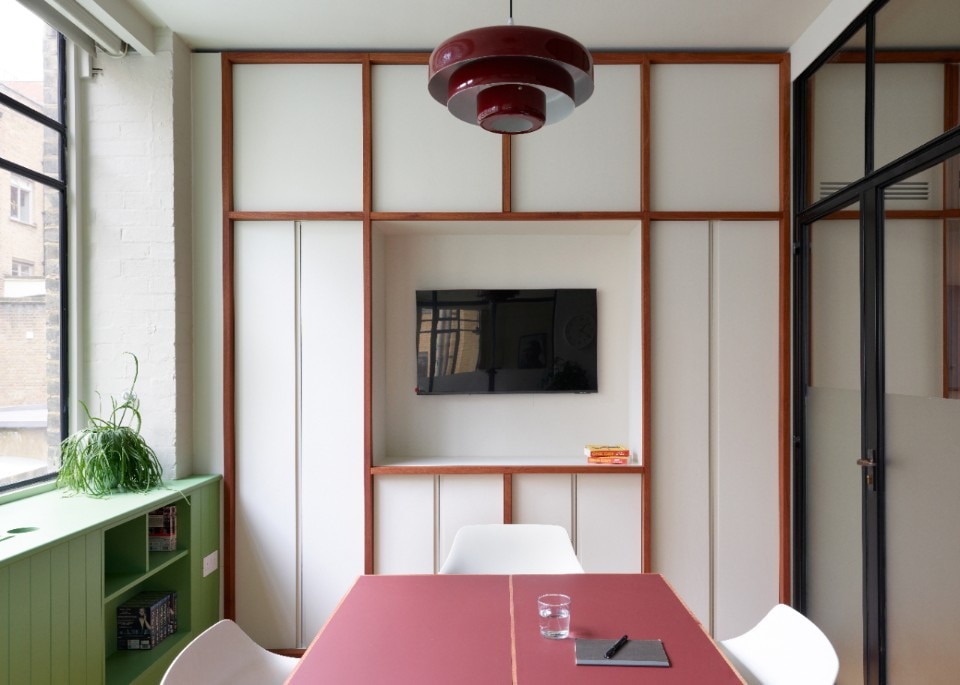
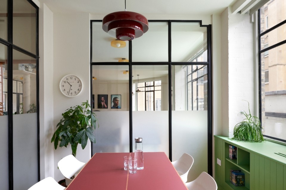
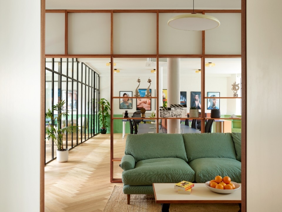
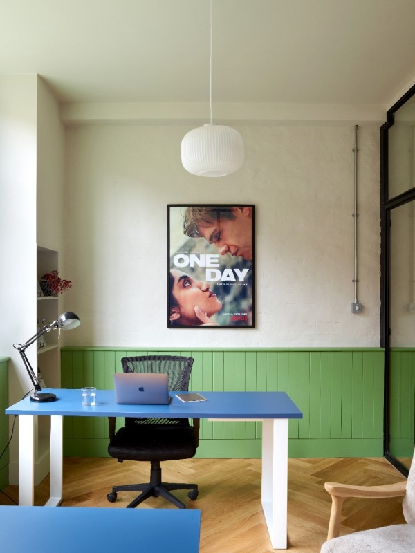
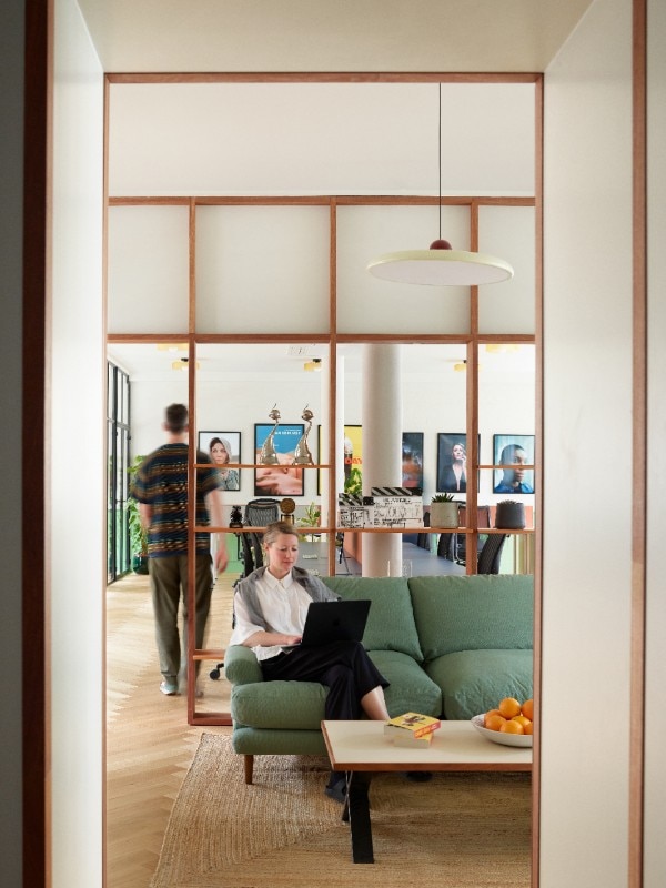
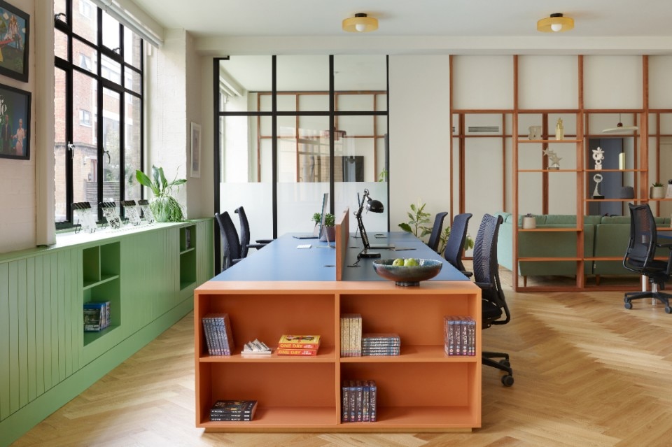
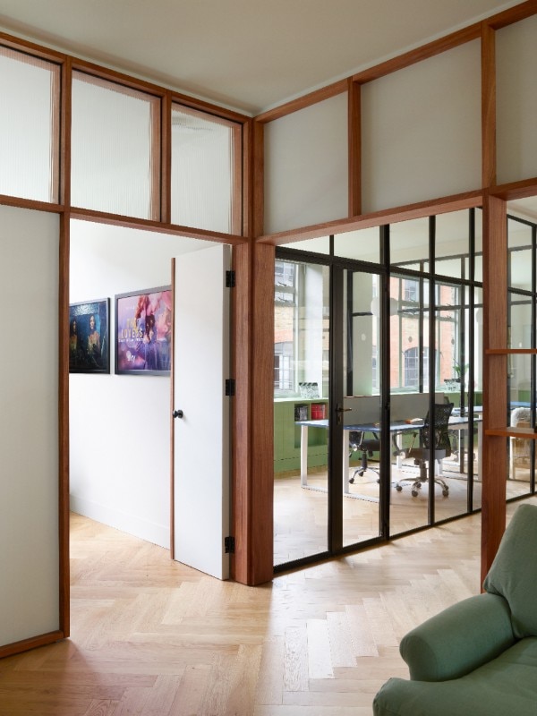
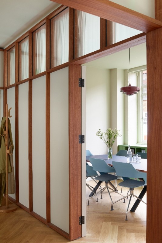
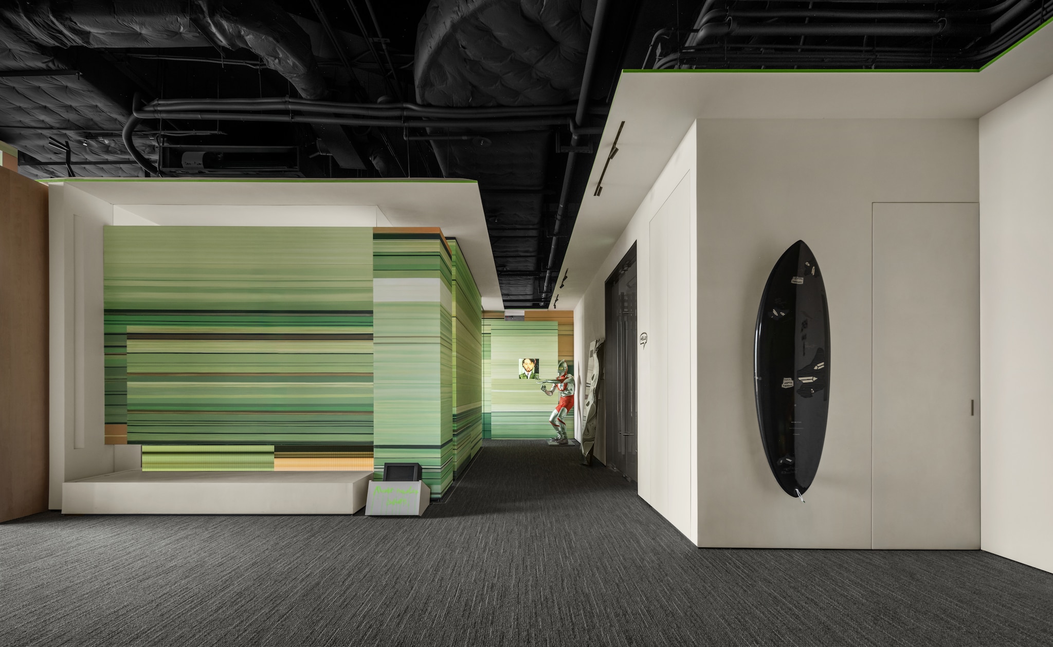
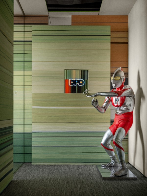
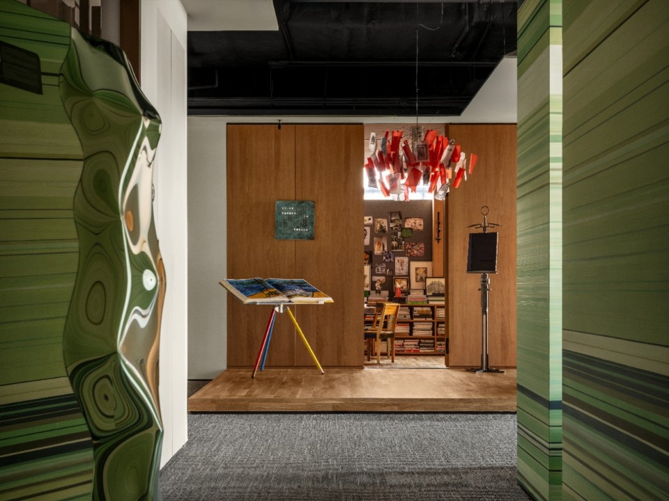
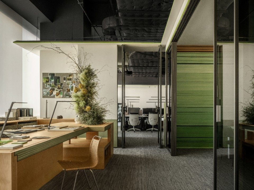
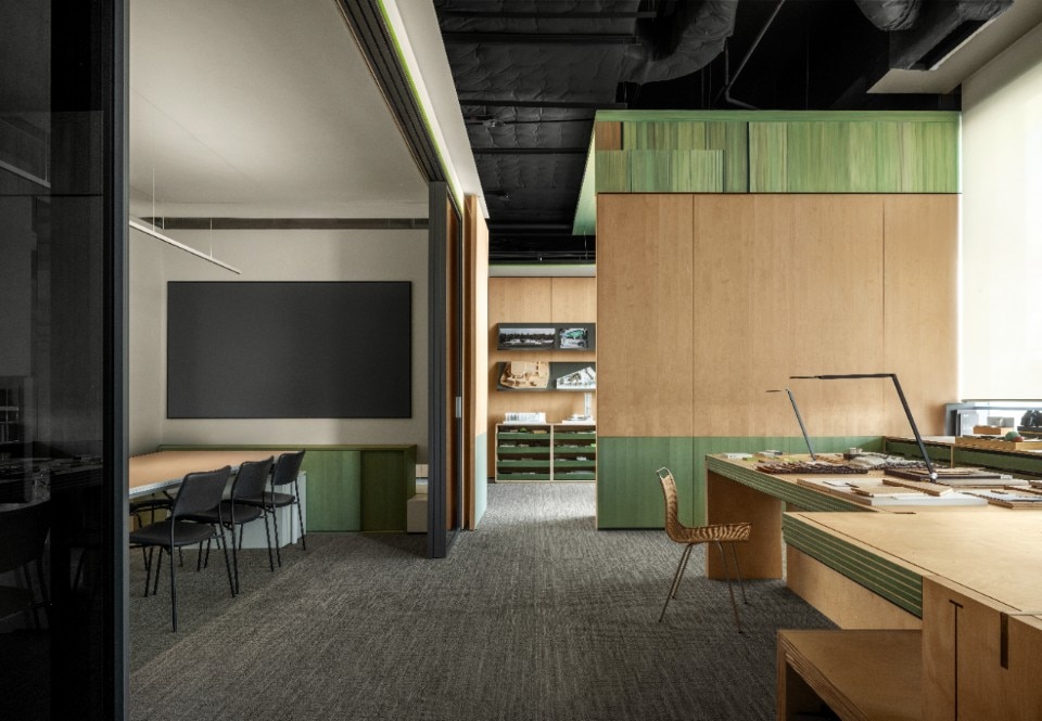
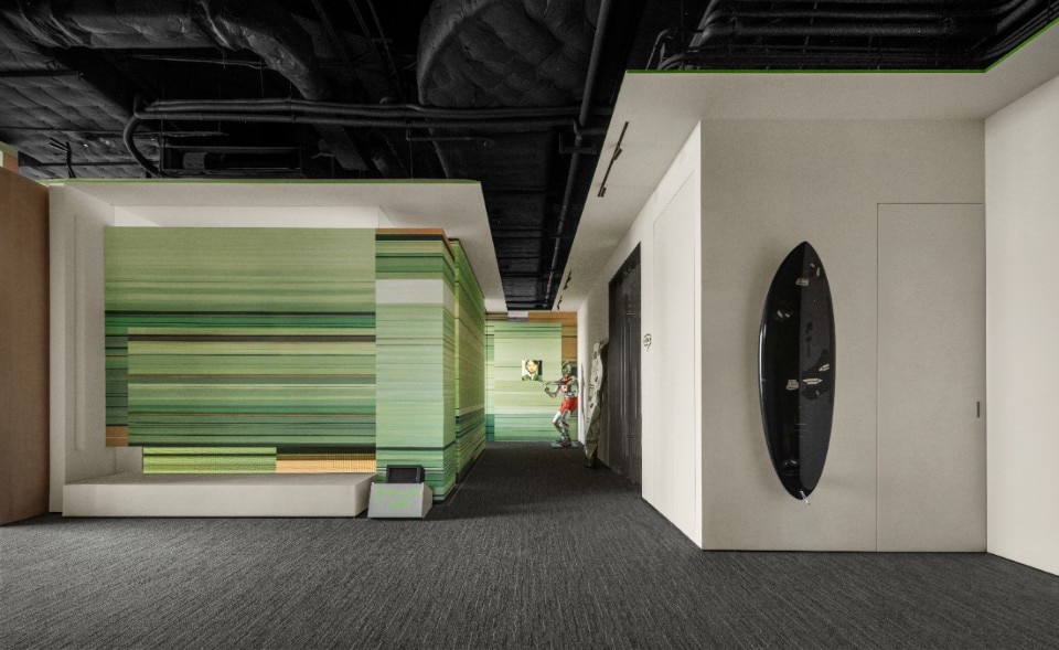
When offices are smaller and feel more like home, color takes on a more personal role, freeing itself from standard conventions and embracing stylistic echoes and cultural references. This is exactly the case in one of the latest projects by London-based Emil Eve Architects, who reimagined the offices of production company Drama Republic using a mid-century-inspired palette of mauve green, cherry red, and petrol blue. A herringbone parquet floor anchors the space, creating a warm, cohesive foundation that harmonizes with the color accents found throughout the furnishings. In contrast, the DPD office project explores a more distinctly futuristic aesthetic. Here, layered shades of green on the walls evoke a geological cross-section, a representation of sedimented eras reinterpreted through a digital lens. The vivid palette is offset by natural wood paneling and an eye-catching metal sculpture painted in green.
Other noteworthy examples show that offices don’t have to be isolated bubbles detached from their context. Instead, they can evolve in dialogue with their environment, drawing on local materials and the color of the surrounding landscapes. In Hoofddorp, the Netherlands, Firm Architects redesigned the offices of the consulting firm APPM with a clear nod to Dutch scenery and architectural heritage. Their design incorporates exposed brick – a hallmark of the local building style – alongside a muted, desaturated color scheme that seamlessly interacts with white walls and ceilings, metallic gray partitions, and soft pink accents on the staircase.
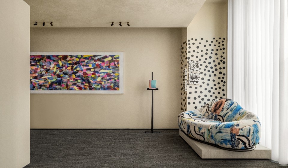
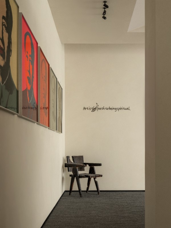
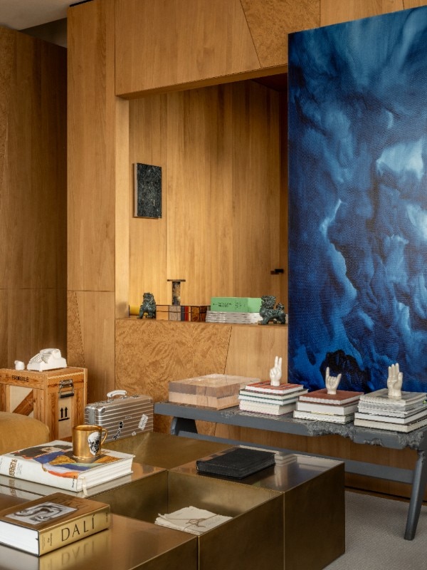
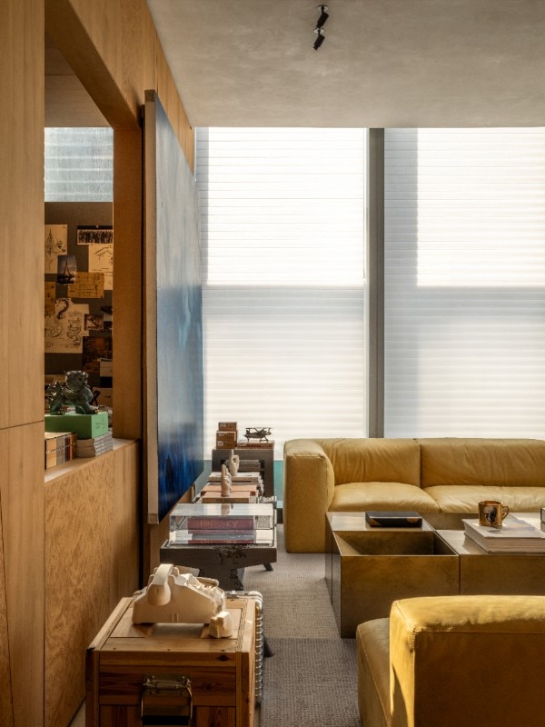
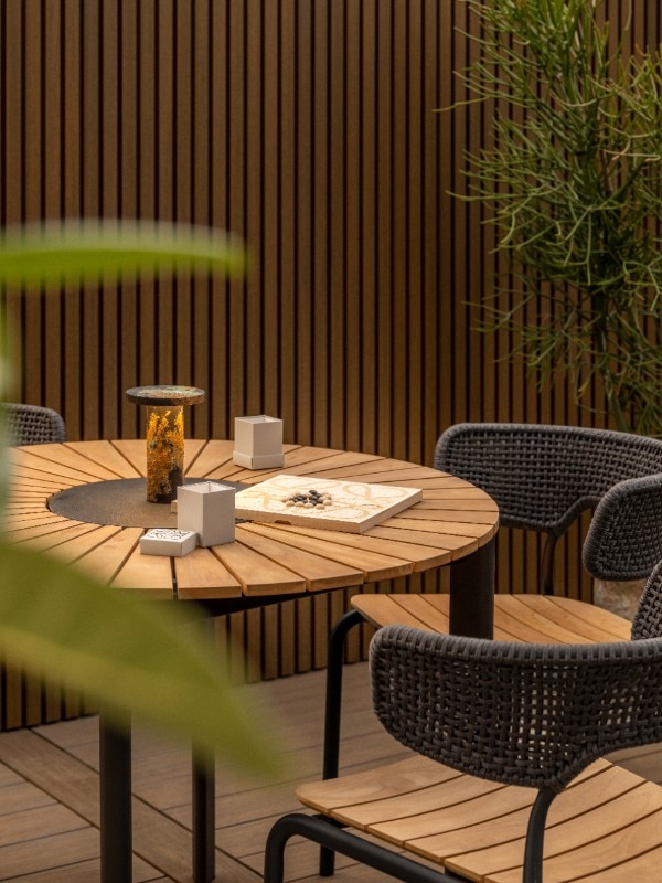
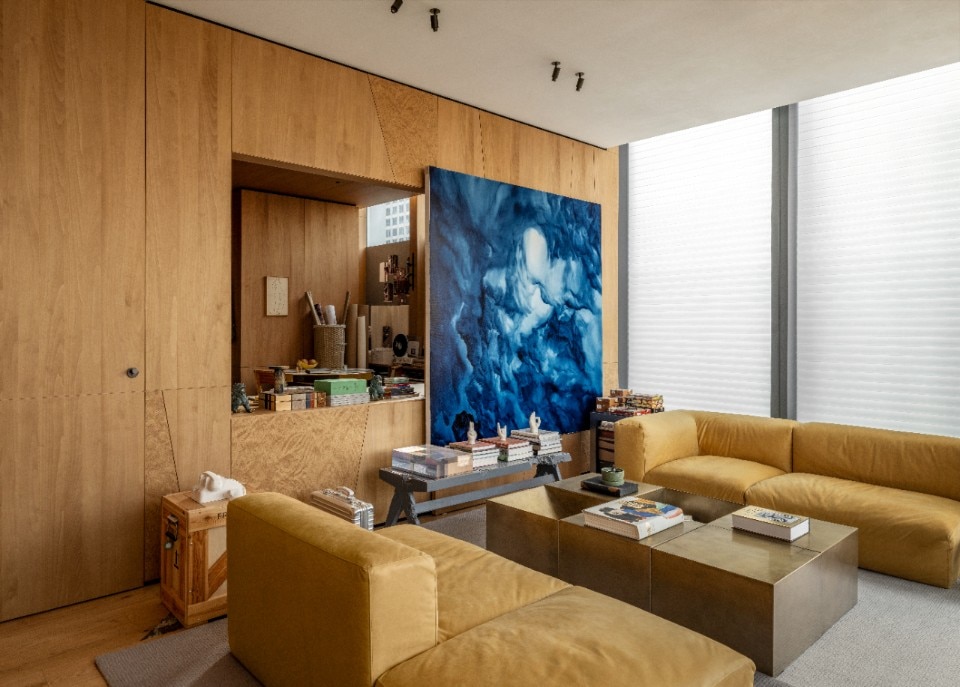
This approach goes beyond cold, cognitive logic or the constraints of fleeting trends. Let’s remember that amid all the pressures for productivity and efficiency, the workplace must also evoke a sense of emotional comfort. Ultimately, it’s better to build spaces around a unique, intimate, and enveloping identity.