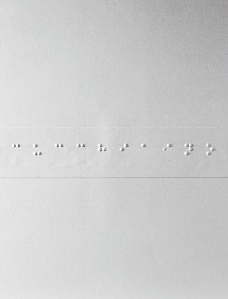
Even when you see that these small tablets house a world of symbols and messages, you may still not understand what they really are, perhaps because these are objects that have little to do with the shared, everyday world. They are in fact a very tiny part of the tactile illustrations designed and created by the Milan Institute for the Blind, an organisation that boasts 170 years of activity and a particularly rich library of teaching material, which it produces in its own workshop under the guidance of Aurelio Sartorio. This huge “image encyclopaedia”, the product of patient, methodical work in the development of tactile illustrations, constitutes an enormously valuable tool for the blind. While Braille, the raised writing system developed by Louis Braille in the first half of the 19th century, had the crucial aim of taking the blind from an oral culture to a written culture, these tactile representations created on tablets or in books allow them to widen the range of their sensations and information. They have given the blind levels of awareness that are particularly important and satisfying, and as a result greater autonomy in the outside world. This is no small goal: it is one that could potentially help a significant section of the population, given that there are 50 million blind people in the world and 135 million with impaired sight.
These tactical teaching materials began to be developed at the same time as the Braille writing system was being disseminated, but the last 50 years has seen a turning point – an acceleration towards a more systematic approach to existing tools and the creation of genuine educational programmes (for play, geography, science and the history of art) delivered through sophisticated tactile materials. In Italy, the decision taken in 1975 to integrate blind children into mainstream schools gave the specialised institutes the opportunity to renew their own educational approaches, adapt them to the changes and begin to develop a form of “industrial design” centred on teaching tools. There was a need to devise new types, that could be shared with sighted children as well – with a different aesthetic emphasis, promoting integration in the classroom – and which could be reproduced rapidly and in large quantities, manufacturing them inexpensively but without damaging the content and quality of the materials. This economic challenge, one tied to distribution, has made the Milan Institute for the Blind a centre of excellence in Europe. The unique master copies created in the in-house carpentry workshop are used to produce a wooden or resin stencil; copies are then made using the thermoforming process, and these are distributed to schools throughout Italy, to students at the Institute, and to their families and teachers.
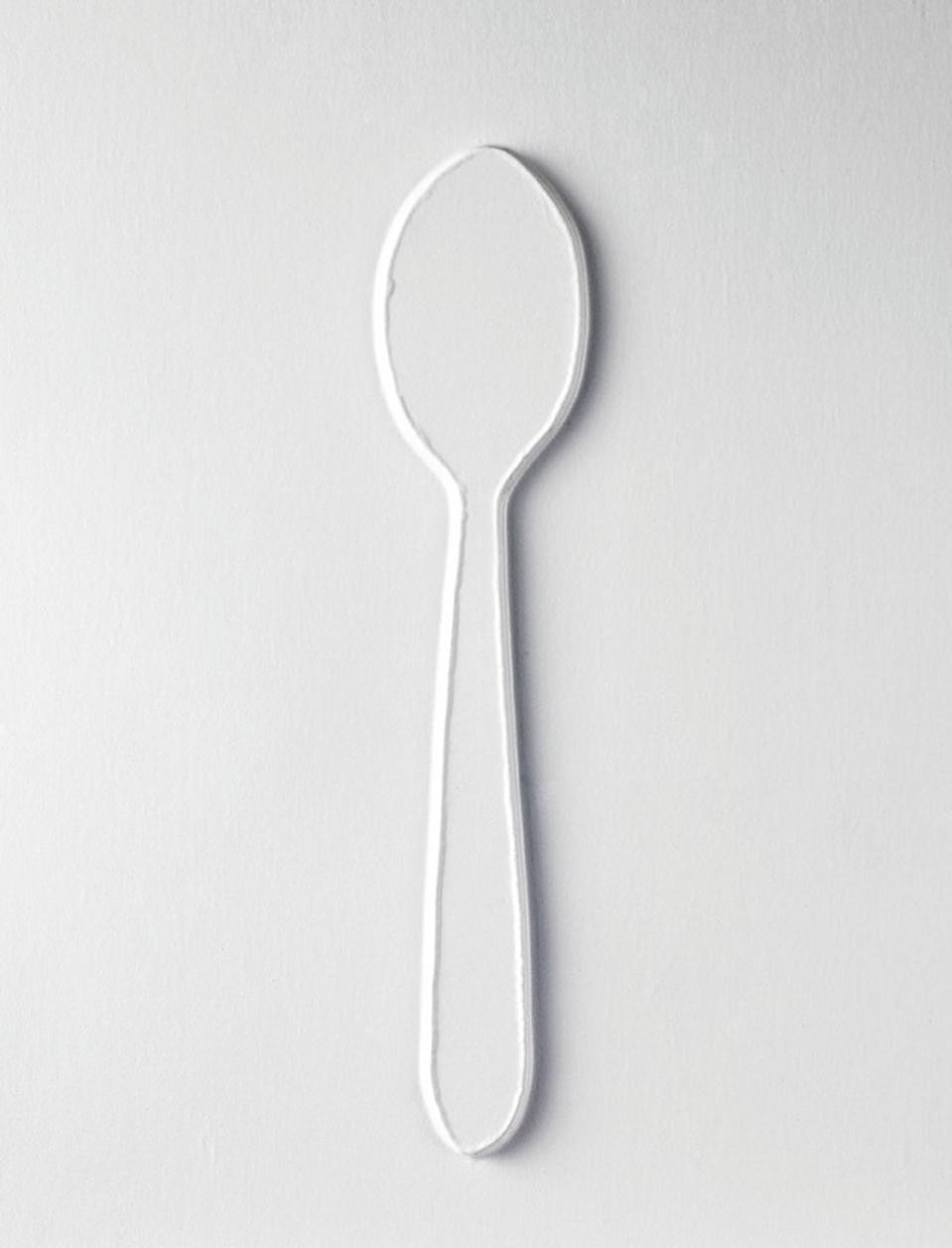
The design challenge behind the tactile tablets is even more interesting than the production challenge, because it works on the assumption that even a person with limited vision can acquire knowledge of form, and attempts to remove most of the factors that affect expressive and interpretative freedom. If sight is the sense that, more than the four others, investigates, measures, situates objects in space and provides the perceptual system with guidance in organising observations, comparing them and making judgements, it is not immediately clear how someone who is blind can compensate for this deficiency with the sense of touch. Exploration with the hands extends over a restricted perceptual field and proceeds via a sequence of spatial fragments, all “deficiencies” that are compensated for through the reading of sensations of heat, quality and consistency of surface, as they relate to an object. These compensations are made possible through the acquisition of specific explorative techniques. A blind person can perceive an object’s form, dimensions, significance and aesthetic value, but only if the exploration is guided by experience; this develops that special form of intelligence which only the process of having previously “mapped” an object with touch can provide. The individual is then able to rebuild with “intelligent hands” mental representations of objects that were not perceived with sight. Scientific research has confirmed this theory: in the 1990s, a series of magnetic resonance studies showed that the visual cortex (which makes up more than 20 per cent of the brain) is not dormant in someone who is blind, but becomes active when they pass their fingers over a line of Braille.
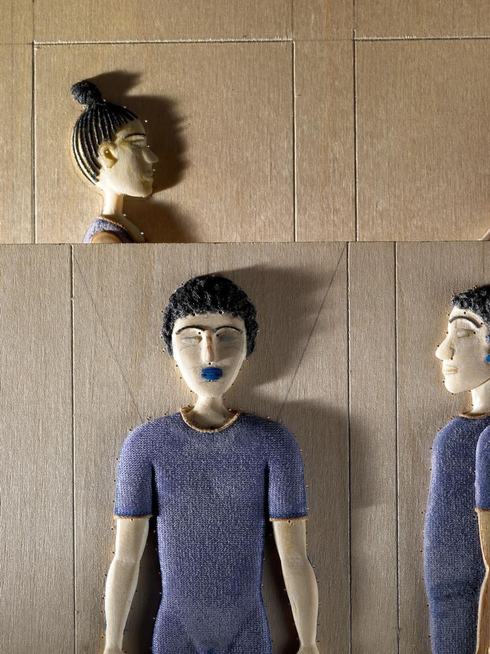
Since the reading of the world begins from touch, which gives words a connection with meaning that sight cannot provide, it is important to educate the blind child from a very young age: there are teaching programmes for the 0 to 3 age group. As well as books and play materials – made with real materials which are simple and concrete, and which are assembled into collages – the teaching system includes illustrations and aids that communicate real features found in the familiar world. These are subdivided by type and are accompanied by short Braille texts, as well as themed tablets on topics that, on account of their size or remoteness from everyday life, can be “understood” only with the help of high relief. Research into the nature of tactility has a fundamental role, since there are rules that must be followed to guarantee a correct reading. Here the experience of experts like Sartorio is critical. They know that the images must be uncomplicated, schematic and meaningful, and should include no elements that could be confused during the reading (there are problems of perceptual threshold and of information saturation). They must also be solid, to allow adequate manipulation, they must be organised spatially in terms of the coordinates of the plane so that they are easily followed, and they must incorporate indications of the respective sizes of the components. They must also be reproduced with the right “point of view” – or should include more than one, as with the front and side view of people, animals and objects, and allow the representation of the spatial planes through the perception of different depths – and must be constructed in accordance with the methods of tactile exploration.
The choice of the surface textures has an important role as well. These must be contrasting, to improve the identification and naming of the different parts. Colour, which would seem to be unnecessary in objects made for the blind, is in fact important as a tool for integration in mixed classes, as well as being a useful means for the visually impaired to distinguish the objects (primary colours, which catch the light, are used because they are easily seen). There are a wide range of complicated factors involved in making tactile images useful, as well as beautiful: an image that has been appropriately made, but which is also aesthetically interesting, is better understood by everyone, whether sighted or not. In this way, they succeed in making words the house of being for the blind as well.


")

")