

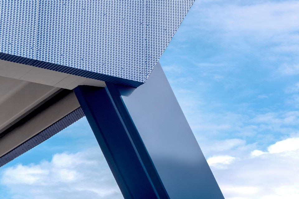
The term “reverse engineering” – when it comes to computer, electrical or mechanical engineering – means analysing and taking apart an object to understand how it works in order to enhance its potentiality. Nowadays, this approach is needed in order to redesign many infrastructure networks and nodes, since not only is it important to restore the "primary device", but also to improve it according to the new uses and perceptions of space. This method breaks away from the static and individualistic early modern tradition, in order to promote a much more free and open architecture.
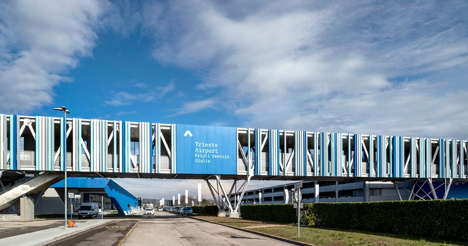
Lombardini22 has always paid great attention to the many cultures and perspectives from all over the world, and especially to all neuroscience findings, thus becoming a community where different personalities and skills come together to create a one-of-a-kind architecture: more than 180 people work together in this studio in order to offer many architectural, engineering, physical branding and communication design services. And it was FUD, the Lombardini22 Physical Branding and Communication Design brand, that has led the unconventional relaunch of Trieste Airport as a new generation intermodal platform, revolutionary not only in terms of infrastructure, but also of concept and perception.
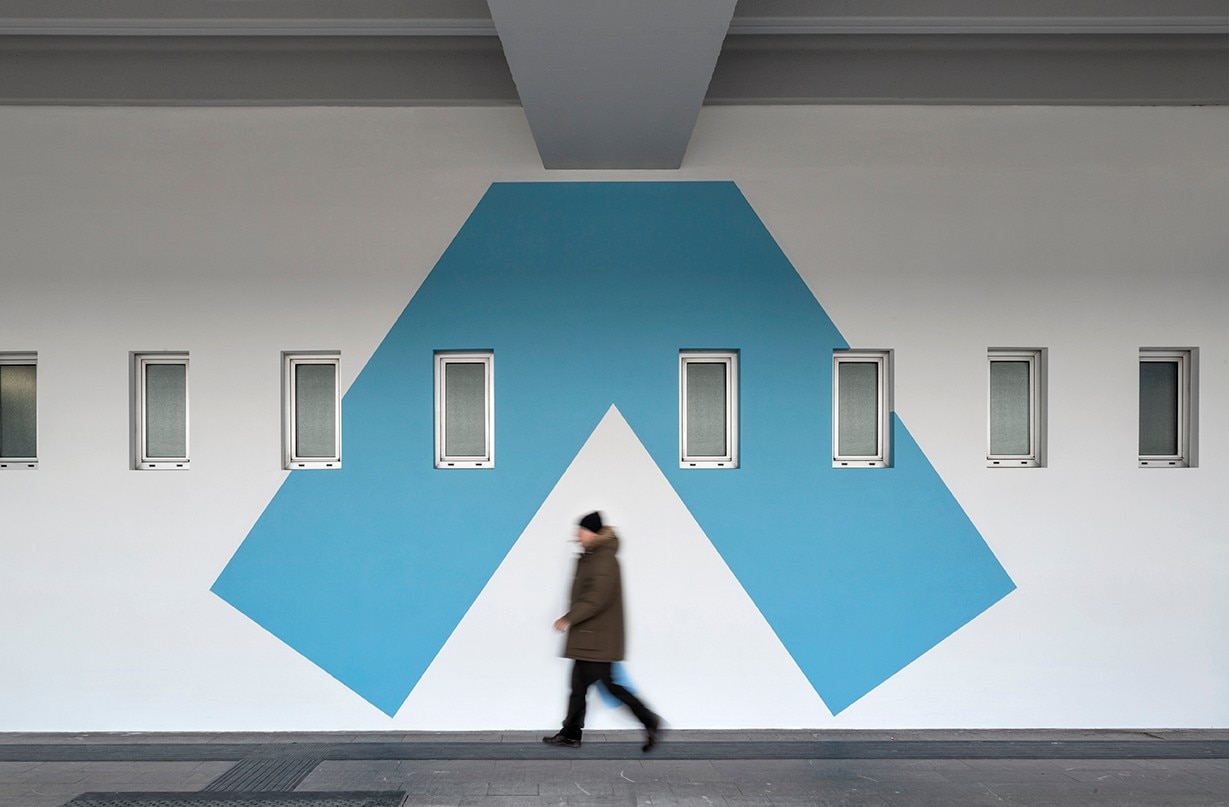
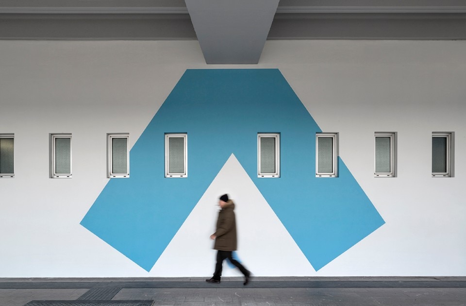
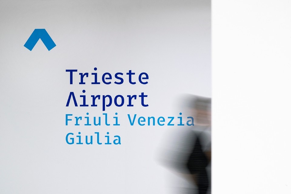
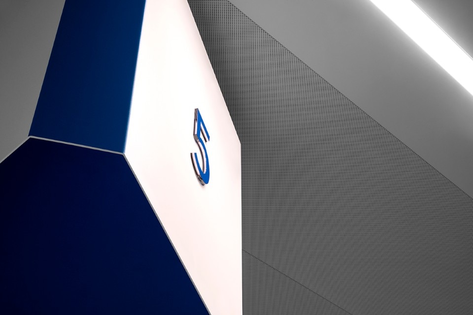
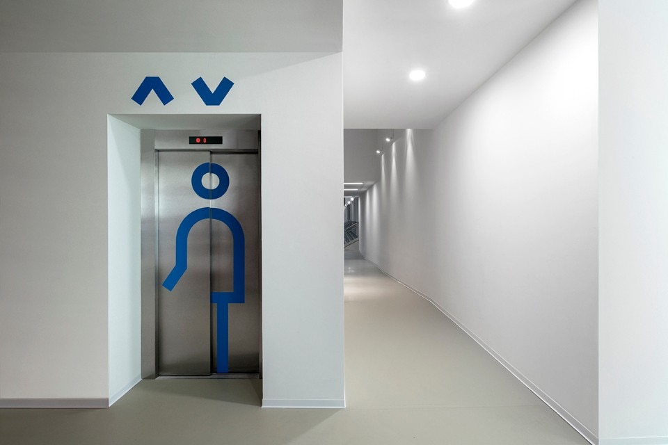
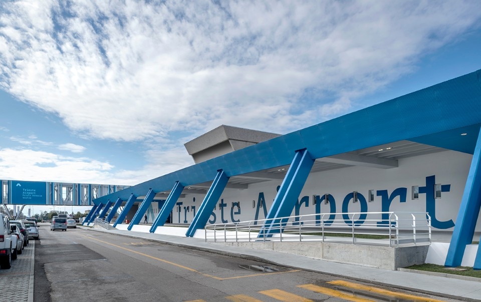
The possibility of modifying the already existing structure has allowed Lombardini22 to completely reverse the traditional scalar procedure which, starting from the physical structure, allows to work on the immaterial aspects only at the end, often in a superficial way. The light architecture designed by FUD, on the other hand, was created keeping in mind the importance of space and time, activating deep emotional and cognitive dynamics that reach every corner of the airport, transforming its meaning: it is no longer for the architecture to establish the rules of life, but rather the exact opposite. The main element of this whole meta-design process is the graphic symbol of an accent, representing Trieste’s border identity and the airport’s polyglot identity.
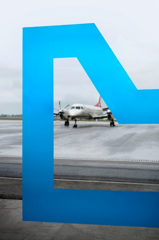
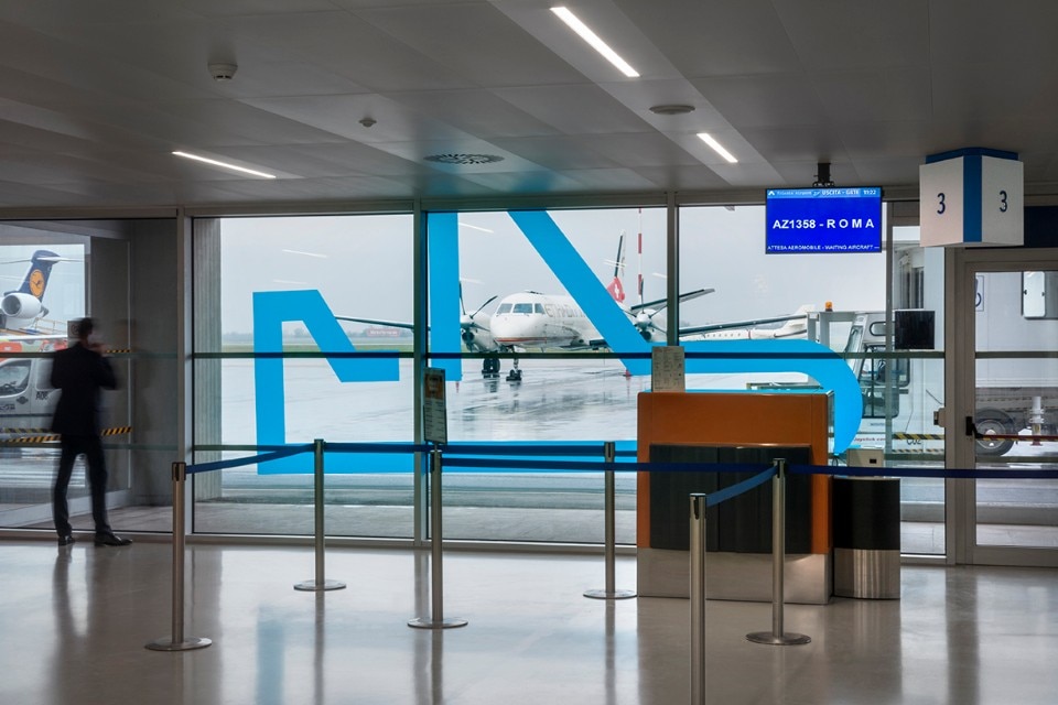
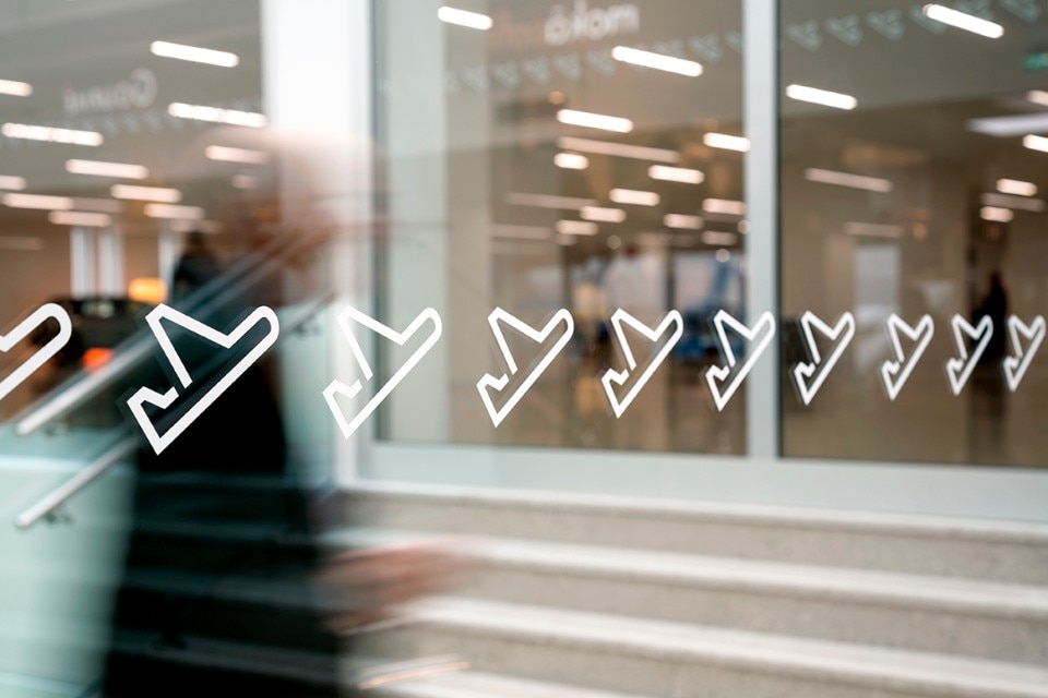
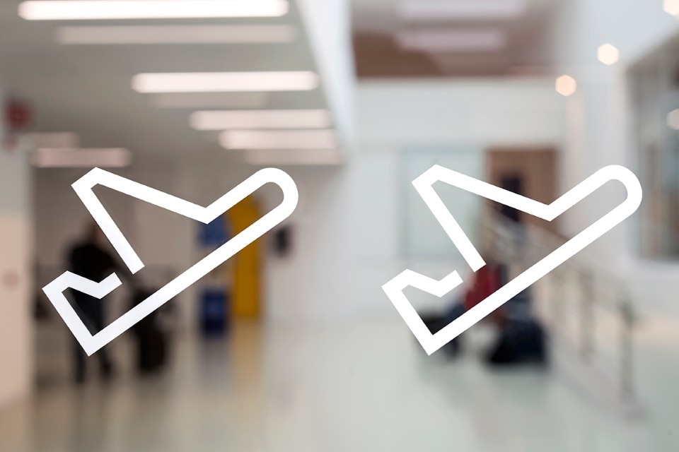
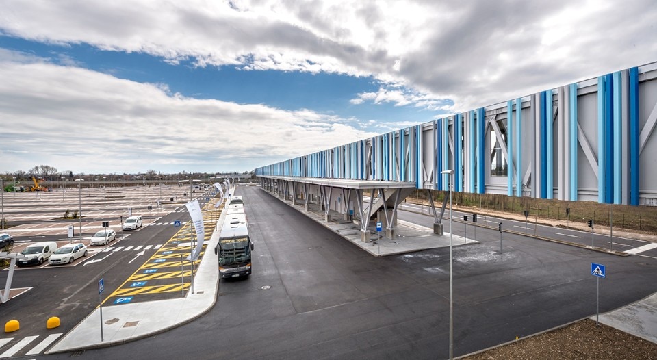
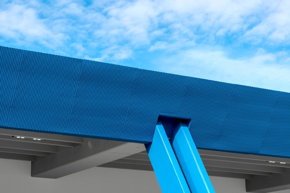
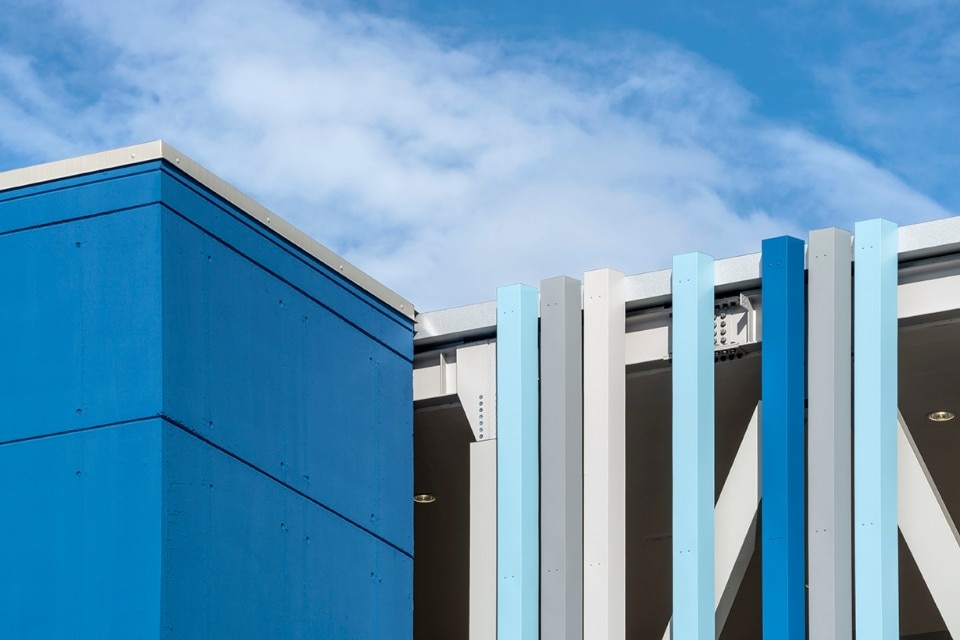
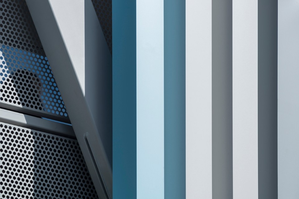
The small symbol, to be found on almost every surface of the airport, represents both a directional arrow and a stylized tail of an airplane. The many chromatic variations of the symbol also mark the architectural additions introduced during the redesign: first of all, a scenic 425-meter pedestrian walkway. Here the symbol becomes a vector of meaning, capable of indicating to the travellers where they can go, but also where they are. With transience as a key element, this redesign enhances the identity of the airport-place (who knows what Marc Augé would think of that?) and of the – sometimes alienating – surrounding city as well. These symbols and colours tell us that, these days, we all are travellers: sometimes we need just a detail of a moment to feel at home again.
- Project:
- Trieste airport
- Architects:
- Lombardini22
- Program:
- airport
- Location:
- Trieste, Italy