


In tech design there is a kind of quiet conformism that becomes obvious the moment you place smartphones side by side: clean surfaces, few surprises, minimal variation. They are black bricks, almost as if it had become a social convention that they should all look more or less the same. Think about what mobile phones looked like twenty years ago and the lack of differentiation today feels striking. Now we mostly distinguish them through colourful cases. But many people still prefer a monochrome, ultra-minimal solution.
In this context, Nothing continues to attract attention because it tries to distance itself from what most brands quietly do: move closer and closer to an idea of neutrality that ultimately ends up looking exactly the same. And this year it does so in a way that goes against the grain not only of competitors, but also of itself.
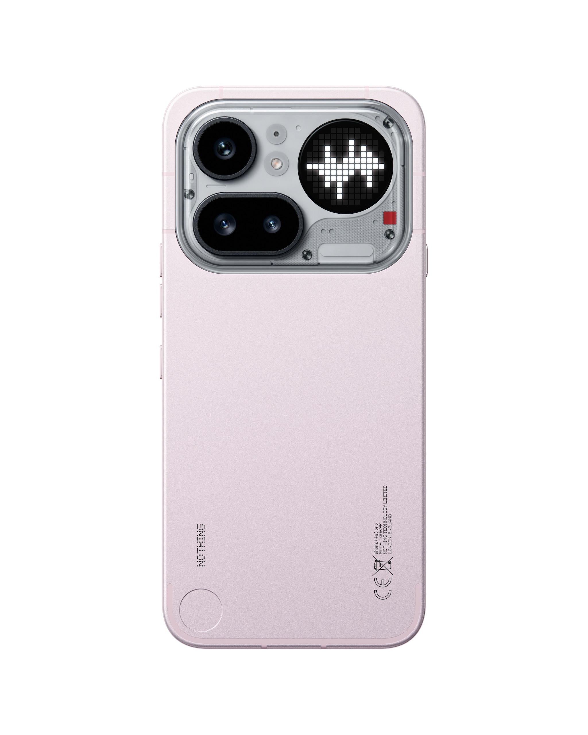
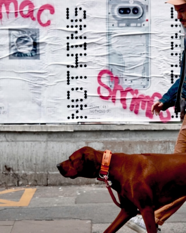
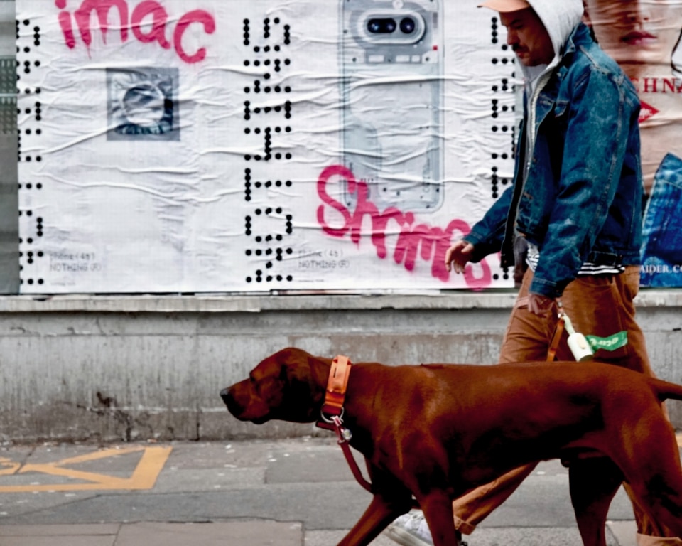
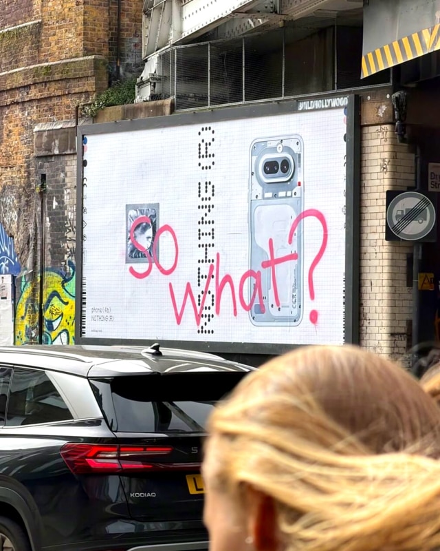
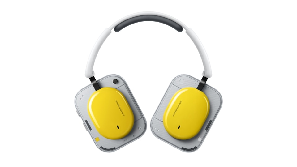
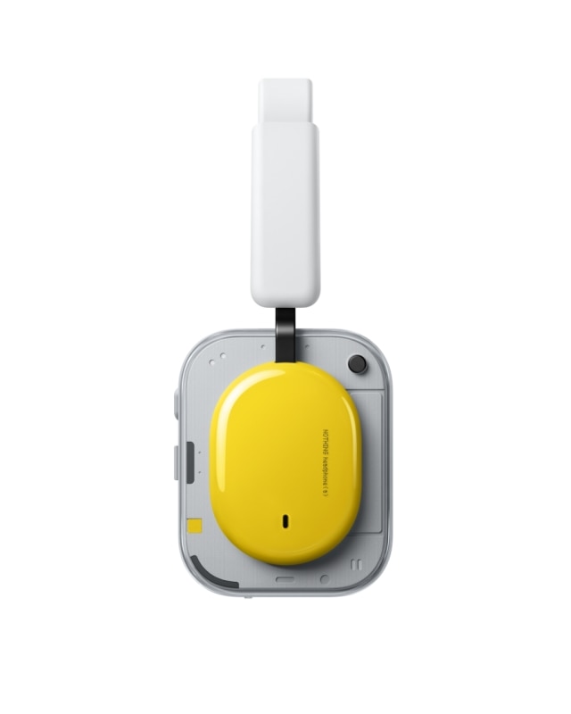
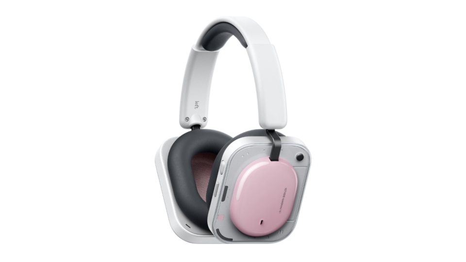
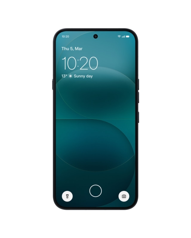
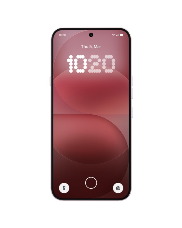
Until recently its identity was built on controlled minimalism—technical transparency, clean graphics, restrained palettes. Now the volume is turned up: a pink phone teased on social media and the new Headphone (a) proudly shown in yellow. It signals an evolution of the brand’s design language.
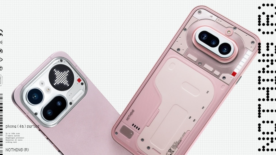


The most debated decision, however, concerns product strategy. In 2026 Nothing is not launching a new flagship. The reference model remains the Phone (3), while the centre of the lineup becomes the Phone (4a) series, accompanied by the 4(a) Pro. Adam Bates, Global Design Director at Nothing, puts it plainly: “For us, every product is a flagship in its category.” And in the case of the 4(a) Pro, the ambition is explicit: “We’re genuinely trying to compete with flagships at a lower price.”
The question then becomes inevitable: how do you design a mid-range device when the brand decides not to build—at least this year—a new top-of-the-line model?
Designing the mid-range
Bates immediately shifts the conversation from product hierarchy to methodology. In his view, Nothing rejects the subtraction logic typical of many tech lineups: “Some companies create a clear hierarchy… by deliberately stepping features down from the flagship… They’re effectively in the business of making things worse. We’re not afraid of competing with our next product up. In fact, we want to.”
Ultimately, it’s about helping users simplify their lives and reduce the need to constantly turn the phone over and get pulled into the screen.
Adam Bates, Global Design Director of Nothing
It becomes even more interesting if you read it as a design issue: not designing a mid-range device as a weakened version of the flagship, but as a product that must stand on its own, with a clear identity. For Bates, the brand’s design language is not a fixed rulebook: “A design language is driven by processes, materials and technology,” and its evolution does not depend on a rigid document: “It’s not based on a rigid document that dictates what every product should look like.” Instead it expands from product to product, “ensuring it remains unmistakably Nothing.”
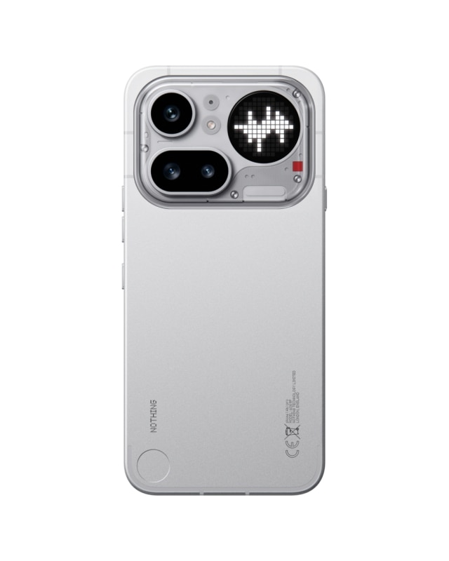
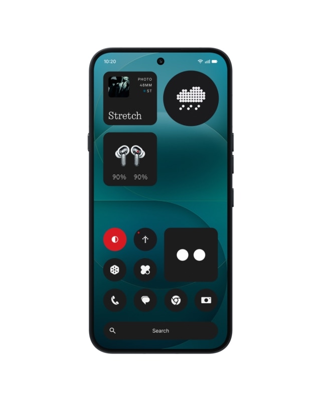
The Glyph and the interface on the back
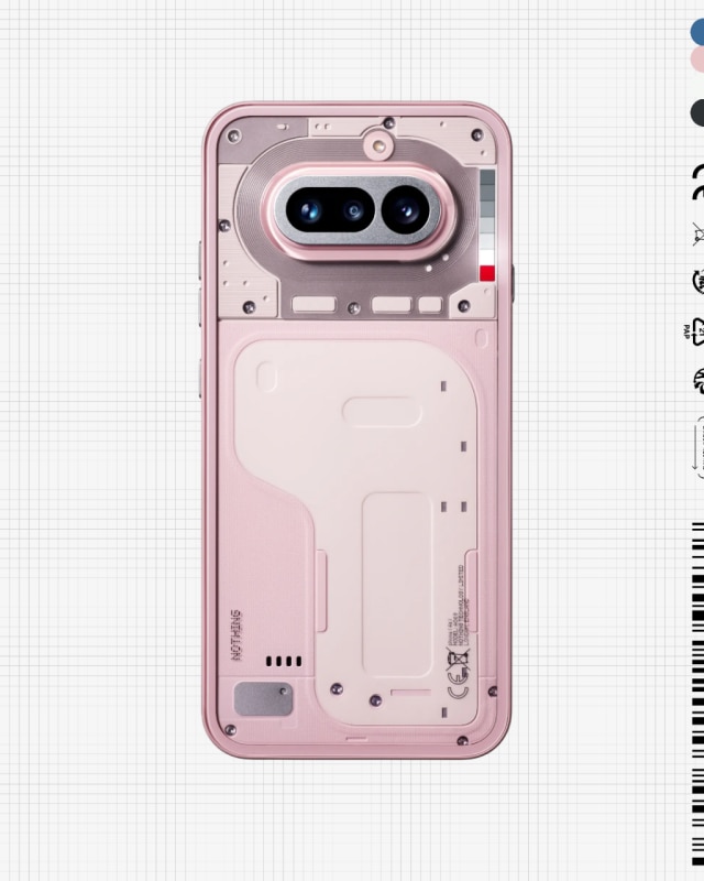
If there is one element that makes Nothing immediately recognisable, it is the Glyph: a simple and highly visible idea—and therefore inevitably divisive. On the Phone (4a), which I had the opportunity to test in preview, the system is more essential (a segmented bar lighting up on the back of the phone), while the Pro introduces Matrix, a more articulated “matrix glyph.”
Bates describes the Glyph as a long-term project: “We have long-term ideas about what the Glyph Interface can become.” And he connects it to a very concrete behavioural issue: “Ultimately, it’s about helping users simplify their lives and reduce the need to constantly turn the phone over and get pulled into the screen.”
Here the Glyph becomes three things at once: a graphic signature, a wow effect, and an attempt to move part of the experience away from the screen. Whether it is genuinely useful or remains, for some people, an elegant gimmick is one of the project’s most interesting ambiguities. It cannot be resolved through a spec sheet, but through how people choose to use it—or ignore it.
Colour, personality and performative minimalism
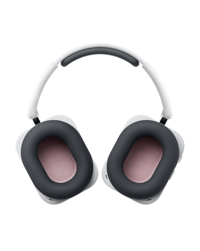
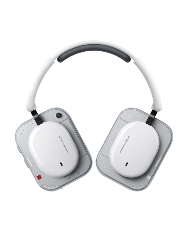
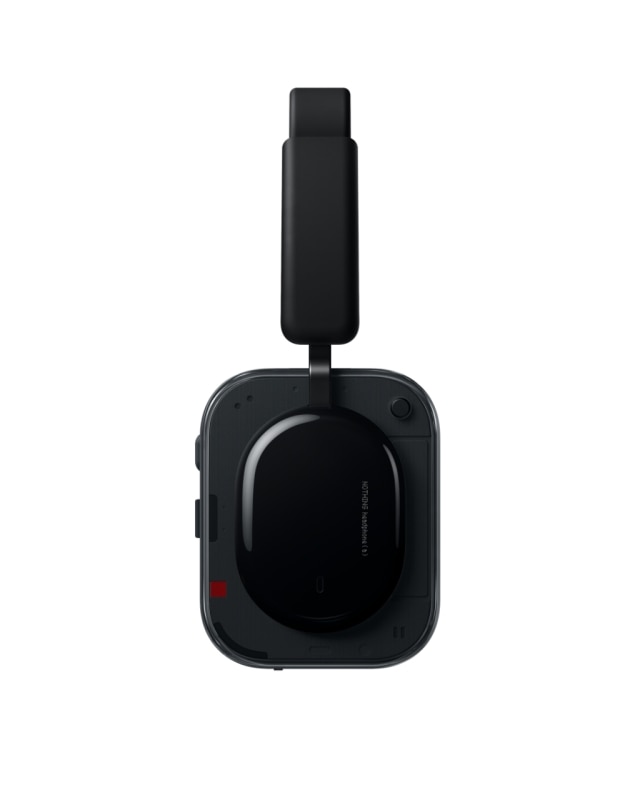
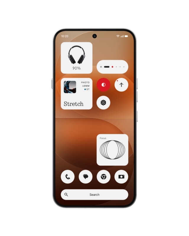
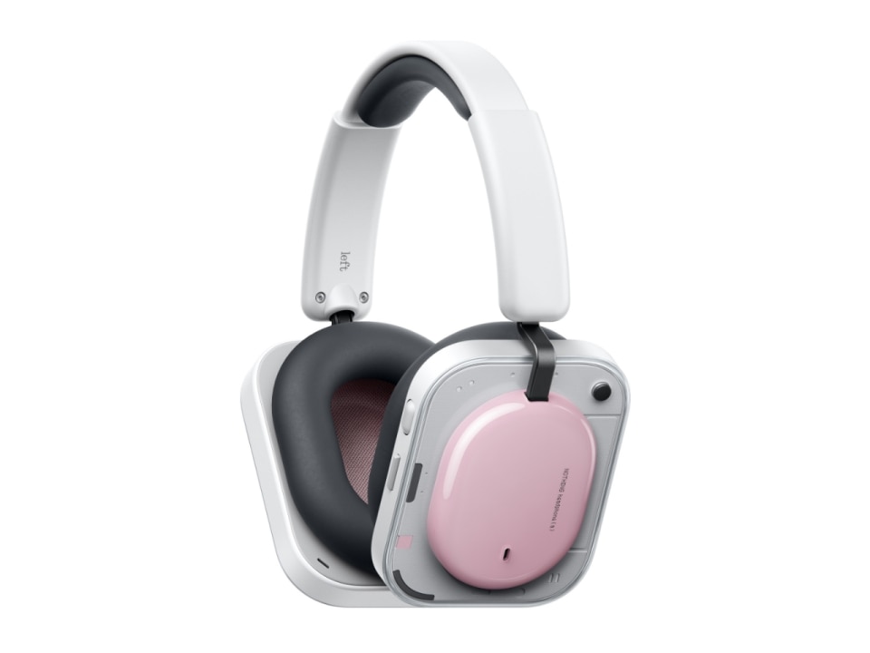
This year Nothing does everything the opposite way—even compared to its own early image. Where colour was once restrained, it is now staged: a pink phone teased in advance, a blue version, and headphones that adopt the form of the flagship Headphone (1) but appear in pink and yellow.


Bates calls it personality: “We want the product to have personality.” But Nothing’s personality is peculiar. It is a brand that appears minimalist, yet builds highly graphic, almost space-age objects full of visual signals. A minimalism that can seem playful, performative, even slightly flirtatious, to the point where it almost flips over into maximalism. It is no coincidence that the company itself describes its language as an attempt to combine “human warmth” with advanced engineering: highly engineered technology, but expressed through a more personal and expressive dimension.
For us, every product is a flagship in its category.
Adam Bates, Global Design Director of Nothing
Let’s be honest: Nothing is a brand you either love or hate. And that can only be a good thing. In a world where the smartphone has become a social convention, neutrality is reassuring. An object that “makes itself visible” always risks misunderstanding—or even accusations of being too much. Vulgar. Flashy.
And at that point you know you have hit the mark. Because you have moved beyond the dull language of tech obsessives counting megapixels and processor cores, and started playing in different territories: fashion, lifestyle and design.
From earbuds to over-ear
For Nothing, audio is not a side project. It is one of the areas where the brand built credibility from the very beginning. Its earbuds have often been perceived as among the strongest products in its catalogue, both in design and value for money.
That is why the move into over-ear headphones felt like a bold step: a more exposed category, more competitive, with extremely high expectations and heavy historical references. It is no coincidence that Nothing says it designed the new Headphone (a) for a “younger, fashion-conscious audience,” signalling how audio has become a territory where technology, lifestyle and visual culture intersect.

Bates frames the move as continuity and ambition: “Expanding from Headphone (1) into a broader family signals that we’re here to stay in the over-ear category.” And the reasoning aligns with the company’s accessibility strategy: “We want to create products that are accessible to different kinds of people, and price is part of that.”
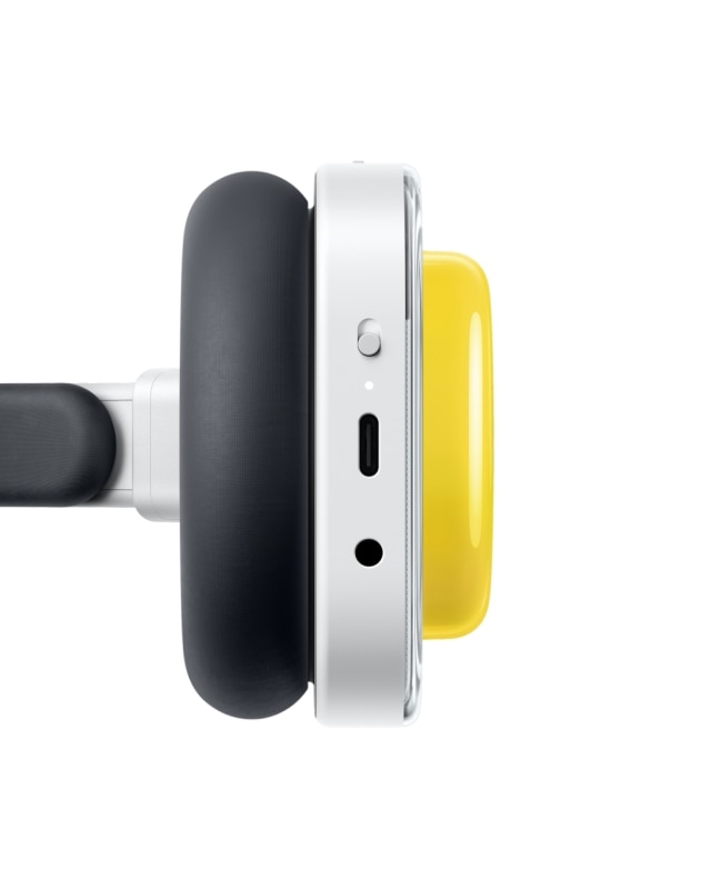
The (a) version does not overturn the vision—it consolidates it and makes it more accessible. For Bates, this means protecting what defines a Nothing product even when constraints change. When asked what they refused to remove, he is very clear: “You’ll notice we didn’t remove the manual controls. That was deliberate. We see them as a cornerstone of a Nothing headphone.” They could have done the opposite—“strip them away and invest in more cosmetic features”—but instead chose to “protect what matters most to the experience.”

There is also an interesting link between economic constraint and formal opportunity. Because aluminium could no longer be used at this level—“an aluminium enclosure isn’t as feasible at this level”—new possibilities opened up around transparency: “Removing aluminium opened up new possibilities… it allowed us to explore transparency on the external housing.” The idea is clear: not to do less, but to find the right balance “between sound quality, ANC, comfort, lightness, usability and distinctiveness.” And when Bates describes the object in almost sculptural terms, the imagery returns to space-age design: it should feel like “an artefact from a more exciting future than the one we currently live in.”
Anonymous design as a social convention
The most difficult question remains: how much room is there for a strong design language in smartphones, if smartphones themselves have become a social convention?
Bates talks about maturity rather than rebellion: “It’s really a sign of maturity.” But in the same breath he admits that there is also an instinctive resistance to the status quo: “The design team is naturally resistant to the status quo… almost a slightly punk spirit.”
We’re not afraid of competing with our next product up. In fact, we want to.
Adam Bates, Global Design Director of Nothing
It is an effective way of describing the internal tension of the Nothing project: operating within a highly standardised category while trying not to become anonymous.
And here the ambivalence returns. If you move away from neutrality, some people admire the courage; others reject it because they want their phone to remain exactly like everyone else’s—because that is the convention.
Braun, Bang & Olufsen and the measure of history
When talking about electronics as a design project, it is inevitable to think of great historical precedents: the visual reference of Dieter Rams’ Braun or the carefully staged theatricality of Bang & Olufsen. But caution is necessary—not because the comparison is meaningless, but because only time tells whether a path was the right one.
Nothing seems to operate in an intermediate territory: neither the absolute neutrality of minimalism nor pure spectacle. Rather, a language made of recognisable signs that tries not to slip into gratuitous decoration. Bates himself insists that design evolution must be rooted in real progress: “The design language evolved from a real technical improvement… grounded in substantial, practical progress rather than simply inventing new shapes.”

Whether this approach will have an influence comparable to Rams—or even to Apple’s spectacular revival under Ive and Jobs between the late 1990s and early 2000s—is impossible to say today. It may take years to understand whether this path was the right one. But in a sector where the temptation to clone a dominant model is extremely strong, the fact that someone is trying not to do it—even accepting the aesthetic risks—is already significant.
At the very least, Nothing is trying. While other brands sing from the same hymn sheet—shifting the spotlight from cameras to AI features in search of novelty that often feels more like marketing than technology people will actually use—Nothing attempts something else. Even the staging of its launch at London’s Central Saint Martins speaks the same language: technology seeking legitimacy in the worlds of design and art. Yet Bates himself brings the discussion back to something concrete: for him, identity is not just communication, it is experience.
Perhaps that is where the most interesting question lies. For more than a decade, smartphones have gradually chosen invisibility: neutral surfaces, objects designed to disappear in the hand rather than attract attention. Nothing seems to be attempting the opposite. More than designing phones, it may be trying to design visibility in a category that had chosen to become invisible.