

Hit The Island is a game recently launched for the recently released iPhone 14 Pro. It is a reboot of a classic, Pong: the player moves a bar at the bottom of the screen, trying to hit with one or more balls the island at the top of the screen. But what is this island? To understand it, we must go back a few years to 2017.

Ten years after the first iPhone’s introduction, Apple launched the iPhone X. This model still represents the most significant leap in iPhone design language since its debut. To keep up with the competition, which was bringing to market models with increasingly thinner bezels - Philippe Starck’s Xiaomi Mi Mix sporting 91 percent display ratio hit the shelves the previous year -, Apple introduced a full-screen smartphone, which loses the two bands above and below the display. From a design and engineering point of view, this mainly creates two problems, both related to the elimination of the up-to-that-point-iconic Home button. The first is navigation: clicks and double-clicks on the button, which allow users to jump from one app to another or back to the home screen, are thus replaced by a series of on-screen gestures. So far, so good.
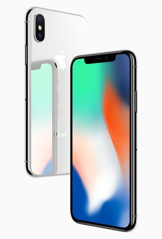
But there is another matter to be resolved. Since 2013, the Home button had housed the Touch ID sensor, Apple signature security system, allowing to manage the phone’s unlocking routines, and to check the user identity - when you install an app, or use the phone to pay with Apple Pay, for example. The solution introduced with the new iPhone X was Face ID, Apple’s facial recognition, an advanced biometric system based on three sensors, which confirms the identity of the person using the device by comparing it with a previously recorded 3D map of his face. According to Apple, it is more secure than the fingerprint system. Of course, the module for Face ID - TrueDepth camera system, Apple bills it - must be on the front of the phone. It finds its place in a black notch, a promontory that skirts the top of the display and where other components, including the microphone and speaker, are also placed.
Inspiration behind the notch #iPhoneX #memecreatorapp https://t.co/t0x57Eb8H3 pic.twitter.com/yIb7ppT1fG
— Meme Creator (@memecreatorapp) September 25, 2017
From the moment of its presentation, the notch becomes the quintessential obsession of the consumer technology world. Twitter swells with memes dedicated to the notch. At first it is mocked, then almost all of Apple’s competitors copy it. The notch becomes an industry standard, each player interprets it in its own way. The game is to reduce it until it (almost) disappears. Alternative solutions are proposed: larger and smaller holes and notches, retractable motorized front cameras, on-screen fingerprint sensor, and even smartphone prototypes with front cameras hidden under the display.
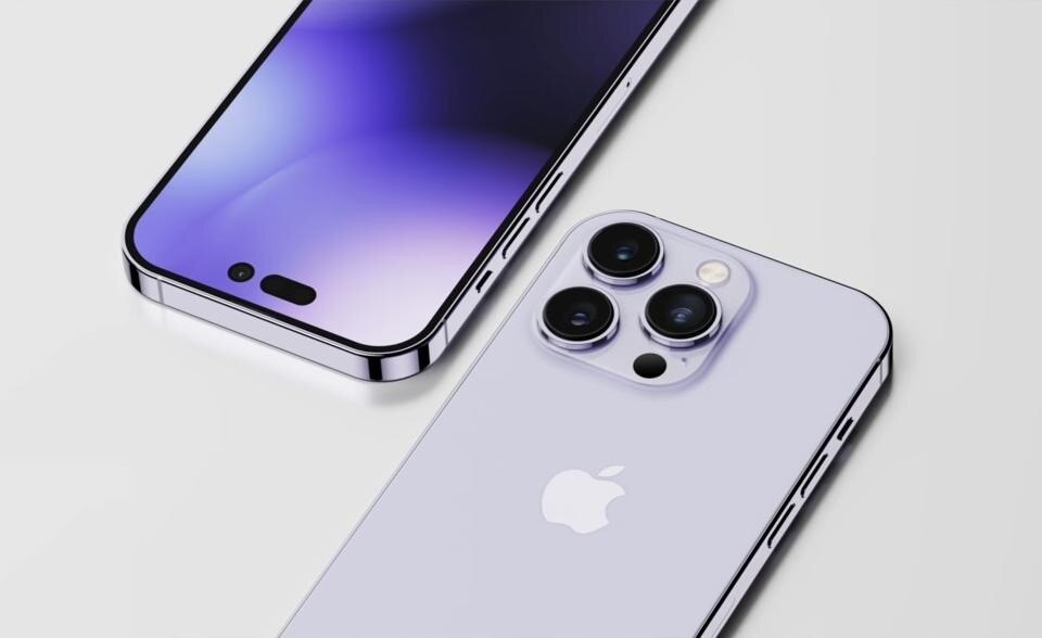
Apple goes on its way and the notch is not given up. In fact, it even landed on MacBooks Pro this year. On the iPhone meanwhile it has slightly shrunk. Until this year, when in the usual leaks preceding the launch of Apple’s new lineup of smartphones, an iPhone 14 Pro popped up that had lost the notch as we knew it. In its place, in a very realistic render, two black elements float across the top of a display colored by the abstract shapes of a purplish gradient, a dash and a dot that, had they turned out to be the actual layout, would probably have been proclaimed as the morse code for “bad design.”
The kind of stuff to come out with broken bones under the strikes of memes, to invoke the return of Jonathan Ive on change.org, while random TikTokers repeat the “Steve Jobs would never have done that” mantra, hashtag #baddesign, and so on. Instead, as in the best game of Othello, Apple reverses the situation to its advantage with a killer move. The solution is called the Dynamic Island - the name is in keeping with the company’s recent hyperbolic turn in naming, which also introduced the Photonic Engine during its September 7 presentation, which sounds like a new component introduced in the upcoming Gundam series, but is instead a new camera technology, heir of the already striking “Deep Fusion”.
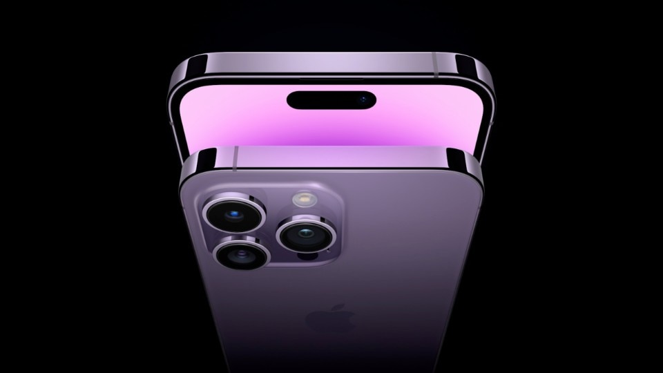
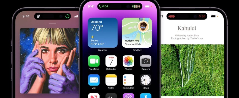
The island designed by Apple is a black, perfectly symmetrical floating bar concealing all the components needed for Face ID; located at the top of the display, it expands to act as a docking hub for a variety of useful information: with the Music app, you’ll see the miniaturized disc cover and a stylized sound wave on either side; in hotspot mode, a little green icon is always present next to the island, which instead expands with an animation when Face ID is operated or you’re making a phone call or you invoke a larger panel to control music reproduction. Apple designed an island that is both dynamic and elastic, adapting to different needs and uses. Other apps that employ the island are Maps and voice memos, and many more are planned - for example, the transportation app Lyft will show how many minutes until your ride arrives. In most of the cases, a tap on the island will allow the corresponding app to open directly.

Apple had a hole and built a donut around it: colorful, tasty, already edible but not yet perfectly leavened - probably we will have to wait a few months, maybe a year, before we see the Dynamic Island at its full potential. The hole remains, though. It’s a matter of habit, but with a few days of use of the iPhone 14 Pro, the feeling is that the new, actually smaller blank space is almost more intrusive than the old notch. And it’s not necessarily that having it enclosed within a pleasing frame will make it more bearable. We will probably get used to it, just as we no longer notice a particularly ugly building we pass daily or a stain on the wall. It is that phenomenon that writer Alessandro Baricco, in his always glossy prose, describes when he recounts about Claude Monet painting water lilies in a old book of his. “Nothing can become as insignificant as anything if you wake up next to it every morning of your life,” Baricco writes – whatever may think those who wake up next to it every morning.
Dynamic Island is a nice idea and a surprise. To Apple’s credit, with the occasion of the notch redesign, it has created an experience around an element we had almost forgotten about - certainly, Cupertino’s competitors had forgotten about or preferred not to consider. An element that is not pretty, but can be made useful. A issue turned into an opportunity. And Apple does it in its own way, with that somewhat top-of-the-class spirit that risks overdoing it with an execution far too brilliant relative to the weight of the problem. It is a firework with which Apple flexes what it has always excelled at, which is to make the hardware talk to the software, amplifying the technical novelty -in this case, the transformation of the notch into an islet - through the design of the best experience one can weave around it.

Apple thus introduces a new layer to the iPhone’s interface, which we are sure others will soon try to copy. It does so by reinventing the higher part of the display, whose design was virtually unchanged from its beginnings - zooming in on the photo of Steve Jobs showing the first iPhone to the audience at MacWorld 2007, one will notice that the elements present have changed arrangement, but are still the same: time, connection, battery. At the same time, it makes the user experience of the device more pleasant. For example, Apollo, an app for Reddit, in its latest update has included sleeping animals on top of the island-this tamagotchi zoo for Dynamic Island at the moment includes dogs, cats and even the axolotl, the very strange endangered Mexican amphibian.
Okay y'all, I think I found the best idea for the Dynamic Island on the iPhone 14 Pro. I added a cat that lives up there like a tamagotchi and just hangs out and does cute stuff as you browse Reddit in my app (Apollo). pic.twitter.com/xJJlazHH4E
— Christian Selig (@ChristianSelig) September 16, 2022
During the presentation, Dynamic Island mustered enthusiasm. On practical test, so far, it left me a bit dispassionates. At times it seems more ornamental than truly functional, like a revised, more glamorous skin put on top of something that was in part already there. And we already have widgets and notifications: do we really need more information on our screens? We’ll need time to understand the potential and effectiveness of this new module: as always, it will be the users and developers who will sanction its eventual success. And if Apple has invested in the Dynamic Island with such energy and effort, we must assume that the heir to the notch will be with us for at least a few years - and perhaps not only on the iPhone Pro.