States of Design 02: Brand design

The MoMA design curator details how brands themselves have changed the landscape of contemporary communication.

This article was published in Domus 947, May 2011

Brand design is not only the art of giving image and personality to corporations and products, but also the art of knowing how to reach people and embed these brands in everybody's mind. Because it is so intimately connected with advertising and thus communication, cognitive science, popular culture and technology, in the past decade brand design has followed the explosion of social networking and multimedia storytelling. It has done so by—unknowingly at times—reaching into its past for inspiration and it has moved away from the mid-century rationalist idea of a centralised design concept—the logo and all its permutations, carefully pre-examined in manuals akin to biology textbooks, think Lufthansa—with precise rules for application and repetition. We will therefore neither talk here about the Brand Hall of Fame— no Coca-Cola, IBM, McDonald's, Playboy, Shell, Apple or UPS, to name just a few—nor will we take on the usual pet peeves, such as Starbucks, or the brands that have imploded because they have not been able to keep control—such as Chanel or Burberry—or those that have created either memorable or diluted alliances with the world of art and illustration—such as Braniff or Absolut. Successful contemporary brands belong in a narrative environment and are thus either fully scripted and idiosyncratic, or abstract, incisive and adaptable enough as to straddle platforms, to perform while always staying in character, and to be recognisable.

The "great brand reform" did not happen peacefully, however. In the 20th century, brands used to be centres of gravity, reliable and permanent presences in people's lives, an influence based on repetition and precise rules. Many forces antithetical to big business have contributed to the change of course, galvanised by scandals and other corporate faux pas such as the almost fatal backlash against a previously wildly successful logo, Nike's swoosh, after the sweatshop scandal of 1997.
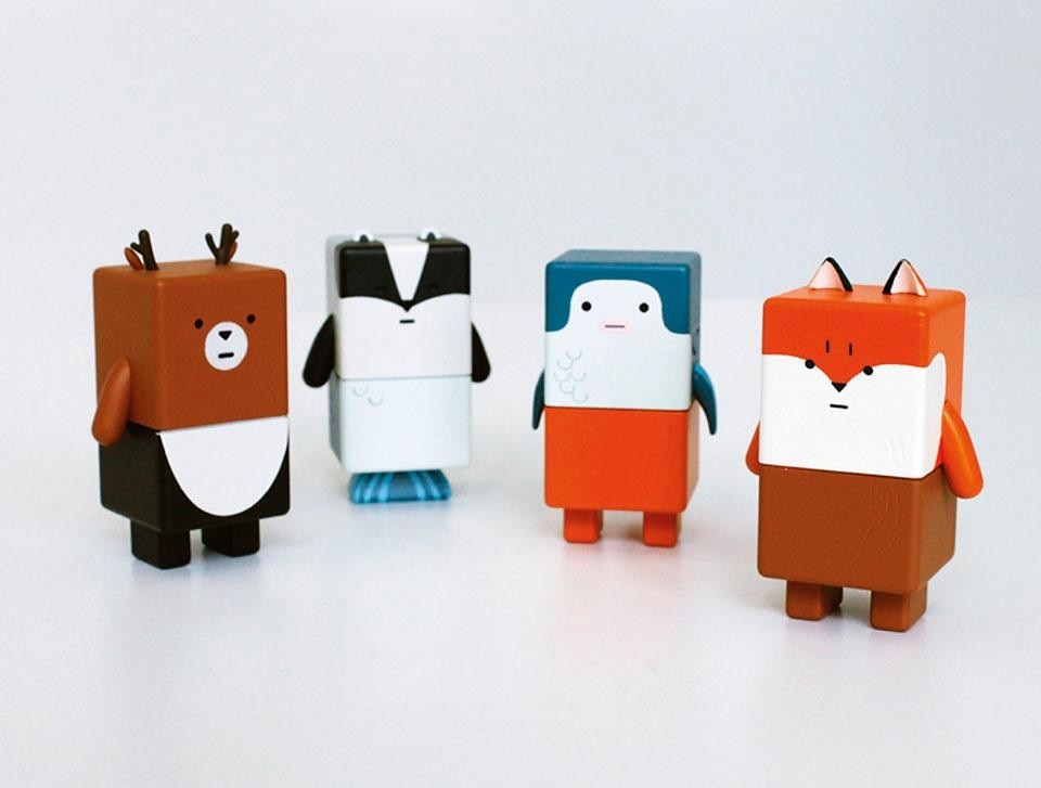
Suwappu consists of
characters (a badger, tuna,
fox, etc.) interacting via
an augmented reality app
with potential to synch
with Twitter, Facebook,
TV and other applications.
Original product concept:
Dentsu London. Consultant
inventors: BERG.
Suwappu consists of characters (a badger, tuna, fox, etc.) interacting via an augmented reality app with potential to synch with Twitter, Facebook, TV and other applications. Original product concept: Dentsu London. Consultant inventors: BERG.
Ideological campaigns such as the far-reaching one launched by Naomi Klein with her No Logo book of 1999, or the ongoing, more community-focused work by the Canada-based Adbusters, a group of advertising and design activists founded in 1989, have forced the creation of a much more interesting and diverse landscape, in which major and minor brands compete for the attention of the jaded and demanding consuming public with complex narratives, high-quality productions and strategic sponsorships.
Carsten Höller, <i>Upside Down
Mushroom,</i> installation for
his one-man show at the
Fondazione Prada, 2001.
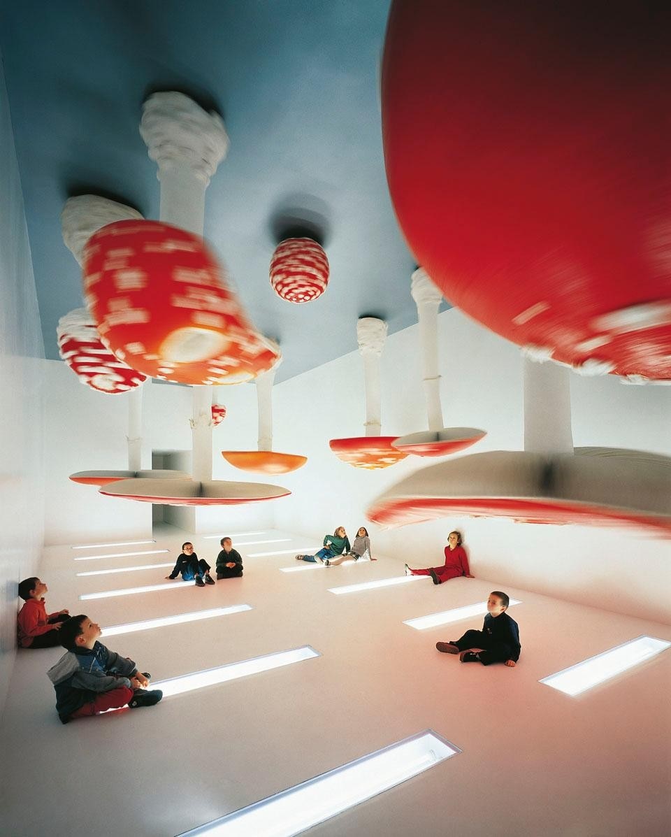
Carsten Höller, Upside Down Mushroom, installation for his one-man show at the Fondazione Prada, 2001.
As mentioned, technology pushed us all forward, especially interesting turns of events such as the introduction of VCRs, which make it possible to jump the commercials while watching recorded television (live streaming of TV programmes on the Internet has reintroduced that old annoyance), as well as the fragmentation of the message across many platforms, some of them unpredictable, such as social networks and Internet pop-ups. The secret, in an era of mash-ups, YouTube parodies and re-enactment, and unleashed popular creativity, is to be able to let go of control without losing presence and communication power. For this reason, brand design today seems more inspired by great examples of yesteryear, from Michelin's celebrated Bibendum to the multi-scale identity rollouts of AEG, Olivetti, Cummins Engines and Campari—which encompassed not only product and image design, but also architecture and social programmes—to the multi-episode commercials in Carosello, the 8:30pm commercial break that would constitute the last treat before bedtime for Italian children in the 1960s and 1970s and which consisted of fully fledged series focused on light sketches (some animated, some with real actors) filmed sometimes by renowned directors, every night different.
Successful contemporary brands belong in a narrative environment and are thus either fully scripted and idiosyncratic, or abstract, incisive and adaptable enough as to straddle platforms, to perform while always staying in character, and to be recognisable.
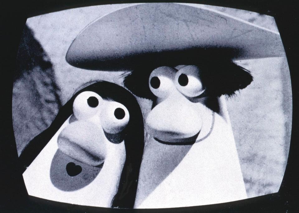
Carmencita was the star in
adverts for Paulista coffee
designed by Armando Testa.
Carmencita was the star in adverts for Paulista coffee designed by Armando Testa.
Bibendum was invented by Édouard Michelin, who together with his brother André took over a rubber tire and conveyor belt manufacturer in France in 1889. Legend has it that Édouard saw a pile of stacked tires which looked like the shape of a human, and came up with the concept. It is considered one of the most successful logos of all time, recognisable, whimsical, appealing to children and adults alike, and open for interpretation. From Bibendum to Suwappu. The London branch of the Japanese advertising mega firm Dentsu has called upon multimedia designer studio BERG to develop new characters called Suwappu, whose narratively promotional and everchanging stories will be told in virtual reality. The two-part toys (there will be eight and so far four—Badger, Tuna, Fox and Deer—are complete) are drawn with very clear, cartoon-like features that can be easily captured by image-recognition software, so smartphone users can see every Suwappu's life story superimposed onto each character's features, every day different like a Carosello commercial, always in motion.

The logo that crystallised the new era of brand design was, however, that of MTV. MTV, a completely new concept for a television channel devoted exclusively to pop and rock music videos, was boldly launched on 1 August 1981. Creative director Fred Seibert had hired Frank Olinsky from Manhattan Design, who concocted a logo in which at first only the M was open to interpretation—of pattern and colour mostly—and then the whole acronym. The opening on-air moments of the channel featured a memorable adaptation of a video of the first moon landing, in which the flag carried the MTV logo. After that, maintaining some general shape and proportions constant, it was all left to artists' creativity. MTV branding history is filled with other memorable moments, the famous "I Want My MTV!" campaign of 1982, for instance, and even though its most roaring decade was the 1980s, it still stands as a testament to the power of zeitgeist.
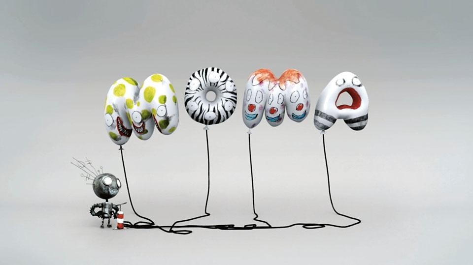
<i>Tim Burton: 30 seconds.</i> 
Creative director: Julia
Hoffmann. Director and
illustration: Tim Burton.
Animation: Chris Tichborne
(courtesy of MoMA).
Tim Burton: 30 seconds. Creative director: Julia Hoffmann. Director and illustration: Tim Burton. Animation: Chris Tichborne (courtesy of MoMA).
2001 was an important year for two celebrated, if a bit dusty fashion brands, Prada and Louis Vuitton. LV, whose monogram brand had been established in 1896 and in good French luxurygoods tradition had remained almost unchanged throughout the 20th century, was undergoing a counterfeiting assault that called for decisive action. LV's new art director Marc Jacobs invited several designers, architects and artists to re-interpret the brand. The late Stephen Sprouse graffiti logo treatment was unveiled as part of the 2001 Spring/Summer collection, and the world of leather goods was never the same. Takashi Murakami's own Monogram Multicolore and Cherry Blossoms takes followed in 2003.
Rendering of
the new Fondazione Prada
building by Rem Koolhaas,
under construction in Milan.
Rendering of the new Fondazione Prada building by Rem Koolhaas, under construction in Milan.
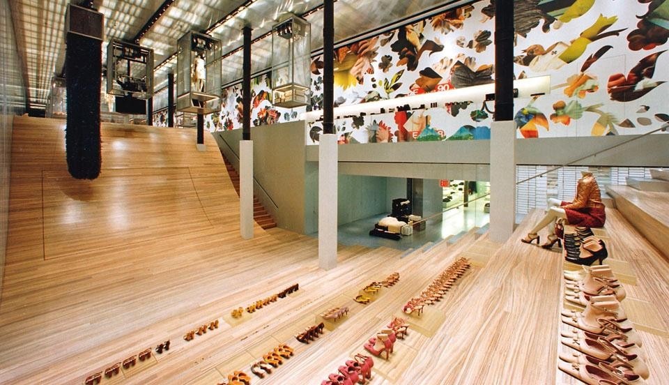
If LVMH's chairman Bernard Arnault is identified with the whole group and therefore spreads his personal cachet over an immense landscape of corporate might, Miuccia Prada's personal image of intellectual restlessness and creative daring is laser-sharply connected to the Prada label. She took over the family business in 1979, and by the early 1990s she had turned it around, from Milanese grandmother's store to a vision of the future of fashion. The Fondazione Prada, devoted to contemporary art, was founded in 1993. The much-anticipated opening of the Prada Epicenter Store in New York, designed by OMA, was scheduled for fall 2001, mid-September to be precise, although the events of 9/11 pushed the inauguration back to December. Miuccia Prada had approached Rem Koolhaas in July 1999 upon learning of the Harvard GSD Guide to Shopping a system called "logo generator" extracts the salient colours and tones from each visual and renders a logo that is in perfect harmony with it. Other institutions have taken different paths, depending on the focus of their message. Just compare Tate Modern's "gaseous" logo (designed by Wolff Olins) with MoMA's iterations by Chermayeff & Geismar, Bruce Mau et al., and most recently Paula Scher and Pentagram; New York's New Museum by UnderConsideration; and the Brooklyn Museum by 2x4. Each approach reveals the personality of the institution and its aspirations, and a shrewd observer could detect all nuances, from arrogance to humility, to the seeds of a crisis of identity, and insecurity revealed in coolness at all costs. One of the most irritating and interesting examples of refusal of design as a form of design in its own merit is of course Google. Bent on proving itself above style and visual indulgence, the neo-functionalist brand "created" by Ruth Kedar using the typeface Catull and its daily declinations— frankly, just doodles—called Doodles, which have existed since 1999, have come to be identified with a whole extreme wave of online branding.
Prada’s New York
Epicenter (designed by Rem
Koolhaas – OMA). In the
background, Vomit wallpaper
designed by 2x4.
Prada’s New York Epicenter (designed by Rem Koolhaas – OMA). In the background, Vomit wallpaper designed by 2x4.
Whether it is the building, the person, a glyph—like the swoosh—or none of the above, or the sponsorship of smart projects (as is the case of Intel, which revived itself by launching the online Creators Project), brands' multi-layered and cinematic life has made for a much more interesting communication landscape.
Paola Antonelli, architect and critic
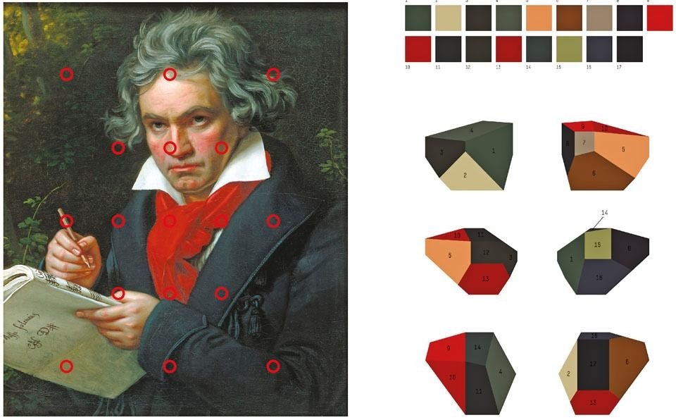
Comprehensive identity
for Rem Koolhaas’s
Casa Da Música.
Art direction: Stefan
Sagmeister.Design: Matthias
Ernstberger, Quentin
Walesh, Ralph Ammer.
(courtesy of Sagmeister Inc.)
Comprehensive identity for Rem Koolhaas’s Casa Da Música. Art direction: Stefan Sagmeister.Design: Matthias Ernstberger, Quentin Walesh, Ralph Ammer. (courtesy of Sagmeister Inc.)
The “Real Fantasies”
publication for Prada’s
womenswear and menswear
collections is “interpreted”
every season with highimpact
images and
suggestions. For the last
two seasons, this visual
tool has been animated by
James Lima in a video format
intended for the Web.
The “Real Fantasies” publication for Prada’s womenswear and menswear collections is “interpreted” every season with highimpact images and suggestions. For the last two seasons, this visual tool has been animated by James Lima in a video format intended for the Web.

Latest on Design

Latest on Domus

Read more
China Germany India Mexico, Central America and Caribbean Sri Lanka Korea icon-camera close icon-comments icon-down-sm icon-download icon-facebook icon-heart icon-heart icon-next-sm icon-next icon-pinterest icon-play icon-plus icon-prev-sm icon-prev Search icon-twitter icon-views icon-instagram