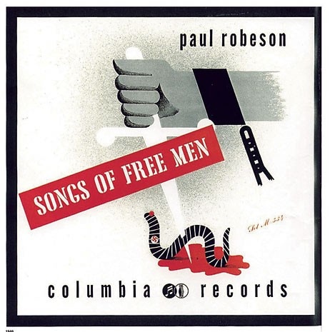
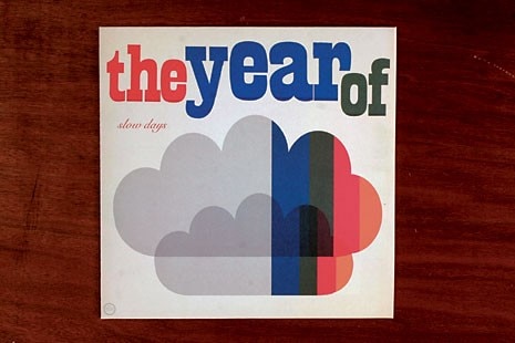
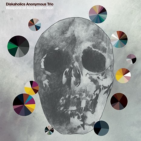
Music was the theme chosen for this edition and it provided the framework for a range of events. Moritz Sauer introduced online independent labels while Elena Albertoni presented for Anatoletype the opentype version of Gregorian musical notation. Particularly prominent was the threeday event with Steve Heller that illustrated the alliance between graphic design and the music industry with the creation of the first record sleeves in 1939. In his eyes the successful collaboration between Alex Steinweiss and Columbia bore all the traits of a small revolution. Records, which until then had been relegated to the darkest secluded corners of shops selling domestic appliances and sold in anonymous packages, finally earned a place in the shop window. The album cover became a favoured place for experimentation and for the possible – however problematic – translation of the album’s musical content into images. For Smalltown Supersound and Morr Music respectively, Kim Hiorthøy and Jan Kruse, among others, explored this complex relationship with their work.
The attempt to examine the many links between music and typography inevitably produced some specious results that were at times not altogether satisfactory, such as the all-graphic-designer band Wolfraam on stage at the Typosounds festival. But there was no shortage of very interesting experimentation. House Industries presented their latest typographic sets in perfect punkmanagerial style; bass, guitar and drums emulated the caustic melodies of the Vandals, while images were screened of Bad Neighbourhood, a font-kit inspired by punkzines and the strongly contrasting effects of the photocopier. Berlin group Jutojo produced live video effects with an analogical procedure whose fascination lay in its intentional anachronism. A slide was projected onto a mirror that, from inside an aquarium, reflected a moving image onto a white surface. The camera collected these impressions and transferred them onto the screen.
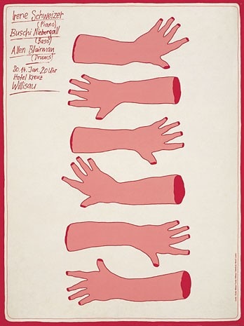
The event would not have been complete without Niklaus Troxler – graphic designer and organiser of the now consolidated Willisau Jazz Festival – who brought the jazz posters series to Berlin, a very Helvetic opposition to the Swiss graphic design school of Joseph Müller-Brockmann. Typo Berlin couldn’t find a more effective way to end than the conference-interview with Klaus Voorman, designer of the legendary and much imitated cover of Revolver (the Beatles, 1966) and bass player in the John Lennon/Plastic Ono Band in 1970.
