Why design matters at Microsoft? Design manager Jonathan Hayes explains in big letters in the section dedicated to the new highly publicised consol on the company’s website, where he talks about attention to all forms of design – graphics, interface, structural components-. Nothing wrong with using design as a promotional tool. What is amazing though is that it is American giant Bill Gates who is doing it, who has always emphasised technological superiority, rather than Apple or Sony.
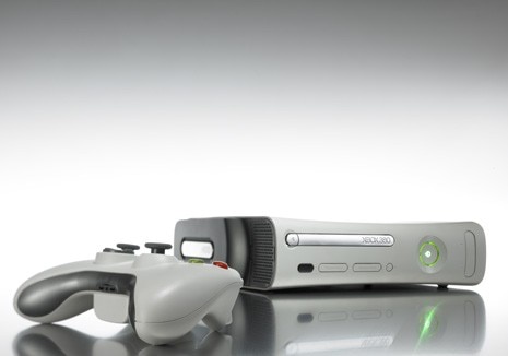
Why this change of direction? The answer to this arises from another question: why is the second version of the Microsoft Xbox called Xbox 360 and not just Xbox 2? To underline that it has abandoned the mere dimension of the game and now has an all round application, 360° in other words, with above all new users. Design then, always intended at 360 degrees, has been the means used by Microsoft to broaden the technological potential of the “magic box” and conquer a new category of users. So while the old Xbox was just for playing games, with the new version you can look at films and photos, listen to music, read emails and connect to internet, talk to friends through vocal and video chat lines and take on the new generation of Xbox Live, the online gaming and entertainment service.
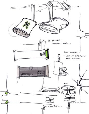
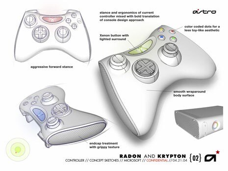
The graphics, developed over two years of work with Akwa, are simple and intuitive, based on menus and designed to be read and understand at “sofa distance”. That’s just the technological side. It was also necessary to invest in the design of the box and joystick to bring the Xbox out of the kids room and into the living room without clashing with the furniture, so it could be used by all members of the family. The working group at Microsoft coordinated by Jonathan Hayes wanted to break out of the usual parameters and open up new avenues and so decided to call upon a dozen or so international design studios, two of which were chosen to be partners in the project: Hers from Osaka and Astro from San Francisco.
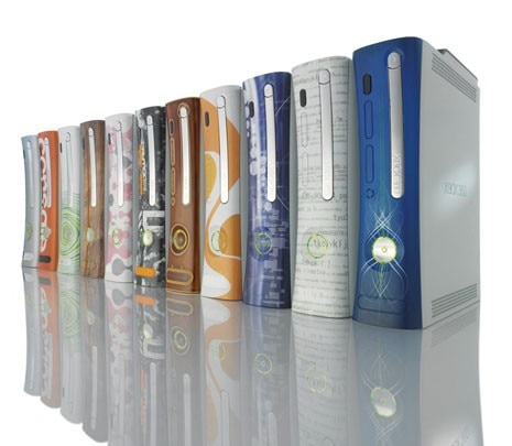
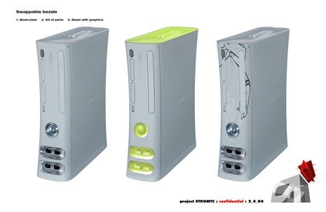
Comparing proposals by the three teams lead to the development of the new shape, “Something that lies half way between ‘wild’ and ‘organic’” explains Jonathan, “whilst the original Xbox had originated more from an encounter between ‘architectural’ and ‘mild’”. The console, that can also be placed vertically, has a slender, slightly concave form, the joystick is smaller and lighter than on the old version and has been improved to become more ergonomic; the faceplate can be removed and replaced with one with a different design, rather like the ones on cell phones. At the centre of the console is the on-off button surrounded by ring of green light that indicates the kind of interaction taking place, the same icon appears on the joystick, also showing information about the four potential players (each assigned a quarter of a circle). Does design help sales? At Microsoft they have begun to think that it does. And Sony doesn’t like it, they have launched an on and off line battle sparing no blows against the new Xbox in May, six months before the planned debut on the market in North America, Europe and Japan. Whilst the new 360 has planned for spring the invasion of the world market, rivals Sony prepare for the launch of the PS3, that will attempt to astound. The game is far from over.