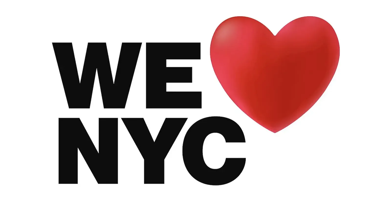
New York has a new logo to promote tourism in the city. Although it closely resembles the one created by Milton Glaser in 1976 – “I❤️NY”, a true icon of the time in American Typewriter, able of anticipating the era of emoji by decades – it does not seem capable to synthesize in an image a collective feeling linked to the city. It focuses a lot on formal details, but without embodying the essence of the place, even if it wants to put the emphasis on a collective rebirth, many critics and analysts have noticed.
In particular, Adam Gopnik on the New Yorker pointed out that by now – apart from the official documents or shipments – nobody really uses the acronym “NYC”. Actually, C was added to focus on the City of New York and not on the State, however, this choice makes the logo instinctively knows of stale, as Gopnik says, a label used only by those who do not New York from the inside, in which it becomes impossible to identify.
An element criticized in the New York Times was the shadow added to the heart image (emoji?), which would weigh it down, turning it into a static formal detail and killing its fast spontaneity, spreaded from the unstoppable energy that filled every corner of the city. Also the New York Magazine didn’t spare itself, proclaiming: “New York’s new promotional logo sucks”.
Photograph courtesy New York State Department of Economic Development.


