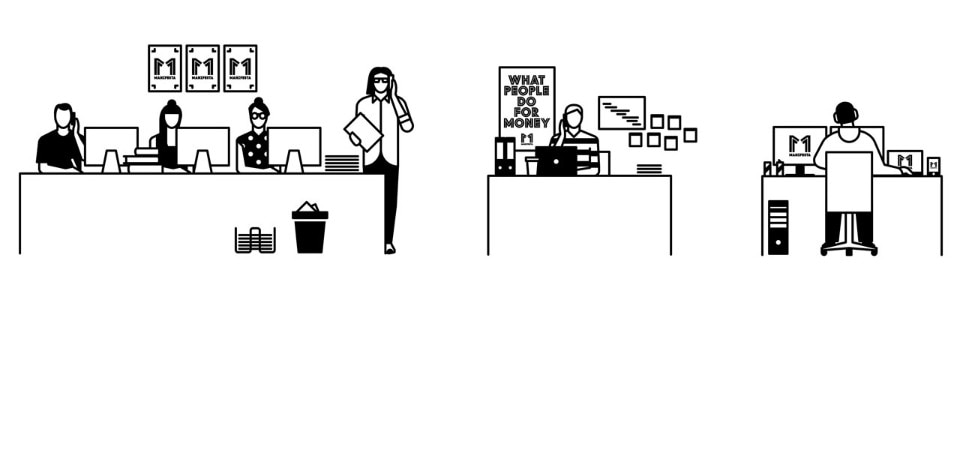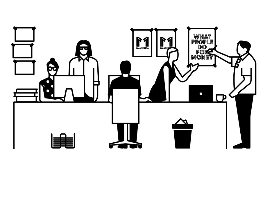
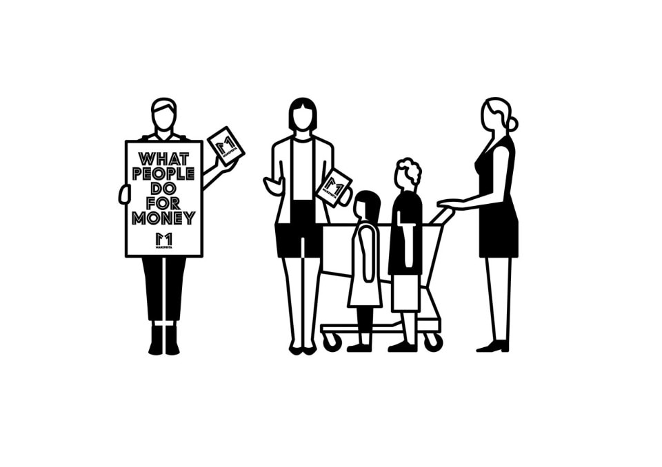
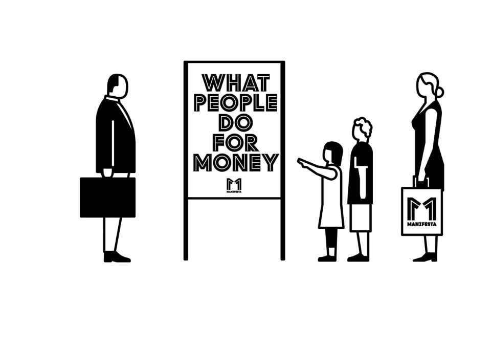
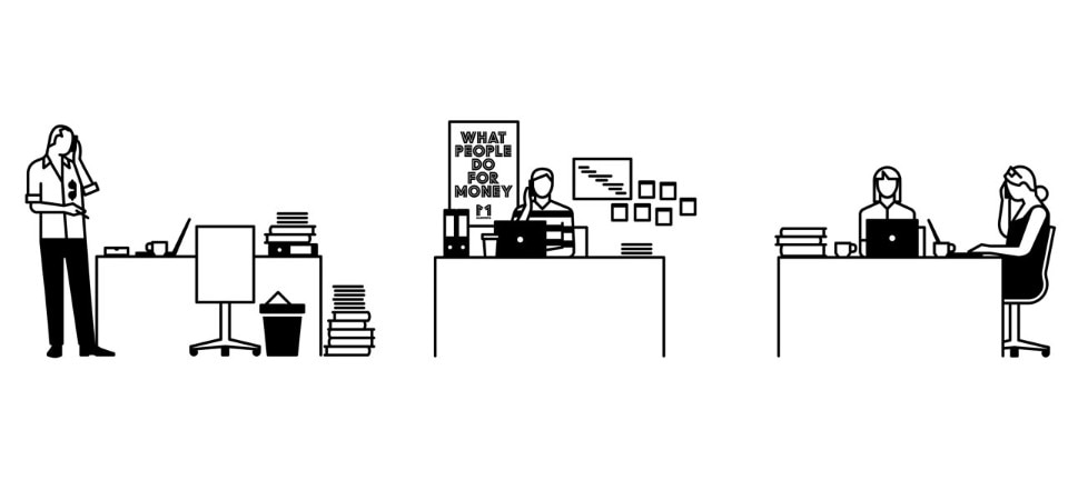
The Formal Emphasis. In addition to an expressive and bold, specifically developed typography, the formal emphasis is mainly on the application of pictograms that integrate societal, political and social aspects related to the topic of ‘working’. The pictograms consciously relate to the artistic and sociological foundations of the ‘Isotype’ conceived by Otto Neurath and Gerd Arntz in the 1930s.
Clear Reduction to Black & White. Graphically, the system refrains from using colour and grabs the viewer’s attention through a deliberate reduction to black and white, which continues with clear, accessible language for floor plans and online navigation. Colour is not used until after the campaign has begun, with an application of photography that extends the system to a pictorial level and offers an atmospheric insight into Zurich’s working world – especially that of the joint venture partners, referred to as guests.
The Mirrored Logo. The logo of Manifesta 11 is constructed as a typogram based on the number one. Along with its mirror image, the number can be read both as 11 and‘M. In this way, the formal mirroring addresses the motif of critical (self-)reflection.
The Specific Typography. The logo and typogram of Manifesta 11 are based on the Manifesta Grow font. The font, set up as a system by the Swiss font designers Dinamo, is one of the design’s central pillars. The original system of Grow consists of several independent fonts, which can be combined in many different ways. Dinamo refined it, adding new characters especially for Manifesta in order to create Manifesta Grow. Its inline structuring evokes associations to neon advertising, helping to develop its own signal effect.
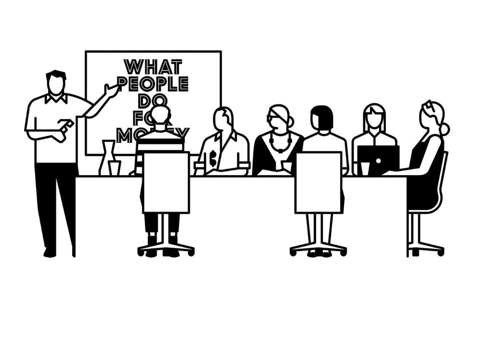
The Multi-Faceted Figures. The second characteristic component is the use of pictograms or figures based on the theme of ‘working’, and set up as a system similar to the font. Employing the building-block principle, countless people can use it to portray their profession or combine it with others. This makes it possible to illustrate various situations, complex contexts or complicated processes in a visual and narrative fashion, thus making each tangible.
The figures, with their lines and abstractions, refer to individual aspects of the typography and begin both a content- and form-related dialogue between text and figures. Depending on the need or occasion, new compositions of text and figures are arranged or the figures formally stripped down. Used in large-scale images, they are part of the concept, in the form of clear symbols for the identification of the different event locations in the public space. With their characteristic abstract form, they represent both Manifesta 11 and the act of working itself.
Visuals for “Manifesta 11 Zurich”
Design: Intégral Ruedi Baur
11.6.2016 – 18.9.2016
What People Do for Money
Manifesta 11 Zurich


