


On June 25, 2021, Umberto Riva, the “master of light,” died at his home in Palermo. The designer and architect left us at the age of 93. Naturalized Milanese, he was a student of Carlo Scarpa and himself later professor of Architecture in Palermo and Venice, at the Polytechnic of Milan and the European Institute of Design. He was awarded the Golden Compass for Lifetime Achievement in 2018 for his distinctive designs in interior architecture and for his lamps, considered masterpieces of Italian industrial design. We revisit his dual nature, that of the architect and the designer, with two articles published on Domus. The first one is a tale on lamps through the words of Riva himself, published in Domus 985, November 2014, while the second one is a journey through two of his Milanese interiors, published on Domus 975, January 2013.
• • •
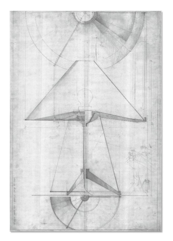
This article was originally published in Domus 985, November 2014 with the title "Details of architecture": a self analysis on the Milanese designer's lamp production. Text Umberto Riva, photo Leo Torri - Domus Archive
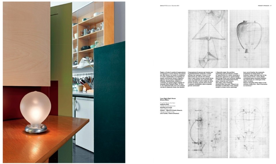
“Reflecting on the design of my lamps, I must say first that I have always thought that the light bulb in itself was already the supreme expression, I terms of form and function, of lighting. It is the element that even now I find the least irritating to be seen in a space, the least intrusive. The opportunities to design lamps came to me many years ago, when relations with makers were very straightforward and spontaneous, less formal than today. Through Tobia Scarpa, I met Toni Zuccheri, who worked for Barovier & Toso and asked me to design lamps.”
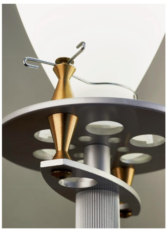
“I have always found glass to be a beautiful material, which is why I have tried to have it blown in ways that would recall forms crated by inertia, by the innate predisposition of glass to be blown. The flask, for example, is one of the most natural forms in existence. I consider glass cast into two mould halves to be a betrayal of the nature of this material. Glass is beautiful if driven to its limits, to the thinnest possible levels, where it acquires greater brightness. If one went early in the morning to watch the first blowings by the master blowers to check the quality of the amalgam, a situation in which there was no construction of form at all, one could see some very special forms. And that is something I have tried to achieve when designing my lamps and in particular the Veronese, which echoes this glass tradition.”

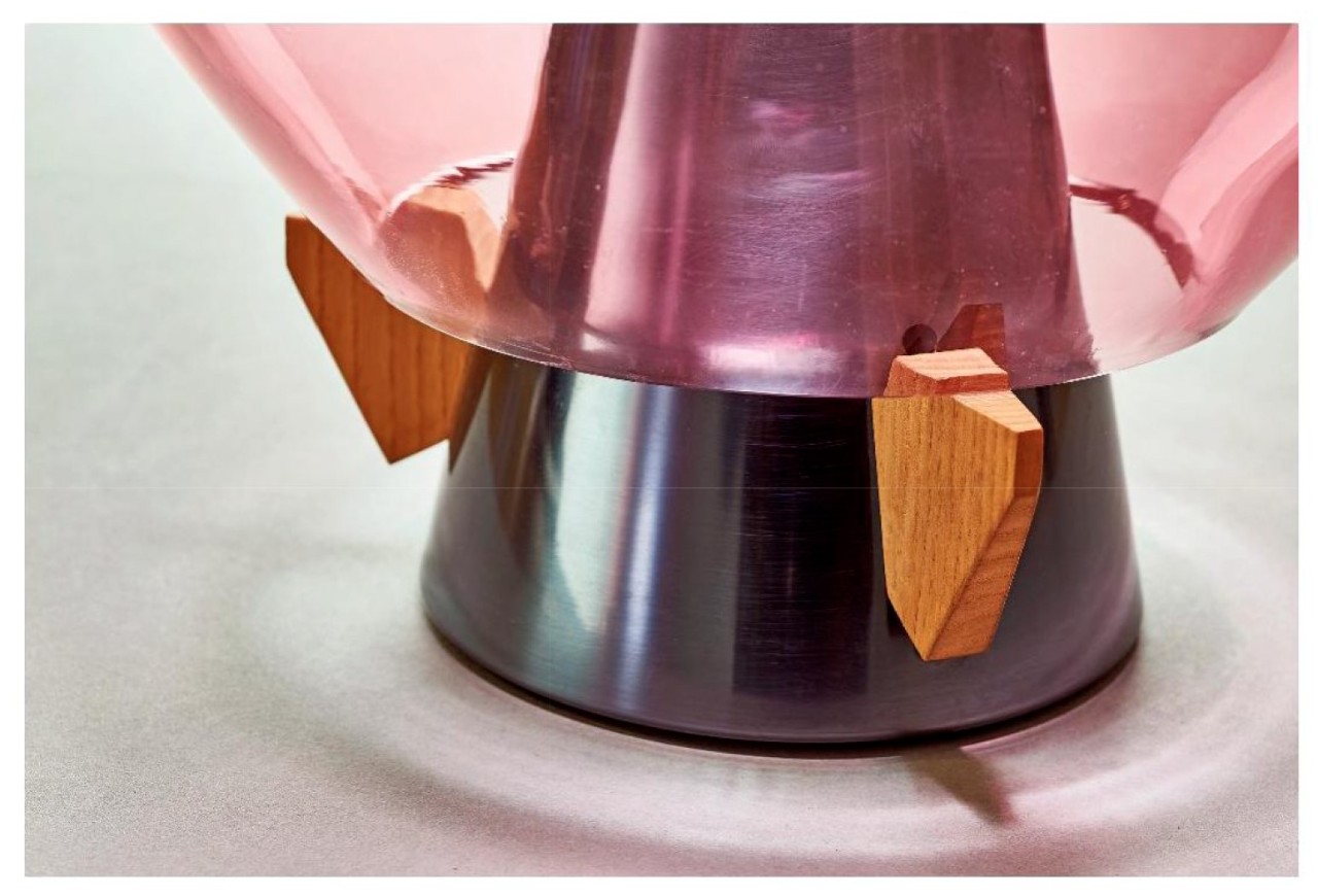
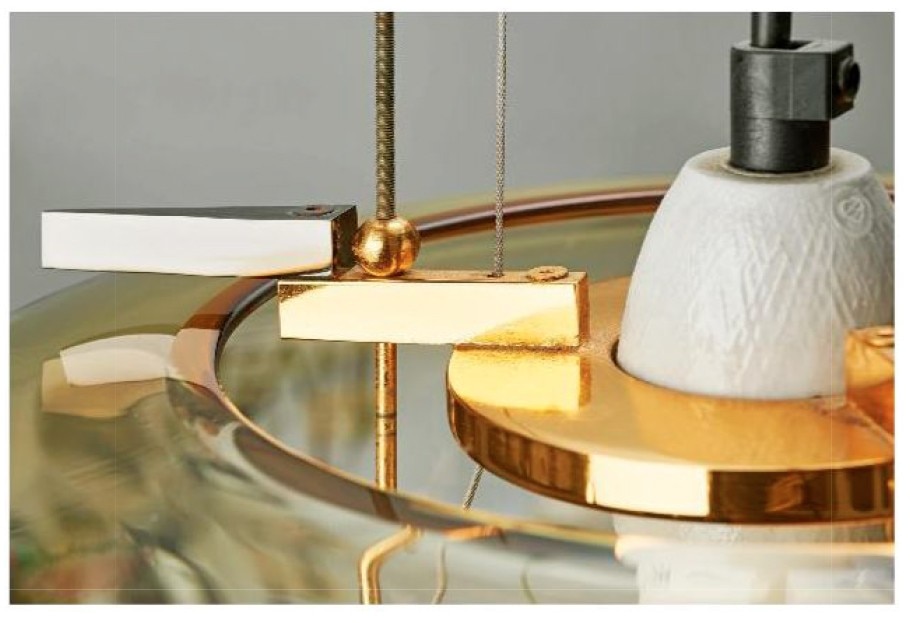
“I try to focus on the contradiction between the lamps’ materials. Metal is hard like glass but fragile too; a marriage between these two materials is not easy. For this reason in the Veronese I rested the glass on three small pieces of birch, which mediate between glass and metal. I made sure the messages carried by these materials would be very well displayed and differentiated. Each had to maintain its own form of competence, without being integrated into the other, helped by a support, a connecting element between materials”.
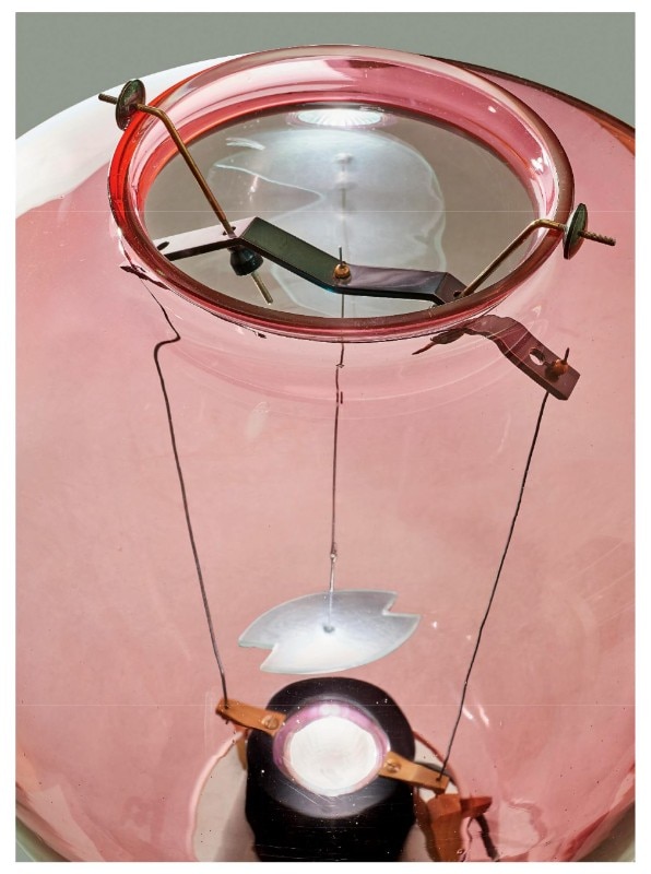
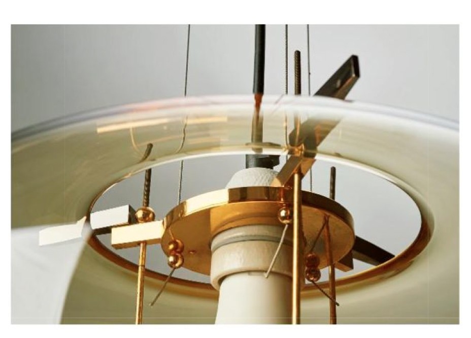
“I try to break down the elements of a lamp, and enhance each with its own potential. In those that have a metal structure, I round off the edges so that the design will never be ambiguous or leave unexplored zones. Before the Veronese, in 1972, I had designed another stationary-mould lamp, the Medusa. It comprised two blown parts joined by a central steam stressing the joint between the two elements. It was one of the first lamps I designed for VeArt. And I discovered that if bicarbonate was put into the vitreous amalgam, bubbles and a sort of opal gelatine would be formed. I have never been concerned about whether or not these lamps might seem 'rich'.”
I always try to focus on the contradiction between my lamps’ materials.

“Murano glass in itself has a certain richness of form, besides its unique lightness and transparency. I think however that the quality of the lamps lies in the design method, which is that of always proceeding by approximations, through a lengthy process in which every element is charged with a precise meaning. I don’t start out with any assumptions, or in the sure knowledge of what I want to accomplish. The shape of the Veronese contained only a reference to classic Venetian glass. Its final shape came int being slowly, step by step and by trial and error. These lamps recount how 25 years ago the way of working with craftsmen was a fundamental ingredient, just as it was thanks to their skills in the processing of each single material that objects of this type could be produced as the fruit of combined processes and skills. They are lamps where nothing is superfluous, and which seem to be impossible to make today, because manufacturers demand the extreme simplification and unification of compositional elements to avoid problems of shipping and warehousing. Objects with richness of form like these lamps would be very costly to make today.”
These lamps recount how 25 years ago the way of working with craftsmen was a fundamental ingredient, just as it was thanks to their skills in the processing of each single material that objects of this type could be produced...
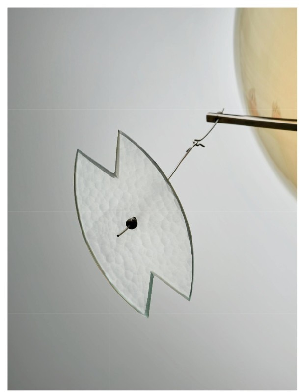
“I like to leave the signs of the processing methods that were adopted on each individual piece, as for example the hole in the metal where the cutting line starts or changes. I like to think that these lamps have an unobtrusive appearance, as if their function of illuminating were almost secondary to their formal presence. In that regard, a lady friend recently told me that my lamps look nice even when turned off. Probably because the richness of their form is enough for them to hold their ground when not in use.”
“I believe, too, that my lamps really need colour. If their transparency is not brightened, their formal richness cannot be appreciated. I would have liked to have gone even farther in this direction, to add colours and an inner blue or yellow core. But somehow the seriality of kiln glassmaking prevented any further experimentation on my part. Maybe that is why I was not allowed to enter the kiln during processing, for fear that I might have impeded it or wasted precious time. The glass-blowers were strong men, who needed a great deal of breath to blow such a mass of material. They were the most sought-after and hence also the most expensive. The beautiful shade of watered wine of which I am so fond came from adding the right measure of gold dust. The green is a pale bottle green, specially blanched to create easier serial reproduction. The amber colour is the only one still in production, I believe precisely for these reasons of large-scale manufacturing.”
• • •
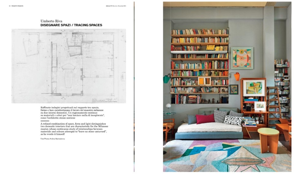
This article was originally published on Domus 975, January 2013 with the title "Disegnare Spazi" (Drawing Spaces): two Milanese houses designed by Umberto Riva are presented here. Text Massimo Curzi, photo Andrea Martiradonna - Domus Archives
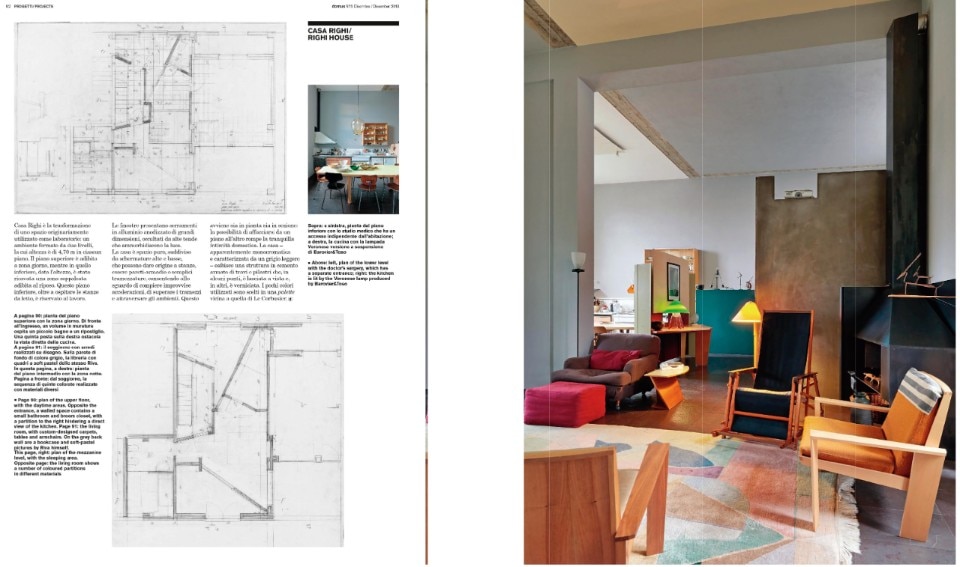
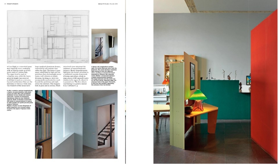
Casa Righi is a converted space that originally was a workshop, with an interior made up of two levels, each 4.7 metres high. The upper level is used as a daytime area, while the lower, given its height, has received a loft that is used as a rest area. Located on this lower floor are the bedrooms as well as a work zone. The windows of the house have large anodized aluminium frames, concealed by tall curtains that soften the light. The house is pure space, subdivided by high and low partitions that alternatingly create rooms, wall cabinets or simply divisions. In doing so, views are unexpectedly accelerated to reach beyond the partitions and right across the interiors. This happens both in plan and in section, where inter-level views interrupt the ambience of tranquil domestic intimacy. Mostly monochromatic light grey, the house’s structure is a reinforced concrete framework of beams and pillars, which in some places is left exposed to give rhythm to the space. In others, it is painted over. The few colours used belong to a palette similar to Le Corbusier’s.

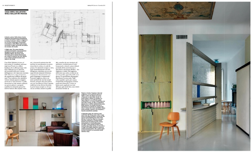
Casa Mieli Ballerini in Milan is located on the third floor of a 1930s residential building of bourgeois typology facing Viale Gian Galeazzo. The mix of materials featured in the communal parts of the entrance and the staircase reflect the industrious and cultivated skills of the master-craftsmen that populated Milan in those days. As was the tradition then, panes of stained glass are set in thin iron window frames; magnificent mock marble decorations are executed in cheap paint; and the parapets are modelled in elaborate wrought-iron swirls. The house is well exposed to the east and receives strong morning light, so the kitchen and dining room are on that side. A wood-and-glass element placed right in front of the entrance functions as a compendium of division, transparency, lighting, and a top used as a coin tray.
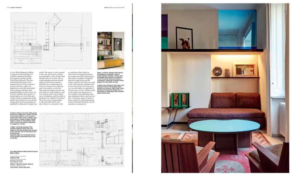
The spacious living room has one wall with two wide windows, and two interior walls. One is taken up by a bookcase, and the other is divided in two different functions. The lower part accommodates a sofa and a coffee table, and above there is a structure with an architrave that holds an alternation of staggered shelves in transparent and coloured glass. This allows daylight to brighten both the living room and the studio, and the view from one room to the next remains unobstructed. A door leads from the living room to a second studio, an appendix to the day area. A tiny vestibule leads to the night area. Apertures in the surfaces, and traditional and non-traditional doors, spell out the flow of domestic spaces. Colour is given mostly by wash-based paint used on the fixed furniture, but its presence is minimal.