Franco Albini was 57 when, along with Franca Helg, he was commissioned to design the stations for Line 1 of Milan’s “metropolitana”, the underground railway. The year was 1962. Two years later, Bob Noorda’s designs for the fittings and signage of the metropolitana won the Compasso d’oro. Over forty years on from the inauguration of one of the most radical and innovative urban transport systems, the Milan transport company, instead of promoting its restoration, is irremediably altering its design. What motivations should have inspired different criteria for protecting its built integrity?
Many years before acquiring the title of “design capital”, Milan was effectively the economic, moral and cultural capital of postwar Italy. This context of intellectual and creative revival provided fertile ground for what was later to become known as “Italian industrial design”.
What now seems to be the height of sophistication was therefore a natural and perhaps not particularly difficult choice: design and build a complex, integrated infrastructure system in a short time. The resultant technical innovation (the type of tunnel construction was subsequently called Milano) and innovative spatial design certainly represent the most extensive urban design intervention ever to be realised in Italy. Events of the time narrate a familiar story in which the architecture had to be adapted to what the engineers had already decided. But in the final analysis this was done so effectively that one would be forgiven for thinking the reverse.
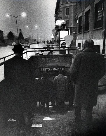
When examining the design it is worth noting a physical characteristic that differentiates Milan’s metro system from most of its counterparts. It is an “underground” that runs very close to the surface. This gives rise to extreme accessibility to the landings that, at least in the early years, extended into pedestrian services areas, subways and shopping arcades. This latter aspect, which was never really completed and underwent continual variations and modifications, was new and courageous and merits further consideration in an age when the city has become a kind of global “mall”.
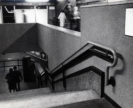
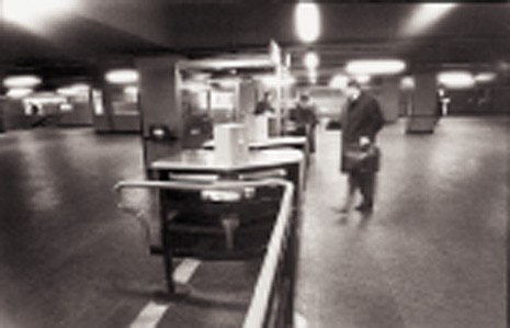
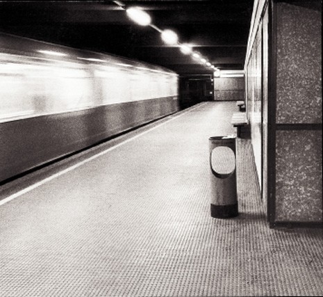
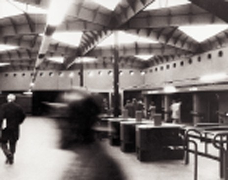
The platforms, two flights of stairs below, can both be viewed at the same time and are only separated by structural partitions. Apart from exceptions in the depth at which the trains circulate, all the stations are identical. If Albini-Helg’s design was limited “just” to adding the finishes to the space and dealing with its perception, this does not seem to diminish the richness of themes and technical solutions. The idea of treating all the reinforced concrete structures with a dark colour (green or brown depending on different circumstances), thus minimising the irregularities of the concrete surfaces, makes them simple and elegant. The easily replaceable black rubber flooring reduces the noise of footsteps and contributes to the general acoustic comfort of the stations. The stone of the benches and the staircases (polished serizzo, or with sawn finish for the outside surfaces) is a real luxury if compared to the plastic, majolica and metal of almost all other underground railways. The walls’ modular cladding, a mixture of concrete and marble dust, is achieved by hanging sheets alongside one another around 10 centimetres away from the load bearing structure. This allows most of the services to be hidden while making them easily accessible for maintenance. The fluorescent and linear lighting is always oriented in the direction of passenger flow. The metalwork design is also remarkable, with the most familiar detail being the curvature at the end of the orange-coloured handrails.
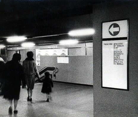
The signage, in a continual strip along the whole perimeter of the platforms and landings, is distinguished by the simple repetition of the station name or indications regarding the position of the exits. Without doubt, the materials used in the design of Milan’s underground still today represent an abacus of extraordinary value. What category of citizen-client were Franco Albini and Franca Helg addressing with their design? Probably a social individual who was already mature, a protagonist of a real cultural evolution. I like to think that the metropolitana belongs to the brief period during which it was possible to design without bearish motioning or compromising in the interests of the collective good. This was a period when the tastes and inclinations of the client and designer miraculously coincided, and of which Milan was the undisputed capital.
What moves have the transport company and consequently the city’s administration made to protect the built legacy of Albini-Helg’s original design? How much of that legacy has already been lost? The corruption of Albini’s ideas began when the Milanese underground decided to design a third line. But, as is often the case in Italy, the cultural deficit negatively affected maintenance and caused the progressive loss of integrity.
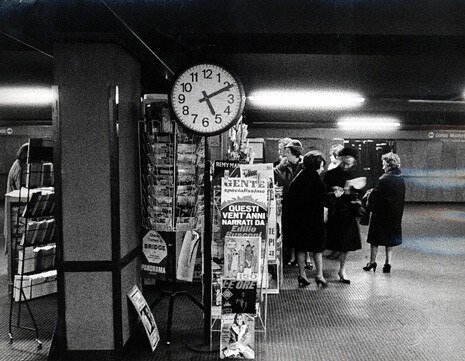
Initially changes regarded the commercial spaces and pedestrian connections. This was followed by inability to set an aesthetic code regarding sign placement and shop window design. But the greatest lack of respect for the original design came with the progressive introduction of surveillance and public communication technology. The privatisation of the transport company introduced a regime of wild commercialisation into the use of the metropolitana’s advertising spaces: light boxes, temporary installations, kiosks and even video projections invade the landings and platforms with obsolete and approximate technological paraphernalia.
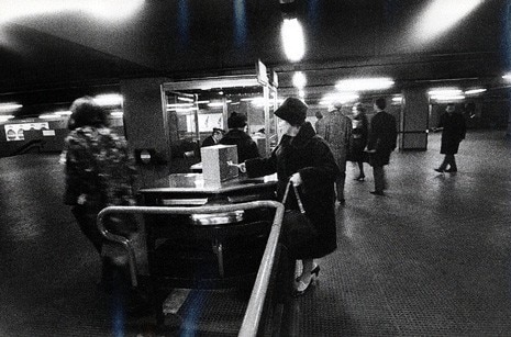
The advent of sound in the tunnels is then, in its obtuse violence of the domestic television, a perfect metaphor for the genetic mutation that the city experienced at the end of the century. The latest changes came with the new millennium, mainly the change of the ticket punching and access system which resulted in the disappearance of the turnstiles and pressurised gates. Then, for no plausible reason, the black rubber floors have been progressively replaced with white stoneware tiles (the principal result being that you can now count all the stains and litter that passengers are capable of producing despite the existence of waste bins).
Neither has the graphic design or signage been spared from this fury of “modernisation”. Noorda’s design has been substituted by a kind of clumsy caricature, which in imitating his style believes it is bringing his aesthetics to the present-day with the use of brighter colours and no longer dedicated lettering. At street level, the same fate is reserved for the light boxes that indicate the stations’ entry stairs, where alongside the metropolitana symbol (which changed years ago to a simple M from the earlier MM) now sits the mysterious S of the “passante ferroviario”, or underground railway link (previously indicated by an R for a short time). After years of honourable service inside the carriages, even the schematic maps of the metro lines are being retired. Perhaps with the illusion of appearing more extensive and complex than they really are, they now include a confused jumble of added information and indications. Could things have been worked differently? Probably not, but it is seductive to imagine the contrary. We can only regret the paradox of a political system whose approach to infrastructure management is completely disconnected from the reality of its territory, and of a superficial and distracted citizenship that is far removed from the spirit which contributed to orienting strategic choices in the past.