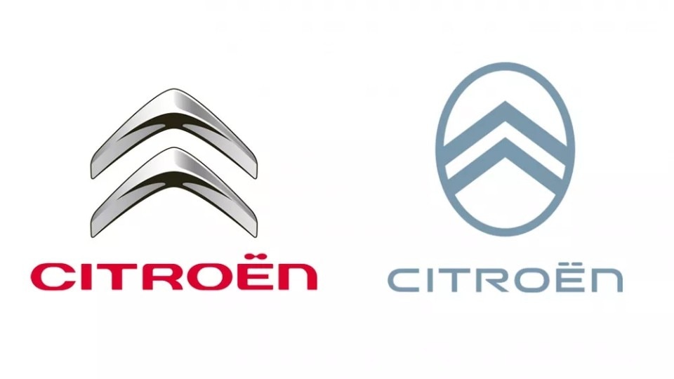
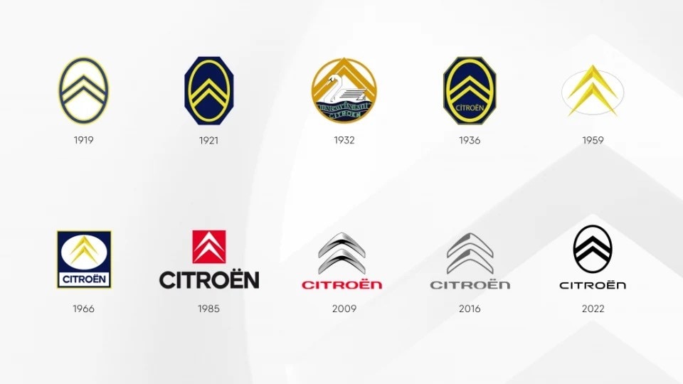
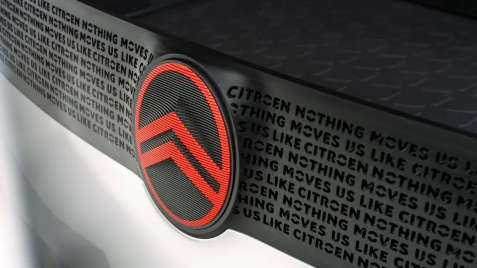
French carmaker Citroën has unveiled the new logo that will start appearing on its cars from mid-2023. The new emblem encircles the iconic double chevron trademark into a circle, clearly referencing the company’s first logo from 1919. The typeface used for the brand name is also completely new, boxier, and more futuristic than the previous one. Citroën said the new branding will appear on a new concept car first. It’s unclear if we will see it already at the Paris Motor Show in October, but the timing would be perfect. Nevertheless, the concept will also feature Citroën’s new brand claim, “Nothing moves us like Citroën”, embedded in the car’s grille.
The new logo follows the general trend of logo oversimplification that many international corporations, not just in the automotive sector, have recently gone through. By simplifying their logos with fill color, smoother shapes, and flattened lines, companies aim to make them more instantly recognizable. That’s particularly important in the digital domain, where attention is a scarce resource, and complex logos with lots of features might not resonate properly with younger audiences. According to the company, the new emblem “initiates a new direction in product design language in which the visually prominent badge will become an immediately recognizable signature element of all Citroën models,” hinting at an imminent overhaul of its entire design language.


