The Stedelijk Museum presents work by French graphic designer Philippe Apeloig, noted for his thorough and experimental use of typography.
Philippe Apeloig engages in a witty interaction with letters, in some instances designing his own typefaces.
His mastery of typography is such that he is able to play a subtle and well-chosen game with characters and fonts. In some designs, he allows letters to function as autonomous images.
Left: Philippe Apeloig, Vivo in Typo, 2008, 175 × 118,5 cm, screenprint. Right: Philippe Apeloig, Frida and Diego, A Creative Love, 2008, 175 × 118,5 cm, screenprint
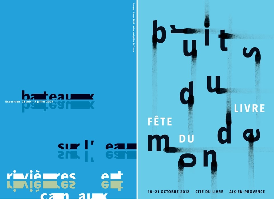
This can be seen in the poster Bateaux sur l’eau of 2003, where the letters form a boat and yet, even when slightly distorted, always convey their message clearly. The letter shapes in the poster Bewegte Schrift of 2011 were also featured in a digital animation screened at Zurich station. Apeloig’s designs are layered with meaning, which is always in tune with the subject of the poster. His resulting designs are rich and varied; some are colorful, others in black and white, with occasional touches of color.
Carolien Glazenburg, curator of graphic design at the Stedelijk said: “Apeloig composes with letters, infusing them with different characteristics; some stand alone, others gather in dynamic groups, some dance exuberantly and, on occasion, serve as a sculpture. They can proclaim their message loudly, or in a more restrained tone.”
View gallery
SHARE
PIN IT
SHARE
PIN IT
Left: Philippe Apeloig, Bateaux sur l’eau, rivières et canaux, 2003, 175 × 118,5 cm, screenprint. Right: Philippe Apeloig, Bateaux sur l’eau, rivières et canaux, 2003, 175 × 118,5 cm, screenprint
SHARE
PIN IT
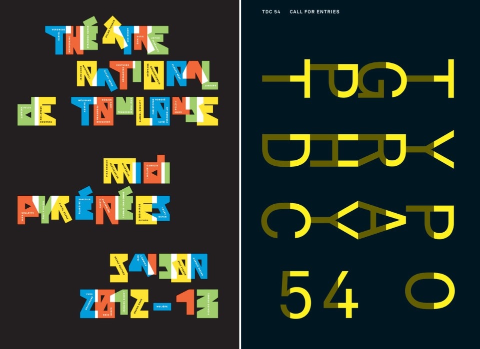
Left: Philippe Apeloig, Théâtre National Toulouse Midi Pyrénées saison 2012 2013, 2012, 175 x 118,5 cm, screenprint. Right: Philippe Apeloig, Type Directors Club, New York, 2007, 175 × 118,5 cm, screenprint
SHARE
PIN IT
until January 31, 2016 Philippe Apeloig
Using Type Stedelijk Museum
Museumplein 10, Amsterdam