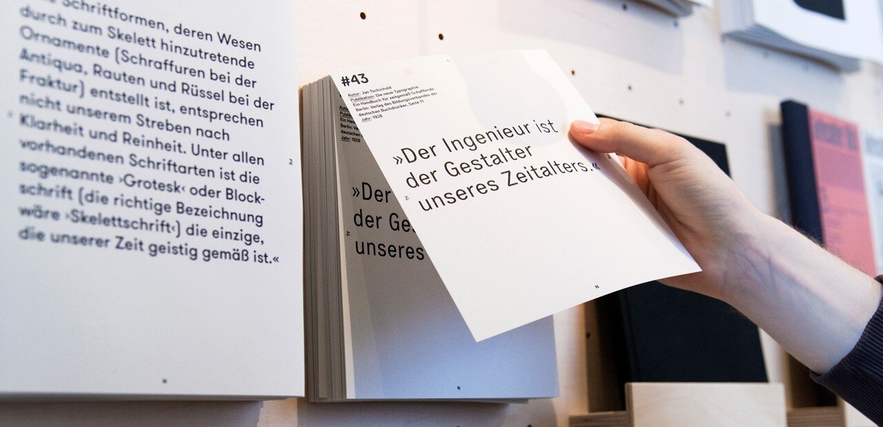
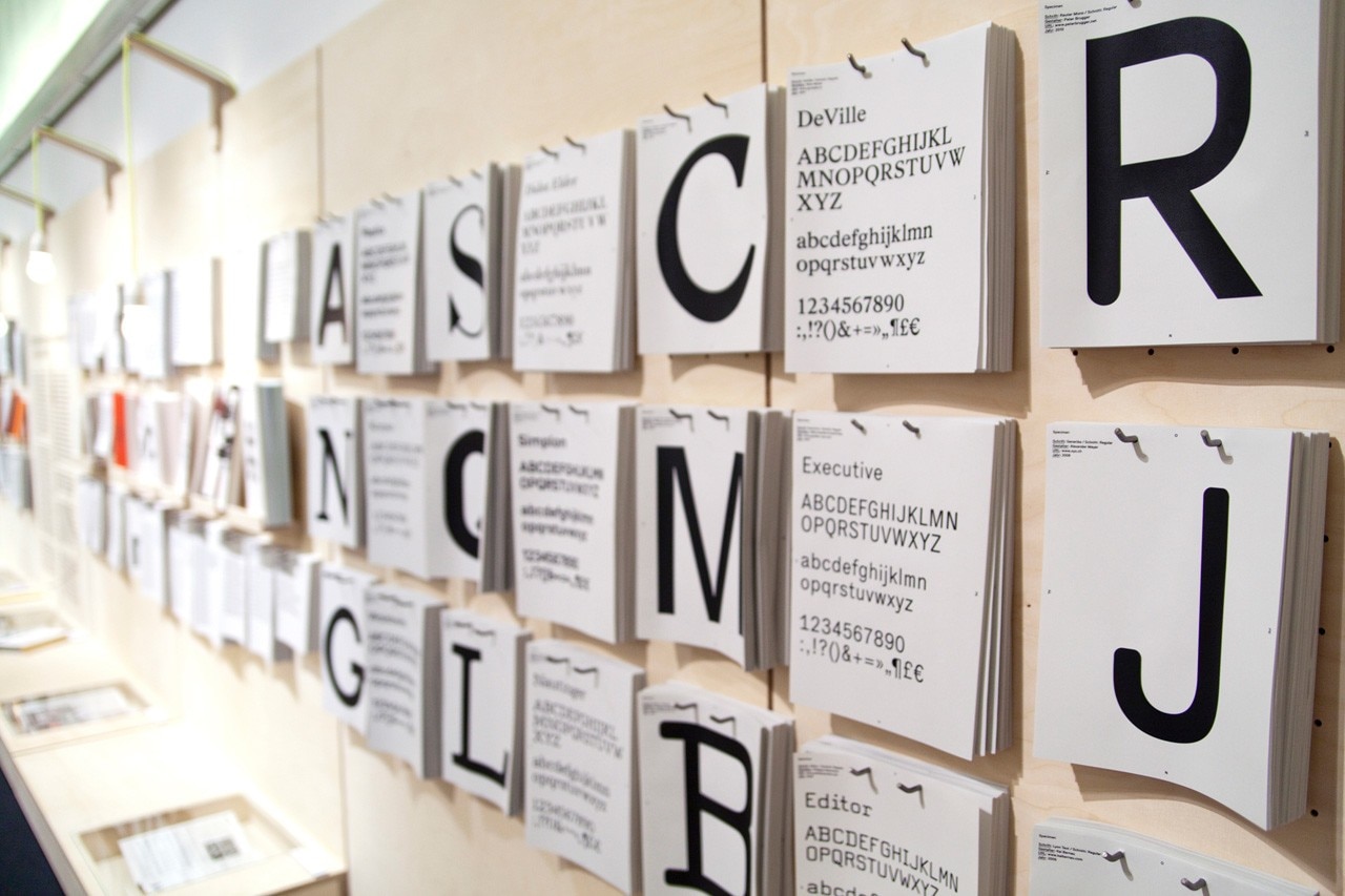
The Bauhaus Archive in Berlin is presenting classics of type design from the twentieth century within the exhibition “On-Type: Texts on Typography”, curated by Prof. Petra Eisele (Mainz University of Applied Sciences), Dr. Annette Ludwig (Gutenberg Museum, Mainz) and Prof. Isabel Naegele (Mainz University of Applied Sciences). The pieces range from Bauhaus and Swiss typography, to postmodern standpoints and topical examples. The exhibition gathers together central theories, manifestos and stocktaking accounts on typography in the German‐speaking countries and presents font patterns and typography magazines. The central figures involved and debates in the history of typography are also introduced – such as debates about legibility, about writing with small initial letters in German, and on the effects of digitization.
Bauhaus Type
Bauhaus Archive’s latest exhibition “On‐Type: Texts on Typography” presents milestones in type design: from Bauhaus and Swiss typography to postmodern standpoints.
View Article details
- 19 June 2013
- Berlin
“The exhibition is based on thorough research on typography” says Dr. Annemarie Jaeggi, Director of the Bauhaus Archive. “The fonts and debates that have been selected reflect major developments, such as the typographical dispute over the use of blackletter typefaces (e.g. fraktur) in German in the early twentieth century and typographic experiments at the Bauhaus. In presenting this participatory exhibition, we at the Bauhaus Archive are hoping to open visitors’ eyes to typography and to pass on to them our enthusiasm for the universe of type.”
Graphic design: Marcel Häusler
Exhibition architecture: Andreas Kulp, Marcel Häusler, Franziska Haube, Lisa Bader
Through 5 August 2013
On-Type: Texts on Typography
Bauhaus Archiv
Klingelhöferstraße, 14
Berlin