

Domus: When did you start your collection?
Michael Stoll: It all began when I encountered the danger of paper disappearing one day, overwhelmed by the digital. If you can hold something in your hands it gives you a more holistic impression of the topic. When I started collecting I also discovered how much interesting and useful stuff had already been invented. As a result I decided to focus on a certain time span because it started to get too expensive. I have to thank my wife for not complaining about my huge collection, as a lot of private money runs into it.
Given these premises, it's peculiar that you made everything you laid your hands on available to the whole digital community by publishing it online. The Internet was also where you found and bought most of your materials, is that right?
I actually found some of my pieces in flea markets or by accident. But, yes, most of the stuff was sourced on the Web. I begun to publish it because information design lacks a valid theory behind it, as well as an overview of its history.
, 26.8 x 20.3
cm, 32 pp. Above: Haruhiko Suzaki,
<em>Axonometric map of Tokyo’s
Ginza Area</em> (1992)")
I'd choose the 1953 World Geographic Atlas. Everybody is impressed by its quality and its sheer weight, but there's more behind it. It was published with Herbert Bayer's Bauhaus knowledge, and it anticipated the educational modernism of the 1960s and '70s. For me as German, the story has another twist: although Herbert Bayer once worked for the Nazi-regime, he later had to leave Germany. It's a warning that the free flow of knowledge and democracy should go hand in hand. We shouldn't forget this.
Where would you place the historical beginnings of information graphics?
I would start with early cave paintings. Seen from today's perspective, they unify visual storytelling and artistic beauty. In other words, art and science originally belonged together, and their division is a relatively recent phenomenon. Although there aren't many examples of infographics remaining from the following centuries, I'd stop talking about the beginnings by the year 1350, when the French bishop Nicole Oresme (1323-1382) "invented" the bar chart. Then, in 1493, Hartmann Schedel printed his famous book Schedel'sche Weltchronik, which explained how God spent the first seven days creating the world. Leonardo da Vinci's technical drawings were tools to clear up thoughts and convey knowledge in a visual manner. In 1786 William Playfair made extensive use of infographics, explaining economic matters in his Commercial and Political Atlas. Finally, in 1869 Charles Joseph Minard created an impressive diagram about Napoleon's march to Moscow and back.
")
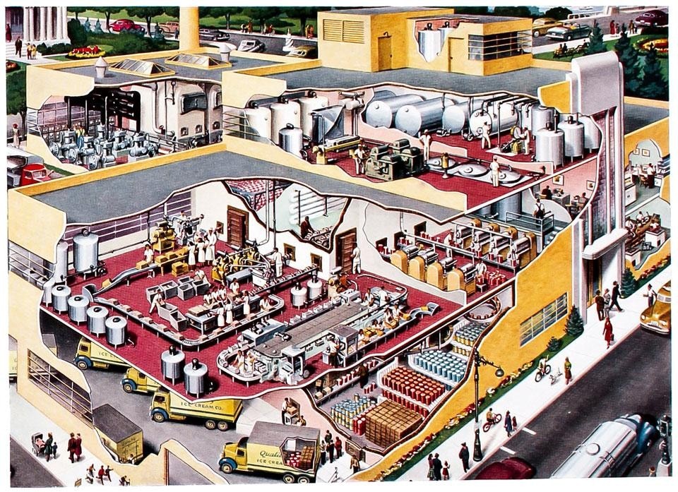
I tried to face this problem—the fact that information design doesn't have a valid taxonomy—with my diploma back in 1991. My idea was to invent a taxonomy that helped journalists and information graphic artists to communicate on the same level. A taxonomy cannot relate to the aspect of visualisation—pie charts, bar charts, explosion drawings—which could disappear from time to time, but rather to the information behind the visualisation. All visual means that try to explain something to you can be placed into one of three groups. The first group is based on numbers, statistics and relations between sizes (data graphics); the second group is made up of objects (group system graphics); and the third one consists of spatial data like maps (spatial graphics). As these fields often overlap, it's also important to consider the borders between information design and, for example, illustration. I always say that information graphics has a strong appeal in the way it can clear up stuff and convey knowledge. Compared to examples such as illustration, information graphics always seeks to increase the knowledge of the reader, like every design process.
This basic taxonomy seems to be very straightforward and effective.
The common idea behind numbers is to make relations more concrete by applying abstract quantities to concrete visual forms. The interesting thing is that an object graphic works the other way around. Richard Saul Wurman's book Medical Access, from the Access series he wrote in the 1980s, gives a step-by-step description of surgery for the average reader. The problem with this kind of image is that it risks looking totally gross: blood all over the place and people with knives trying to cut something out of your stomach. You can't actually show that sort of thing to average people.
Visualisations can guide towards an enlightened citizenship
,
Container Corporation of
America, 28.5 x 41 cm, 368 pp")
That's right. The idea behind system graphics is not to make things more concrete but to make them more abstract. So by transforming photographs of surgery or forensic entomology into a graphic, you make them consumable. A translation into a vector graphic helps to look at things that would otherwise shock you. Only drawing gives you the ability to modulate details within one image. When you take a photograph you have the possibility to bring one object into the centre, but with an infographic you can show how it works internally.
It's about creating a metaphor that people know how to decode. But it also seems crucial to make people aware of the method you're using to present information.
In infographics we speak of "ensuring perception". In other words. we have to ensure that what we show is perceived as intended. I normally ask students to draw me a human liver on the white board, and everybody always says, "Oh, no! I can't draw a liver." I can't draw a liver either, but I can show you how an information designer would do it. He would simply draw something that is supposed to be a liver and then he would label it. The interesting thing is that these labels ensure the perception of the shape. In most cases it can work the other way around, too, when you show an object that doesn't have a name yet. It's like a layer above the information itself.
, 44 x 47 cm,
118 pp")
Although I think the visual is a rather global language, its borders are set by cultural backgrounds. Information design is not the main target in communicating on a global level. The question "who will read our graphics?" is a very important one, and it has to be answered from the context in which the graphic is published. I don't think we'll all end up speaking the same visual language, as that would mean that everyone on earth had gone through more or less the same socialisation process.
Is the recent proliferation of infographics reducing the effectiveness of the visualisation itself? And to what extent can aesthetics affect the readability of data?
Choosing a visualisation purely on the basis of its beauty can be a huge problem. We need to avoid design for design's sake. Aesthetics is a method of presentation without distracting elements. The aesthetics of infographics can't be defined per se, because in most cases it appears in the context of a newspaper, a magazine, a website or a cityscape, with which it has to appear as a single integrated system. But I think this discipline is still in its early stages and standards have yet to evolve.
. Directed and edited
by William L. Kahrl, the atlas
provides a detailed description
of the use of water resources
in California with maps,
graphics and diagrams")
Many people think that acquiring data is a voluntary task. But in today's information society, the amount and quality of knowledge you hold is essential for your private success. If you're developing strategies to learn fast, you'll probably go further than people who avoid doing that. It's not just you voluntarily pushing yourself; it's also society pulling a required amount of knowledge from you. Conveying knowledge is a deeply democratic process, but it's also important that the readers understand it.
What about maps?
I collect axonometric cityscapes. I began to focus on them when I found a map of Augsburg by Hermann Bollmann. I like these maps because they show escaping flatlands and they're easy to read. Interestingly, there are very few artist doing axonometric cityscapes nowadays.
In perspectives the presence of the viewer is very strong, while an axonometric view has no centre point at all. We could say it's more democratic.
In axonometric maps you're above the scene, not part of it, and when you don't have a vanishing point everything looks "over-parallel": everything is clear, clean and in the same light. Perhaps it's more of a communistic than democratic view of a scene. Often axonometric maps look more beautiful than reality itself.
, prepared
under the supervision of
Henry Gannett (1846–1914),
geographer of the Twelfth
United States Census (24 x 30
cm, 91 pp. plus 207 plates)")
The science is dividing the field of knowledge into disposable knowledge and reusable knowledge. Google maps are falling into the first category, while axonometric maps belong to the second, because they're suitable for being reused. An 11-year-old hand-drawn map still looks beautiful, whereas 11 years from now Google maps will be dated. Google and others are failing to present the beautifulness of our planet to us when doing their digital atlases.
Are you familiar with Baidu? The Chinese can't show satellite images of their cities so they model these detailed axonometric cityscapes.
Baidu shows very beautiful representations, similar to hand-drawn maps. They're like the depiction of a promise, telling you that it's a beautiful country to live in, whether it's true or not.
, Verlag Das
Beste, Stuttgart, 23 x 26 cm,
568 pp")
The digital has had a great impact not only on the production of information, but also on how to get to the sources. But this speed comes at a cost that shouldn't be underestimated, and that cost is precision. In the early days, information designers controlled the entire process and physically possessed the information. Nowadays, if you're doing a data visualisation using bytes that aren't on your hard drive, or that you don't even own, then you're dependent on other people. That's the digital drawback. The moment authoritarian countries decide to cut the wires, all the knowledge will be gone.
How have the role and skills of information designers changed from the appearance of the first visual narratives to the contemporary digital age?
Information design is a truly multidisciplinary discipline. As Will Burtin would have said, it's integrative. But I think we should still look closer at the basic pieces of information we're converting into infographics. The digital plays an important role when it comes to researching data for visual representation, when it comes to producing it and distributing it, but the main aim of a designer is to conceive the conceptual framework. An information designer's role is to understand information and integrate it into meaningful presentations. This role becomes increasingly important as our cultural and economic issues become more and more complex and abstract, which means less understandable. For the citizen, this can lead to discomfort, fear or technophobia. Visualisations can help to push this back and guide towards an enlightened citizenship. A true basis for democracy.
, originally published
in the <em>Berliner Morgenpost</em>")