

Marco Ferrari: On the one hand, the basic idea is to transcend the clear distinction between the traditional categories of architecture, design and art. On the other, there's the desire to create issues that are almost monographic, in which the underlying theme is perceived more as a "densification" of reflections and cross-references between the cover story, reportage and the various contents, rather than as an explicit declaration. This approach allows us to imagine a magazine structure that is formally less rigid and repetitive, to concentrate on the identity of some of the ongoing columns ("States of Design" by Paola Antonelli, conceived almost like a real TV series, or the bibliographic interviews by Gianluigi Ricuperati just to cite two examples) and to study some content formats. In the first issue [Domus 946], the article by Beatriz Colomina on Le Corbusier's travels, supported by Ramak Fazel's photo-reportage on the new Boeing 747-800, is an experiment—we believe, with a very interesting outcome—on the double-page spread (and thus on the "naked geometry" of the magazine) as a support that can create immediate visual connections between two apparently different topics.
As noted in a recent analysis by Alice Rawsthorn in the New York Times, the new Domus "accentuates the tactile qualities of print by mixing different types of paper, each with a distinctive scent and texture." Can you explain this by highlighting the editorial choices behind your decision?
The ability of the web to update content has, today, dealt a blow to the primacy of magazines as a main source of information. Blogs and sites of deeper and quality thinking—the renewed Domus site, designed by Dan Hill, points clearly in that direction—can satisfy the need for more demanding specialized information. Trying to stem or reverse this process by playing on the same level would be counterproductive. Rather, I think it's important to recover the aspects that most distinguish paper from digital publishing, radicalizing the quality of the support that we have available rather than tending towards homogenization. Working on the material physicality of the magazine as an object subject to good design is a first step in this direction. Reading not only implies the use of sight; it's also fundamentally a tactile experience.


The layout is a very simple structure based on 12 columns. It is easy to see that 12 can allow many different numerical combinations which are reflected in the flexibility of the page's horizontal organization. Two columns of main text plus one for notes in articles that require a greater amount of ancillary notations; a leaner one of three full columns of text for shorter articles where the diminished column width allows us to fill the entire surface of the page or leave an entire column for secondary titles.
The grid substructure, also divided vertically, allows us to publish almost all photographs in their original format. The images are never layered with graphic elements or print; as objects of analysis in a sterile context, everything the reader needs for their understanding surrounds them in a cloud of information, without interfering with reading. In some cases, a miniature iconographic apparatus appears, like notes in the margins of the text passages, to enhance reading.
As far as the photographs are concerned, we decided to keep them almost always within the grid margin. It seems to me that giving the reader the possibility of holding the magazine in his/her hands without covering any details in and of itself enriches the object of our attention. It's a choice that brings the magazine closer to the way books are made. Like the book (but also a file folder), the top margin is populated by small blurbs that recall information that might be helpful to the reader—a kind of textual signage, on different scales, to guide the overall geography of each issue. The page numbers, however, are separated from the rest and left undisturbed in the lower margin.
Working on the material physicality of the magazine as an object subject to good design is a first step in this direction. Reading not only implies the use of sight, but is also fundamentally a tactile experience.

Interestingly, your question raises a sort of paradox that informs the perception of much of the contemporary visual landscape. It seems that everything comes from the web, whereas, from the earliest digital interfaces, designers constantly worked to construct, and improve upon, the desktop metaphor, the physical page and all systems of traditional writing and reading, trying to imitate them in the most credible way possible. Today, seeing everything through a computer monitor, we have the perception, instead, that the world of paper reproduces the virtual one.
One of our project's basic features was to restructure the magazine around the theme of the archive. In this sense, therefore, many of the visual solutions experimented thus far refer to the logical structure of the catalog, meant not so much as an ordered series, but as a three-dimensional principle organizing information. The web analogy, then, refers to its peculiarity as a multi-dimensional platform rather than to the aesthetics of certain solutions. The formal affinity of some solutions with some recurring web layouts is simply a natural consequence of this approach.
In Paola Antonelli's article (Domus 946) on the latest research in the field of visual design, we wanted to emphasize this aspect. In general, we'd like to maintain this research ambition (perhaps in a naive, sometimes raw, but immediate, way) in each issue.

For captions, for more technical and precise information (for example, all authors' names) and, in general, for smaller characters, we chose Aaux: a font that is perhaps not widely known, but in my opinion, a good alternative to Akkurat, a wonderful font, but now perhaps a bit overrated.
Finally, Tarzana is a personal tribute to that refined type designer Zuzana Licko. It is a delicate font with a very small body which we chose in order to render even the magazine's most peripheral sections—where the eye arrives tired or distracted—more "precious." Sometimes, small text inserts composed with this font appear within sections in which the articulation of very different subject matter requires corresponding attention from a visual point of view.
In general, the project is deliberately open; it's almost a sort of "low definition" scheme. Its greatest ambition is to evolve in progress over the next few issues, developing mutations without changing its DNA. It's as if the design is focused much more on writing a good genetic code than defining the appearance of every single "epidermic" feature with immutable precision. Issue by issue, we will always try to introduce new elements or simply correct what's not working. An obvious example is the variation in the appearance of the captions between the first and second issues. We slightly increased and enlarged the font size. In this way, the overall visual balance with the lightness of the main texts seem improved.

The Photoessay is flexible. In the first issue, it was a visual summary of its contents; in the second issue, it is a true photo essay, tied seamlessly, in a photographic narrative, to the first images of the opening project. In both cases, a more or less diversified visual sequence suggests possible expressions of how the issue's different contents relate to one another.
Including very specific technical data for each frame falls within an archival logic, in which the completeness and uniformity of information increases access to content by providing more the explicit information needed to facilitate understanding. In this sense, therefore, the intention is to give the lay public access to the basic technical characteristics that are usually the domain of professionals.

We immediately appreciated Joseph's idea to open the magazine not with a column that would rapidly become obsolete, like a collection of news about current or upcoming events (there's the internet for this, as we know), but to have a lucid and more in-depth look at what happened during the month preceding publication. The Journal is a collection of short reviews, micro-essays and instant reports on significant events that took place in the world, as observed by the international network of Domus correspondents.
This section is perhaps the one that had the greatest number of "beta" versions. We tried out a number of ways to balance the hierarchy of information on the page, to try evidence the most important words more clearly, to provide a brief summary and, only in the end, to allow a complete reading of the text. This section is not meant to be read in full, but only to provide more in-depth information about what the reader is interested in. It seems to me that the final layout chosen for the publication can achieve this result.

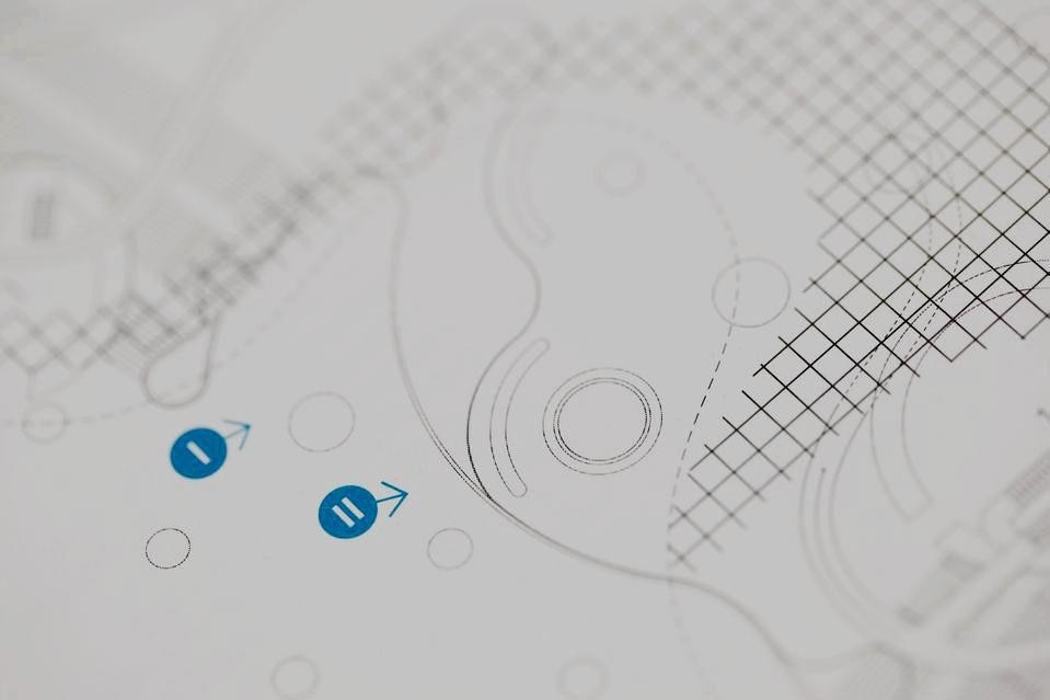
One of the first steps we took when we began to think of the new Domus was to verify how much text and how many photos and drawings, respectively, occupied the physical space of a single page in past editions. Our impression, represented in a visual diagram of this analysis, was that drawing no longer occupied the space and clarity that it should in an architecture and design periodical. Hence the decision to include at least one double-page spread of plans, sections and details for every project. Now, in Domus there are essentially no other architectural drawings outside these large pages; the abundance of white space makes it possible not only to study the drawings with no other disturbing elements, but also, perhaps trivially, to facilitate the reader in annotating and copying the drawings themselves. Copying a good project and redrawing it is the only way to truly understand and assimilate the nature of its design.
Another kind of drawing colonizes parts of the text, working with typography and introducing it almost mimetically—at least chromatically and in terms of the economy of the sign—between paragraphs and captions to add some visual system to those stories with underlying spatial complexity.

Finally, starting in the next issues, we want the use of information design to become even more present as an additional level of detail (thanks to the help of everyone at motocontinuo). We live in an increasingly complex, but invisible, world in which this same complexity needs to be shown to be understood.
The beginning of our publishing experience was marked by a strong and prolonged reflection on drawing. To continue this echo from a purely stylistic point of view would mean betraying its logic and what we might learn from this reflection. The use of the axonometric, exploded views and the decomposition of complex objects into layers, accompanied by areas of seemingly tangential meanings, is a very contemporary trend, and by working like this, I think we intercepted a way of feeling and seeing reality. With Domus, we would like to continue this research in a more comprehensive way, continuing to experiment and getting involved with questions regarding the world of visual design about which we still have much to learn.