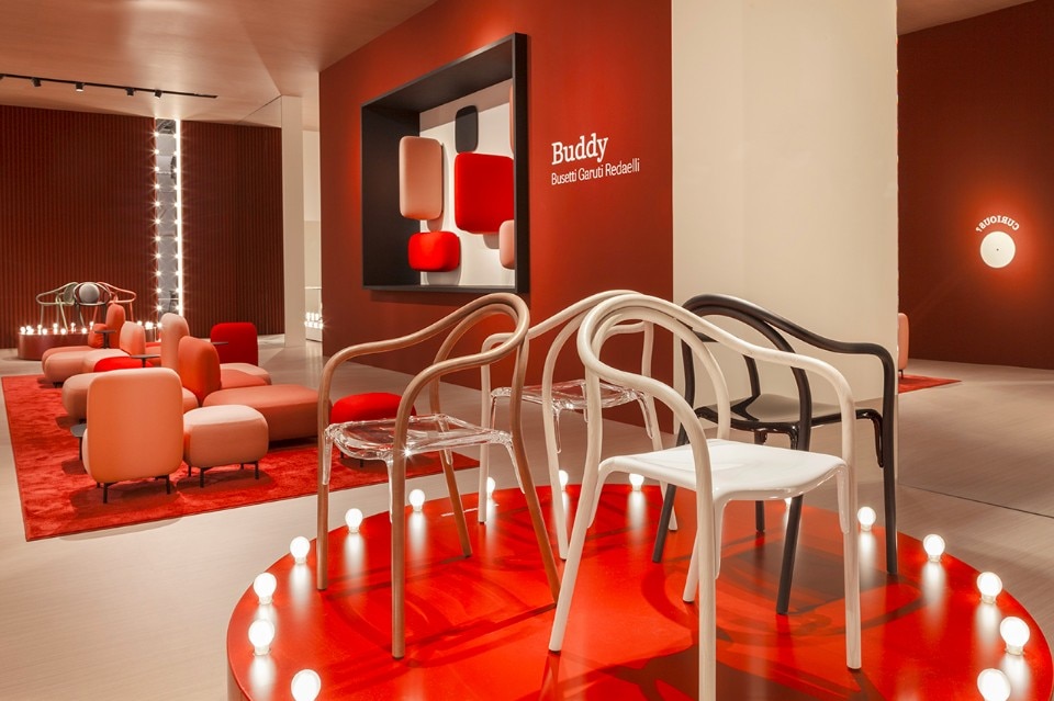
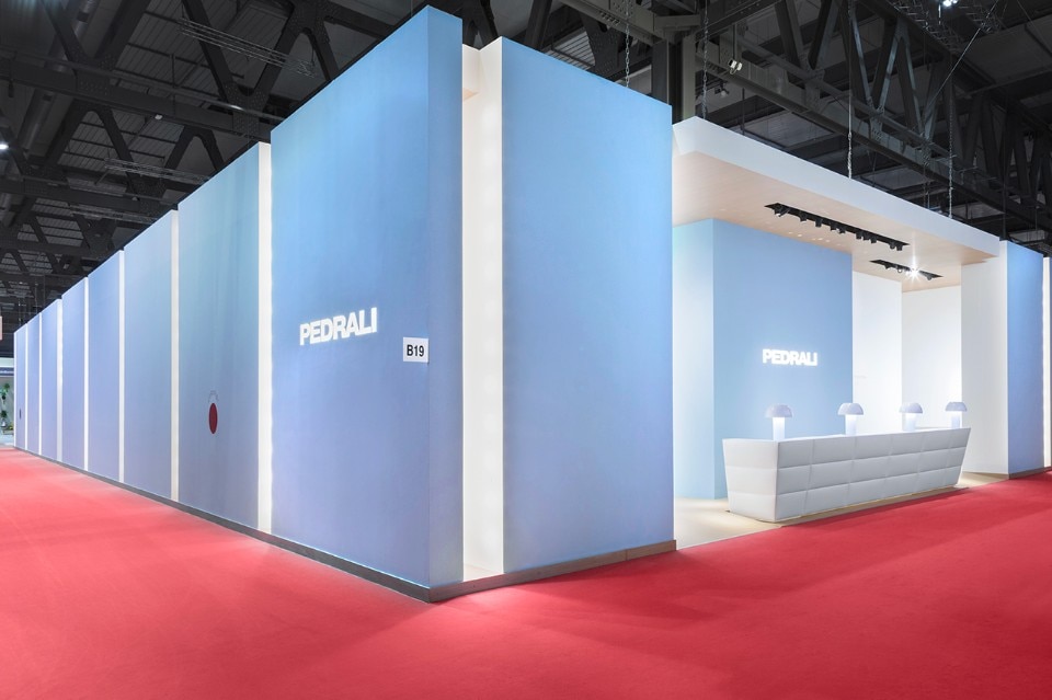
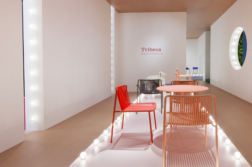
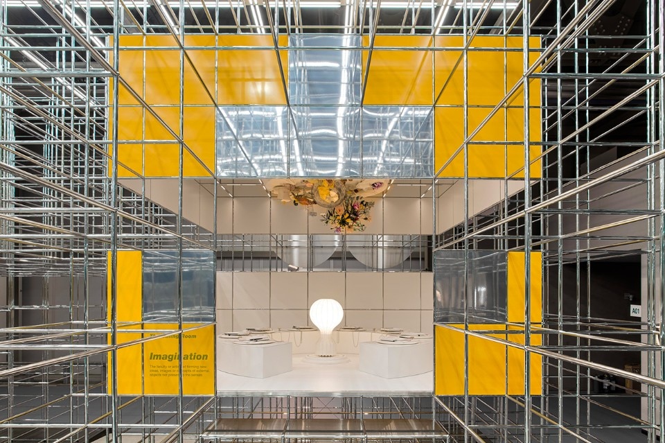
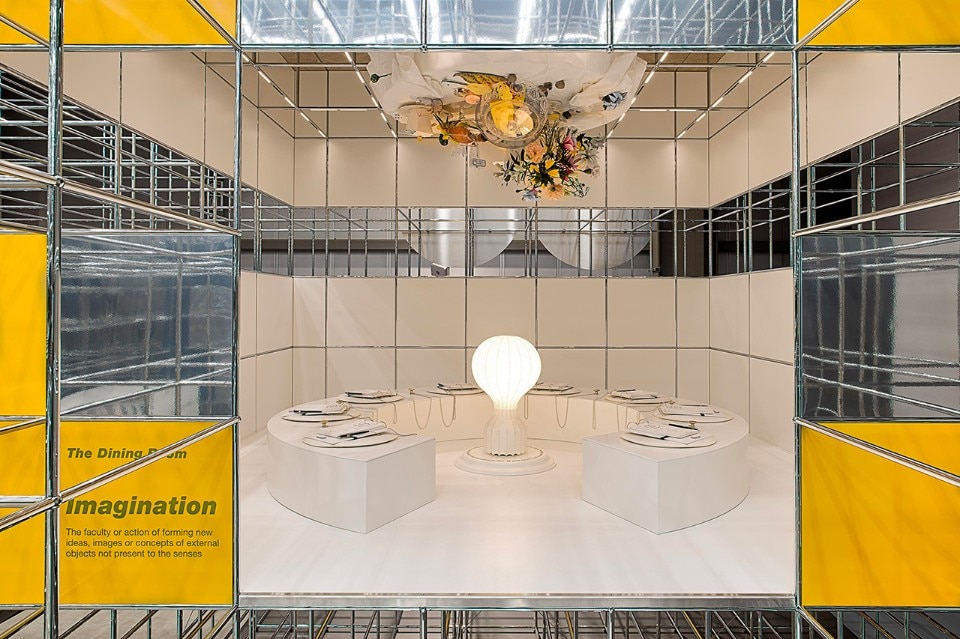
Pedrali by Calvi Brambilla
Hall 10 Stand B19-C28
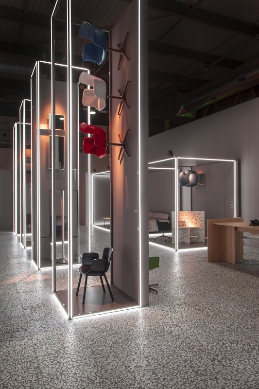
Eight hundred square metres laid out like a museum route divided into seven exhibition areas are distinguished by an unexpected feature: settings composed of small stages profiled by regularly distanced light bulbs in the classic way of the theatre. The effect turns the products into the stars of a show, standing in position, waiting for admiration from the public. The similarity is amplified by a mirror that reflects their image in an act of perhaps supreme narcissism as suited to all divas. Created by Calvi Brambilla, the light-bulb-based display is a twofold homage: to the "latest good ideas" campaign devised by the company from Bergamo (#pedraligoodideas) and to the Cuban-born American artist Félix González-Torres. The installation is at once a set design and a metaphor, a communicative element and a piece of architecture. The concept is also used to emphasise the external structure of the display, which takes the dramatic quality one step further by offering visitors the opportunity to look through peepholes on the back of the stand at two dancers interacting with some of Pedrali's iconic products.
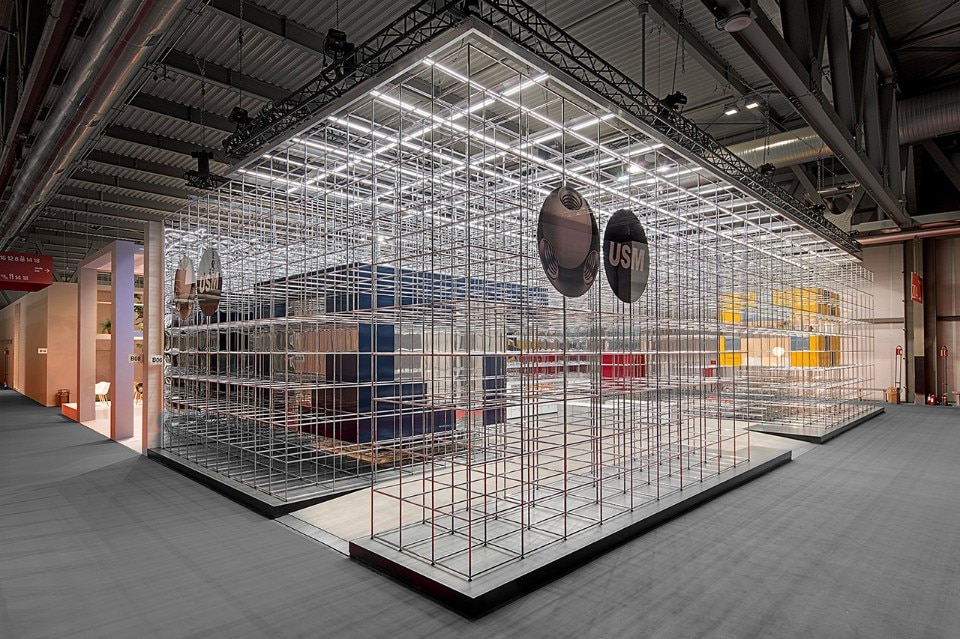
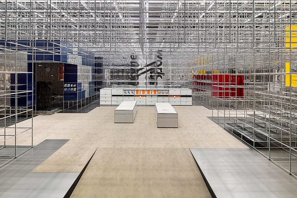
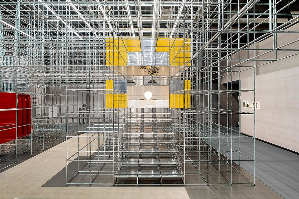
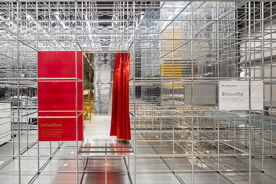
USM by UNStudio
Hall 20 Stand A07-B06
Designed by the Futures team at UNStudio, the USM stand looks like an architectural construction straight out of a science-fiction movie, but with a retro flavour, like a hideout that might have belonged to the comic-book character Diabolik. The effect is obtained in a simple, brilliant way by multiplying the modular basic element of the USM steel frame. A naked skeleton made up of 13,318 tubes incorporates a bathroom and a work room that are halfway between house and office, imprisoned by a spiderweb that represents the opposing forces emanating from duty and pleasure. The display by UNStudio underlines the contemporary hybridisation of these two settings, and how to structure them so as not to pollute them: by concentrating on the human qualities that distinguish us from machines. It is a reference to how automation will give us more free time to spend on ourselves and our social relations, unlike in the past, which is represented here by a cubicle where three secretaries from the 1950s tap ceaselessly on typewriters, divided by screens that prevent them from interacting.
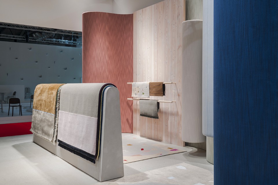
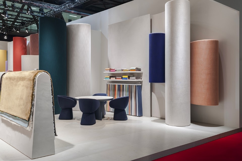
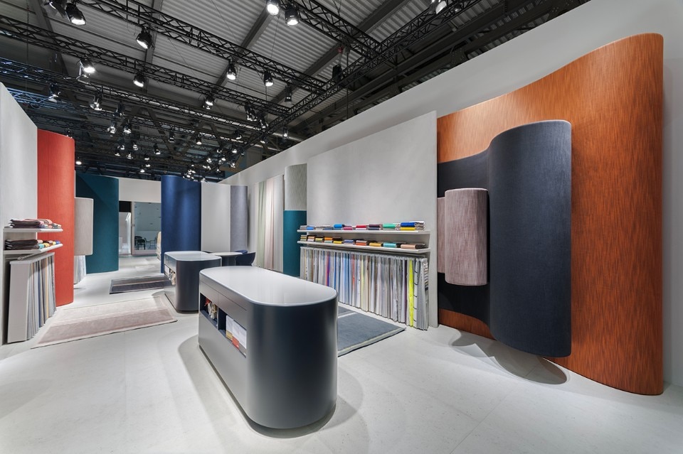
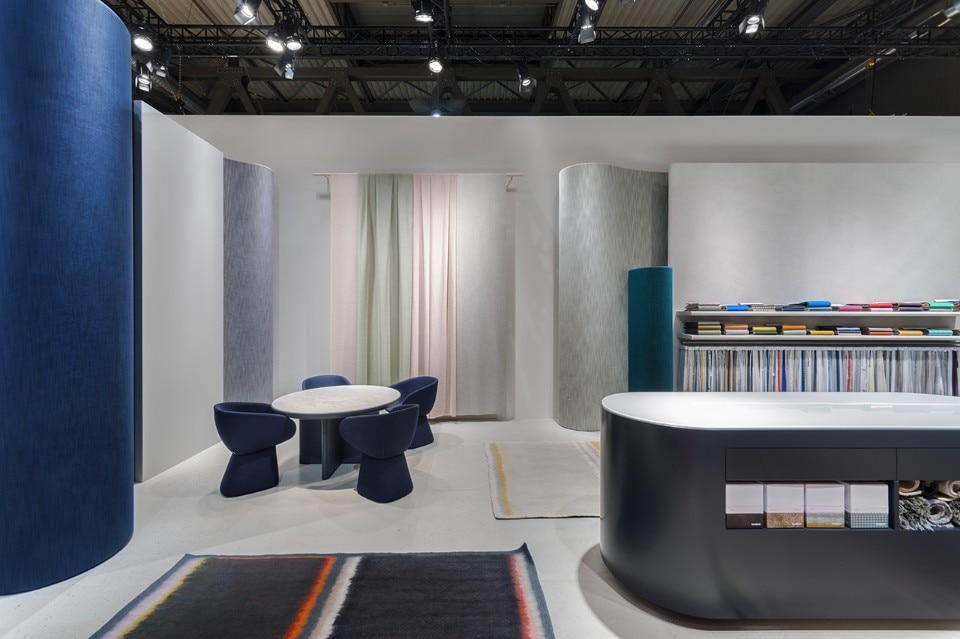
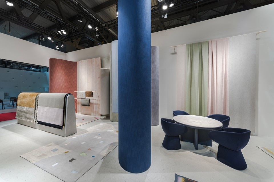
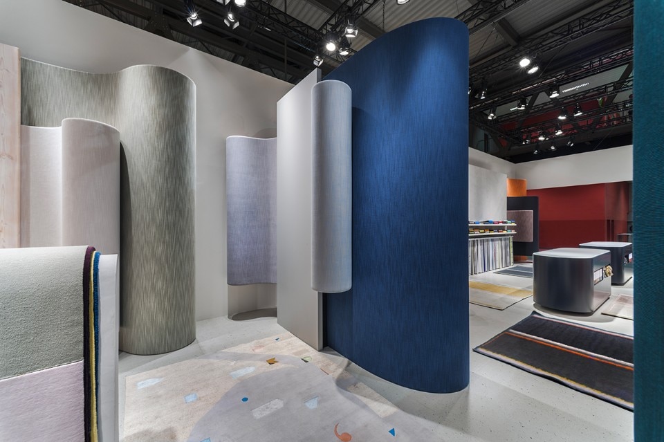
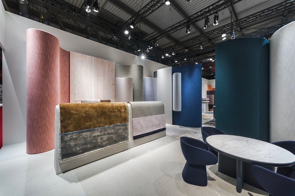
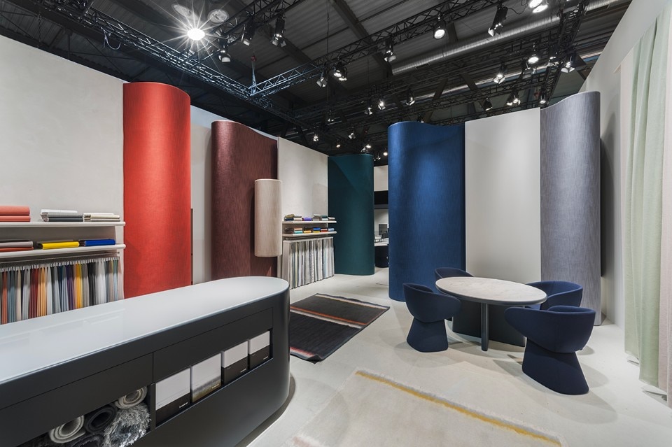
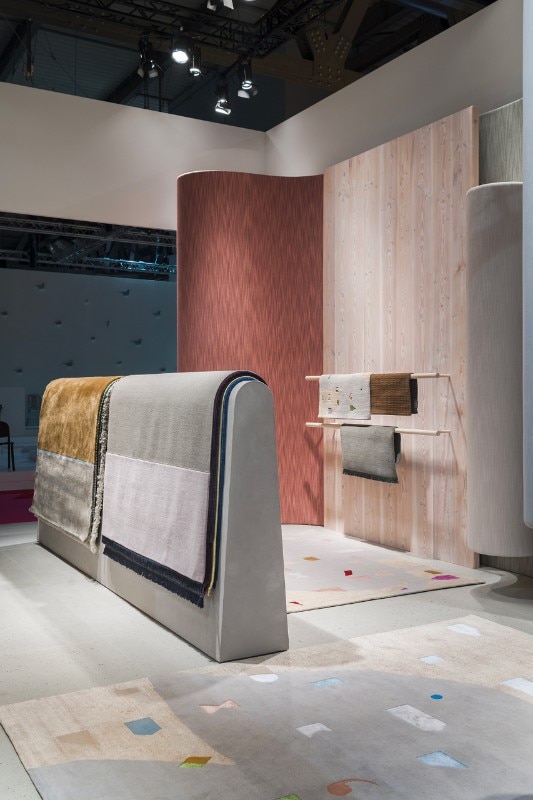
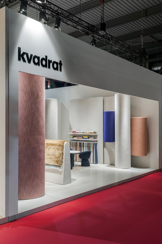
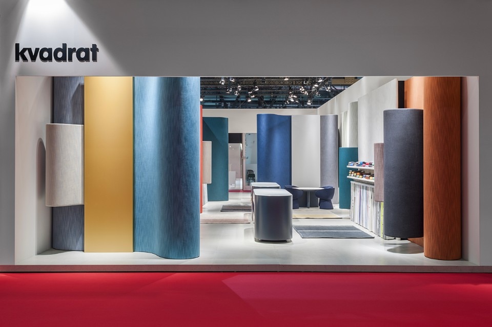
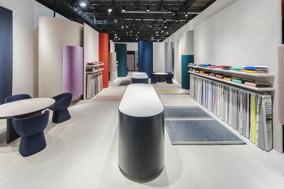
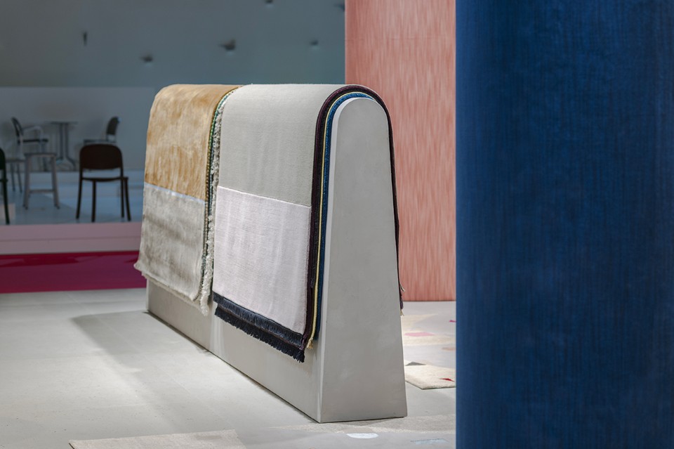
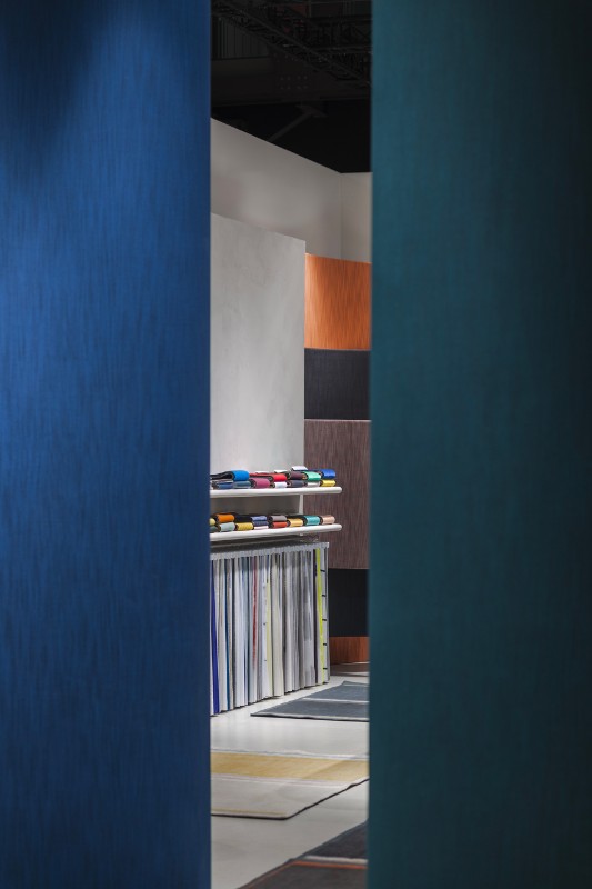
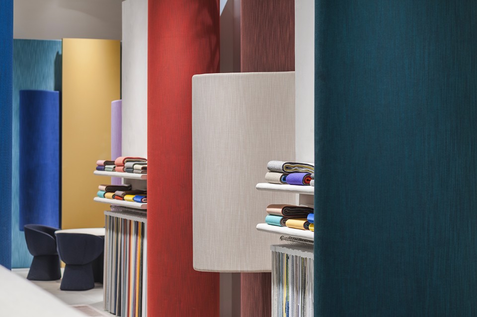
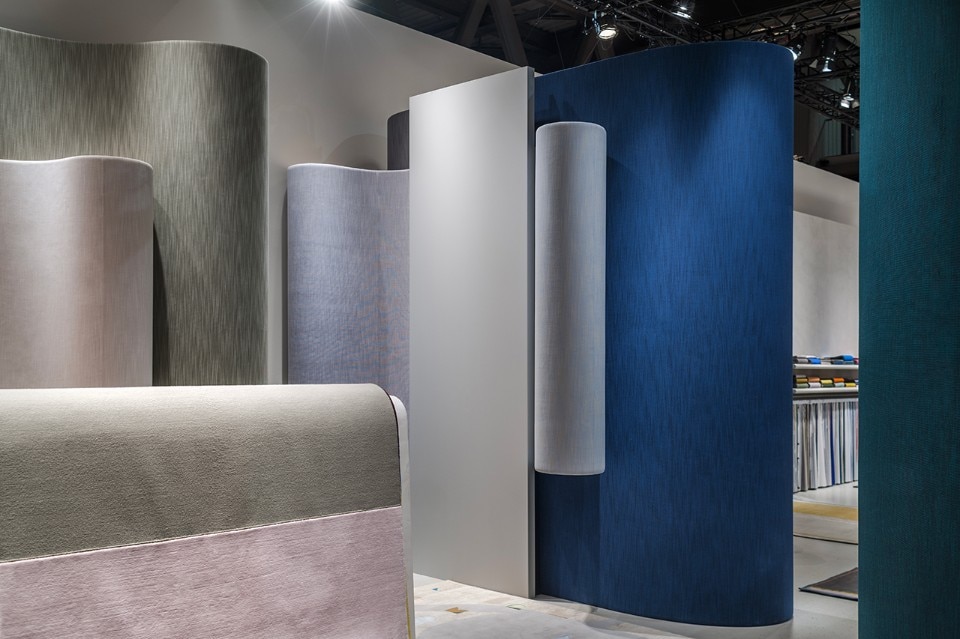
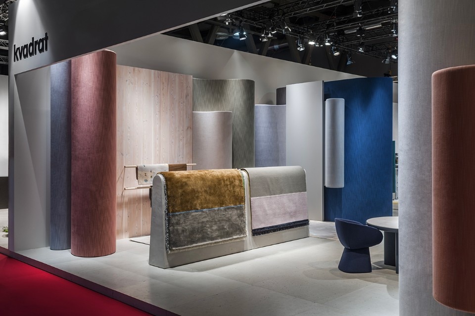
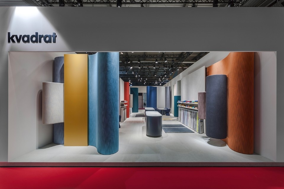
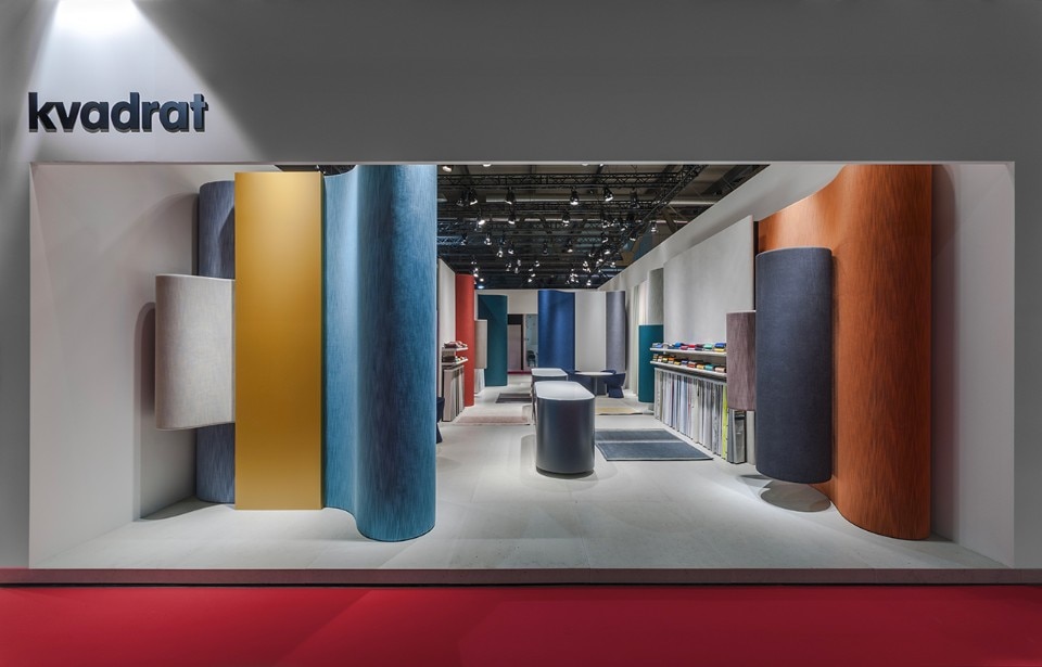
Kvadrat by Doshi Levien
Hall 20 Stand E25-F22
The concept by Doshi Levien, a real-life couple formed by Nipa Doshi from India and Jonathan Levien from Scotland, is "vertical waves". Standing at different heights, these are covered with the new Kvadrat fabrics Raas and Lila they designed (both 92 per cent wool + 8 per cent nylon). Commenting on their first stand design, they say, "We wanted to obtain an image of extreme softness that gracefully would invite visitors to enter the space. To design a stand is a natural evolution of our creative process. In this specific case, seeing it was for Kvadrat, we took inspiration from acoustic systems that protect rooms from noise. Usually, these are distinguished by special shapes and textures." Narrow and long, open on the short sides, the stand is meticulously studied in the chromatic sequence of the different fabrics. Pauses of neutrality are given by raw wood and grey surfaces. Together with wall and floor supports that carry draped fabrics and rugs, these break the elegant rhythm of the waves of fabric, but not the harmony. "This is our total concept of architecture, sculpture and the study of materials, the three elements that form the basis of all our studies. Raas and Lila, for instance, were inspired by ceramics from Sèvres, Byzantine art and the palaces of Jaipur."
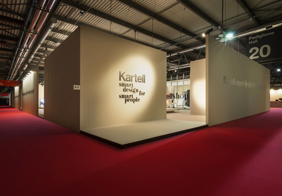
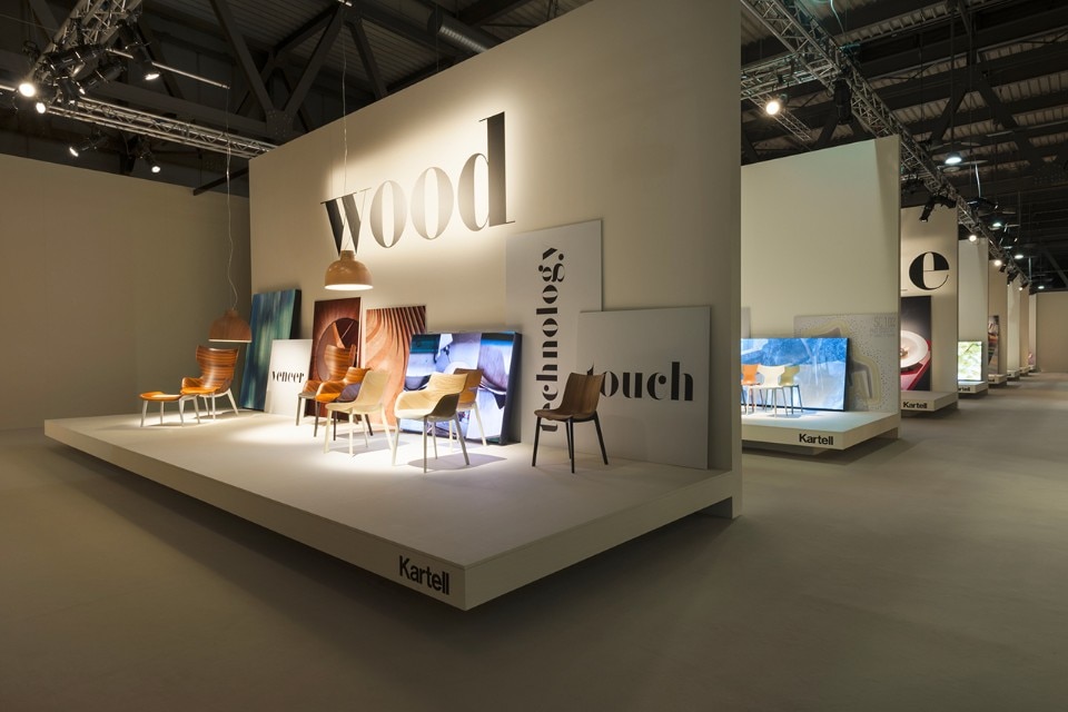
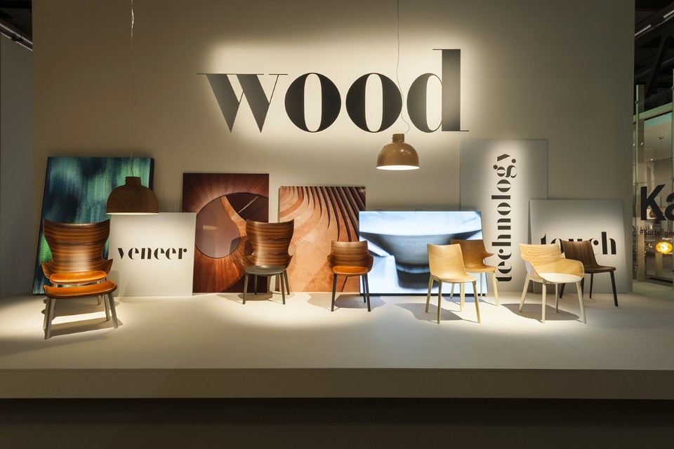
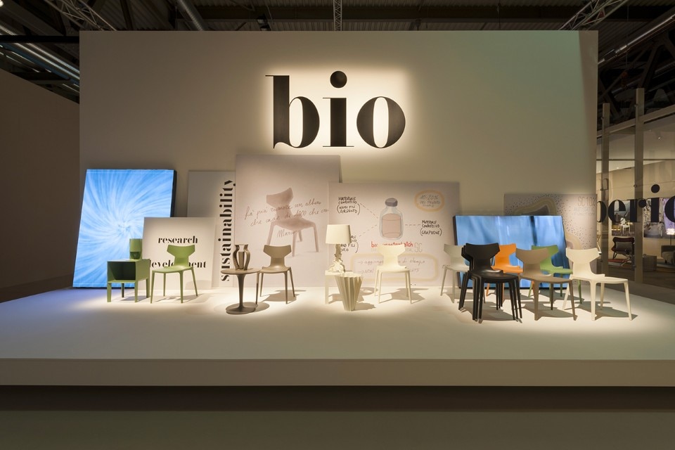
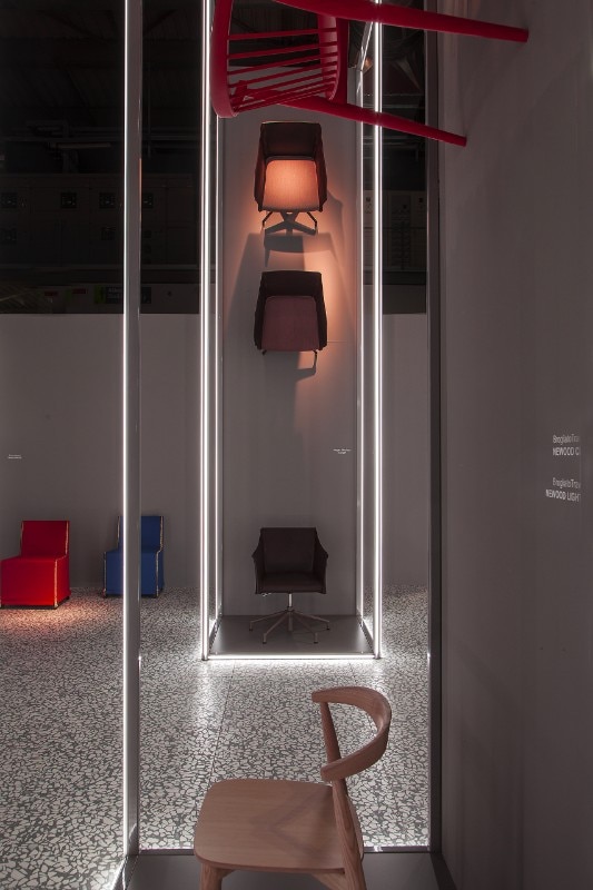
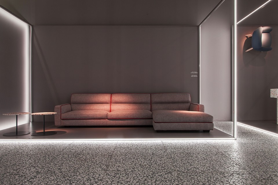
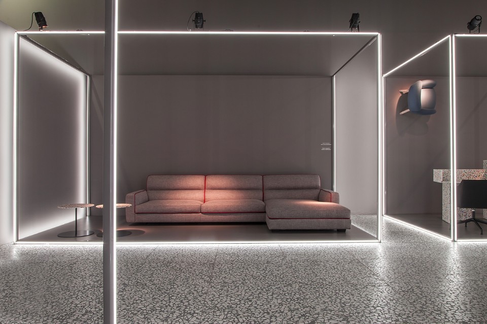
Kartell by Ferruccio Laviani
Hall 20 Stand A15-B14
All white, this stand is structured by a parallel sequence of eight giant L-shaped platforms, each dedicated to a specific product. Ferruccio Laviani's stand for Kartell is monumental but not oppressive. Rather it is elementary and comprehensible to everyone, from the general public to design professionals, who are welcomed in a new type of retail space where the Kartell lifestyle concept is unfurled. The presentation of the new products is made more impactful by iconographic research that strengthens their image, along with video screens. This display can also be read as a play of miniatures. With an effort of imagination, the pedestals become shelves holding furniture-shaped toys, juxtaposed with personal elements such as photographs, sketches, notes, memories and objects. As in a typical private space, these items are organised in a fresh, light way, overlapping one another slightly. The problem of the captions, which are lengthy and detailed, is resolved by an intuitive spatial correspondence, inserting the texts on the wall opposite each macro group.
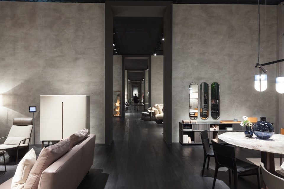
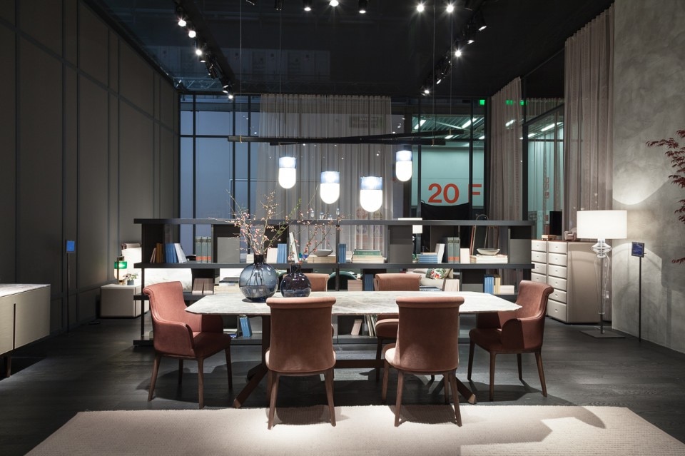
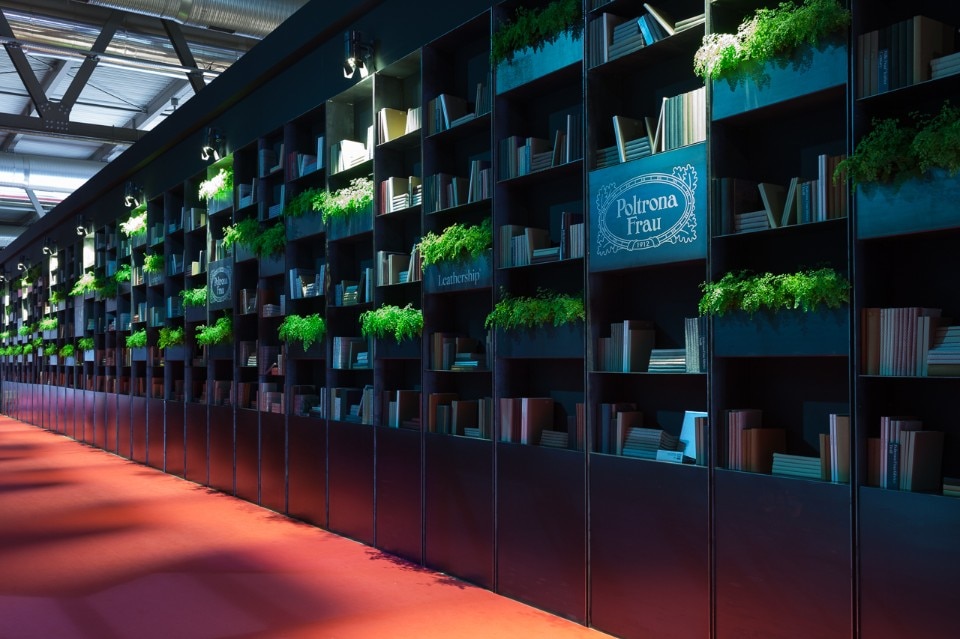
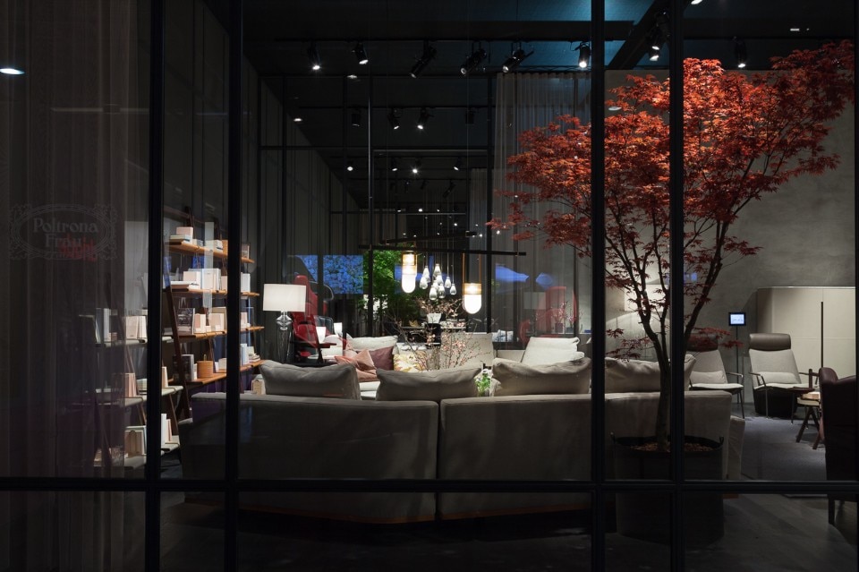
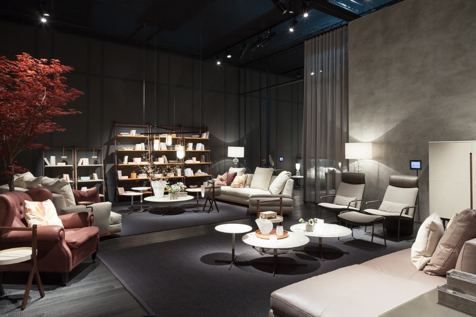
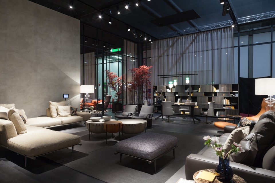
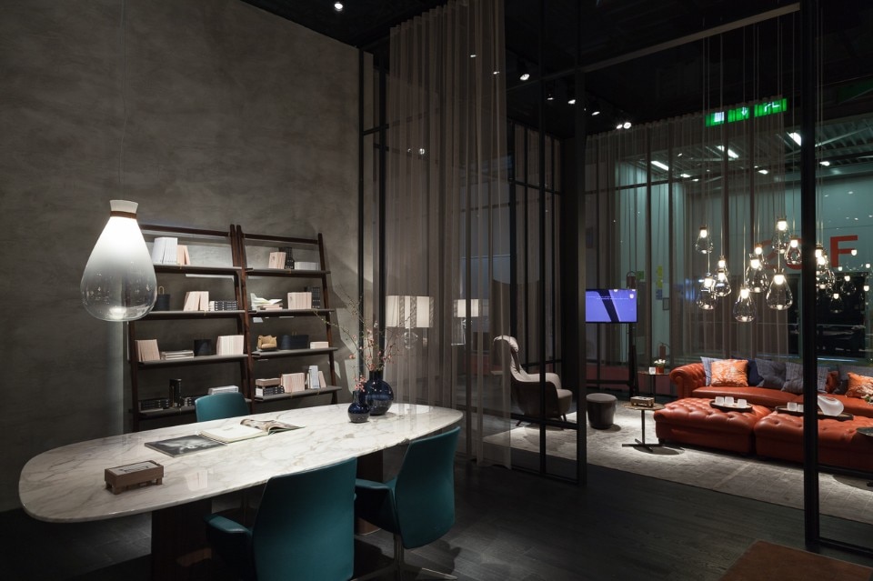
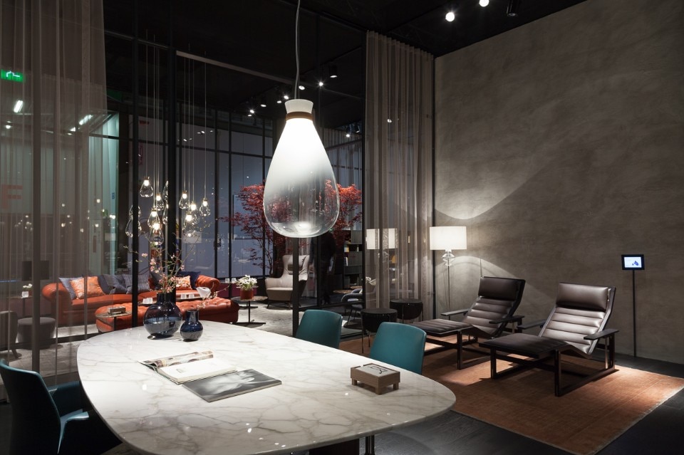
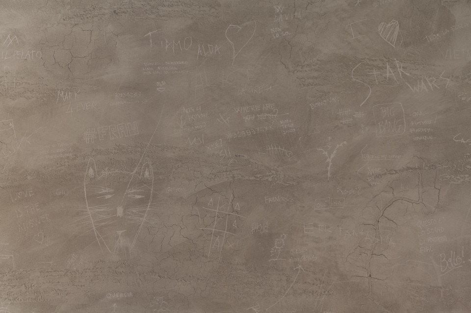
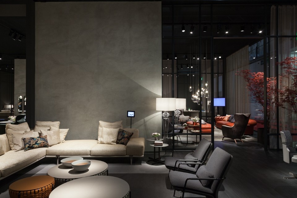
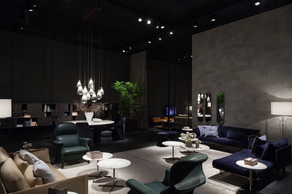
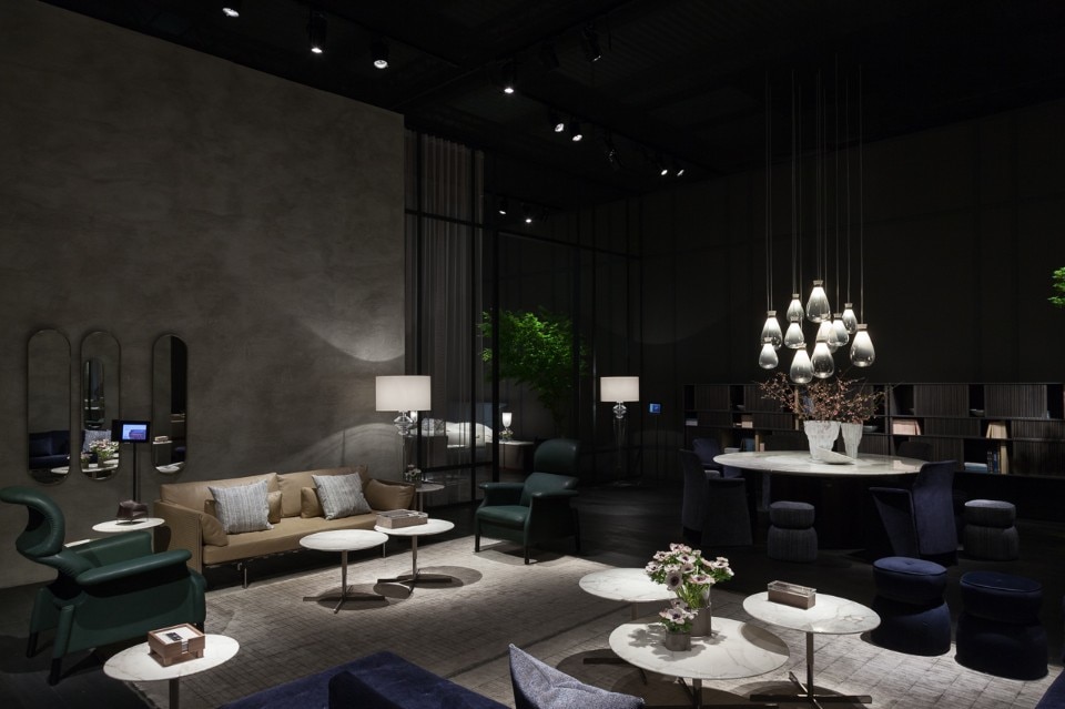
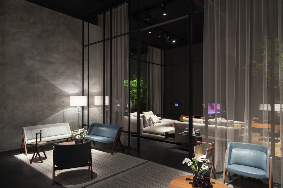
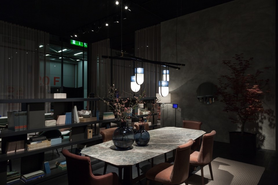
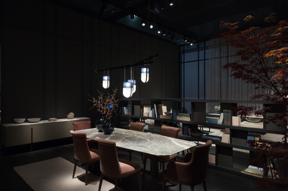
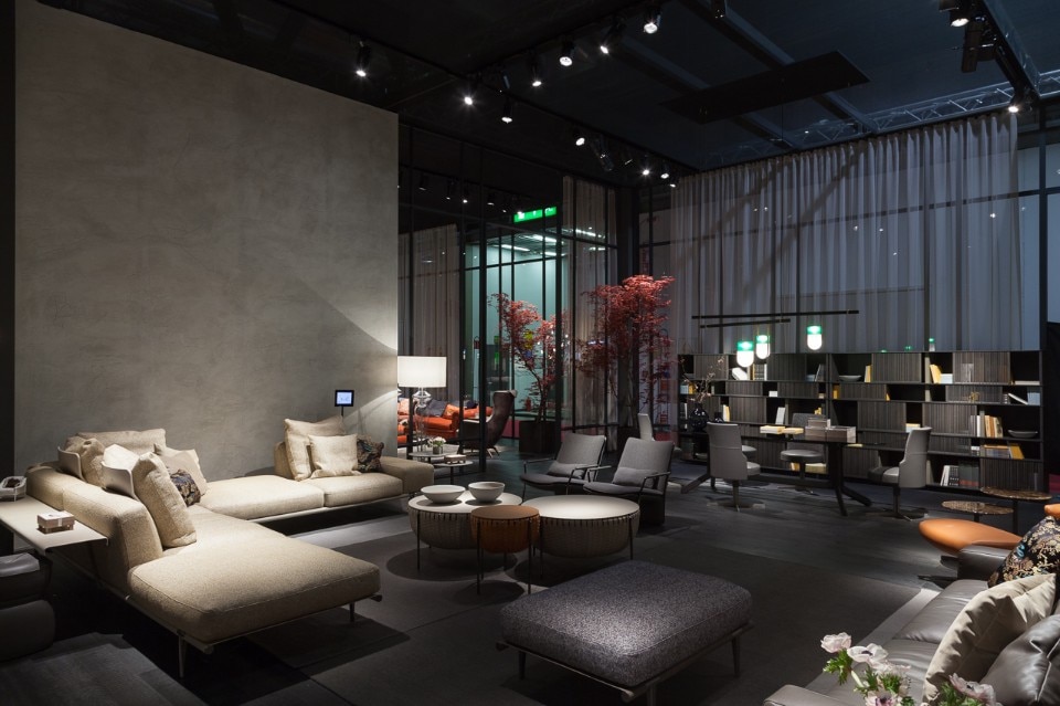
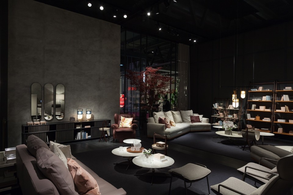
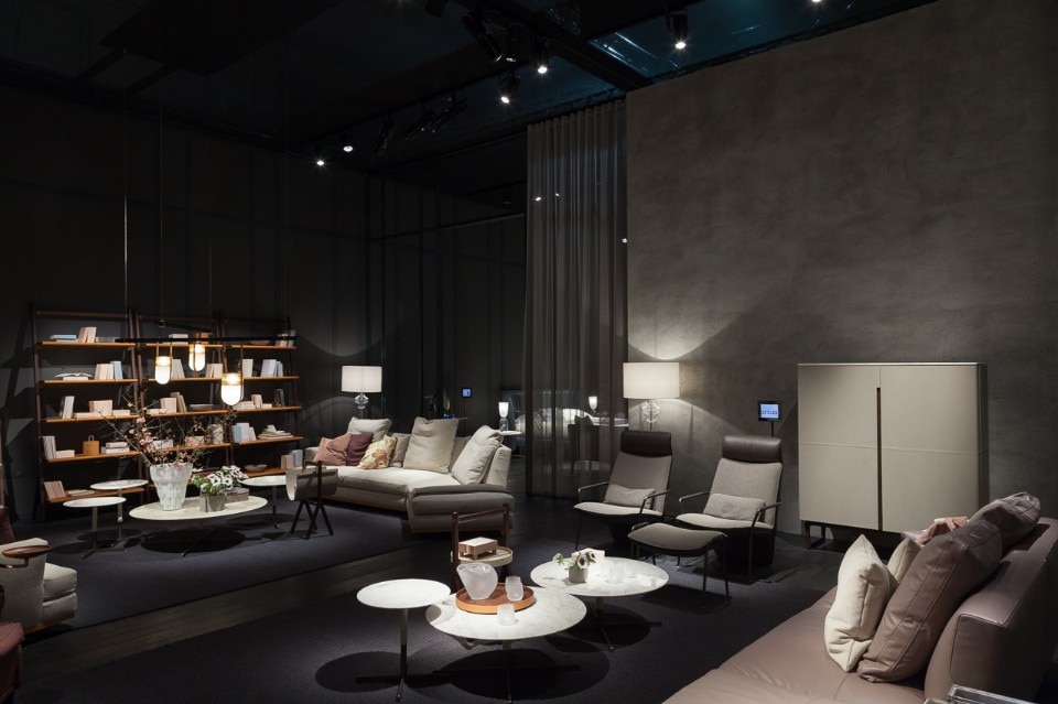
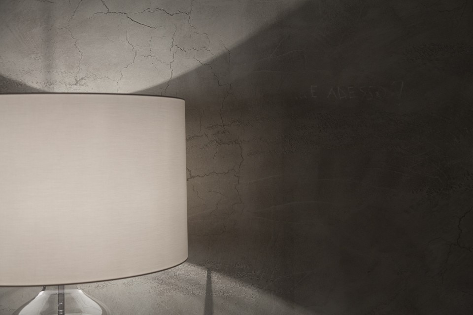
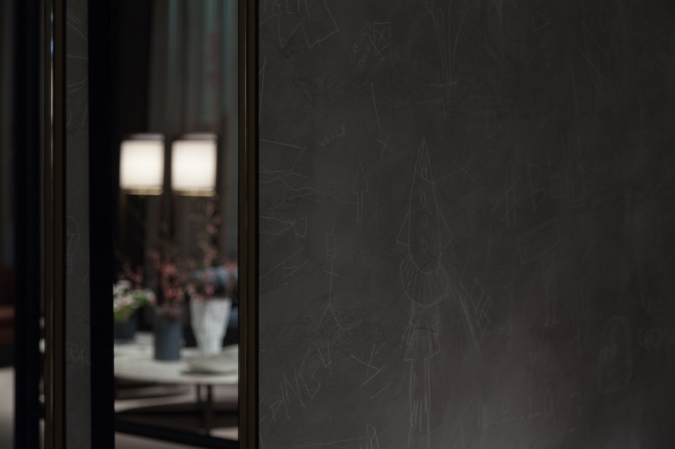
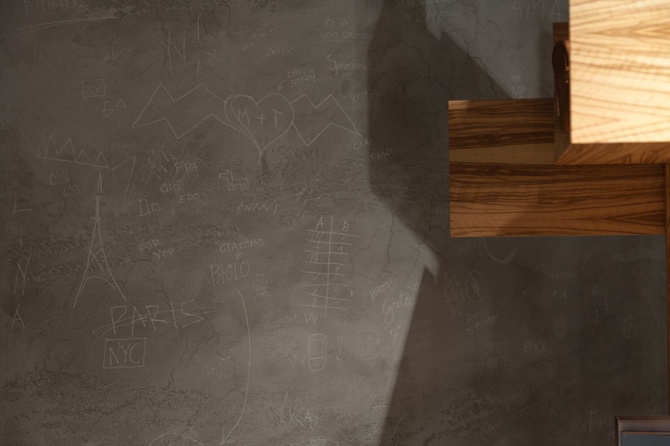
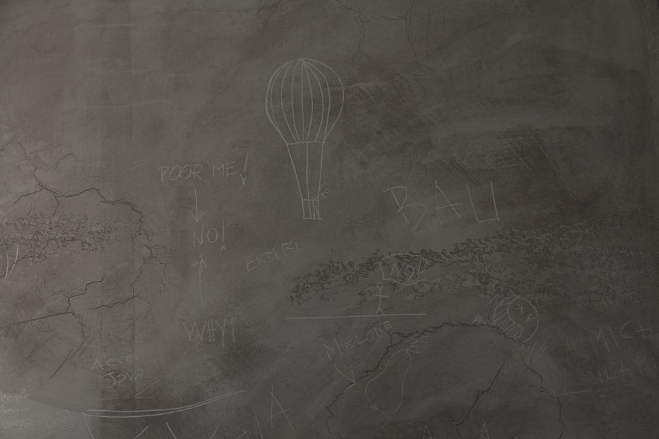
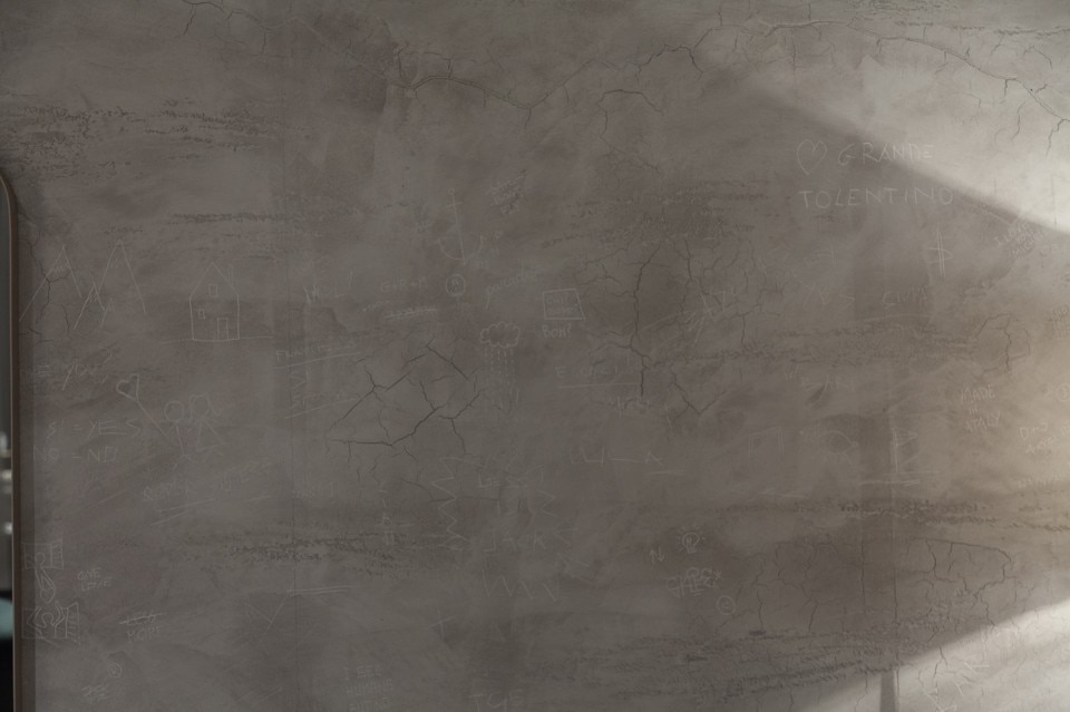
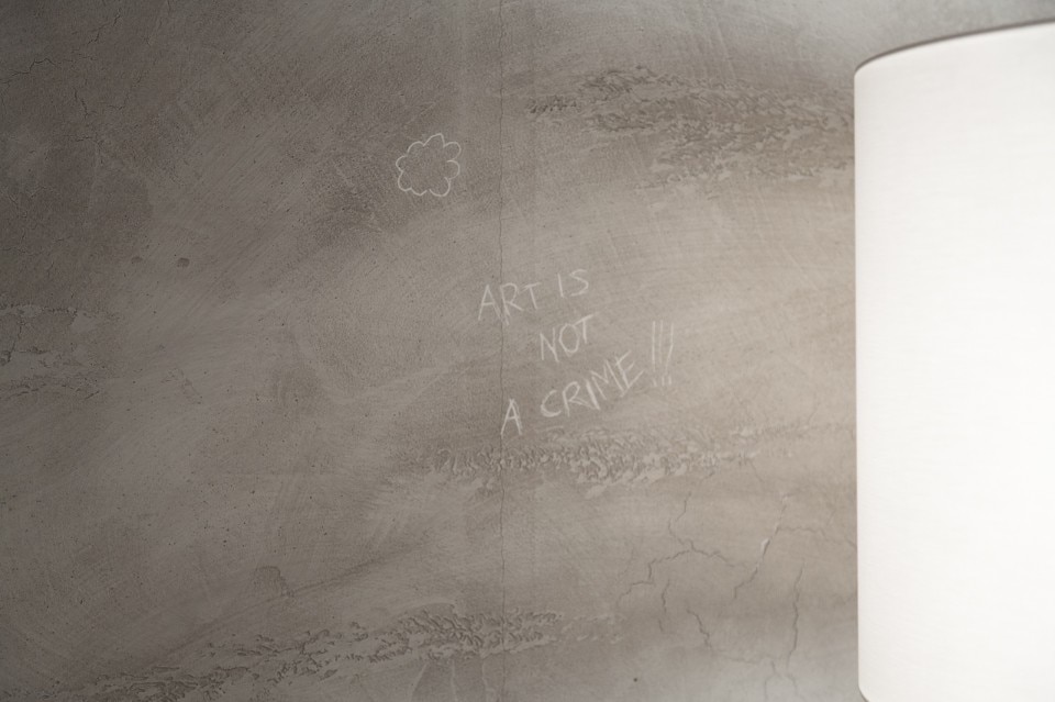
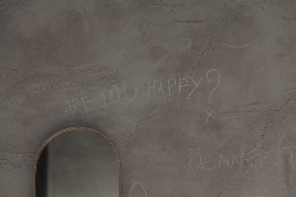
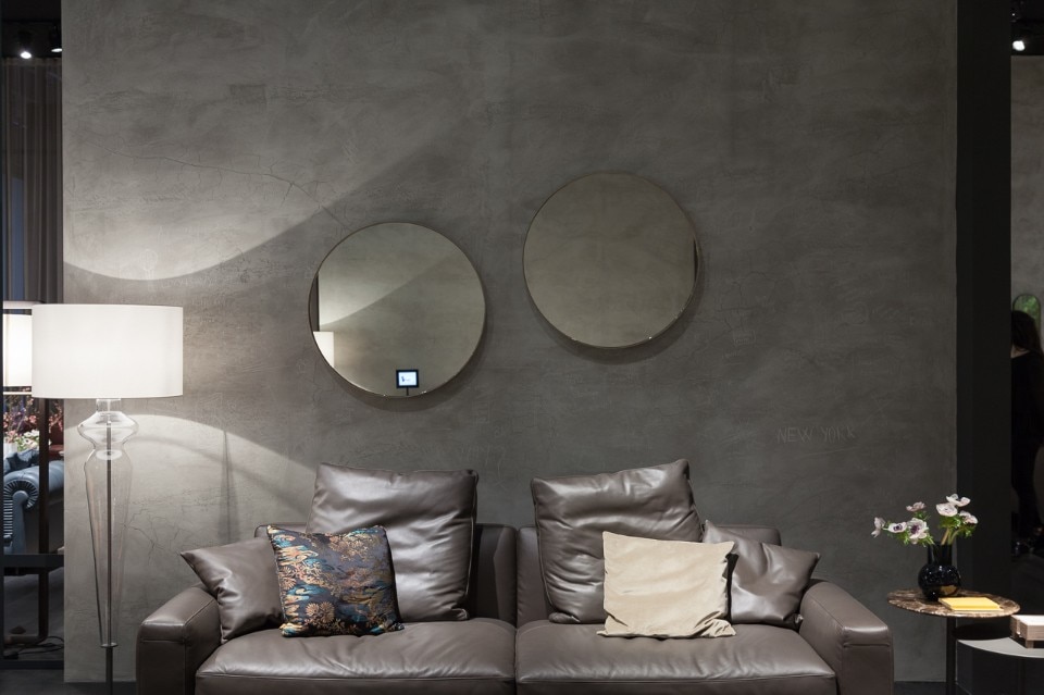
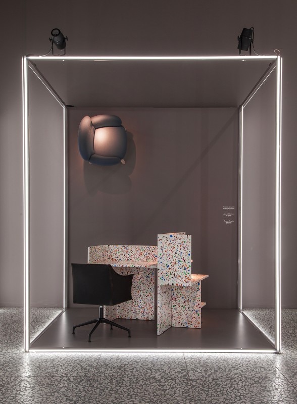
Poltrona Frau by Michele De Lucchi
Hall 20 Stand E 01-02-06-04
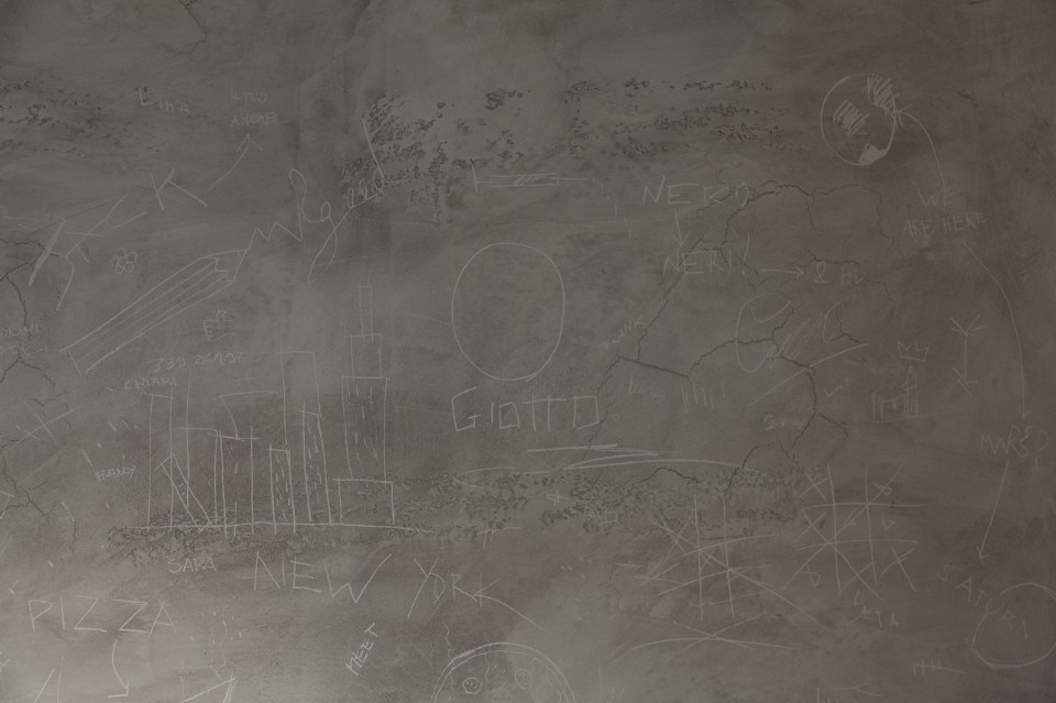
Neither shop nor showroom, the Poltrona Frau stand by Michele De Lucchi is a theatre open to the public, an invitation to interact with its structure. As is habitual here, the concept of perspective is key, but this year it is enriched with a consideration of equilibrium, summarised by De Lucchi: "The proportions not only represent harmony, but also find relations between solids and voids, light and shadow, what is concealed and what is revealed, an idea of beauty and the scars of time." To arrive at this condensation, the space is composed of a handful of architectural elements, a mix of classical inspiration and contemporary visual languages. In a play of contrasts, the solidity of the masonry walls cohabits with the lightness of the loggias built in metal and glass. The coarse walls cohabit with the perfection of the Poltrona Frau products. This network of forces is perhaps "jeopardised" by an act of vandalism taken from the work of the artist Rudolf Stingel: the possibility (otherwise irreconcilable with the formality of a trade-show display) to mark the surfaces of the walls with doodles, signatures and drawings. These gestures intensify the expressiveness of De Lucchi's idea of a space dedicated to our imagination, even if it is polemic.
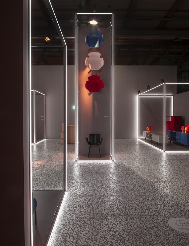
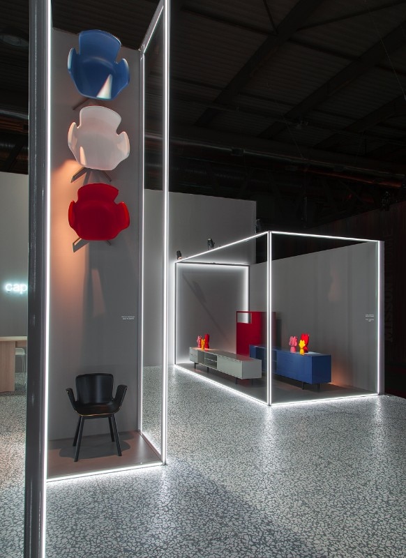
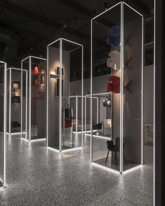
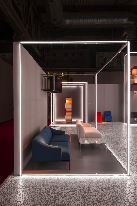
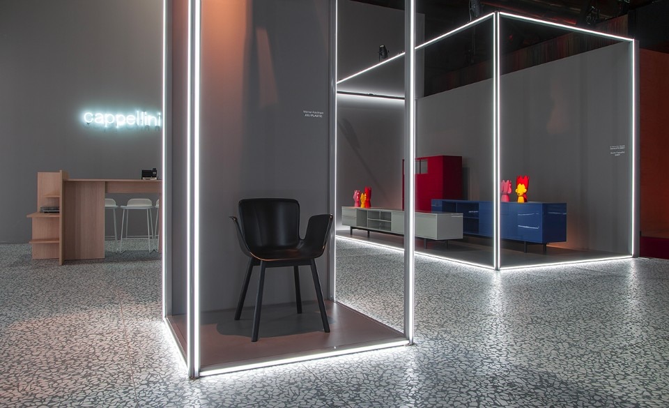
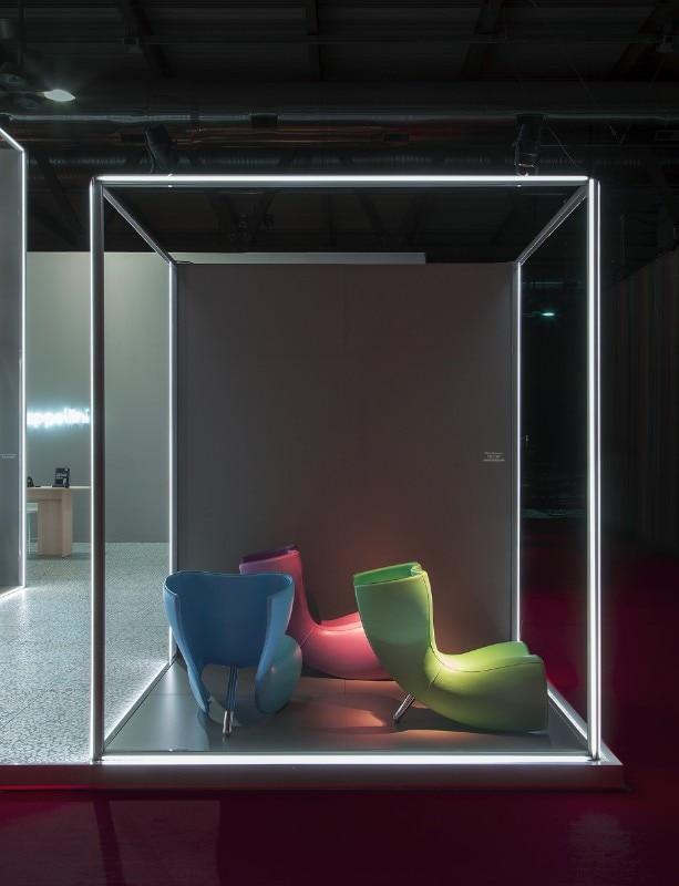
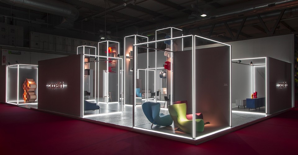
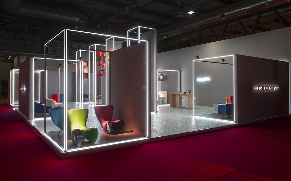
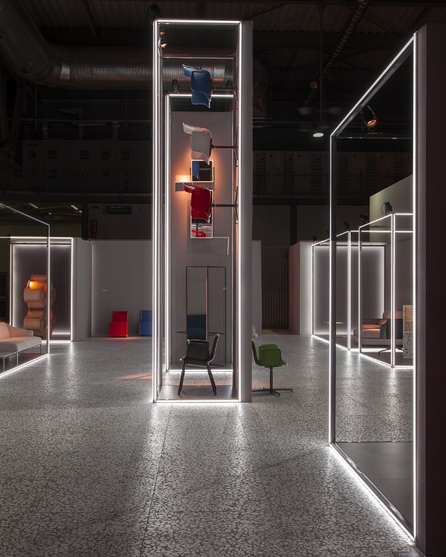
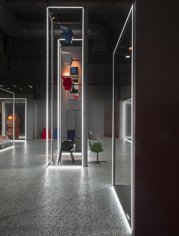
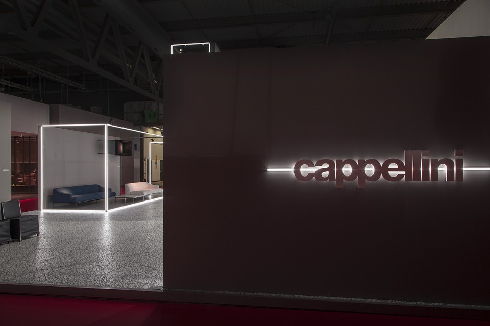
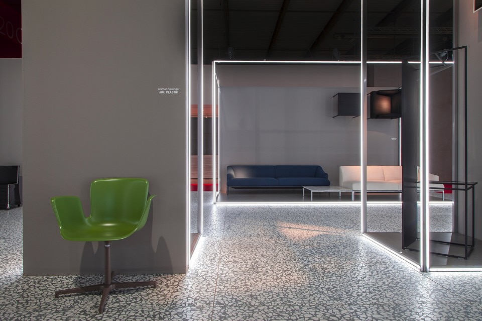
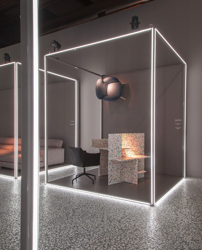
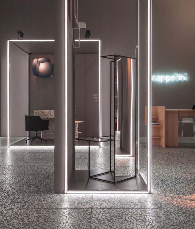
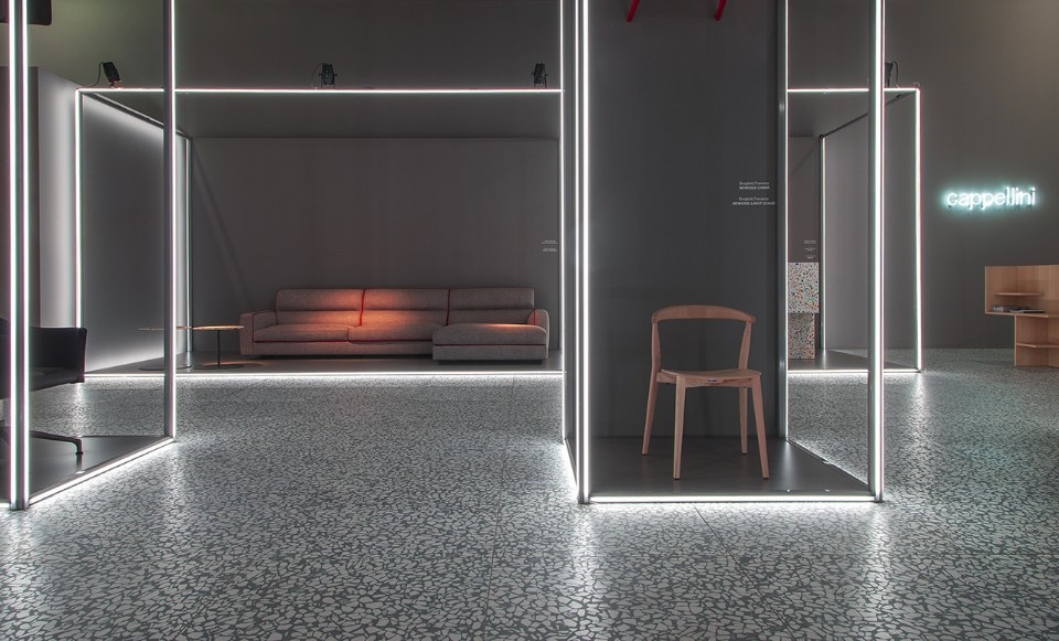
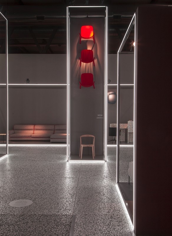
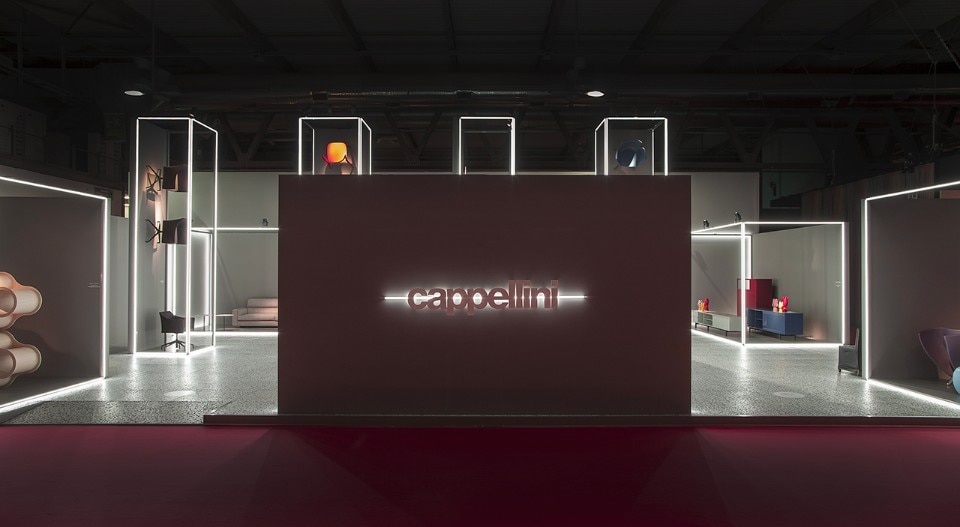
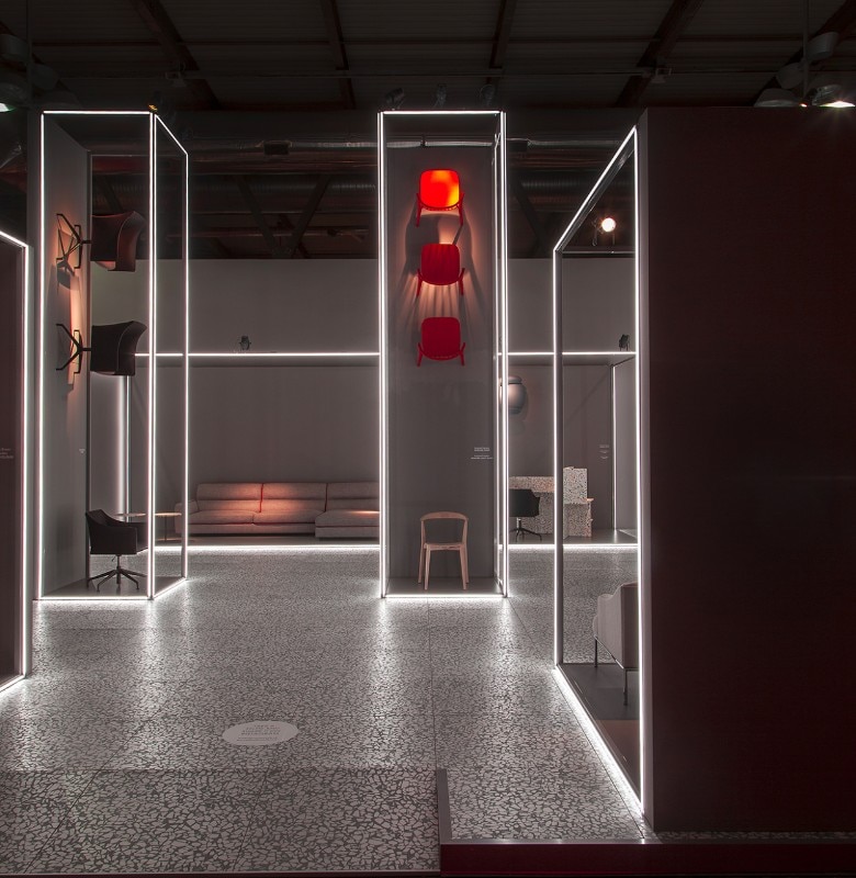
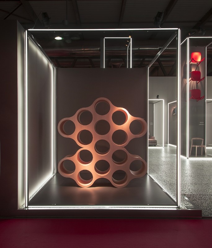
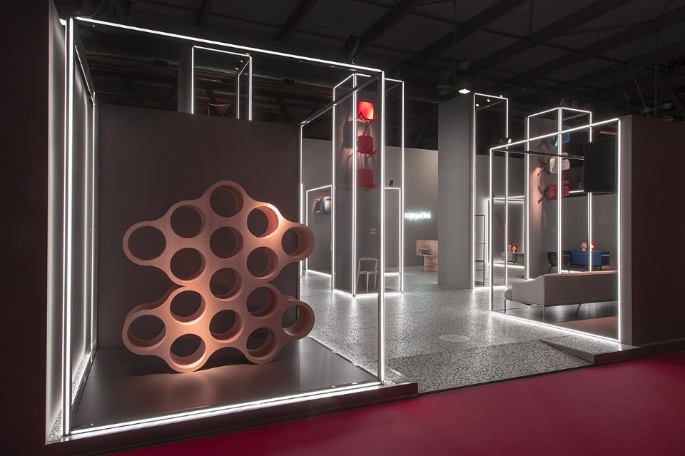
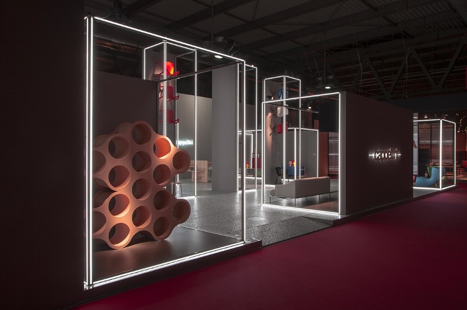
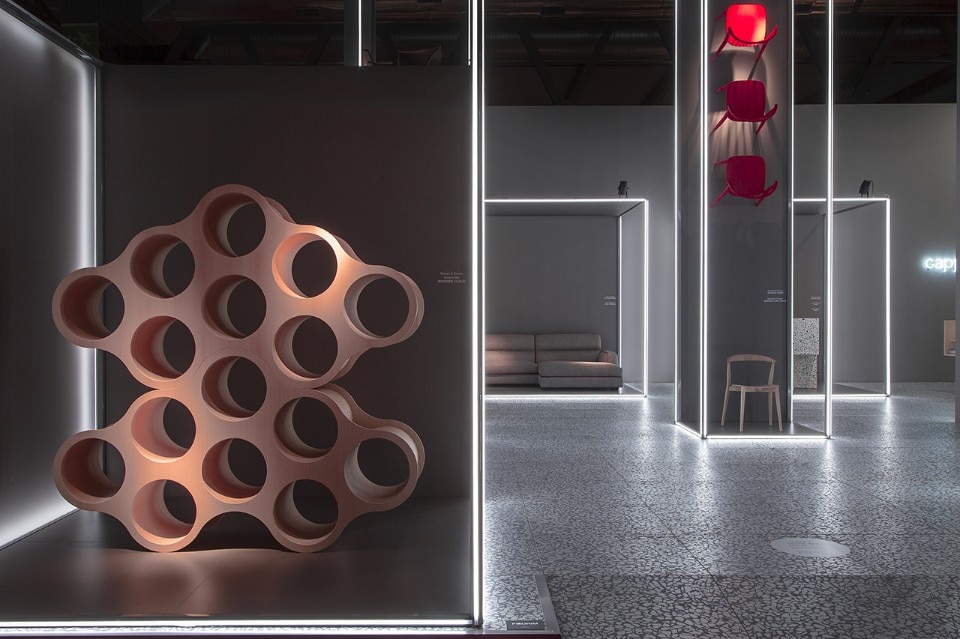
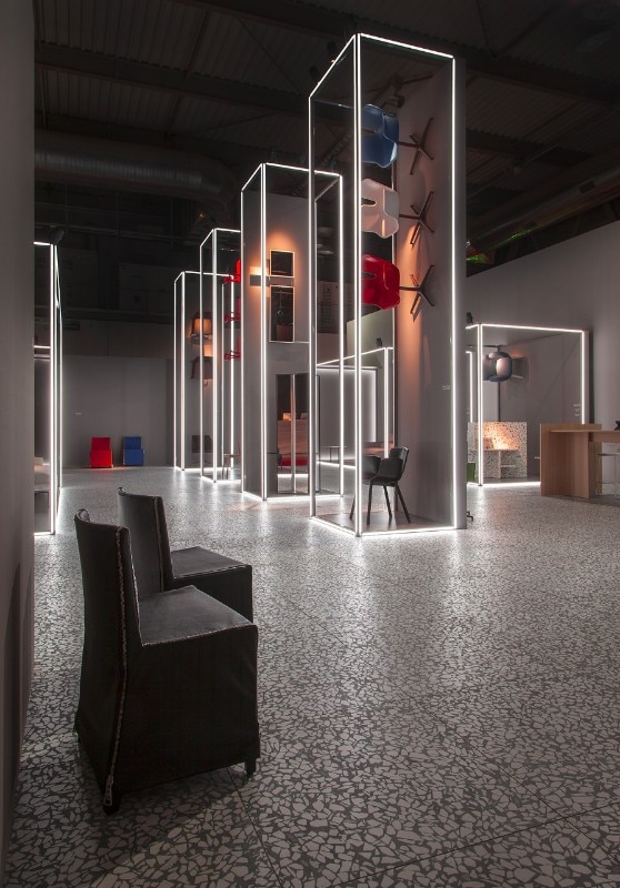
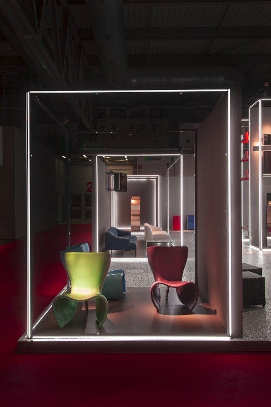
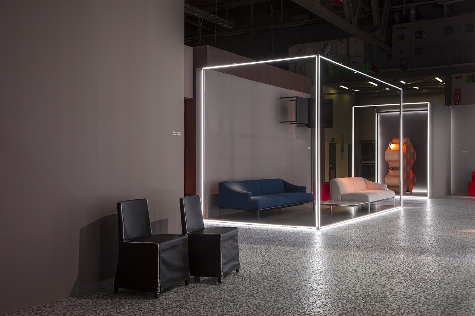
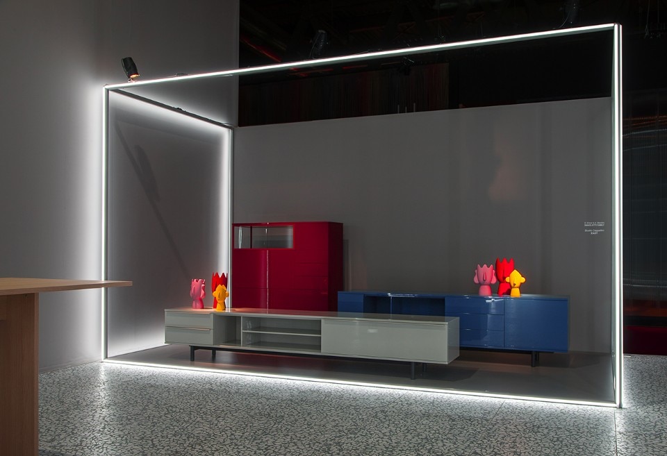
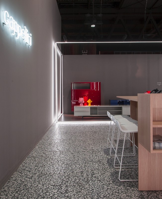
Cappellini by Giulio Cappellini
Hall 20 Stand C01-C03
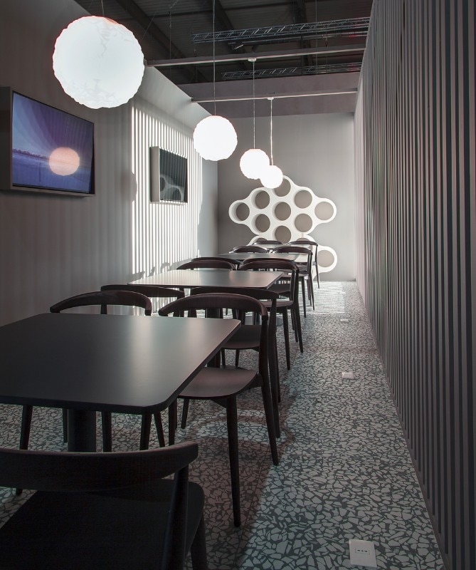
Giulio Cappellini's stand is a volumetric sequence of hollow towers and boxes profiled with neon. Inside them, the new collections are housed. This set design is reminiscent of museum displays of contemporary art, particularly the work of Dan Flavin and Lucio Fontana. It is an homage to them, but not so direct. The stand represents a way of organising the space, where architectural influences are joined unequivocally by clarity of organisational thought, fully concentrated on the beauty of the new designs. The effect is helped by the use of grey for the surrounding walls and by the terrazzo floor with tone-on-tone marble chips. The economy of expressive means does not lessen the wow factor that we have come to expect from a stand at the Furniture Fair. To the contrary, it offers a lesson to those with stands overflowing with scenographic objects that drown out the evaluation of the single pieces. Following the "less is more" maxim when it comes to dressing the stage is always a good idea, as long as the products feature the opposite thinking in the research phase. And that is something that Cappellini has definitely made its philosophy.
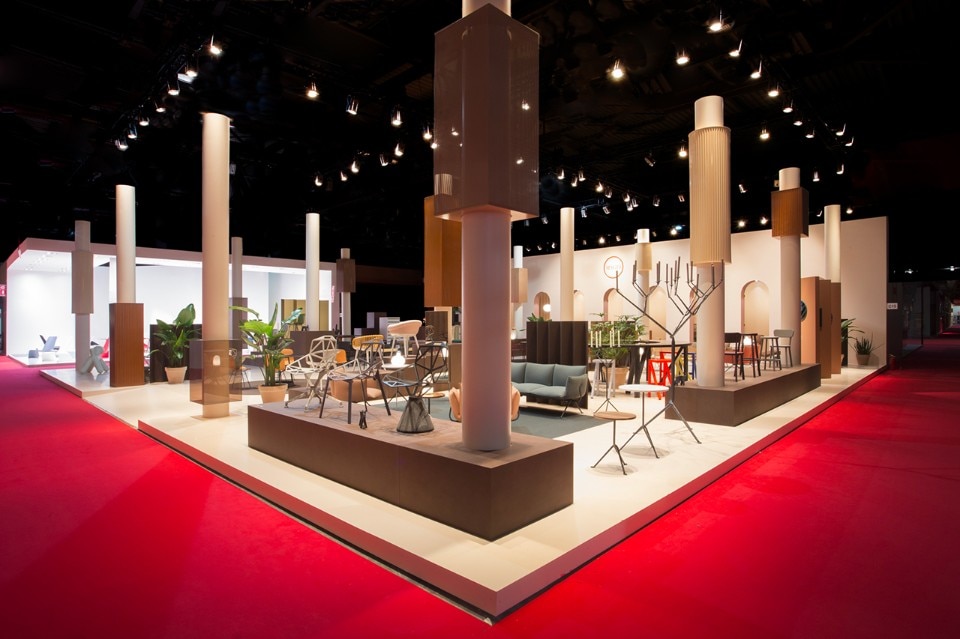
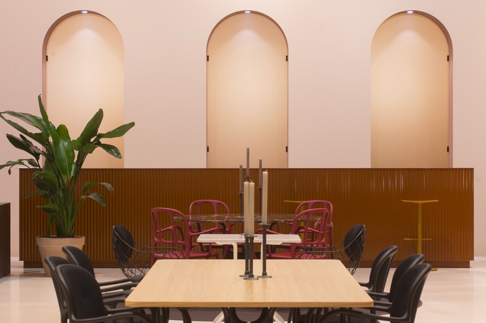
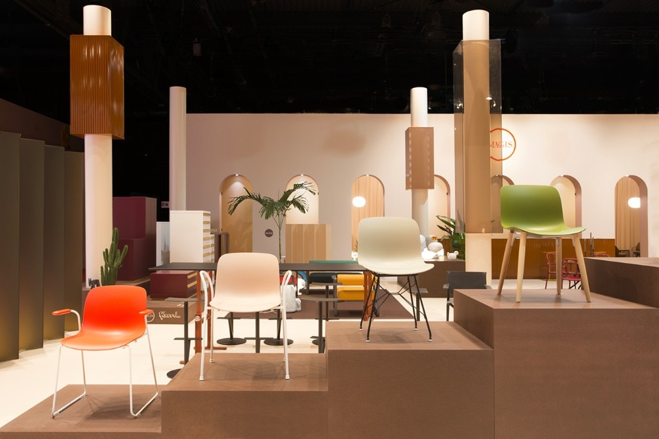
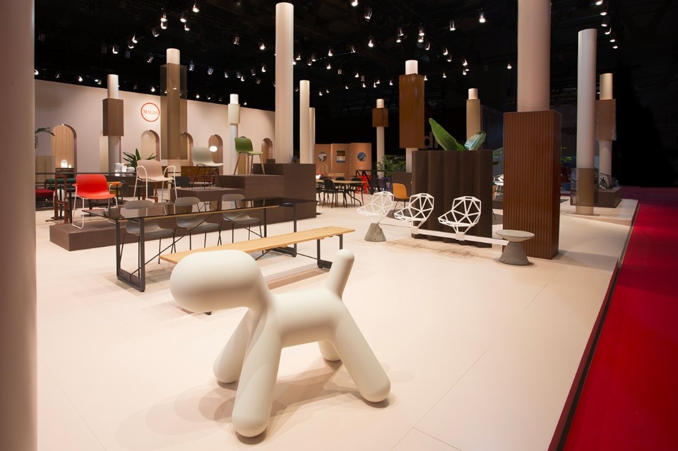
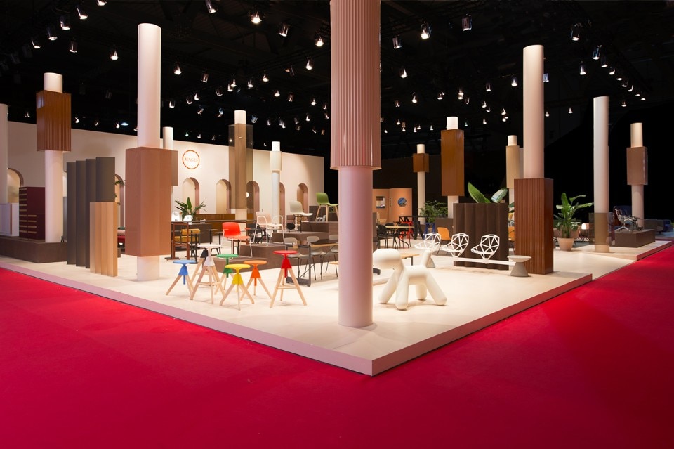
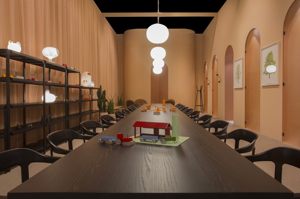
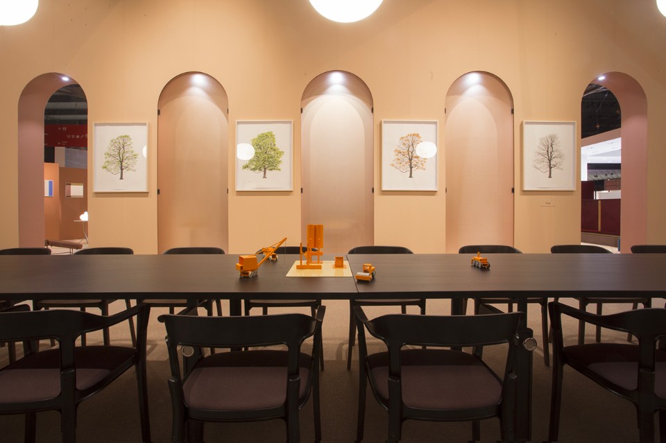
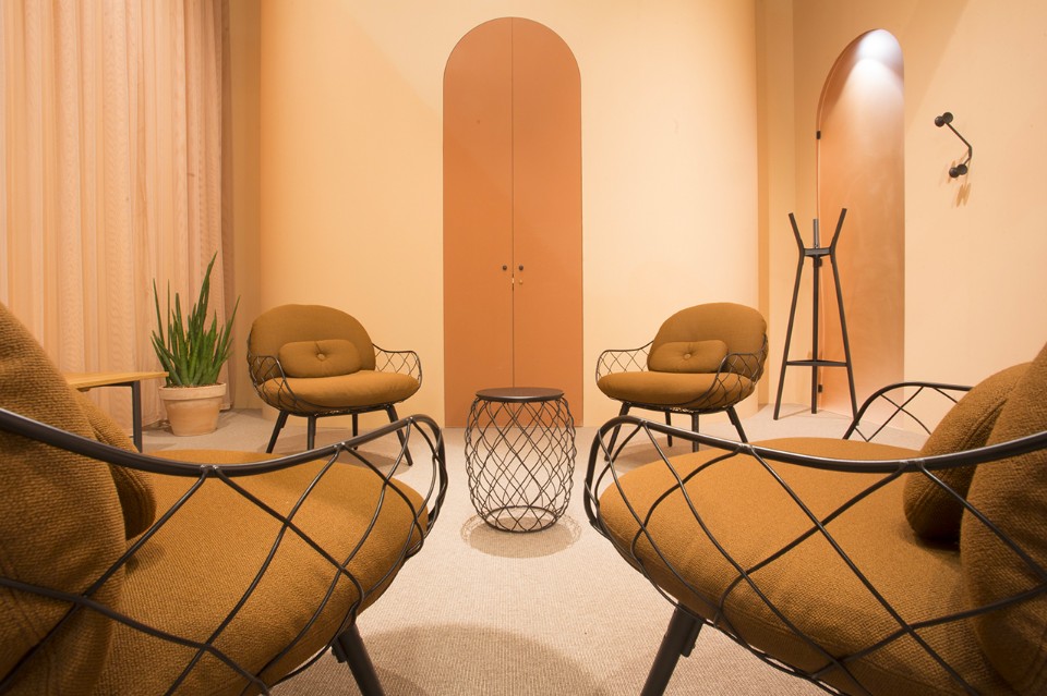
Magis by Note Design Studio
Hall 20 Stand C-15-D14
Without walls, at the complete mercy of uncontrolled fluxes of visitors, is the price Magis is willing to pay in order to offer us an unobstructed view of its original stand, dotted by columns, small platforms and screens in a herringbone layout. The backdrop is a stage flat with arched openings inside which offices are hidden. The inspiration for the stand designed by the Swedish firm Note Design Studio is the architecture of an imaginary small Italian town. More precisely, this is the visual language of Andrea Palladio, whose architectural topoi have been stylised here by means of Plexiglas cages either transparent or opaque. They grasp the columns, suggesting capitals and bases. The use of arches and a colour palette of ochre, brown and beige complete the picture. Besides being an imaginary city, the display could be read in different ways, such as a piazza on which outdoor and indoor products alternate between private and public settings. Seeing the reuse of building elements from classical times, we could also say that this construction is an homage to postmodernism.
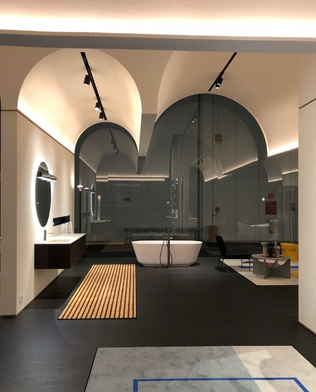
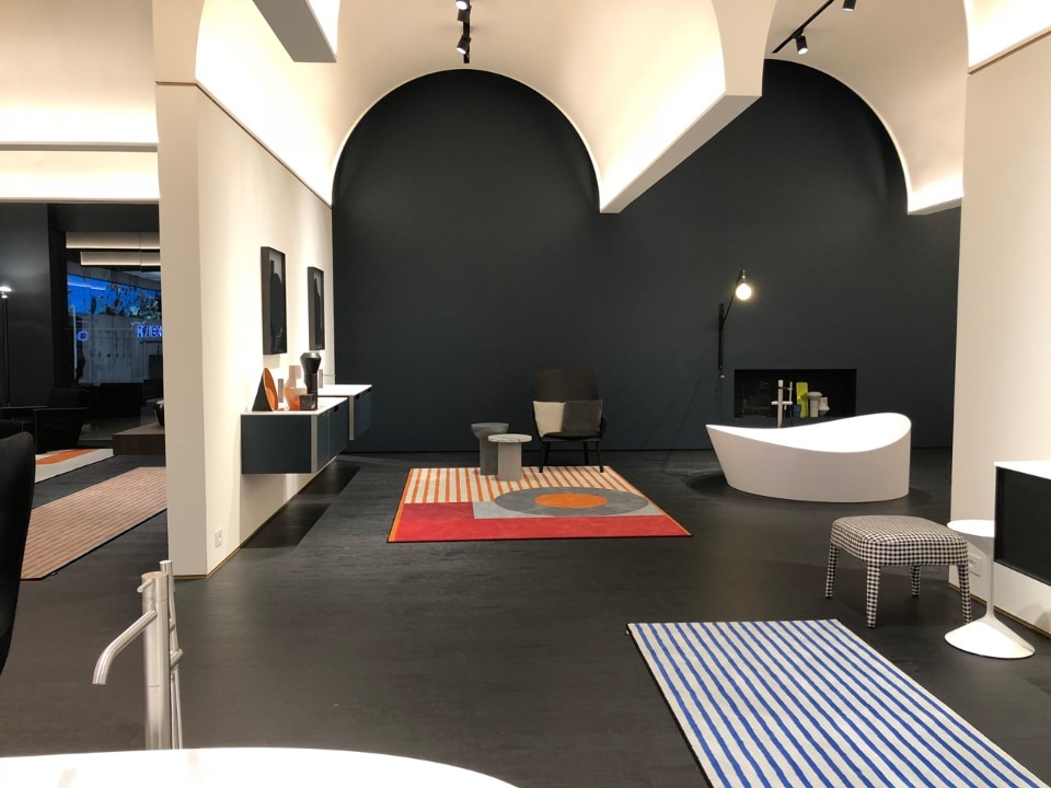
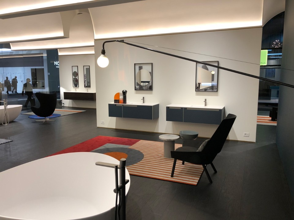
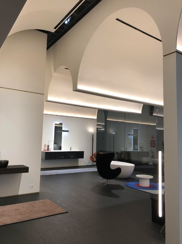
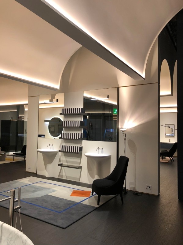
Antonio Lupi by Calvi Brambilla
Hall 22 Stand A29-B20
This stand connects stylistically to the Antonio Lupi showroom (also designed by Calvi Brambilla) on Via di Porta Tenaglia, close to Parco Sempione in Milan. Like there, the interesting aspect of the display resides the particularity of the ceiling. A series of broad, irregular vaults are magically hung on the stand's dark walls, sometimes brusquely interrupted. Underlined by neon lights, these architectural elements give majesty and importance to the surroundings, and a sense of perfect aesthetic correspondence with the products dedicated to wellness. It is as if the most appropriate setting for a display of bathroom collections were barrel vaults. Indeed, the model at the base of this stand is the Kilic Ali Pasa hammam in Istanbul designed by the famed 16th-century architect Mimar Sinan, which is overarched by huge vaults and cupolas full of light. At second glance, we see the teachings of modern masters such as Philip Johnson and Louis Kahn, whose work for museum institutions included special attention for the ceiling.
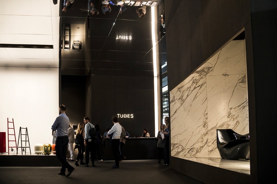
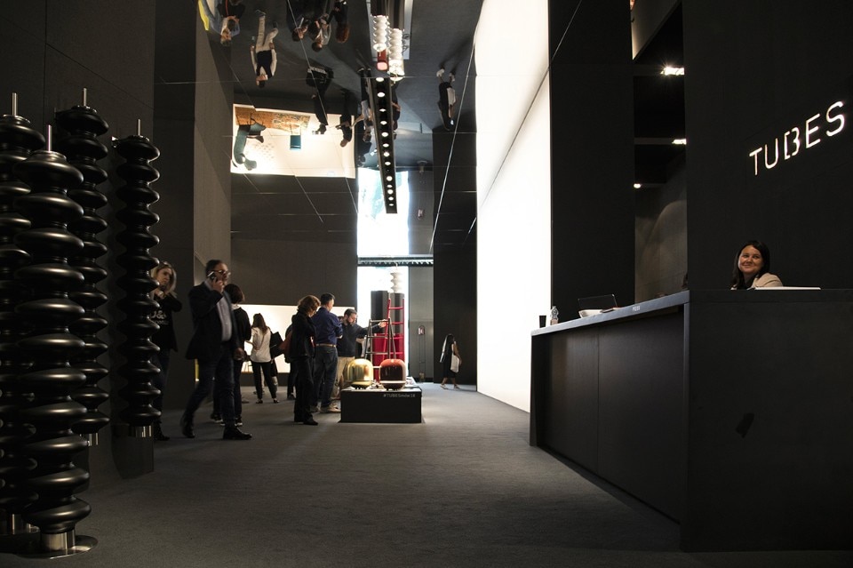
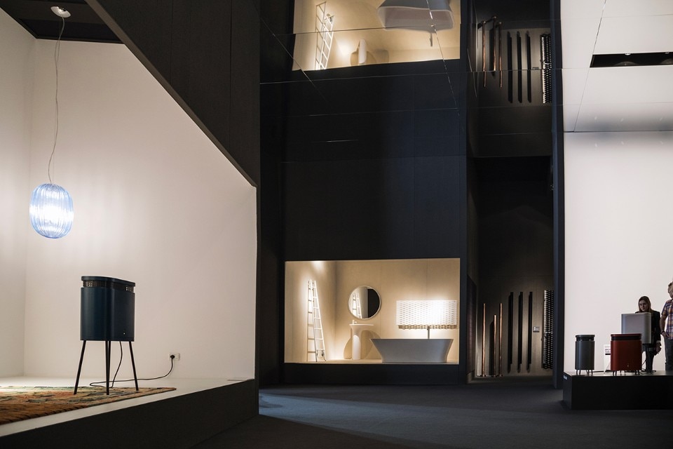
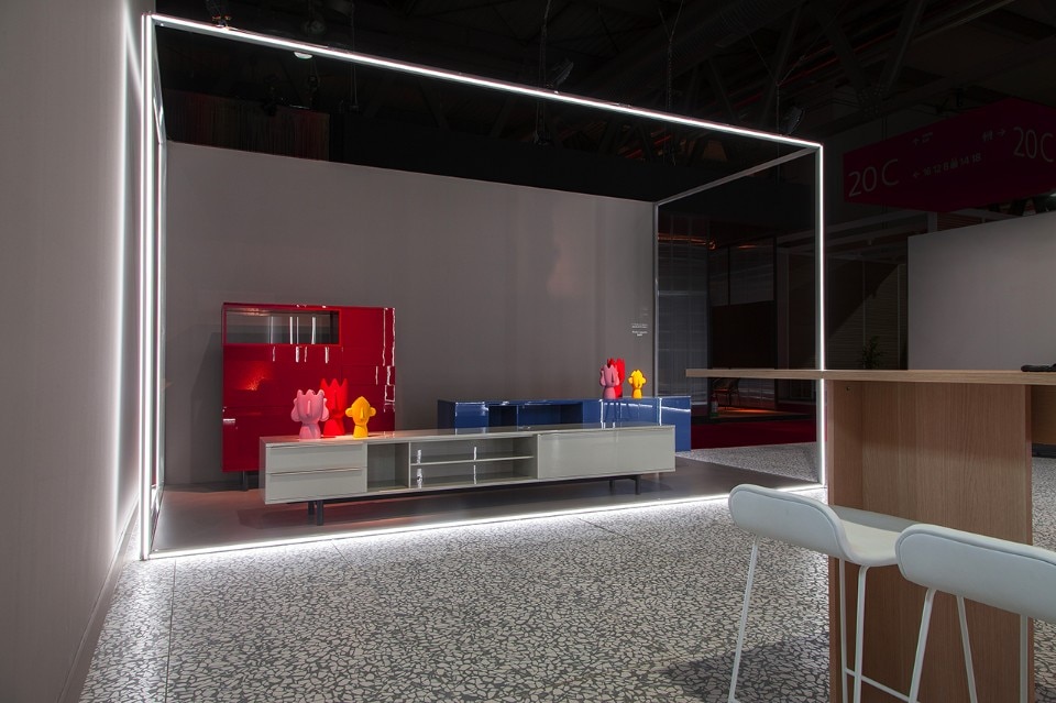
Tubes by Ludovica+Roberto Palomba
Hall 24 Stand G21-G25
The trick here is an entirely mirrored ceiling, making the 240-square-metre Tubes stand feel at least twice as wide and twice as tall. It's a traditional and elementary stratagem, yet every time you come across it, it never fails to amaze. Ludovica and Roberto Palomba have used it with the express intention to create a display that is at once delicate and powerful, having in mind the prestigious example of Olafur Eliasson's 2003 installation The Weather Project, which turned the Tate Modern in London into a perpetual sunset. Although there is no fiery sun at the Tubes stand, the atmosphere in the space possesses tactile characteristics similar to Eliasson's piece. Something magical and vibrant is magnified by the layout of the products, which are grouped according to a minimal approach inside pale-painted niches. Lost as they are in the surrounding grey space, they almost seem to hover above the ground.