


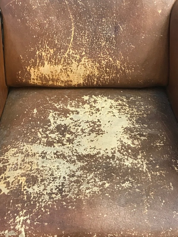
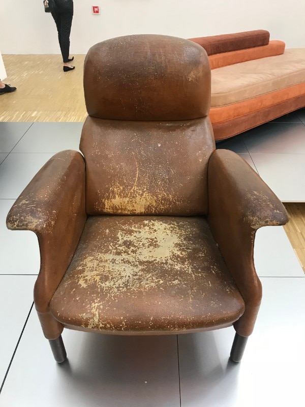
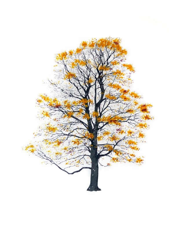
Among the objects on display at the Achille Castiglioni show now underway at the Triennale di Milano, there is one of the Sanluca armchairs he designed. It comes from Achille's private house, and its brown leather is worn and stained. Now that our eyes are full of the turning leaves of autumn, the mood awakened by this abstract surface is akin to melancholy transitoriness, because it represents the burial shroud of a great design talent born 100 years ago. Of course feeling moved by objects that preserve the traces of an existence is nothing revolutionary. But when the scars seem to speak of fog and cold, while in July, they would have been an excuse for new upholstery, might we have fallen prey to a meteorological hallucination?
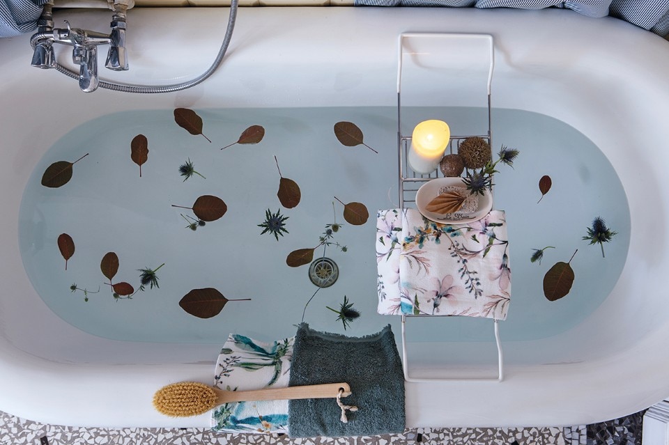
Or is it like the inevitable passing from short sleeves to coats? Should we just sit back and welcome the autumnal style? As Duccio Demetrio writes in his book Foliage: Vagabondare in autunno, the fall factor no longer belongs to the months of mournfulness like it used to. The boom in outdoor excursions to the decaying woods at Oasi Zegna, a nature park in the Piedmont region, conceals the wish for sincere conciliation with the season of apprehension. It is a sign that autumn is being looked to as a profound model for our behaviour and rhythm of life. It sounds a bit like the programme of a sect, true, but it is welcome if it means abandoning for good the romantic lie – or fictional truth – that makes an everlasting connection between the fall and the trio of book, steaming tea and blanket.

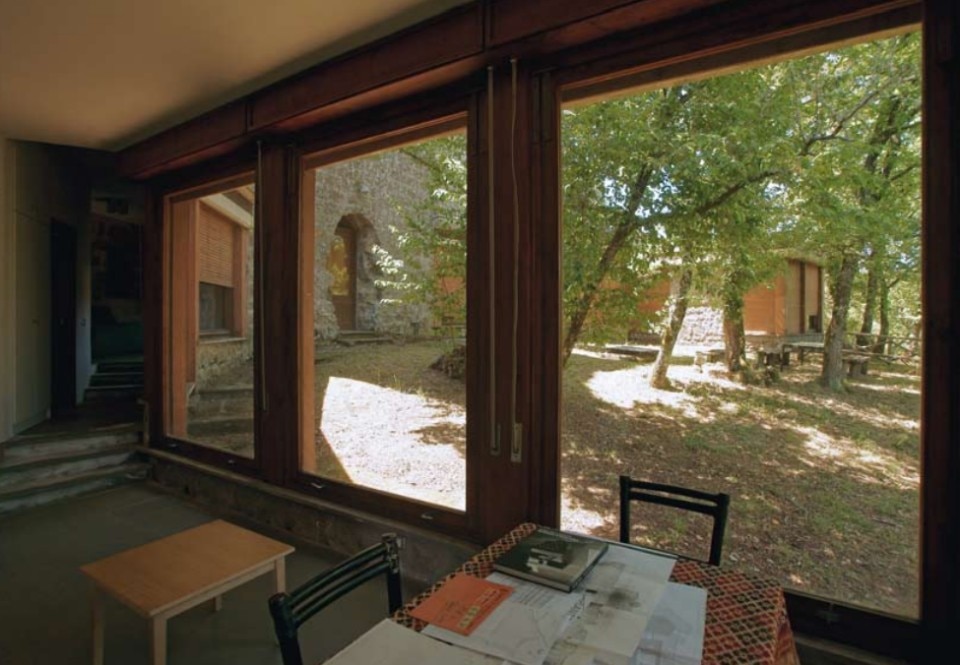
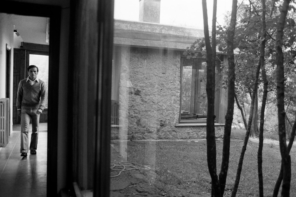
Although many might be counting on it, my accusation of inauthenticity might be overly hasty. For example, how unlikely is it (just because there is no photographic proof) to imagine Pier Paolo Pasolini enhancing his experience of the turning foliage by nursing a cup of tea in the comfort of a quilt? Looking at the big windows in his house-cum-hideaway in the woods of Chia outside Viterbo (built in the 1970s by the architect Ninfo Burruano in collaboration with Dante Ferretti), the hypothesis is not entirely implausible. The fall factor was the Russian writer Leo Tolstoy's recipe for happiness, but he added music to the package deal of nature, books and rest. In the (admittedly implausible) hypothesis that "Casa Pasolini" were turned into a bed and breakfast in order to enjoy edification coming from the autumnal landscape, what would be the experiential difference with the slickly appointed tree-houses on the Airbnb market?
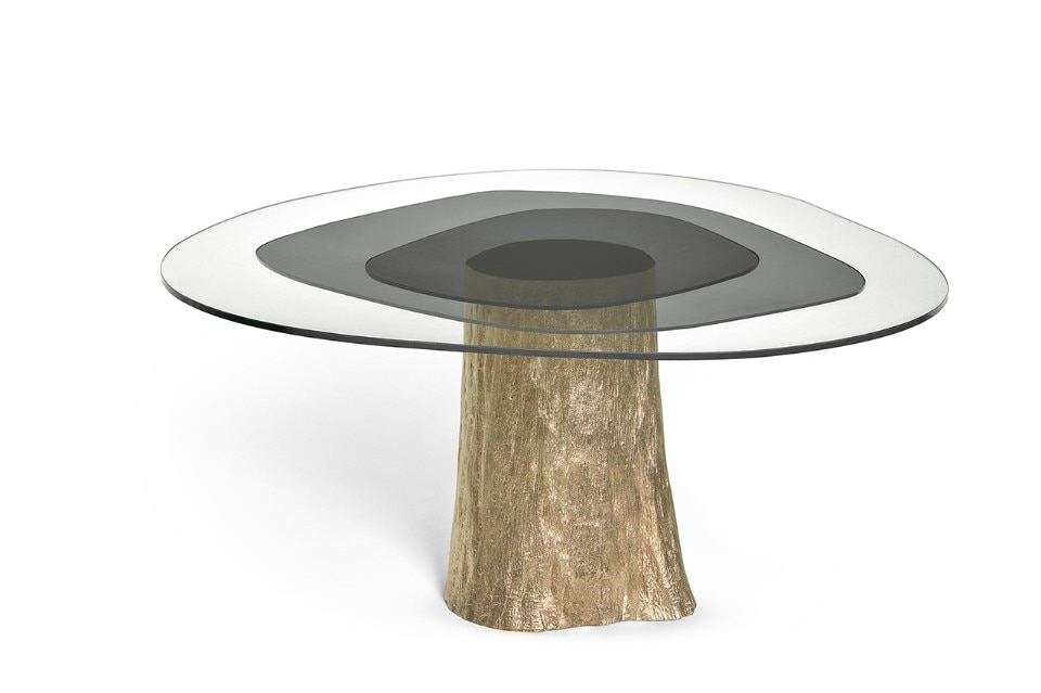
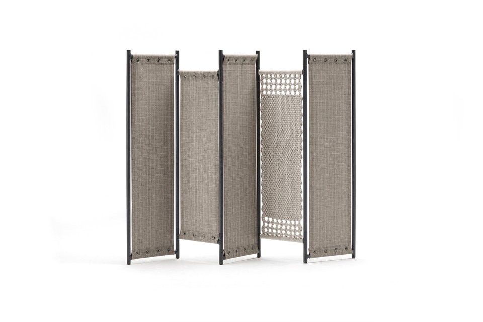
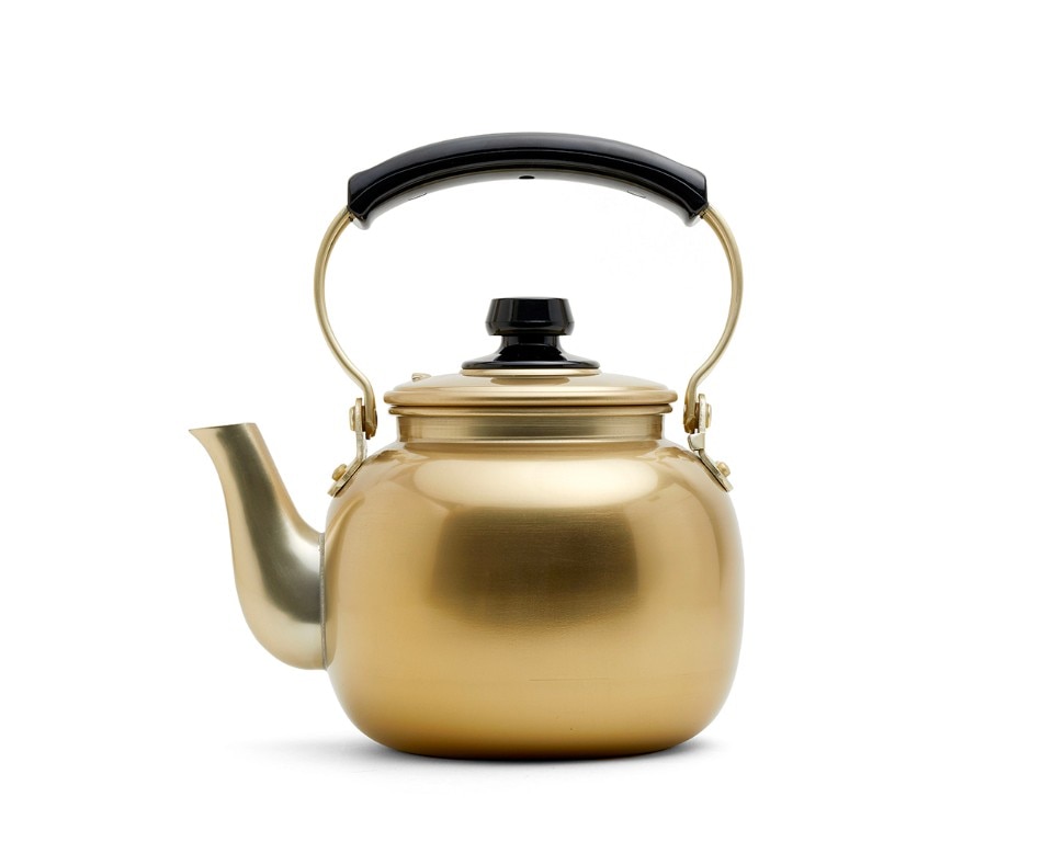
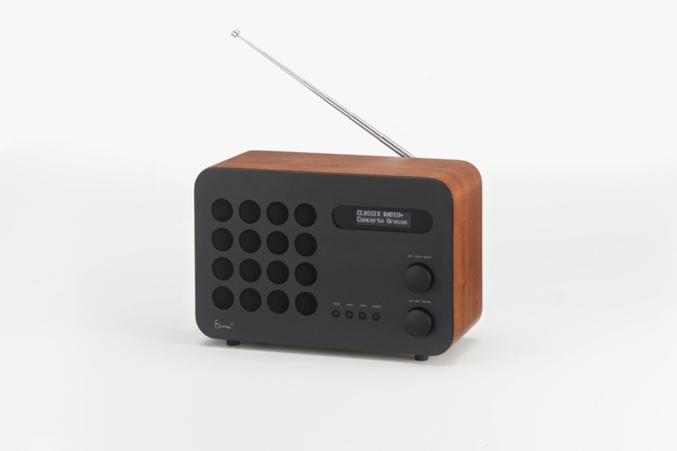
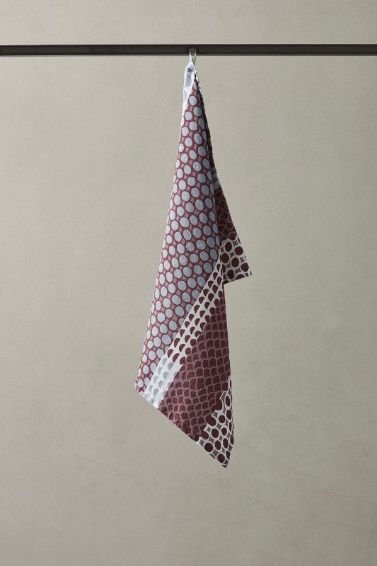
Except maybe for some rickety Pasolinian relics similar to Castiglioni's Sanluca armchair, only the good propensity to introject the surroundings. The search for authenticity is a contemporary obsession whereby a scratched vinyl record and the "new" Eames radio (1946) now produced by Vitra are preferred over the Autumn playlist compiled by Spotify because they are more unfeigned. Autumn is a substance that settles on objects. When design tries to recreate fall's subdued charm, does it make the surface dull? No, or better, yes but not only that. When it does, it is a benevolent lie. See the Pantano dining table held up by a tree trunk, produced by Ginger & Jagger. See the Tree Trunk Chair designed by Wolfs + Jung. At least they partially avoid the effect described by the psychologist Deirdre Barrett in her book Supernormal Stimuli: How Primal Urges Overran Their Evolutionary Purpose (2010). She refers to sensorial stimuli that override our natural instincts to such a degree that we see the latter as (authentically) fake.


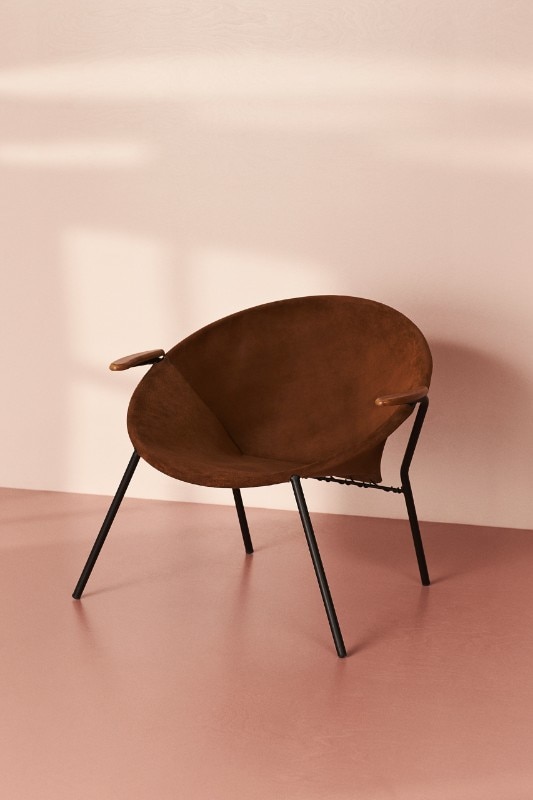
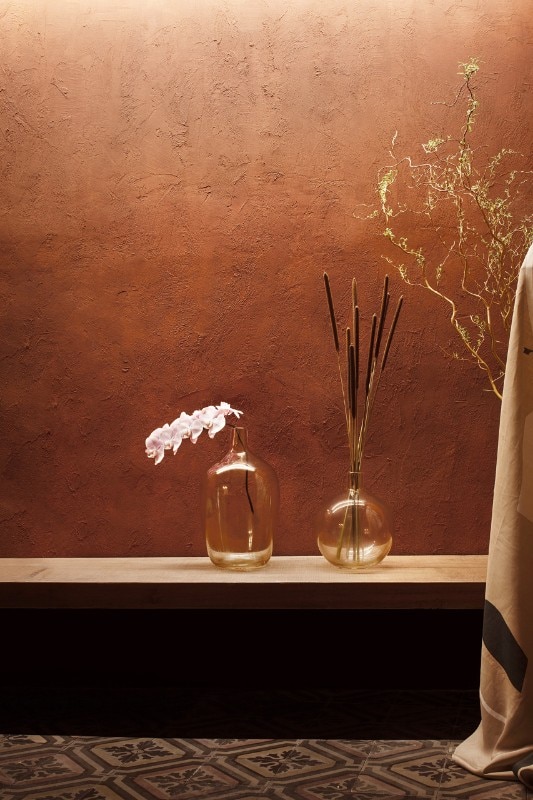
With the right delicacy regarding design, much fading natural beauty can be transported into an interior. We can have walls that are carbon-copies of the brown earth seen in the 1912 painting by Egon Schiele, Herbstsonne und Bäume (Autumn Sun and Trees) by purchasing the hand-made wallpaper of the Fabscarte company, which reproduces the spatula-painted effect. The dark cognac suede of the Balloon chair designed in the 1950s by Hans Olsen and produced by Warm Nordic is an interpretation of autumn. Most conventionally, the season's light is rendered by tones of sepia and burnt sienna. In the chromatic range of earth colours, there are many distinct items worth noting.
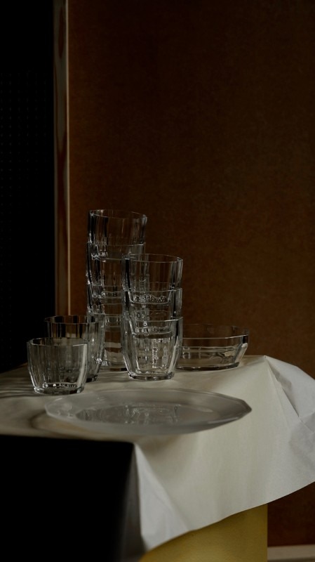
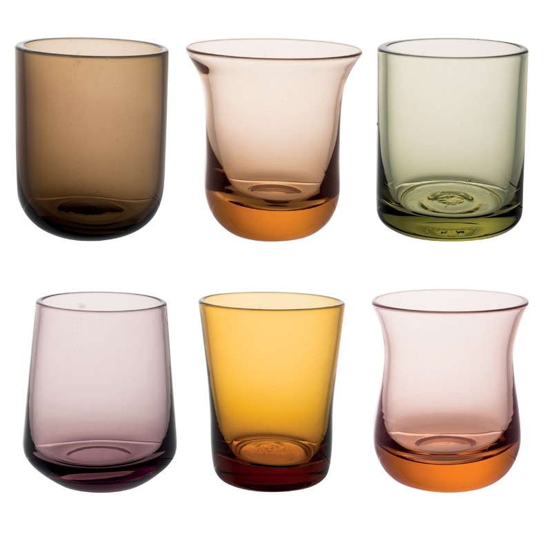
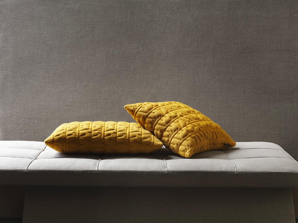
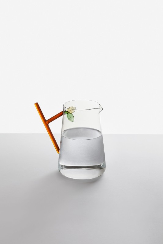
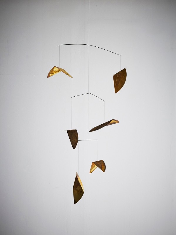
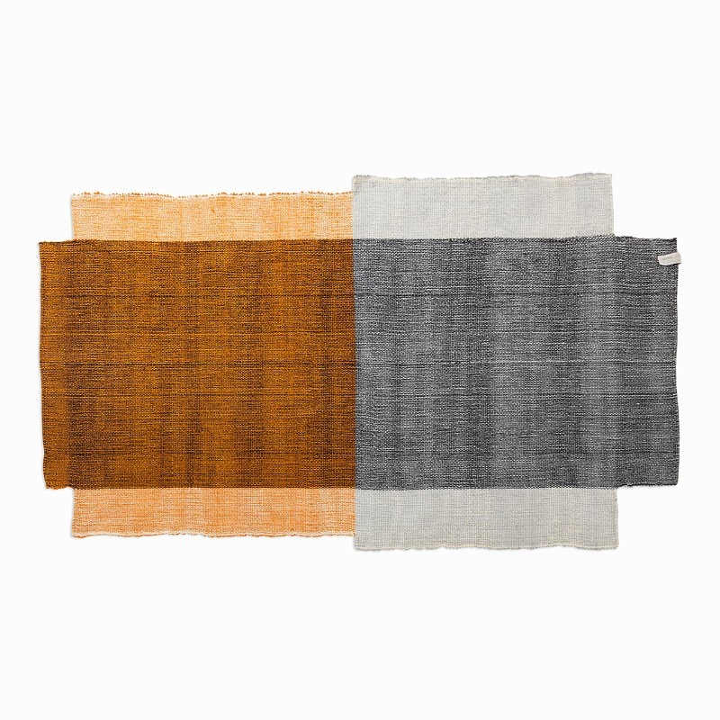
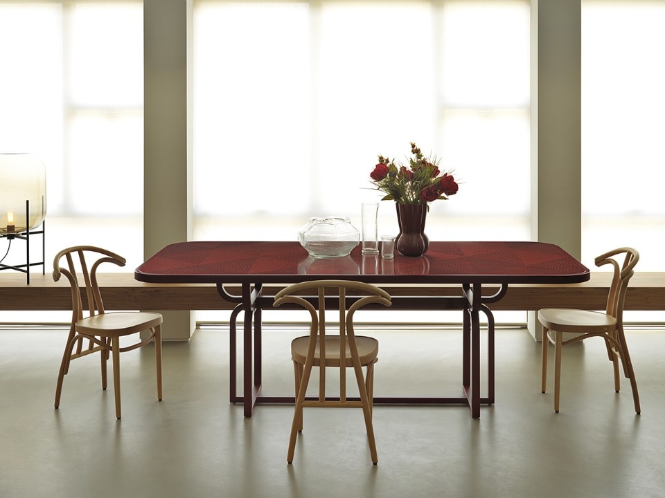
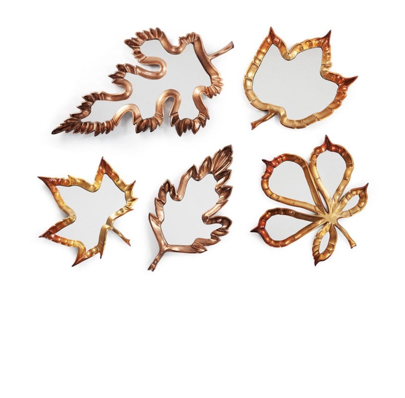
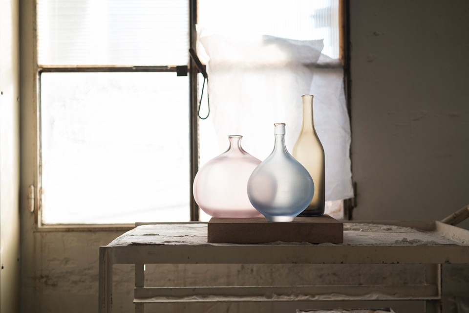
The first is the ochre covering of cushions with a special quilting design by Arne Jacobsen, produced by Fritz Hansen. Another is the polychrome art-deco red top of the Caryllon dining table by Cristina Celestino for Gebrüder Thonet Vienna, inspired by straw marquetry, a sophisticated inlay technique that possesses the grace of fine-grain tree bark. When it comes to one of the most celebrated elements borrowed from Mother Nature – leaves – the Swedish company Artilleriet is a winner in sobriety with a hanging sculpture in the mode of Alexander Calder's mobiles. Its metal leaves look acid-etched by long exposure to bad weather. Another winner, in sentiment this time, is Alessandra Baldereschi, an Italian designer who makes glass drinking cups and pitchers, Inside, on the bottom, little leaves of coloured glass are sprouting. The pitcher handle is a glass twig. The collection is called Greenwood and it is produced by Ichendorf Milano.

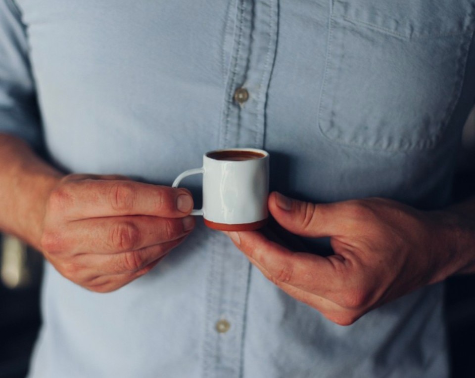
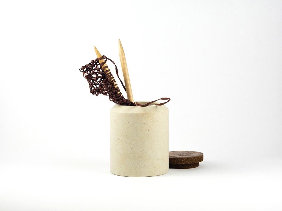
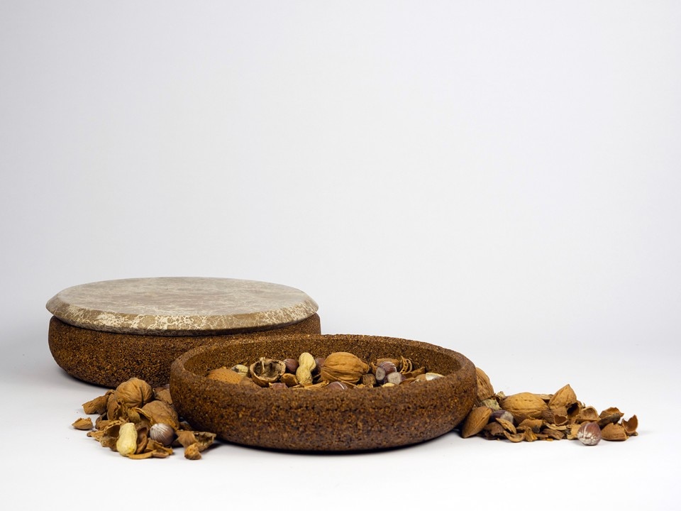
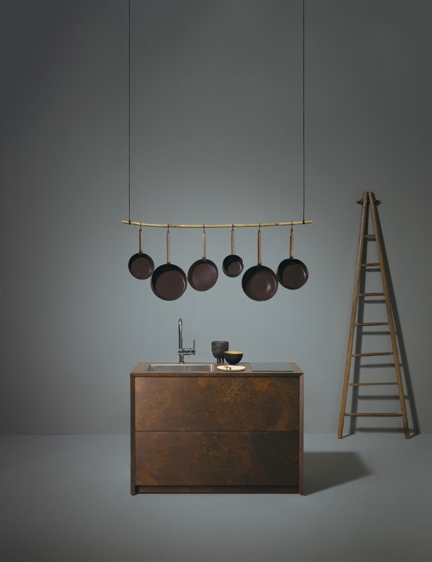
Jeremy and Cath Brown, the husband-and-wife founders of Feldspar in southern Devon, UK, make objects with a slow life. In the silently rolling hills of Dartmoor, the couple hand-makes earthenware coffee cups from Devon clay they dig up outside their studio. They leave the base of the cups unglazed to show the beautiful russet colour of the clay. Then there are the three storage containers called Guscio produced by Gum Design. The containers are moulded from Keep Life, an ecological composite material made out of the nutshells of hazelnuts, chestnuts, walnuts, almonds, pistachios and peanuts. The covers of the containers are made in Emperador Light marble from Turkey.
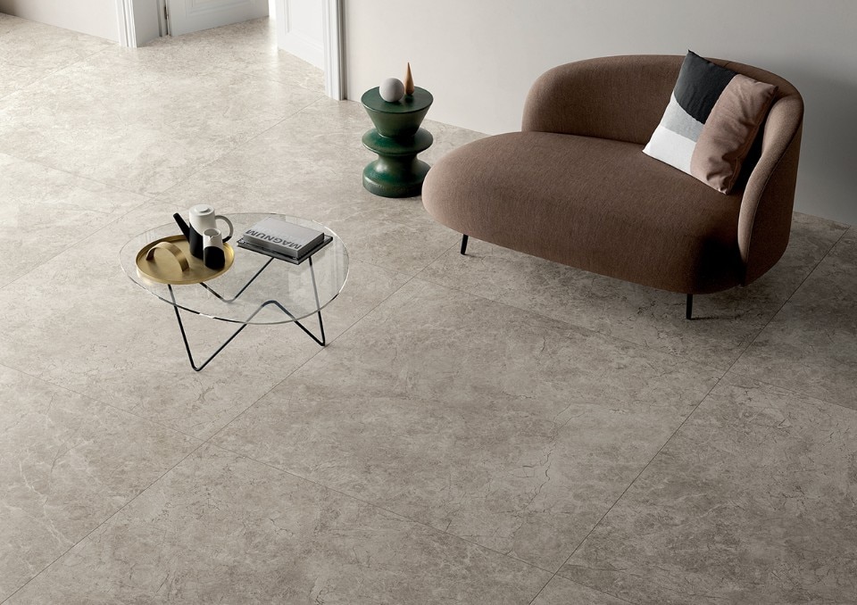
Now what if for sensorial reasons you wanted the floor of your house to be subtly similar to a muddy footpath in the countryside? Fiandre Architectural Surface has just the solution: Atlantic Grey stoneware tiles in extra-large sizes, presented at the 2018 Cersaie trade show in Bologna. There are but few lamp proposals, you might say. Naturally, entering into a phase of semi-darkness means being almost obliged to not get carried away with light. A dimmer means everything. Should the warmth of the solar disc be missing, the Radiance Collectables are lamps made by the London-based company Haberdashery. They reconstruct the nostalgic power of the setting sun in three colourways: amber, blue and yellow. Not green, because that ray is only seen by those with a pure heart, according to Éric Rohmer's 1986 movie Le Rayon Vert. Why not aspire to that status now, under the auspices of autumn?