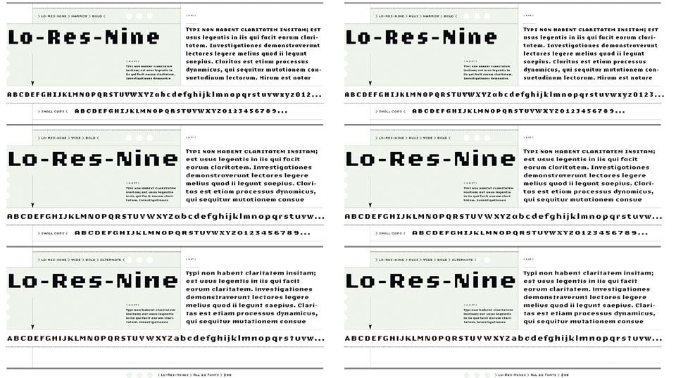
States of Design 06: In your face

The story of contemporary typographical design is the story of typeface designers.

This article was originally published in Domus 951, October 2011

Type design follows the history of the design of objects and buildings throughout the centuries, similarly reflecting social developments, advances in materials and means of production, cultural biases and technological progress. Just like the design of artefacts and buildings, in the past two centuries type design has grappled with the industrial revolution first, and the digital revolution later. Similar to architecture and object design, type design has had a modernist, a post-modernist and a digital phase. Like architects and other designers, type designers have felt the need to move beyond modernism and find new inspiration in traditional examples, in the vernacular and in popular culture. Type is a design universe unto its own, an essential dimension of the history of modern art and design.

Experimentation in the digital realm began in the 1960s, prompted at times by the problems faced when computers became mainstream. Businesses needed to find ways to process information efficiently, and in 1966 OCR-A (the first machine readable typeface designed by American Type Founders in the same year) was adopted as a standard. OCR stands for Optical Character Recognition, a technology that allows the electronic conversion of information from a printed source—a handwritten, typewritten or printed document read or scanned by a computer— into a workable text document by recognising and translating individual characters, so that the translated text can then be edited and manipulated. OCR-A was originally designed to reflect the standards set by the USA Bureau of Standards (now called National Institute of Standards and Technology, or NIST) for developing OCR technologies.
Top image: An application of DIN by Pool: the New York
City Ballet 2008 campaign,
created by Paula Scher of
Pentagram using a palette
composed of black, white
and silvery grays, a visual
reference to New York’s
buildings.<br />Above: A screenshot of the
original of Mac Paint
application that used
Kare’s Chicago font.
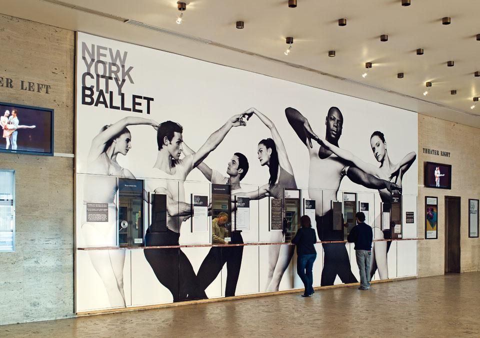
Top image: An application of DIN by Pool: the New York City Ballet 2008 campaign, created by Paula Scher of Pentagram using a palette composed of black, white and silvery grays, a visual reference to New York’s buildings.
Above: A screenshot of the original of Mac Paint application that used Kare’s Chicago font.
In 1973, OCR-A became the international standard and the typeface was expanded in 1977 to include enough characters to match the American Standard Code for Information Interchange (ASCII) character set. In the 1960s, Letterpress and Linotype (hot metal) machines gave way to early CRT (Cathode Ray Tube) monitors and photographic reproduction technology. Another stand-out pre-digital face of the 1960s, Wim Crouwel's New Alphabet (1967), was almost a commentary on the disruptive potential of digital technology. In the infancy of digital typography, just when type was switching from being set by hand with physical lead pieces or lines, to being set on screen and then reproduced photographically, Crouwel recognised the limitation of CRT monitors, which could only render images by means of fairly large dots on a grid, otherwise known as pixels. Traditional letterforms with their curves were difficult to reconstruct with this grid, so in response to the new technology—in a way similar to experimental abstract typographic designs of the early 20th century—he redesigned the known alphabet using only horizontal and vertical.
Screenshot of the letter O in Matthew Carter’s Verdana: the digital computer outline is
superimposed on the bitmap.
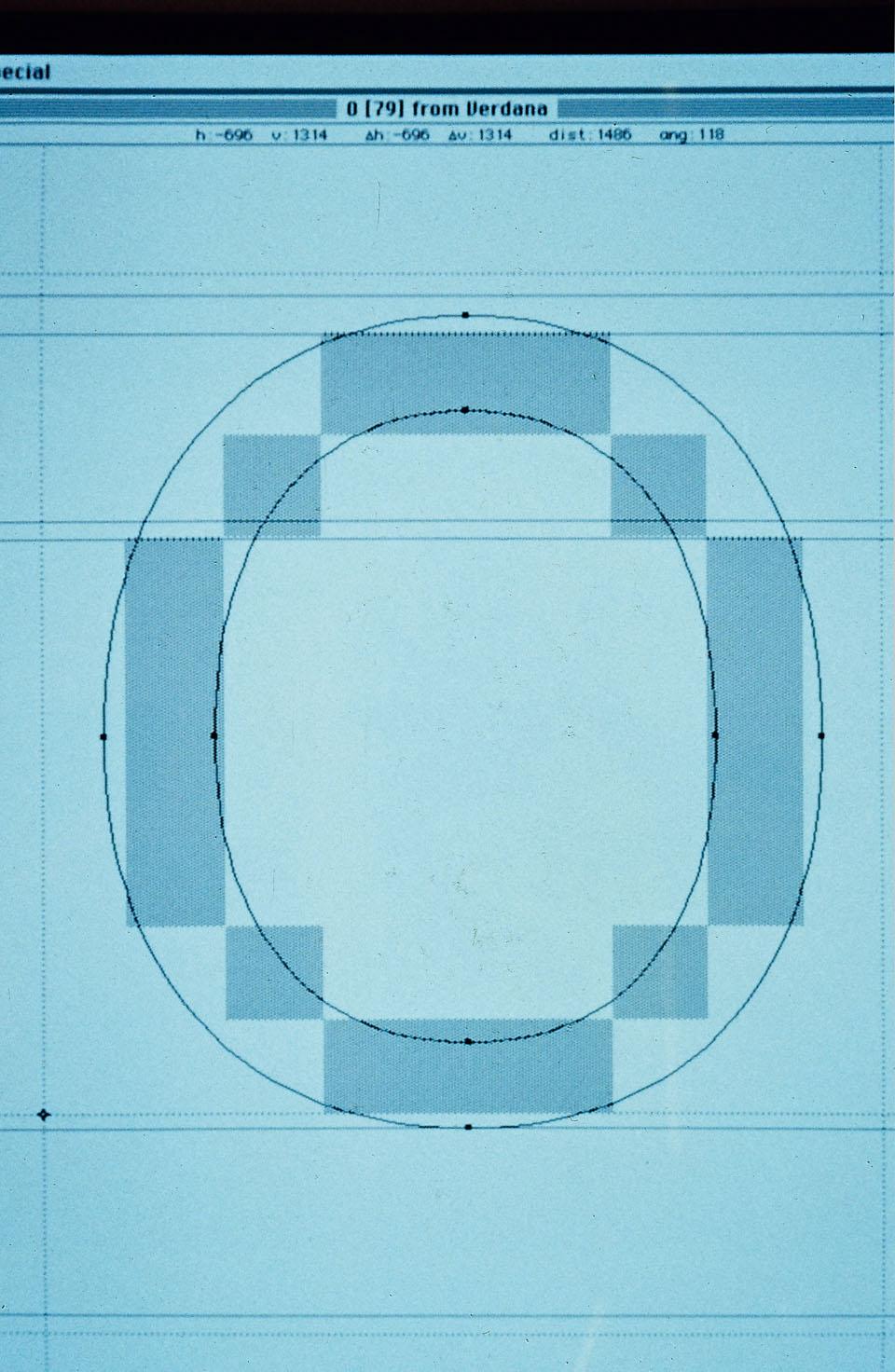
Screenshot of the letter O in Matthew Carter’s Verdana: the digital computer outline is superimposed on the bitmap.
In the mid-1980s, a new revolution spurred by the Macintosh home computer, introduced in 1984, took Crouwel's experiment further. A novel aesthetic, supported by the ability to create custom faces directly on the computer, came to light as designers produced typefaces made of pixels and composed of dots on a grid. The new wave began in the Bay Area and Susan Kare and Zuzana Licko were among the first to create the foundations for bitmap digital type design, the former with her milestone Chicago, Geneva and Monaco fonts for Apple (1983–84), and the latter with her innovative and expressive faces produced at the Emigre foundry.

Zuzana Licko emigrated from Czechoslovakia to America in 1968, received a degree in graphic communications from the University of California at Berkeley, and founded Emigre magazine with her husband, fellow typographer and graphic designer Rudy VanderLans, in 1984. The magazine became well known for its fonts, designed by Licko on an early Macintosh, and was lauded as a graphic design publication that paid attention to the profound changes in the world of communication design. With the Mac, Licko designed several typefaces, the unforgettable Oakland among them (1985), as bitmap fonts. They were designed with public domain software, intended for use on a low-resolution, 72-dots-per-inch (dpi) computer screen, and printed with a dot matrix printer.
Type designers found new inspiration in traditional examples, in the vernacular and in popular culture.
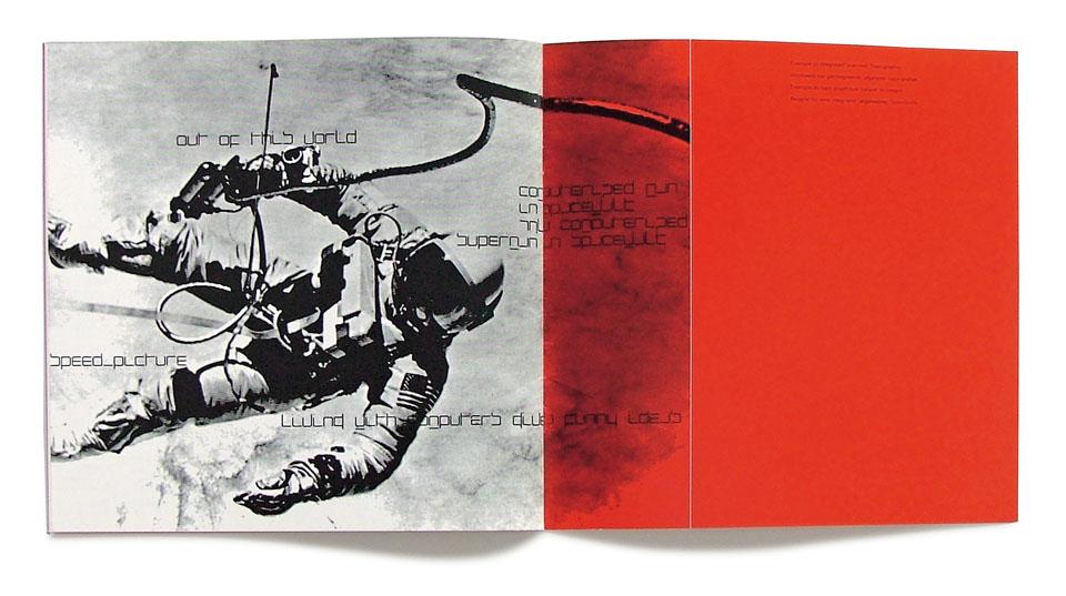
New Alphabet. Wim Crouwel, 1967
(Foundry Types). The font was intended to
dramatise snags arising from
image processing in early
monitors. Cover and inside
pages of the specimen book
of New Alphabet by Crouwel,
reprinted this year by David
Quay for the Design Museum.
New Alphabet. Wim Crouwel, 1967 (Foundry Types). The font was intended to dramatise snags arising from image processing in early monitors. Cover and inside pages of the specimen book of New Alphabet by Crouwel, reprinted this year by David Quay for the Design Museum.
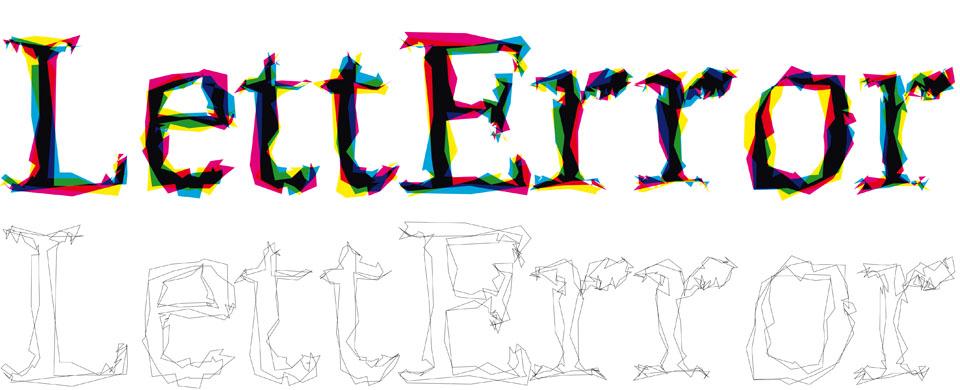
Those were indeed exciting and euphoric times for designers, with heated debates firing up conferences and journals, often pitting the new generation, high on freedom and possibility, against the older, especially a very vocal Massimo Vignelli, ardent defender of a more traditional and rigorous approach to graphics and type design. However, some of the new adopters were bent on pushing the limits of visual communication one character at a time—as in the intentionally out-of-focus letters of Neville Brody's Blur (1992) or the randomised outlines of LettError's Beowolf (1989)— and defining post-modern in type design. Others, meanwhile, continued the modernist quest for uniformity and clarity using the new methodologies. Erik Spiekermann's Meta (1984) and Albert-Jan Pool's redesign of the German standard typeface, DIN (1995), were formidable successors to the "classic" and oft-used face Helvetica.
Beowolf. Erik van Blokland and Just van Rossum, 1989 (Letterror). It was produced with a
computer randomisation
process. The letter outlines
have a space in which to
move, creating a vibrant effect.
Beowolf. Erik van Blokland and Just van Rossum, 1989 (Letterror). It was produced with a computer randomisation process. The letter outlines have a space in which to move, creating a vibrant effect.
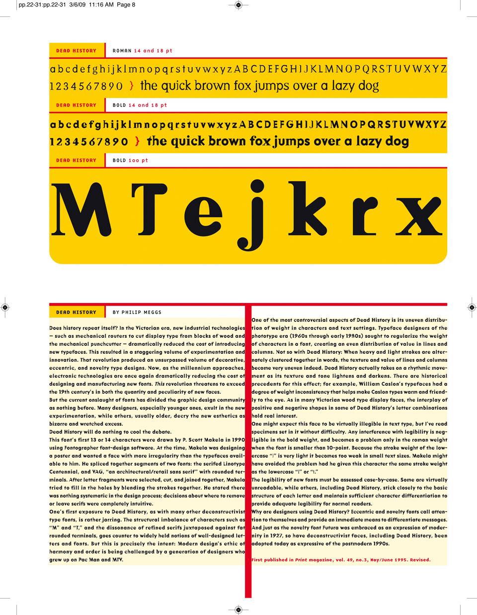
As computer programs for type design became more sophisticated in the 1990s, designers felt free to experiment in ways that had previously been impossible. For instance, Barry Deck created a typeface from a laundromat sign when he designed Template Gothic (1990), and Jeffery Keedy designed a new typeface in 1989 because the fonts available did not satisfy his needs as a graphic designer. Even the history of typography received special treatment in this era, becoming a repository of timeless and universal ideas ready to be updated, while popular culture provided familiarity, closeness and a collection of idiosyncratic curiosities ready to be re-imagined, from highway signs to punk leaflets. Just like in music and fashion, mash-ups of existing typefaces were mixed with homages to stonecutters of the past—P. Scott Makela's Dead History (1990) and Jonathan Barnbrook's Mason (1992) are good examples.
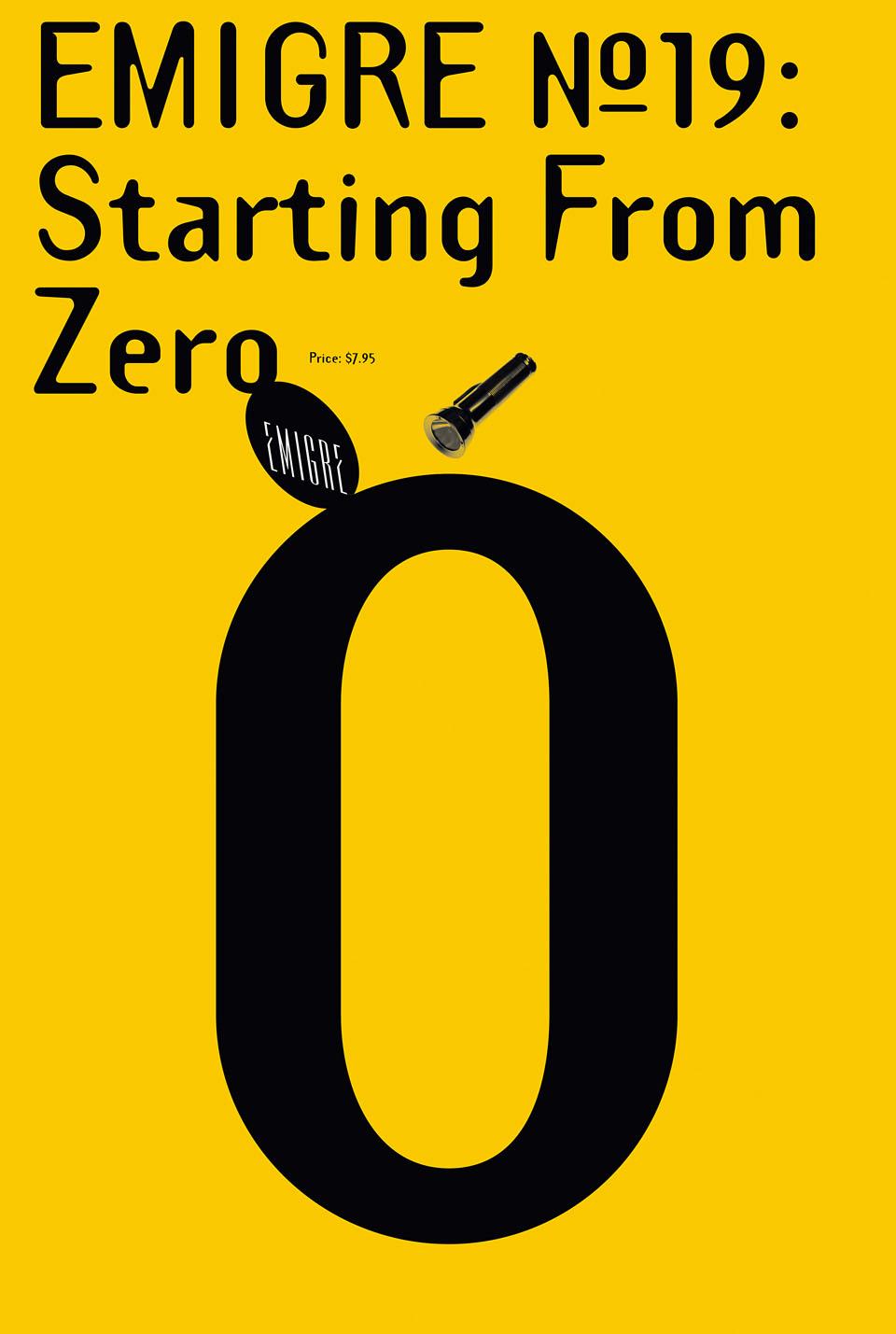
Template Gothic. Barry Deck, 1990 (Emigre). The font abandons the
perfection of the shapes of
modernist characters, in a
celebration of the imperfection
of manual craftsmanship.
Template Gothic. Barry Deck, 1990 (Emigre). The font abandons the perfection of the shapes of modernist characters, in a celebration of the imperfection of manual craftsmanship.
Nevertheless, the turning point in digital type design arrived with Verdana, the 1996 typeface designed by Matthew Carter. Matthew Carter is at the zenith among pre-eminent type designers of the 20th century, his career directly coinciding with dramatic technological developments in typeface design brought about by the spread of computers as universal design and production tools. He began when typefaces were families of lead blocks, one for each character or punctuation mark, and a series of blocks for each style and for each point size, and then moved seamlessly to the digital realm, compiling a checklist of the most important fonts of the turn of the century. He apprenticed in The Netherlands in the 1960s and learned the skills of a traditional typographer and punch cutter (the craftsman who cuts out the shapes of actual letters in steel, from which copper matrices are formed in order to cast the lead type for letterpress printing). After working for several companies, Carter opened his own office in Cambridge, Massachusetts, first in 1981 with colleague Mike Parker, and then in 1991 with his current partner Cheryl Cone.
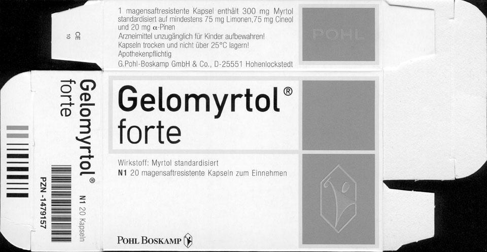
Another application 
of DIN by Pool: packaging for
the Gelomyrtol medicine.
Another application of DIN by Pool: packaging for the Gelomyrtol medicine.
While most of the digitally designed fonts in circulation are still meant to be used in print and read on paper, Verdana is designed specifically for use on monitors, its form classically dictated by its function, with simple curves and larger and more open letterforms that are easier to read in small sizes on a screen. The bold version of Verdana is easy to recognise and distinguish from the "regular" style of the face onscreen, and the letterforms are more spaced out on the monitor than they are when printed (with this stratagem, they do not look too crowded when displayed in computer applications that have no way to control the space between letterforms). Letterforms that look alike were designed to be as dissimilar as possible, contributing to legibility on the screen and at tiny sizes.
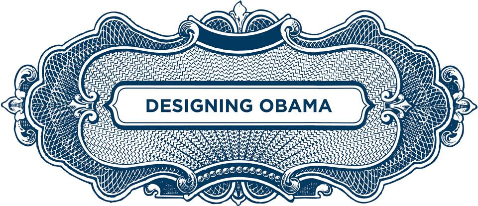
Gotham.
Jonathan Hoefler and
Tobias Frere-Jones, 2000. The source of inspiration
were the neon signs of New
York. The Obama campaign
directed by Scott Thomas
(author of the book <i>Designing
Obama</i>) made extensive use
of Gotham to communicate the
substance of the President’s
polics.
Gotham. Jonathan Hoefler and Tobias Frere-Jones, 2000. The source of inspiration were the neon signs of New York. The Obama campaign directed by Scott Thomas (author of the book Designing Obama) made extensive use of Gotham to communicate the substance of the President’s polics.
Verdana is a paragon for a perfectly executed functionalist typeface. While the design capabilities provided by the computer have also gone in the direction of formal anarchy, type design remains an exquisite exercise of balance between expressiveness and strict, almost scientific discipline. The Adobe Font Folio, today a mind-blowing collection of more than 2,300 fonts, has made this rationalised production process its modus operandi, bringing a highly diverse range of fonts to market so that they could be both an endless palette and a reliable source for designers. Adobe was also first out of the gate, beginning its release of digital fonts in 1984, and was responsible for setting most standards of format and language for all digital fonts.
Video rendering tests
of Oakland sets designed
by Licko with an Apple
Macintosh 128k, marketed
in 1984.
Video rendering tests of Oakland sets designed by Licko with an Apple Macintosh 128k, marketed in 1984.
Outstanding titans of the younger generation include Jonathan Hoefler and Tobias Frere-Jones. Highlights from their production comprise the hyper-functional Retina (2001), designed for the Wall Street Journal not only to complement rough newsprint, but also for increased legibility on the battleground of the stock ratings pages; HTF Didot (1991), a historical revival of revered historical typographer Firmin Didot's work that adapts, and does not directly copy, the master and which became the distinctive trait of a contemporary publication (Harper's Bazaar); and the vernacular Interstate (1993) and Gotham (2000), both conglomerations of the words and letters that we see everyday throughout the landscape in 21st-century America, refined into a versatile yet recognisable design.
Dead History.
P. Scott Makela, 1990 (Emigre). The design of this font
began at school, by merging
Linotype’s Centennial with
Adobe’s V.A.G. Rounded.
Dead History. P. Scott Makela, 1990 (Emigre). The design of this font began at school, by merging Linotype’s Centennial with Adobe’s V.A.G. Rounded.
Font designers who are able to marry critical and commercial success are a unique mixture of two basic clichés: the artist and the scientist. They are eclectic, curious, obsessive and absorbed, as well as rigorous, punctilious, enamoured of rules and limitations, and loyal to a higher code of design behaviour. They are an even more different breed among the many different breeds of designers working today. Contending now with the dynamic methods of communication provided by tablet computers, smartphones and other supports for text and brand, they deal with each family of fonts as if it were truly made of individuals, live characters that need to be able to fend for themselves once released into the wider world. In this vein, font design might just be the most advanced form of design existing today.
Paola Antonelli,
Critic and curator, MoMA

Latest on Design

Latest on Domus

Read more
China Germany India Mexico, Central America and Caribbean Sri Lanka Korea icon-camera close icon-comments icon-down-sm icon-download icon-facebook icon-heart icon-heart icon-next-sm icon-next icon-pinterest icon-play icon-plus icon-prev-sm icon-prev Search icon-twitter icon-views icon-instagram