


In summer 2021, according to Michelin’s figures, the sales of maps, in their classic 1/200,000 scale, grew by 10% compared to the previous year, while the sales of atlases grew by 20%. According to modern cartographers – engineers, designers and illustrators who are quite different from explorers with a compass – this is a response to the desire to improve the experience of travellingand the knowledge of the territory, especially at local level.
Luigi Farrauto, founder of 100km Studio, Italy’s first design studio specializing in cartography, is not surprised by this newfound interest in maps. “It’s not just nostalgia or a rediscovery of vintage items”, he explains, “A map is an attractive object. Some say people are unconsciously attracted to maps because they allow us to see the world from above. The growth of the market sector is linked to the increasing demand for infographics from the publishing industry, with newspapers and magazines using maps to get the news across. Cartography is a branch of infographics that provides spatial information. Also, the map appeals to everyone, it fascinates children as well as the elderly, and it is very intuitive”.

Besides the publishing industry, the usual clients of a company such as 100km Studio are architects, people who design complex spaces destined to welcome a public on the move: airports, museums, foundations, parks, resorts. “Project designers have begun to realise that orienteering tools, long taken for granted, are not only necessary, but part of the experience. The design of informative signs is part of the way people experience the place. It is necessary to turn to a specialised studio. I remember that in Holland, twenty years ago, there were already firmly established studios doing the work that we are doing now”.
The dialogue between physical and digital maps
There is also a practical reason: while it may seem superfluous to make a paper map of a motorway, for all small places (a park, a museum, an airport) with highly concentrated details, GPS is not the most suitable tool for orientation. “Almost all airports have a dedicated App”, says Ferraudo, “you can scan your ticket and it will show you the way to the gate. But the question is: how many use it? These tools cannot be considered universal. When I designed the maps for Doha airport, only 2% of travellers were using the app. So there is a need for physical signage that is immediate, clear and easy to find”.
Usability and empathy, this could be the key for bringing the physical map and the digital GPS together. Martì Guixè illustrates this dialogue with the metaphor of the flower vase: the vase is the structure that represents the digital world, the flowers represent empathy, what is real, natural, ephemeral and fragile.

When maps do not correspond to reality
The exact correspondence of the map with reality is a topic that fuels debate. One example is the book The New York Subway Map Debate, published a few weeks ago and already sold out, edited by Gary Hustwit, that collects the long discussion on the well-known affair of the New York underground map designed by Massimo Vignelli, where functional abstraction clashed with the realism citizens desired. “Underground maps are diagrammatic”, explains Luigi Farrauto, “a diagram represents a concept. In the underground, the variable of real distance is of little interest, what is important to know what the next and the previous stations are, the real distance between the two stops is not so important”. Sometimes people do not take this excess of abstraction too well: if Central Park becomes a square, New Yorkers may rebel because they do not feel represented by that map.
“In Manhattan, thanks to its more orthogonal structure, the map is also used to move around, outside the underground”, continues Luigi Farrauto, “in London that does not happen, here the map is only used inside the underground. The reason is that in London there is a very high concentration of lines: the centre is so crowded with lines that, ever since Harry Beck’s first map in 1932, criteria that did not take into account real distances had to be used in order to draw the train lines, so everything was distorted in the name of usability”.

Furthermore, in London, the alteration of real distances between stations seems to have posed another problem: people – especially novices, tourists for example – not having the perception of real space, use the underground even when the same distance could be covered on foot.
This has become a profession for cartographer-illustrators.
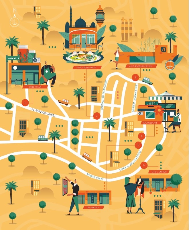
Relation to reality is also a theme that fascinates Alexandre Verhille, partner with Sarah Tavernier of Atelier Cartographik, a French studio that has been making maps and illustrations for publishers, airlines and ministries for fifteen years. They are the authors of the bestseller Cartomania France, where dozens of general questions are answered on the hexagonal map that defines France. “People tend to make maps that are increasinglymore imaginary andincreasingly less realistic”, says Alexandre Verhille. “We usually start with a street map, with its buildings, shapes and proportions. Then we are asked to add a personal interpretation of the area, I would call it an authorial intervention. This has become a profession for cartographer-illustrators. This way different styles can coexist, and they are all functional, because each style carries a different message”.
A new knowledge of the territory
The search for a different way of getting around and getting to know the world is one of the reasons why an institution, or a company, chooses to invest in a map, perhaps illustrated and interpreted, rather than in an app linked to the GPS. Slow-living, walking acrossa territory without haste, discovering its details, easily accessing information flows.
The GPS, in fact, gives us an extremely accurate image of the territory, showing the next curve, the crossroads thirty metres ahead, but little attention is given to the context. And then there is one element, or rather four, we have forgotten about: the cardinal points. “Today, we are working with generations who were born with digital technology, people who have only travelled with GPS”, says Alexandre Verhille. “I have noticed that these people tend to build their own cartography. For example, North-South orientation, one of the bases of classic cartography, is almost completely absent in these generations. As a result, they define their own territory, they have a perception that only belongs to those who are not used to putting detail into context”.
In times of pandemic and travel restrictions, the success of the old maps is also a consequence of a renewed interest in exploring the locality. “The maps we are asked to design”, explains Alexandre Verhille, “do not just contain information on roads or paths, but also on traditions, information on food production and local products. Before the pandemic, we were working on more global projects, but today the work is focused on local areas”.

Drawing a map means choosing
The designer’s job is not just to define detail in a functional way, but also to make choices. “It’s not a matter of simplifying, or thinking of symbols, but of turning layers on or off based on a certain concept”, explains Luigi Farrauto, who confirms the growing demand for an authorial representation of the territory. “Returning to the example of the underground map, in this case you turn off the level of the territory to turn on that of the connections. Or again, the physical map of a region turns off all the political information and turns on the geographical details, the mountains, the lakes, the height differences”.
In fine, new maps are created for a reason and based on a choice. The cartographer’s job today is no longer that of an explorer who has to measure unknown distances. Data and dimensions are well known and, in new projects such as airports or museums, can be taken from the architects' plans. “It is very rare today for someone to go out and measure a piece of the world”, explains Luigi Farrauto, “today the cartographer is the engineer who allows the designer, through GIS, to obtain the data required in order to design the map. Then, whoever draws it has to choose what to include and what to omit”.