Project Heracles #14

The selections by Marco Brizzi drift toward projects bearing less architectural, but not simplistic nor naïve, visions.

For all of the guest-curated sets of Project Heracles submissions, please look here. Marco Brizzi is the next of our guest curators to select his favorite entries out of the hundreds Domus received.

My first impression was that that the Domus series of Project Heracles postcards never ended, as if the visions inspired by Lieven De Cauter and Dieter Lesage and promoted by the magazine regenerated themselves. In truth, last July the number of submissions was about 200 when they were exhibited at The Gopher Hole. So why did I have this impression? Perhaps because of the number of points of view and comments offered by the different observers who expressed their opinions on the Domus website during the following months. The interpretations of the projects offered by the various commentators produced an interesting mechanism based on the persistence of images and the construction of a discourse. Too often design visions, for which the media has become increasingly greedy in recent years, are consumed the instant in which they are produced. Sometimes, on the contrary, they need to be digested and assimilated slowly. Ideas and visions have precise limitations that are not only dictated by the postcard format but also by the culture that produces them and the language with which they are expressed. These limits apply to both those who produce them and those who collect them. In addition to giving dignity to those visions, the establishment of a continuous discussion tends to give them the space and time they need.

In selecting the postcards, I must confess that I was tempted to choose the ones whose meanings I didn't quite understand. I thought about accepting Giovanni Corbellini's invitation to use them as instruments for interpretation. It would have been a kind of surreal exercise, one that is not uncommon for me in my daily dealings with architectural projects. But then I thought that this approach could offend some of the authors, in addition to explicitly revealing my personal limitations. So I decided to leave my students with the task of deciphering the most cryptic proposals and measuring the reasons for their failure in communications. And so I gravitated towards the seemingly less architectural solutions. I excluded the numerous bridges and even the city-bridge, even if they are an interesting series. And I looked for visions with simpler—but not simplistic or naïve—messages.

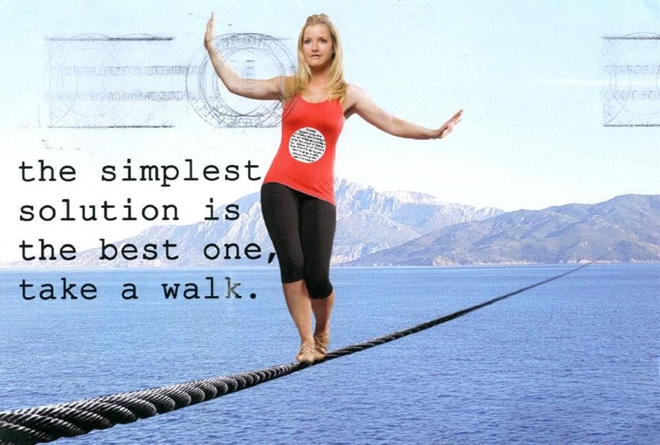
Postcard #65. [top] I chose this from among the many tightropes—once again, a sort of moving away from the project?—and acrobatic representations. I like its playful note and find Helen Skelton's presence—stolen from a Red Nose Day performance for Comic Relief—bizarre enough. A few years ago Albert Iacovoni and < a href="http://www.ma0.it/" target="_blank">ma0 reflected upon the "little people" who live in the photomontages of many projects, especially in competitions. We saw that there is a real population—born on the pages of magazines and now growing up on the Web—that knows, closely and obliquely, an architecture which increasingly suffers from its distance from people.
Gian Piero Frassinelli, Florence (Italy)
Postcard #94. [above] Piero Frassinelli's postcard places the project itself in the background, neutralizing it with the brushstroke and eliminating predictable architectural connotations. The giant dam could be made of squares to express cosmic relationships like in Superstudio's projects, or dots or lines in keeping with contemporary taste. But, instead, it is veiled, perhaps even transparent, so that it interprets the sense of naturalness at the heart of the story, viewing the Mediterranean as a very large and fertile inhabited land. The rural almost Eden-like condition is surprising.
Frozen Cell, Angelos Floros, Athens (Greece)
Postcard #83. [above] There could be a relationship between this vision and the previous one. Here climate change at the base of the project would be welcome—thanks to Mediterranean waters and with none other than the approval of Aeolus—in order to mitigate the climate in North African countries. This might be a new field for experimentation in Philippe Rahm's meteorological architecture. In any case, here too we have limited infrastructure and a general suggestion for rethinking the territory.
Ideas and visions have precise limitations that are not only dictated by the postcard format but also by the culture that produces them and the language with which they are expressed.
A rainbow is made of water and sunlight, Nikos Smyrlis, Athens (Greece)
Postcard #21. [above] Setting aside the nauseating rainbow rhetoric lurking right around the corner, I like this postcard because of the choice of the elements it puts into play: water and light (from the sun, also referred to in the postage stamp). The bridge theme is circumvented and sublimated in a vision that plays on natural elements. Much more than a bridge; much less than a hyperbole. I would be interested in seeing how Carlo Ratti or Usman Haque might develop the topic.
Andrea Bruno, Turin (Italy)
Postcard #96. [above] I'm always fascinated by the use of storyboards; and I think that its use here is convincing although I would have done without the central image. This is a bridge; but it is a bridge that separates and creates doubt about how any attempt at rapprochement and unification can be produced in a game of separation and military control. Corrupted by fear, architecture can lend itself to the politics of separation and marginalization. The project description states that protection feeds and grows upon itself, reaching the global dimension which covers the entire planet, representing itself, protecting itself. I think it's less unrealistic than a Philip K. Dick vision and I like the conceptual subversion.
Euroafrican bridge outposts for sale!, Pedro Kok, Utrecht (Netherlands) / São Paulo (Brazil)
Postcard #54. [above] Here we have an ostensible bridge and I chose this postcard for this reason. It is a simulacrum of the paradoxes, or possible consequences, of the construction of a real connection between Africa and Europe.
Andrea Sarzi Braga (Italy)
Postcard #3. [above] Many designers worked with the fascination with distance and its contradictions. Others sought balance, as in this case, which is interesting because it tends to neutralize—graphically speaking—the difference between the continents as well as between land and sea. The solution makes the parts that touch fit together like pieces of a puzzle, still leaving a visible border.

Latest on Architecture

Latest on Domus

Read more
China Germany India Mexico, Central America and Caribbean Sri Lanka Korea icon-camera close icon-comments icon-down-sm icon-download icon-facebook icon-heart icon-heart icon-next-sm icon-next icon-pinterest icon-play icon-plus icon-prev-sm icon-prev Search icon-twitter icon-views icon-instagram