results
No results
Please enter a long search term
History as contraband
The exhibition at Hamilton Grounds for Sculptures celebrates the 50th anniversary of Graves’ design firm and five decades of visionary work of one of the most celebrated American architects.
As I made my way through the comprehensive retrospective exhibition Michael Graves: Past as Prologue at the Grounds for Sculpture in Princeton, New Jersey, a particular image caught my eye.
This seemingly innocuous picture is an avatar for the exhibition, a sprawling visual journey that shows how Graves’ work evolved not only within history, but within itself as a body of work spanning 50 years, from his earliest experimental work to a series of healthcare designs he has developed recently for Kimberley Clark. What jumped out at me was an ad for Alessi, where Graves poses with a long coat open to show teapots, silverware and a set of china. Here, the designer himself smiles wryly as he takes on the Coat Full of Contraband TV trope. This image sums up what is most special about Graves, and always has been. He somehow marries the radical and everyday in a calculated way that merges art and life. This appropriated TV sight gag is not just any old high-low combination. It is one where the designer shows himself playfully offering up conceptual design in the delivery style of a counterfeit watch peddler.
Michael Graves, Alessi advertising
This was a nice foreshadow to Graves’ design ethos later in life, which was to give as many people good design as possible. This took a particular type of packaging – mostly a subtle, nuanced color palette – and a wide range of partnerships, from JC Penney to Target. But to understand exactly how extraordinary Graves’ career has been, we must look beyond the PoMo work that is so often denounced as the exemplar of a somewhat dubious period of architecture in the 1980s. Graves’ work at its best was avant-garde conceptual architecture. The styles and systems developed early in his career help explain much of the later work. For example, the design for the Fargo-Moorhead Cultural Center Bridge inverts the forces of gravity, making a column out of falling water. This semantic, visual language posited history and knowledge as something that can be productive, loaded with meaning. The visual rhetoric of an enlarged capital with a small, fluted column was one of the most progressive and subversive architectural propositions of its time, rooted in history.
Michael Graves, Denver Library, 1990-1995
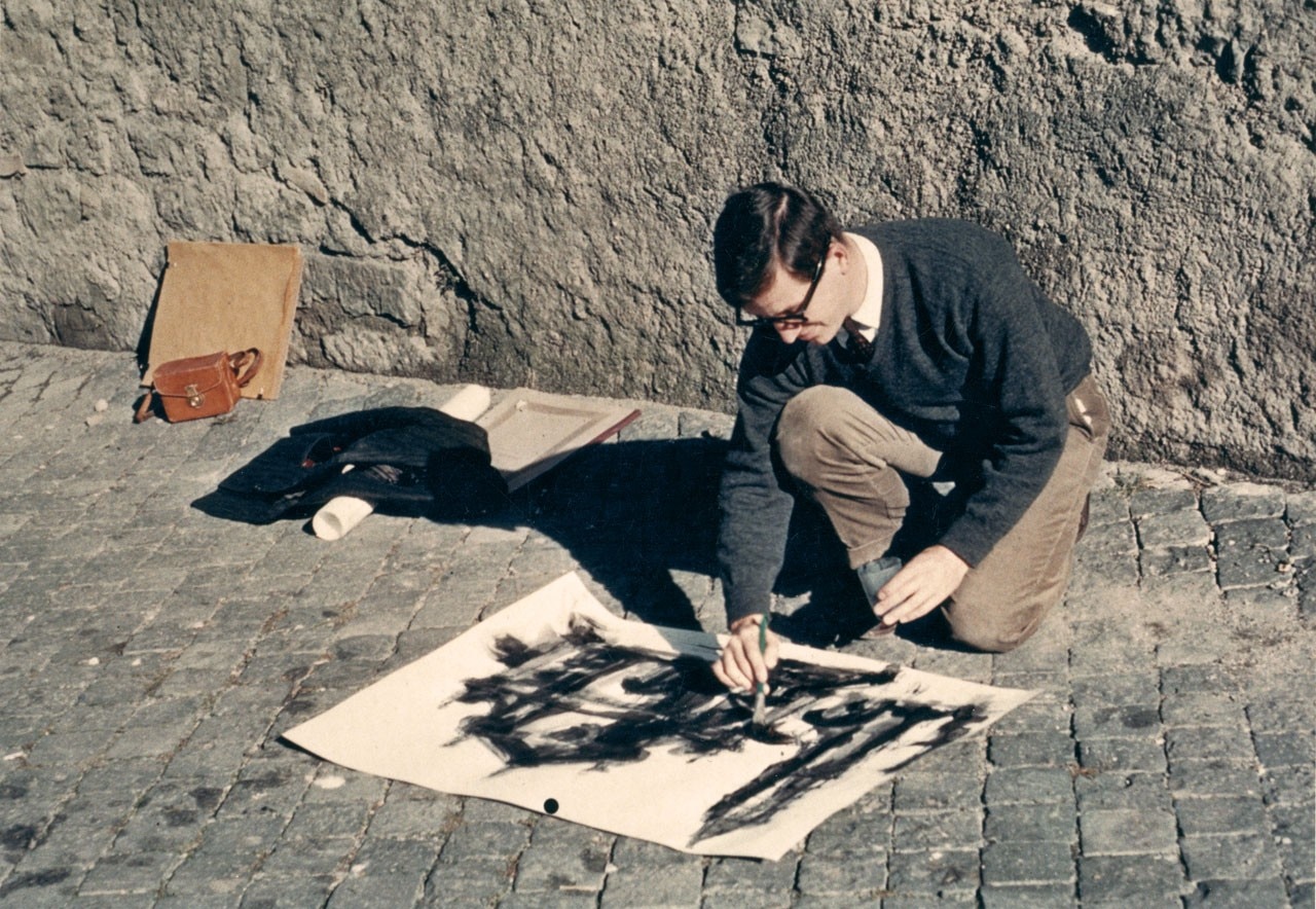
Of course, this seemingly contradictory relationship of history and the present is the crux of Past as Prologue. The exhibition shows drawings from Graves’ time in Rome. It was these Grand Tours that inspired both Graves and Robert Venturi to take from the past as a reformist vision of architecture – this was the early 1960s, when Modernism was king and any formal content was taboo. Graves and Venturi had slightly different views of how this should be achieved. Venturi looked to Rome for ideas about semiotics and reading surfaces, while Graves made a catalog of parts to use in his designs. Together, they spearheaded a new way of thinking about architecture, inspired by the past. This quasi-revolutionary new view of design was meant to be provocative, subversive, and slightly tongue-in-cheek. This is why the image of the Coat Full of Contraband is so important. It shows these designs as cheeky and under-the-table, but also as products derived from other products – not necessarily counterfeit, but something like that.
Michael Graves, kettle for Alessi, drawing for Alberto Alessi, 1995
These appropriations were not direct rip-offs or reproductions of historical buildings. Parts are always playfully scaled and distorted. For instance, in the Denver Library, an arcade is somehow formed by eliminating the wall below a series of square windows. Above, a rotunda with similar square windows is topped by a very light roof that extends out to provide shade. These playful reimaginations of historical elements were at the time subversive in their own way. The goofy look on Graves’ face in the Alessi ad hints that he knows exactly what he is doing.
Michael Graves, sketch for Sant'Ivo alla Sapienza, Rome
The trope of watch peddler also shows the “humanist” side of Graves. The linguistic and compositional in-jokes were only one part of the reaction to orthodox, rigid Modernism. This softer side was a continuation of the original Modernist tenet of design for the masses. Graves’ work is the embodiment of this classic Post-modern dilemma: does the marriage of art and life require knowledge of art history? Grave’s designs package radical concepts for the masses, and this juxtaposition gives them their unique character. For example, Graves’ famous soft hues are not the same colors as the more confrontational Charles Moore or even Venturi would use. In the case of Moore, bright psychedelics were his palette of choice, while Venturi often used bolder primary colors. This softer palette made the goofy historical mashups and out-of-scale elements manageable for a general public that Graves always wanted to reach.