


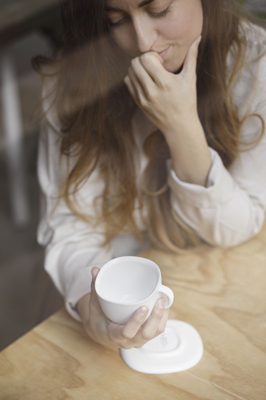
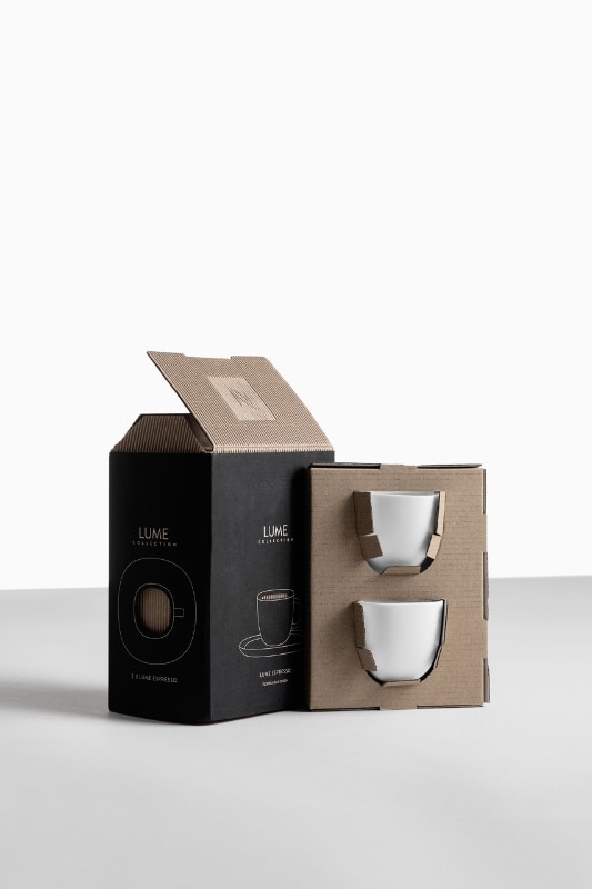
LUME Collection is the latest project by Milanese designer Federica Biasi. The young talent of Italian design has accepted the challenge of redesigning the classic Italian espresso cup, reinterpreting it in a contemporary and international way for the Swiss brand Nespresso. Biasi answered our questions, telling us about his design experience.
Can you tell us how it was to design a "super normal" object like the coffee cup? What inspired you in your research?
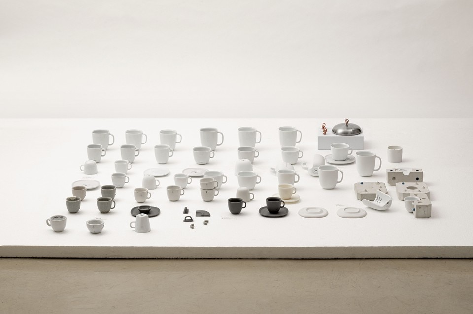
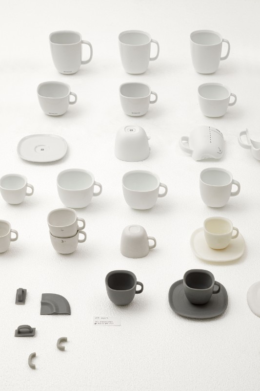
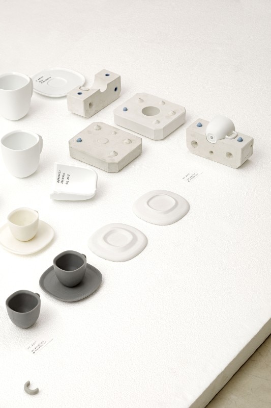
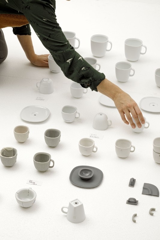
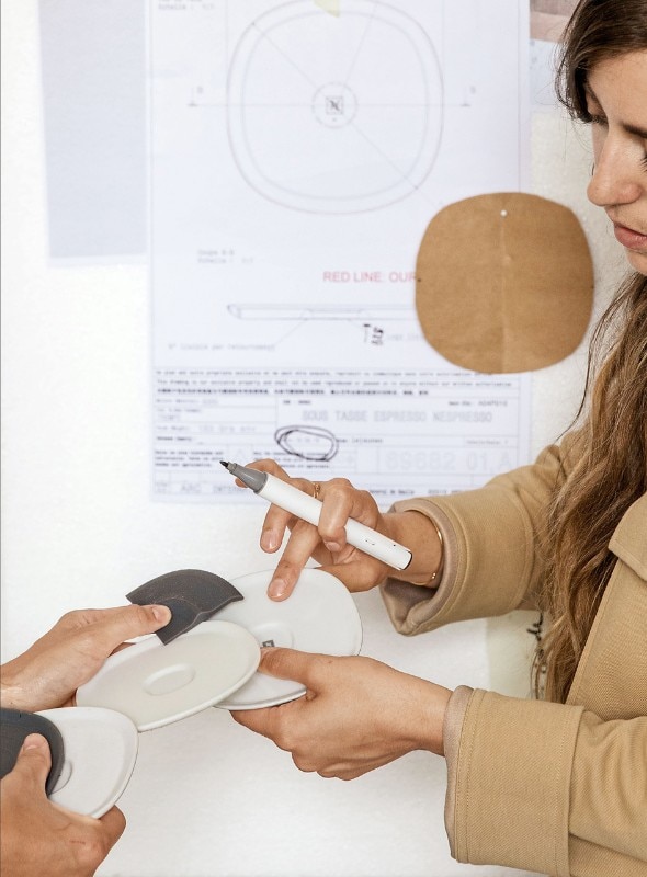
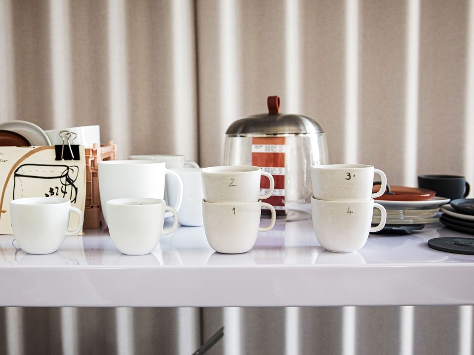
Talking about inspiration is not complex in this specific case. I was guided by the function and demand of the brand: reinterpreting the classic Italian cup with a contemporary twist. So I conducted a research on cups, anonymous or famous, in bars in Italy, in Milan and in some international places visited on business and leisure trips. The project was a real challenge, because the cup is a very personal object that comes into our homes and accompanies us every day... it is one of the first accessories we come into contact with in the morning as soon as we wake up, something to get attached to. Among the designer cups I studied is the Bavero by Alessi, designed by Achille Castiglioni, characterised by its conical and rounded shape, which allows perfect stacking without neglecting aesthetics. I have collected lots of anonymous cups, from the low, stumpy Neapolitan cups to the more "1990s" ones, with angular shapes.
What did you learn from your trip?
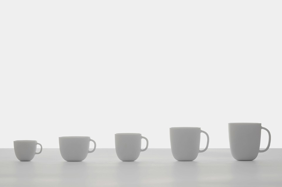
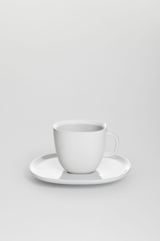
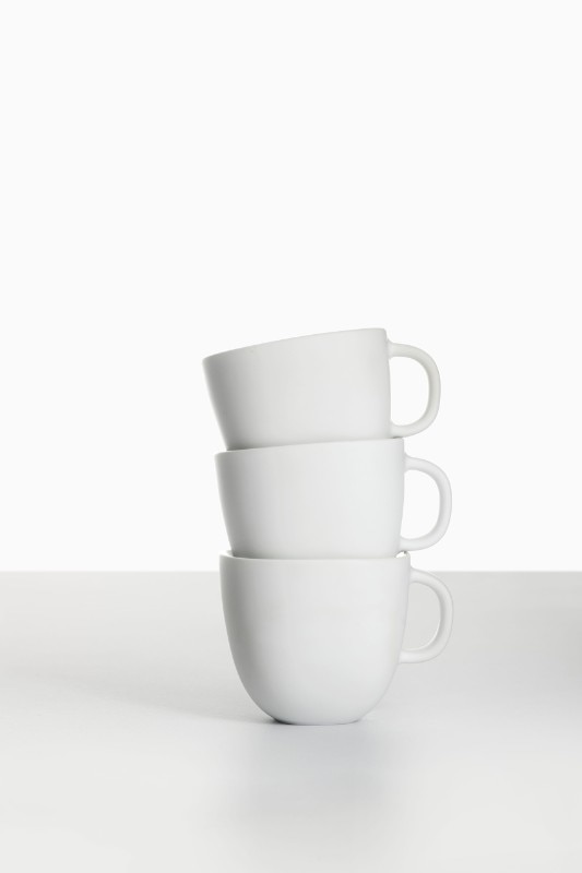
I understood that weight and thickness are the characteristics playing the most important role. For the thickness I looked a lot at Neapolitan cups, whose small size and generous thickness help to maintain the aroma in all its nuances, essential for a company whose "core" is the sale of coffee, before the coordinated accessory. In my design, I wanted to push to the last millimetre to maintain a rounded, stackable shape. In this way the cup is neither round nor square... but hybrid. I really like getting new lines. So I would talk more about study and research, to learn what had already been done and try not to replicate it, going into some aspects that I thought were essential.
In your research trip you also went abroad because you wanted "the product to speak an international language". Can you comment on this choice?
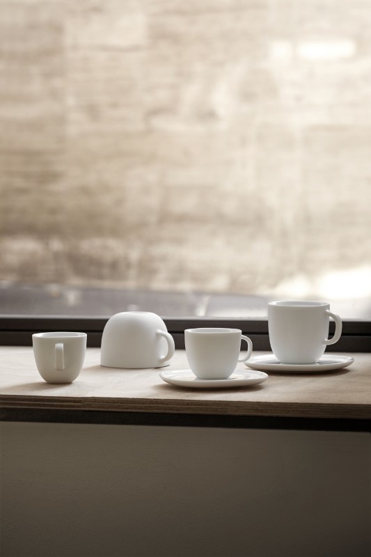
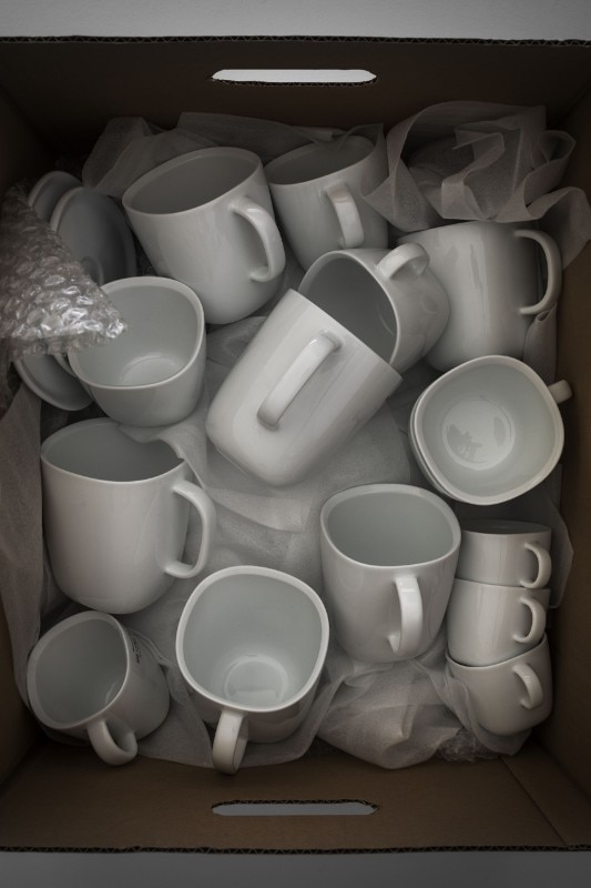
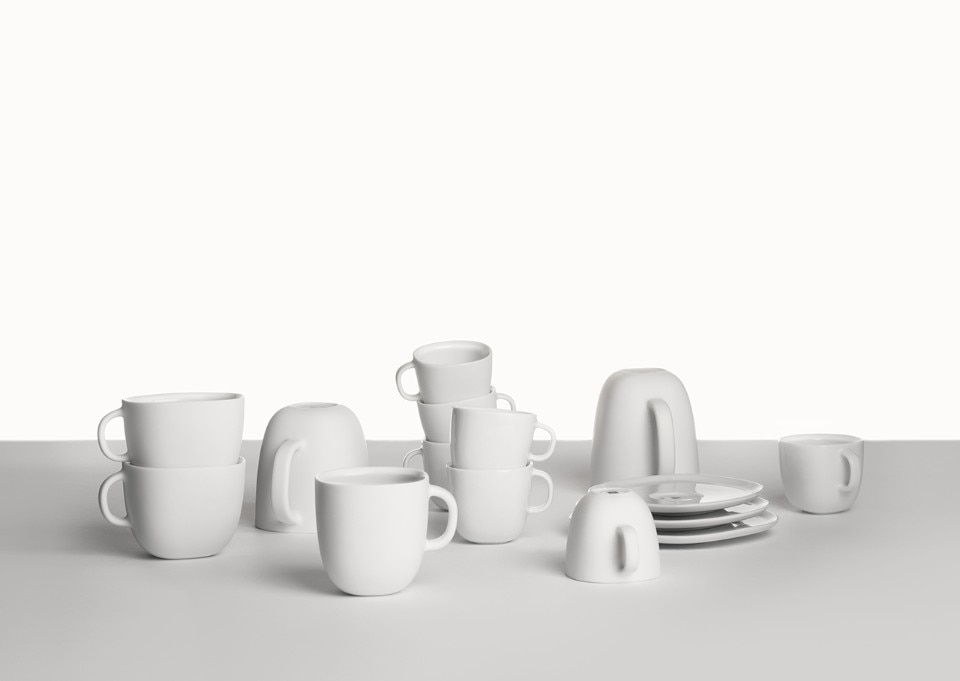
Nespresso is a brand known all over the world. The company's accessories must speak a global language. Coffee is widespread everywhere, and the Italian philosophy of espresso is just one of the ways in which the beverage is consumed. Take Northern Europe, for example, to which I am very fond: they do not cultivate the "passion" of espresso, but rather drink long, American coffees. The collection I was asked to design included five formats. It didn't make sense to focus the research only on the cup, but I wanted to understand how to make the large formats as comfortable as possible for long breaks, as they are allowed in other places. All cups are part of the same family and share the same accommodating shape.
In which formal and material choices has your research been translated into?
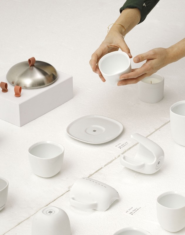
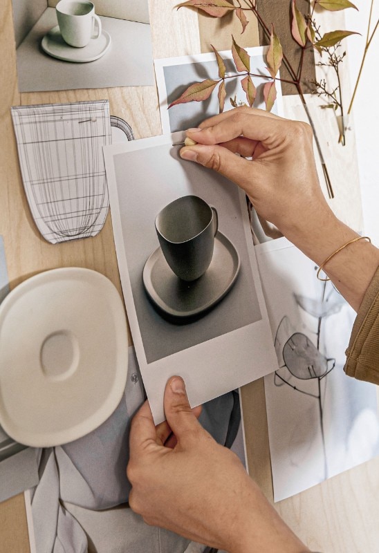
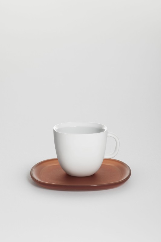
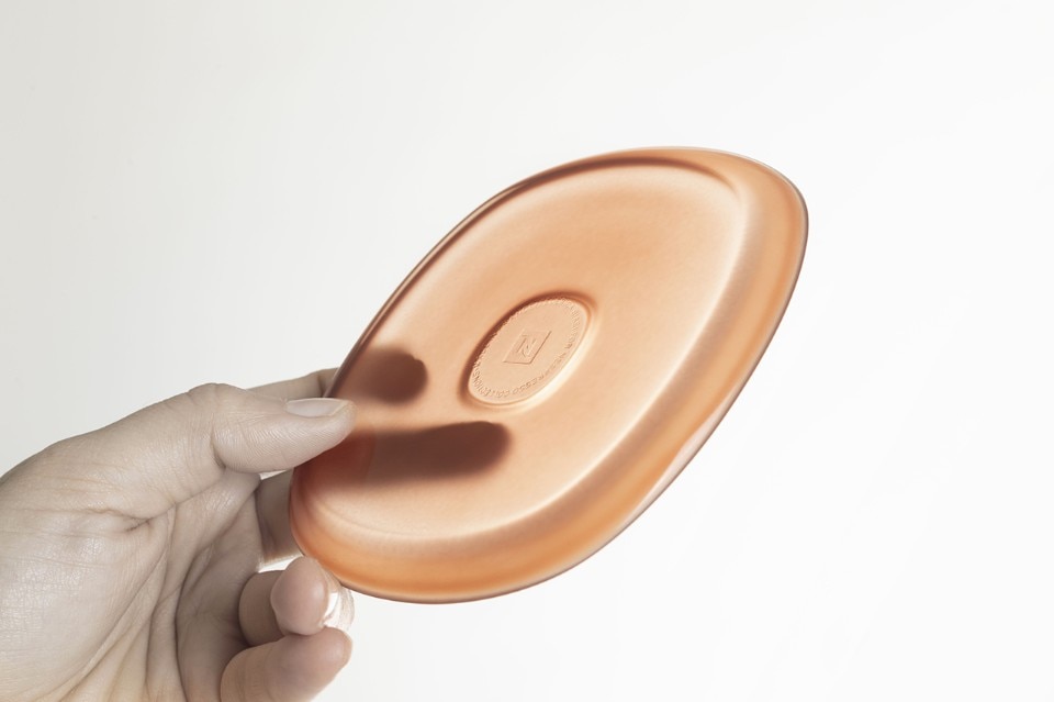
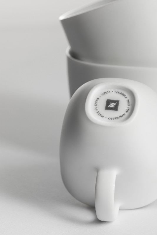
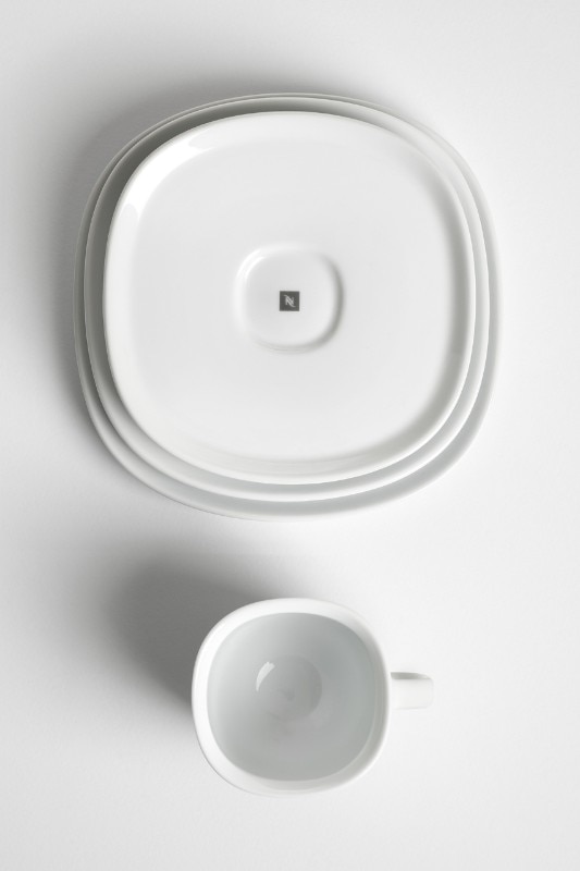
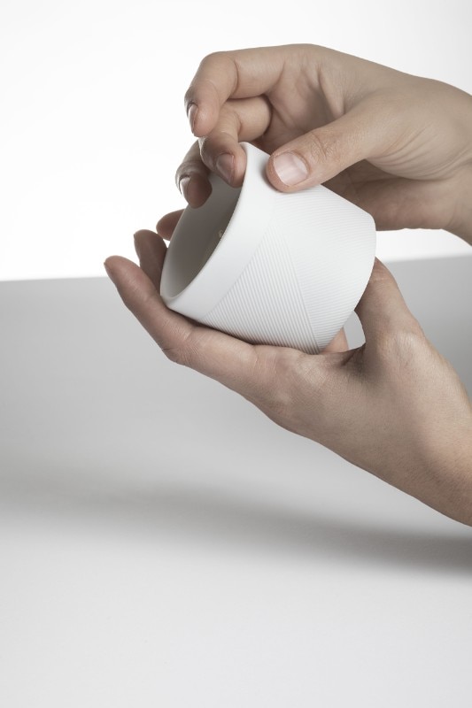
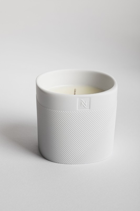
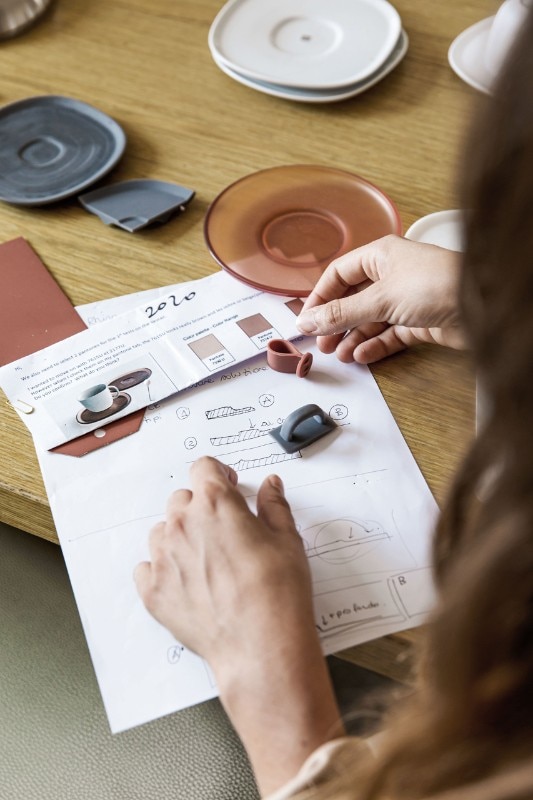
Porcelain as main material was a company request. The research I did on home consumption instead gave me feedback on the "cold" aspects of polished porcelain. In many cases people connect the glossy and white material to the coffee in the bar and therefore to a more detached experience; for this reason I chose a matt finish, which is at the same time soft to the touch, keeping the interior glossy both for reasons of use and hygiene and for aesthetic contrast. Still talking about aesthetic contrast and more or less for the same reasons mentioned above, I decided to propose a dish in "disagreement" with the total white tradition. The saucers are made of frosted and translucent glass, with colours chosen after extensive research that has focused on "typical consumers", the relationship with the drink and the company.
- Collection:
- LUME Collection
- Designer:
- Federica Biasi
- Company:
- Nespresso
- Year:
- 2020