


This interview was originally published in 2020, when Giuseppe Basile officially retired from his role as art director. However, his presence has been a constant in Domus offices until his last days, always overseeing the magazine’s graphic concept.
“I joined Domus in 1988 with the idea of staying there for two or three years: I came out after 32 years. I had been working for ten years in the publishing world, then one day, by pure chance, a friend of mine showed me an ad in Corriere della Sera... you know, once you had whole pages of job ads in the newspaper. The ad went more or less like this: ‘International publishing house, architecture magazine, searches for a graphic design manager in Rozzano, Italy’. I thought, this is Domus! Inequivocable. I answered the ad and within 20 days I was hired. I had several interviews, the first one with Italo Lupi, who was then the art director of the magazine during the direction of Mario Bellini, and on the third meeting I walked out with my hiring letter”.
This is how our long chat with Giuseppe Basile started. Born in 1958, Domus art director left the publishing house after three decades and is now working in his studio in Milan. He told us his beginning, the transition between analog and digital, anecdotes about cigars and faxes and how he gave shape to the ideas of thirteen directors while keeping the identity of the magazine alive.

How was your first day of work?
Really traumatic because I had a lot of people around me – once the editorial offices were much bigger – and, as always, in a workplace they all want to test you immediately: they didn’t know me and they wanted to see if I was good enough. I was in charge of the internal graphic team and I was the link between Italo Lupi and the editorial staff, basically the essence of my work at Domus in all these years: when you change direction every few years there is a need for those who arrive to find a structure capable of implementing everything that conceptually they want to bring to the magazine.
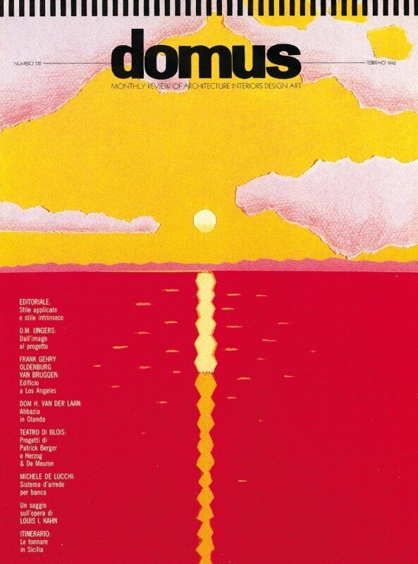
Then, within two years, everything turned upside down. Lupi left, Vittorio Magnago Lampugnani came in as director, and at that point I was asked to stay to give support in this transition and what were supposed to be three years became thirty. With Lampugnani, then, we agreed that it would be useful to have an external art director of the highest level and together we chose Alan Fletcher. I went to London to follow the graphic project once a week, on weekends. It was very hard because at the time there wasn’t all the technology available today, the best that technology offered was fax... it was all absolutely primordial. Contacts were always physical and analog.
With Alan Fletcher we realized that the publishing industry was moving towards the computerized world. In fact, I was hired at Domus also because I already had experience with computer graphics. I bought my first computer and paid it 18.5 million lire, a little less than what the Spider Alfa Romeo cost. That period also coincided with the transition to computers within Editoriale Domus: it was long and it took five years for it to be put into production. With Alan, therefore, there was a double project: a paper one (his) and a digital one (mine), in which I transformed everything that was done on paper into the digital world. They were two really different worlds.
Since then my experience went on, in the end I had the beauty of thirteen directors and it was these sudden changes that kept me in Domus for so long. My presence was crucial in these steps, because it is never easy to translate the idea of a director.

How do you translate the idea of a director?
The most difficult one was Lampugnani’s, because it was born in analog and had to be transformed into digital, trying to keep it as faithful as possible to the original. It was complicated and very heavy. From then on, everything was simpler because we all spoke the same language. Soon after came François Burkhardt, then Deyan Sudjic and so on. We had to translate the spirit of a director who wants to bring innovation to Domus. The speech of every director is always the same: “Ah, Domus the great, what a pride to work here, I am honored to enter this excellence, however...”. Here, after the ‘however’, they tell you exactly what they want to do. And that’s where the beauty begins, because the magazine must always be faithful to its principles.
Domus has its own recipe that it has to pass on to all the editors when they arrive, just like a cooking recipe where you need a little of this or a little of that. That’s how Domus is, it doesn’t just talk about architecture but, in the right doses, about design, art, and themes related to these worlds. On the one hand there are the innovations that a director brings, which is the very sense of change, and on the other the foundations of the magazine, which readers expect to find, direction after direction.
The change interrupts the past a bit, which is fundamental for Domus. If the magazine is still great it is because it was built by all these people who helped shape it, for better or for worse. This is also the secret that makes it strong and unique even today. To have something like this, you would need to sum up all the directions, the secretariat, the editors and the people who have gone through it: something impossible to replicate. Today’s Domus preserves some of what Gio Ponti left behind. And we are talking about names of the highest level imaginable.
What does Domus mean to you?
Domus has been my life. Unlike other projects – a poster, the cover of a music album – it is not an experience that is born and ends after a short time. If you produce a poster graphically, you condense in a page a concept, your visual culture and it ends there. In the publishing world, however, the fascinating thing is that you raise a child. When I arrived the child was already an adult and this was a bit more difficult, because it was already done, finished, formatted, that’s why I had to adapt to the magazine rather than trying to make the magazine adapt to me. If I have been able to go through 32 years of Domus it is also because I had to adapt every time to the various directions, also accepting things that I did not fully share, of course.
But the graphic world is a bit like that. I always say that I could design a porn magazine as much as a culture magazine because my design process somehow bypasses the content in the sense that the conent is foundamental but the difficulty in getting a result is similar. I’ve never seen myself as an editorial graphic designer specializing in specialized magazines, whether they were fashion or architecture and design. Take for example Playboy from the golden years. All the greatest graphic designers collaborated with Playboy, as well as the greatest opinion leaders, such as Alberto Moravia. There was more text on those pages than in many cultural magazines today. The 60’s issues of Domus and Playboy had black pages, full of text, always interesting to read.
So for a graphic designer making a magazine means adopting or giving birth to a child, and it is a project that never ends. Few other magazines in the world have the story of Domus and are still alive. It means that this child, as long as you feed and care for it, continues to respond.
This is a bit the obligation of those who work in Domus: to meet a whole series of people, of characters who gravitate around the magazine and to establish a relationship of mutual respect to maintain the maturity of a magazine that is now 100 years old. This is only possible thanks to the alchemy between those who arrive and those who are already there.
Who were your masters?
My great masters date back to the school days, the ISA Institute in Monza that I attended for five years. Roberto Orefice, rather than AG Fronzoni as a graphics teacher, then there was Nanni Valentini, who was one of the greatest ceramists in Europe, then Narciso Silvestrini. I looked at the works of international graphic designers like Ivan Chermayeff or Alan Fletcher. Maybe the holy card to put on the bedside table is Robert Brownjohn, I was very fascinated by British and American graphics that interested me more than the Italian, even if we had names like Franco Grignani that were famous abroad. Today it is more difficult for Italian graphic designers to go abroad with so much success.
In Italy I liked Italo Lupi, himself fascinated by the Anglo-Saxon world, he even had a house in London. My fortune was to be able to meet and work with many of them, like Fletcher, Chermayeff, Massimo Vignelli or Simon Esterson. Being able to observe them at work was a life lesson for me. There were those who worked super fast while others were more reflective... I also observed their attitude towards criticism: some were involved, others isolated themselves. This gave me serenity because it also taught me a little bit about the meaning of life in relation to the world of work. Moreover, the most beautiful thing in these 30 years has been to work both on concepts that I liked and on concepts that I did not like.
How has the publishing industry changed over the past 30 years?
Now, I don’t want to call myself old, but I come from a different era. The world of communication has evolved so fast. It has ancient roots, just look at the first layouts, the first graphic cages dating back to ancient Egypt. If you look at the papyrus you can see the lines that allowed you to write straight.
The world of graphics was almost always run by people who were close to the art world, take for example the posters of Toulouse–Lautrec. In fact, when photography was not yet there, it was necessary to know how to paint, draw, represent. Then with the birth of photography and the influences of the Bauhaus, publishing received a great boost at the beginning of the last century. The magazines were originally made almost only of text, very expensive and with very few images inside. Then came the magic of photography reproduced in printing and the publishing phenomenon broke out.
Just think that once an illustrated magazine indicated how many color images it contained because color was very expensive. We used to say “I recommend not more than three photos for each double page or else we’ll go over budget...”. The titles were also drawn by hand. Then the computer arrived. Today they say that the era of print magazines is over but I don’t believe it and I will never believe it. I believe that, as in all revolutions, something of what was there will remain and in this case I am convinced that something will be saved. What will be saved? Only the most interesting part. Once there was a magazine for every economic sector, “my-window”, “my-wood”, “my-heater” and so on, maybe it didn’t make much sense.
On one hand the world of graphics was very much helped by the computer, on the other hand it made many people believe that they could try their hand at graphics without having the basics. In Domus we used to test the paper because the ink was absorbed differently from the glossy one or from the uncoated one. Then I worked on the press. Today there is a whole remake of printing on the press, moving characters and so on, but what today is a remake, was my life until yesterday. So belonging to a certain historical period gave me the fortune to work today, in the digital world, on something that I know from its origins. If you do not have this knowledge you can imitate, copy, simulate, and sometimes you get lost in a glass of water because you do not master the basics. There were times when I talked to people who wanted to work in this field without knowing the difference between Bodoni and Helvetica.

What is the difference between Helvetica and Bodoni?
It’s a world... Fonts tell the story of the historical period they belong to. Every artistic movement has produced architecture that you see reflected in clothes, objects and typography. Each typeface brings with it a world. Then there are characters that have gone through history so brilliantly like Bodoni. Here we are at the beginning of printing and is still one of the most beautiful characters today. The study behind it is perfect, has brought this harmony between the thickness of the letters, the magic of certain curves giving extreme readability.
Can you think of any anecdote about life in the office?
I remember when we used to smoke cigars with Pierre Restany. When Pierre was in Milan and came to the office we went to the cafeteria to eat. There we listened to beautiful stories, he had a particular way of speaking, he would close his eyes and speak in his beautiful Italian–French language, every word was weighed up... and he didn’t just talk about art. He spoke about women, about life, about his travels in Mexico, in the Amazon. He was a citizen of the world. A transmission of data that is not made with the computer but with a person who tells you a thousand anecdotes about Andy Warhol or his friend, the owner of the Moulin Rouge, and all the dirty things that happened there. It was a whole world that ranged from the spatial concepts of Fontana, his dear friend, to the most beautiful butts in the office. Then we would move into his office and he would offer me a cigar: he always had two or three in his jacket pocket, all of the highest quality, Cohiba, Montecristo. Inevitably you could hear Marianne Lorenz’s decisive step, because at the time you could smoke in the office, but the cigars were a bit heavy, they left their aroma in the corridors, and said “But you two! Pierre, enough with this cigar!”. Today all these things seem almost unimaginable. Then I still remember the clamorous quarrels, the crazy fights with swearwords and books flying around!
Another time Marianne received from Bruno Munari an envelope for Domus, which she sent back to him simply by inverting sender and receiver by drawing an arrow, instead of rewriting the address. This is how it used to be done in the past. When the envelope returned to Domus again, on the side where there were the words “do not bend”, Munari – who was a great graphic designer, artist and many other things but above all knew how to play with words – added “do not eat, do not burn and above all, do not keep in the archive”. The envelope remained with me and I always thought I wanted to make a nice picture of it, because it tells you about an era. Beautiful.
Once I was working on a cover with Alan Fletcher and just then a cover similar to ours but from a competing magazine came out. I was very worried and I sent him an urgent fax writing “Alan, look, a cover like ours has come out!”. When he went to look at it he replied: “Yes, it’s true, it’s similar. But ours is better”.
I always remember Alan’s way of criticizing, a true master of life. He always accompanied one criticism with gratifying phrases. In fact, I happened to have to manage the cover of an issue on my own, and when the issue came out, I didn’t receive any comment via fax from him. Then, after the next issue came out, he sent me a fax with a poker face on it drawn by him and wrote “Dear Giuseppe, I saw the second issue, it’s much better of the first one!” Another day he said “The whole world is looking at you”, it was his way of telling me “watch out, you are fucking up”.
What about your last day of work?
Are you recording? Then I’ll tell you later (laughing). I left during Covid19 so I didn’t have the trauma of the last goodbyes because everyone was home. The editor was there and I was moved to say goodbye to Giovanna Mazzocchi after 32 years working together.
Now that you have more free time, is there a dream you would like to realize?
My dream is to live the world. And this is frustrating too, isn’t it? I would have already moved to the United States if it wasn’t for the coronavirus and the precarious situation there in general. I had always imagined resigning and taking a flight to Los Angeles the next day. Instead...
You know, travel used to be a thing for the rich, today you can get your ticket, leave and the next day be on the other side of the world. It’s the most beautiful thing. Living a life on Earth, especially when you reach a certain age and never have seen it is a crime! Also because I come from a generation where all this was only for the chosen few... that is, Gianni Agnelli could afford to spend an hour on the phone with the United States or to go there.
Do you have a message for the aspiring art directors?
First of all, to stay alert because I haven’t stopped working, I’m still on board! The only advice I can give, as far as possible, is to choose some masters and go meet them. The important thing is to know well how to choose them.