


This article was originally published on Domus 1070, July-August 2022.
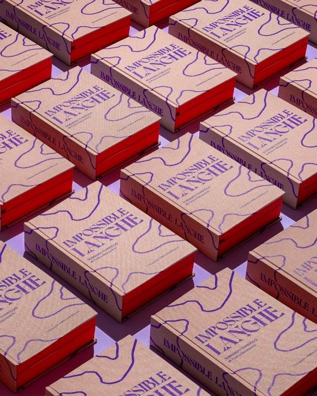
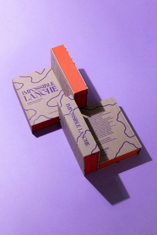
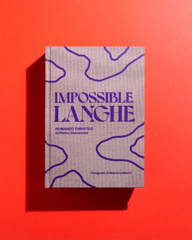
Impossible Langhe is a tourist novel, half guide and half story. A travel log designed by the Turin-based graphic studio Undesign, it aims to weave together contemporaneity with the local Langhe culture, its history and geographical specificities. The author Pietro Giovannini seeks to answer a simple yet frequent question: why are the Langhe hills so special?
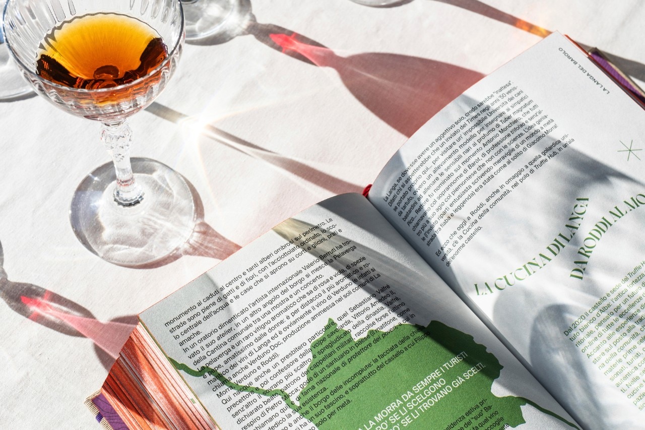
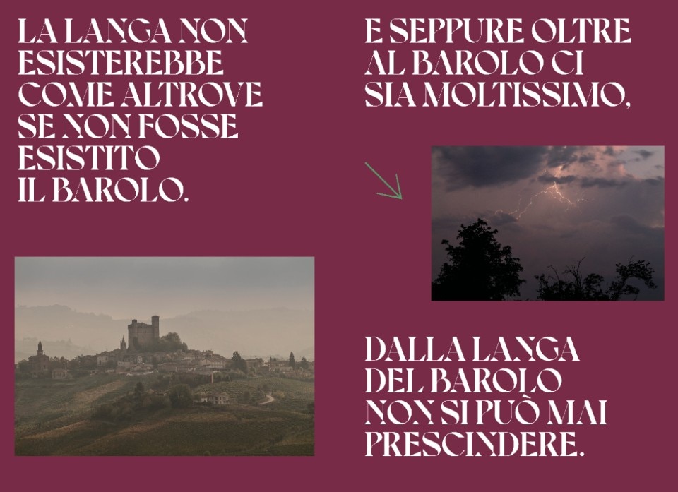
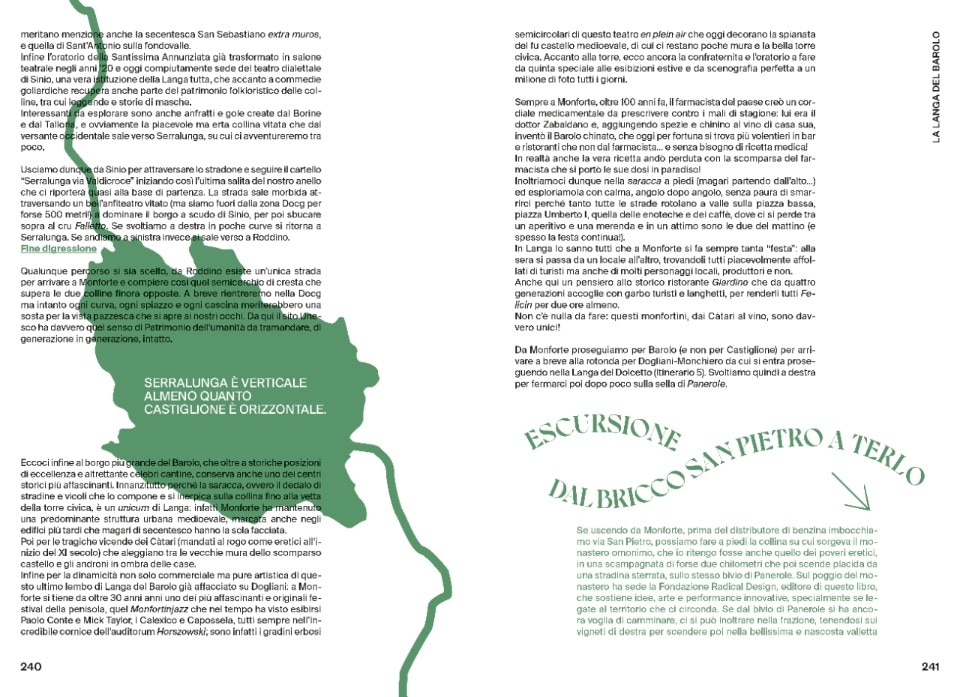
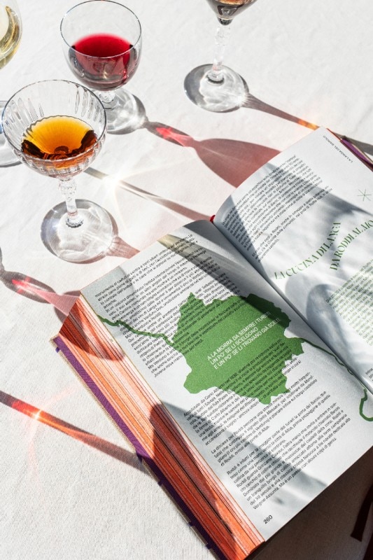
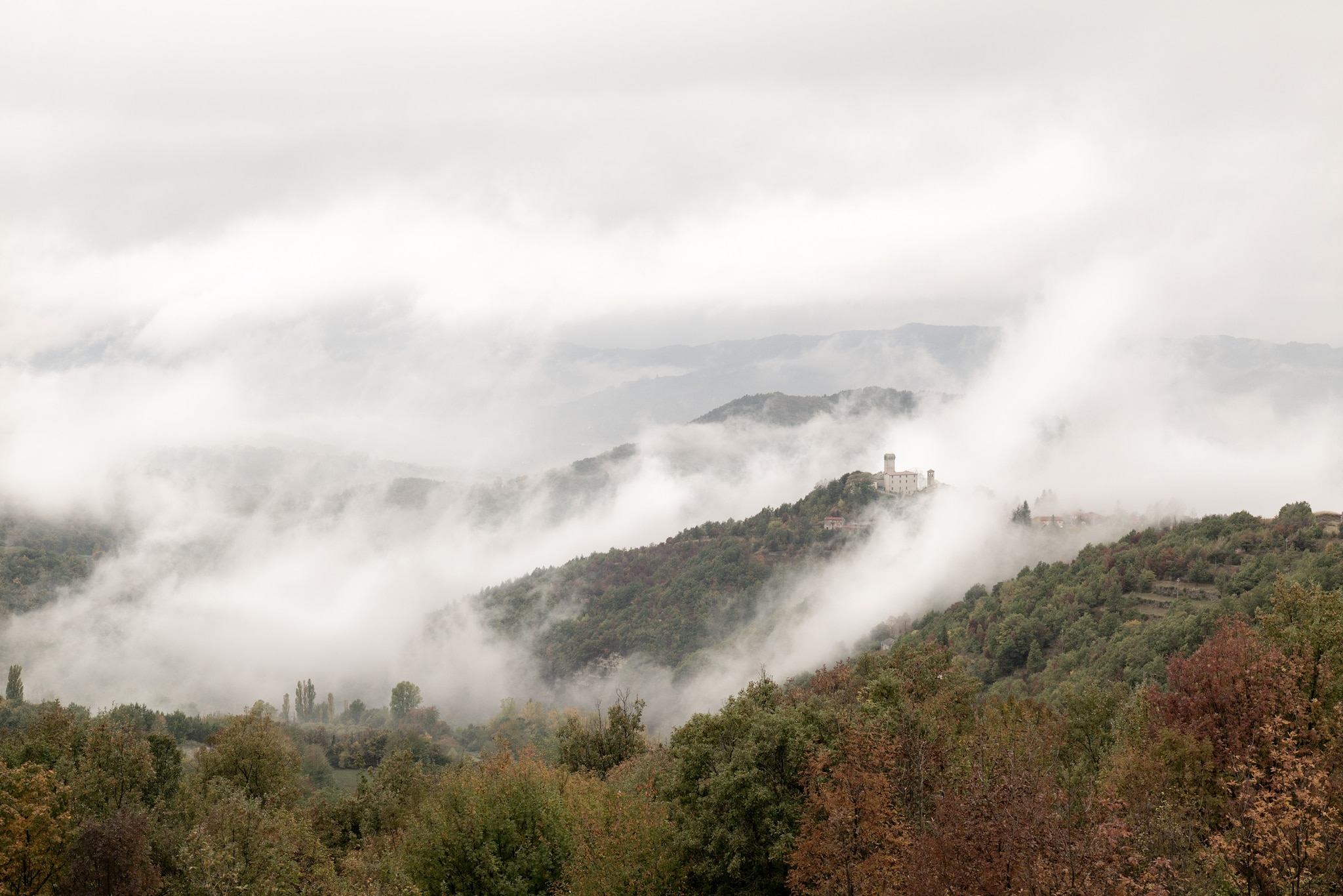
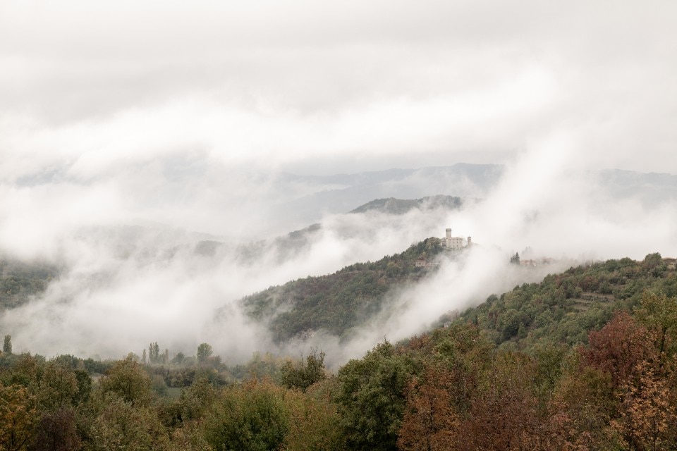
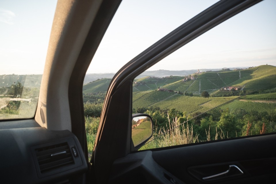
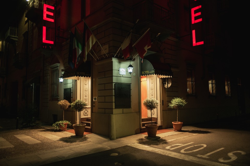
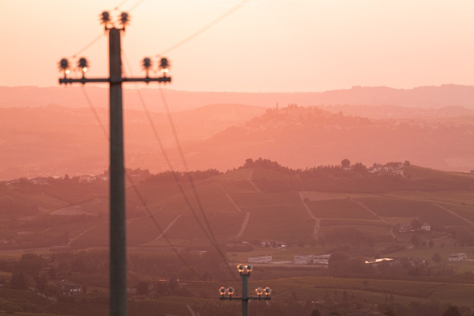
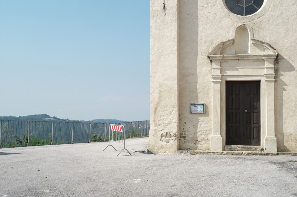
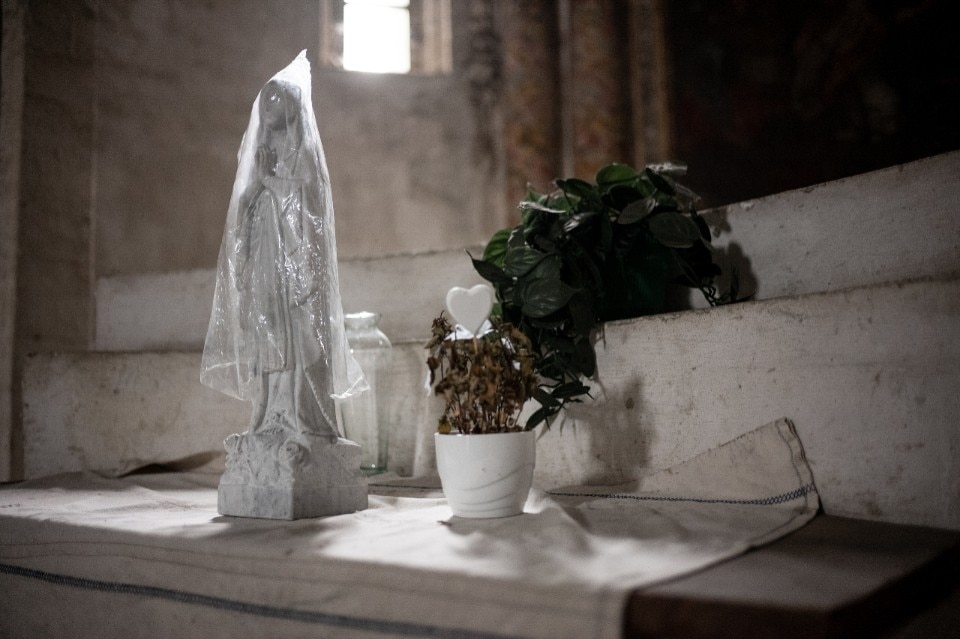
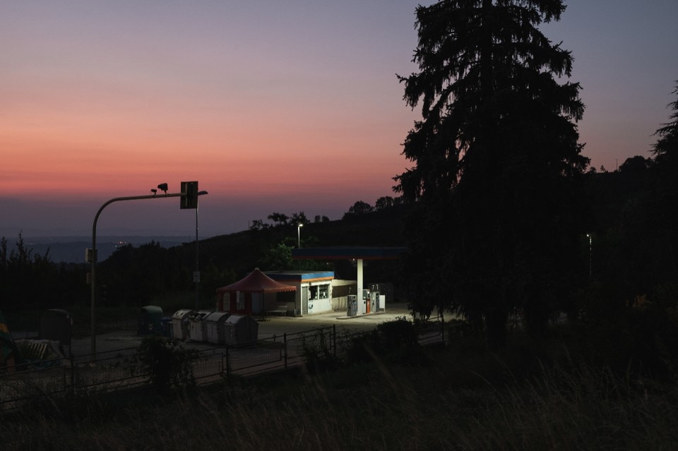
The book describes a land of contrasts and epic stories, inhabited by big and small everyday heroes as well as incredible visionaries. The hills, valleys, cities and towns, from Lower Piedmont to Liguria, frame a breathtaking and detailed story that suggests unexpected itineraries portrayed by Maurizio Beucci’s masterful photos.

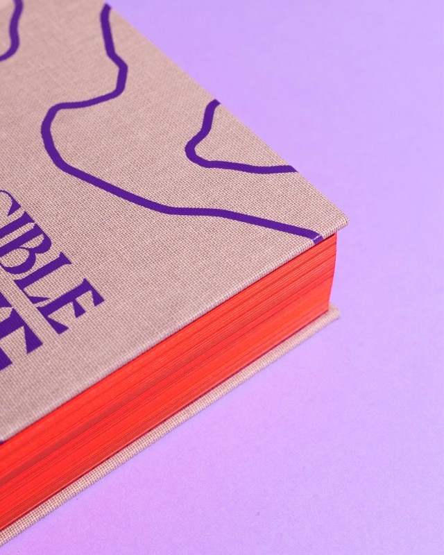
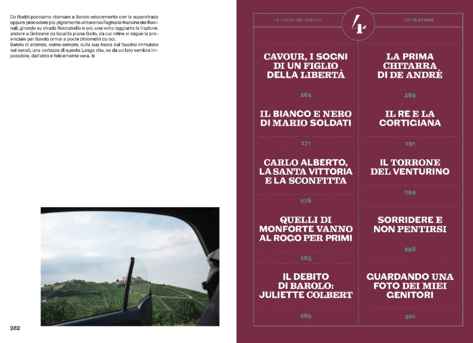
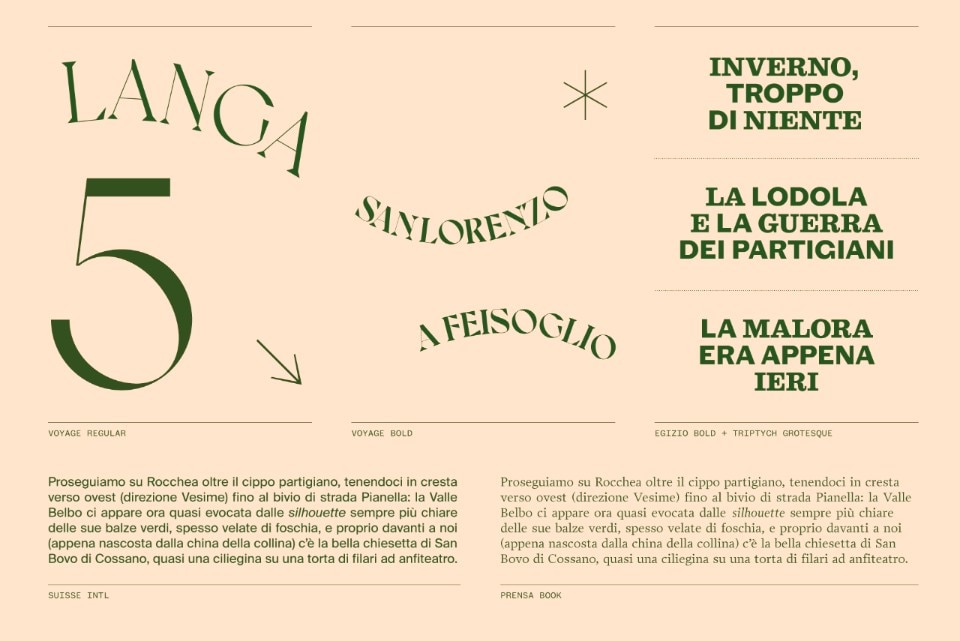
The book’s two-fold nature is also revealed in the binary structure of the graphic design. Nine chapters present two complementary sections. On one hand, the comprehensive and analytical geographical journey accompanies readers through panoramic spots, country churches and hamlets. On the other, inserts supplement each itinerary with stories, traditions and characters. These contents are visually translated through psychogeographic maps that reinvent the land, with a collage technique and images rendered in different shades of colour. There are clear references to the Situationist International, a movement that, between 1957 and 1972, impacted the 20th-century art scene and, in the Langhe, found particularly fertile ground.
Indeed, its origins were notably influenced by the encounter between artists Pinot Gallizio and Piero Simondo. In 1955 in Alba, they founded the experimental workshop of the International Movement for an Imaginist Bauhaus, which, two years later, joined the Situationist International that would be at the centre of the debate on the role and function of art. The typographic choices also reflect the personality of this area.
For the titles, Undesign chose a serif typeface that enhances the shapes of the letters used on wine bottle labels. The font family is enriched by the famous Egizio character, designed by the master Aldo Novarese in the late 1950s for the world-renowned printing press manufacturer Fonderia Nebiolo (the oenological assonance with the company’s name is no coincidence for a project about a land of vineyards and wines).
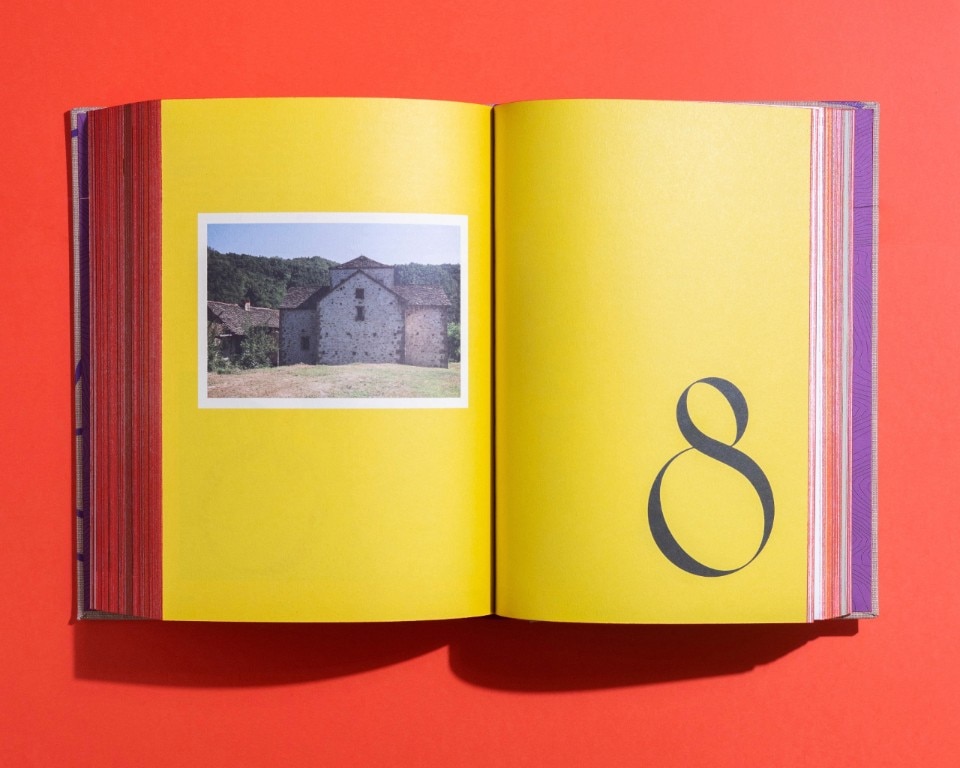
Emphasis is given to the photos, which occupy entire pages or are composed in special opening sections like postcards in a travel log, accompanied by notes or quotes. An original, intimate and sincere portrayal of people and places, it seems impossible that these stories with such different horizons can coexist across just a handful of miles.