


On September 4, 1975, the British audience were the first to enjoy, from the comfort of their sofas, the debut episode of Space: 1999. The TV series, the last joint effort by Gerry and Sylvia Anderson – the golden couple of sci-fi animation – arrived six years after the July 1969 Moon Landing and at the apex of a long decade in which the space age had permeated the creative industry, on both sides of the Berlin Wall.
From fashion (Pierre Cardin) to communication (the Papalla designed by Armando Testa for the Philco adverts), from music (David Bowie and his ‘Moonage Daydream’ and ‘Space Oddity’, just to name the most famous examples) to the endless production of children’s toys, popular culture – high and low – in those years was certainly fascinated by the Space Race and, in turn, fed its myth.
In the consumer industry, the sectors that were most seduced by this extraterrestrial frenzy undoubtedly were design and cinema. Both had the ability to give birth to works that we venerate today with the obsequiousness otherwise assigned to timeless icons, but which at the time of their conception were, above all, interpreters of a very specific zeitgeist. It is therefore not surprising that the most fascinating aspects of these two creative spheres are often to be found in their dialogue.
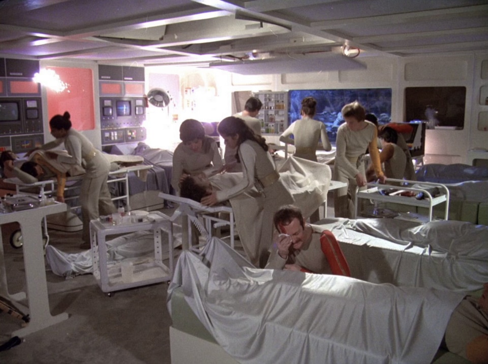
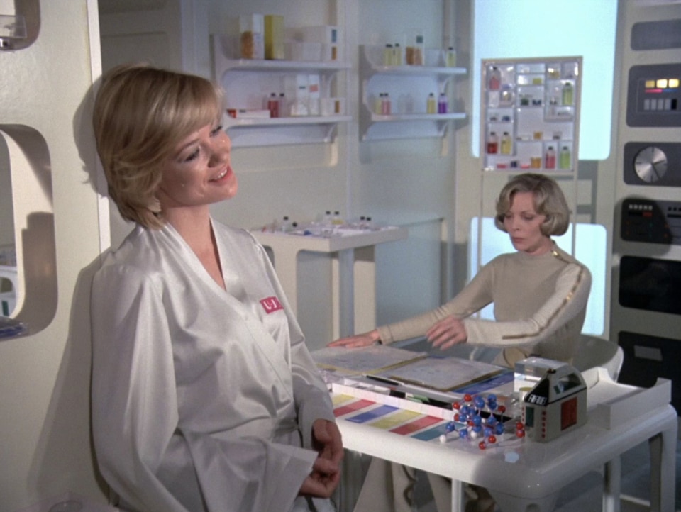
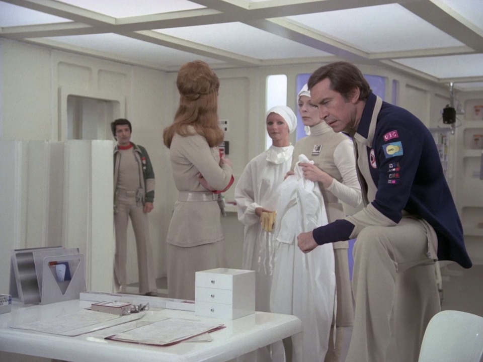
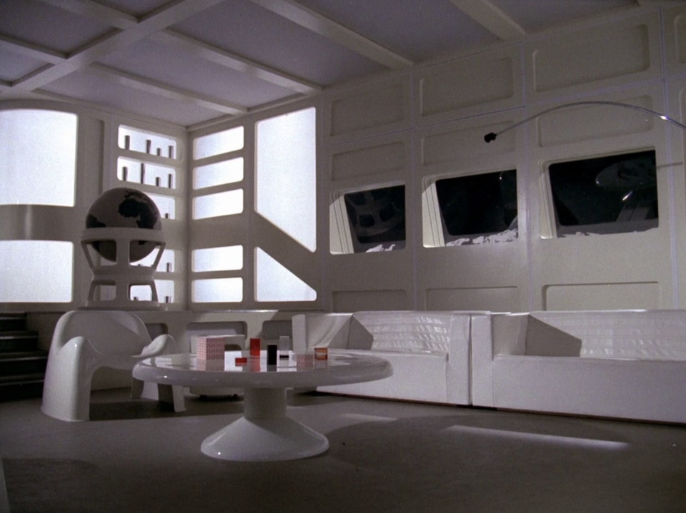
A combination that – on top of Stanley Kubrick’s 1968 masterpiece 2001: A Space Oddyssey – found its peak precisely in Space: 1999, the most expensive series ever made by the BBC at the time. Its set, also thanks to the role of co-producer of Italian public broadcaster RAI, is a blissful triumph of (often Italian) interior design, where white plastic and leather reign. Something that over the years has contributed to a multitude of blogs, like The Catacombs, dedicated to diving into the topic.

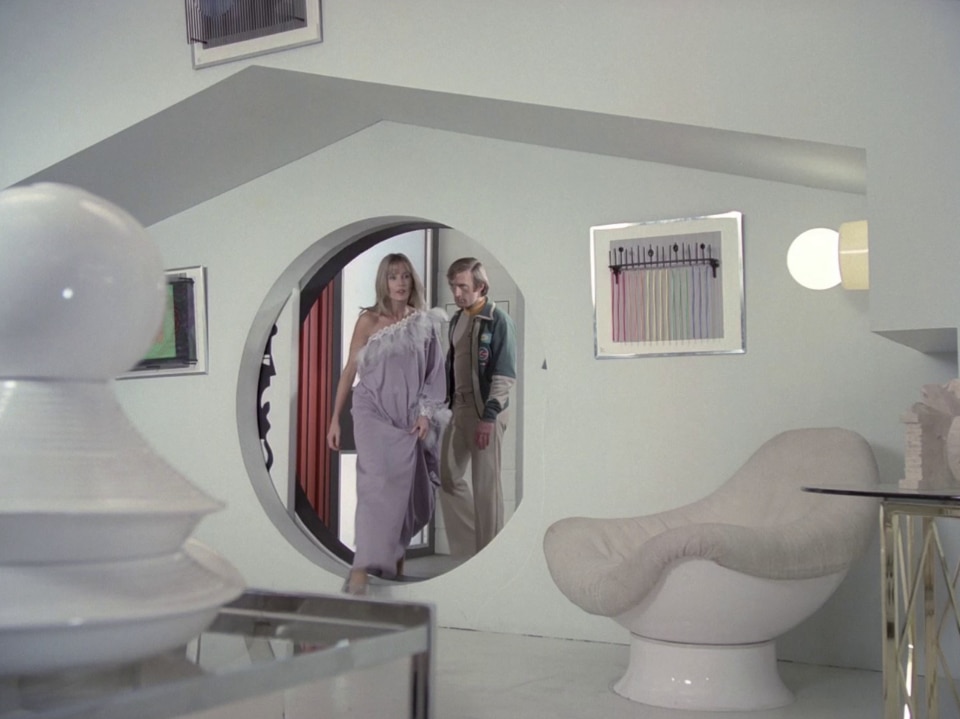
Unlike many science fiction or Pop-oriented films produced in the 1960s, where set designers often had the task of setting up environments capable of mirroring the Space Age iconography also pursued by the world of design, Space: 1999 represents an exception.
Thanks to its mid-1970s release, therefore in a moment of maturity of said culture, the television series could make use of the cream of interior production of the time with greater awareness. The use of furnishings which had often been designed in the previous decade highlights, at the same time, the undeniable visionary nature of European and, above all, Italian modernist design.

The bright side of the Moon
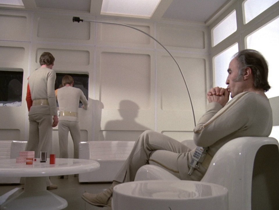
This is the case, for example, of the Sorella lamp by Harvey, today reissued iGuzzini which, produced in 1972, was widely used in cinema over the following years whenever the camera was investigating the Moon. On top of serving as a desk lamp for the Main Mission control room in Space: 1999, Sister returns in Moonraker (1979), the eleventh film of the James Bond saga, and in the episode ‘The Invisible Enemy’ (1977) of the equally famous British TV series Doctor Who.
Similarly, the Pileo lamp (1972) by Gae Aulenti for Artemide, another classic of the Spazio: 1999 sets, was adopted for the adventures of the Time Lord later in the decade.

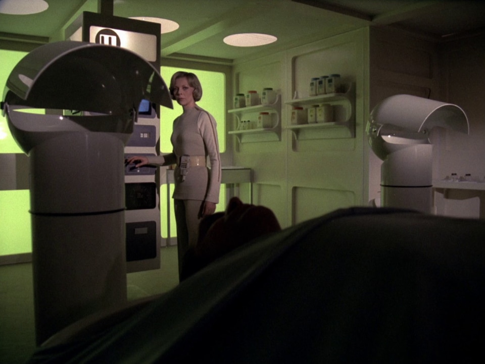

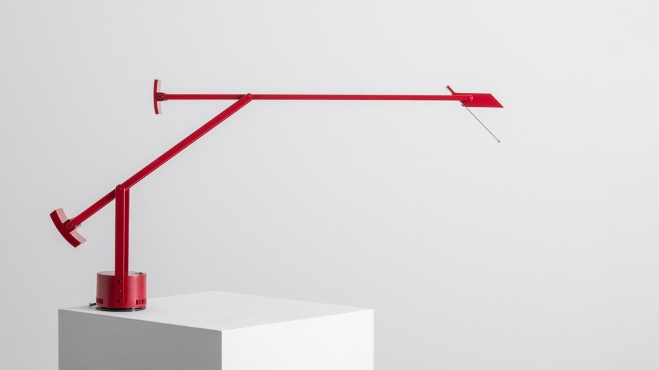
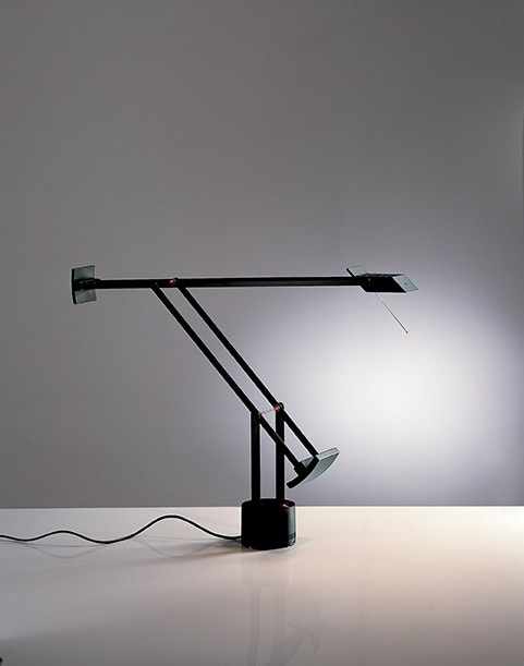
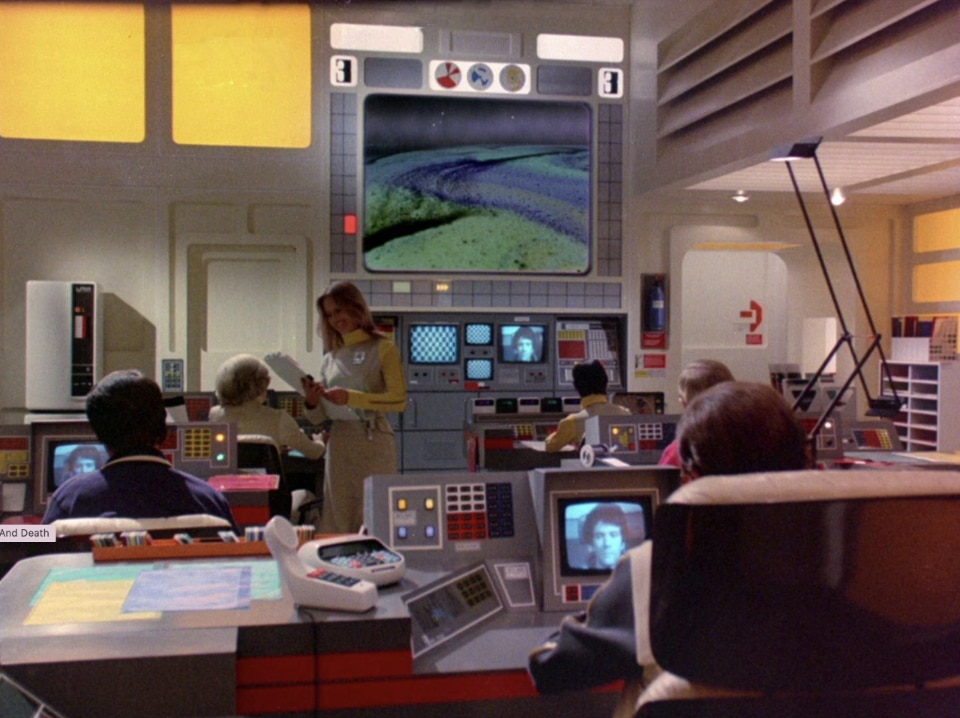
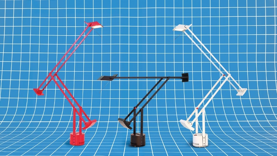
Again, another Artemide lamp, the Tizio (1972) by Richard Sapper, whose futuristic matrix lied, above all, in the longevity of its commercial success. Winner of the 1979 Compasso d’Oro award and an unmissable must-have of the 1980s, the lamp boasted an industrial aesthetic capable of going beyond the Space Age style anticipating post-modern design.
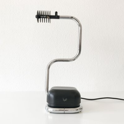
Emblematic of the futuristic momentum of interior design at the times, is the use made in the TV series of the Lucciola (1971) by Fabio Lenci for iGuzzini. The lamp, in its desk version, is in fact turned with a cinematic license into a microphone because of its enigmatic and sinuous silhouette. However, Lucciola is, above all, an interpreter of the forward-looking mindset chased by the TV series itself. It was in fact – together with Tizio – one of the first lamps to employ low-voltage LED light bulbs, a lighting system until then adopted in the automotive industry only.
The design of optimism
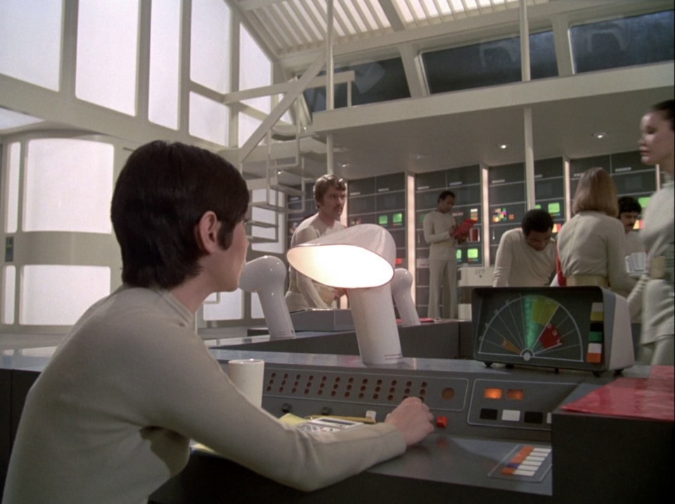
If the selection of lamps used in the television series would be sufficient to set up a design museum, the same can be said of the seats and desks.
They appear like the synthesis of the research on materials, such as glass fiber and plastic, which contributed to assigning to the industrial design of the 60s the futuristic and experimental connotations that made its production so much cherished.

A research that could thrive exceptionally also thanks to a culture that optimistically promoted the use of materials which would now be condemned following the centrality acquired by the themes of sustainability and circularity in the design discourse. The unrepeatability of the premises of such research therefore contributes to today’s perception of these design products as iconic, not because timeless, but precisely because of their ability to capture and interpret a precise moment of socio-cultural transformation.
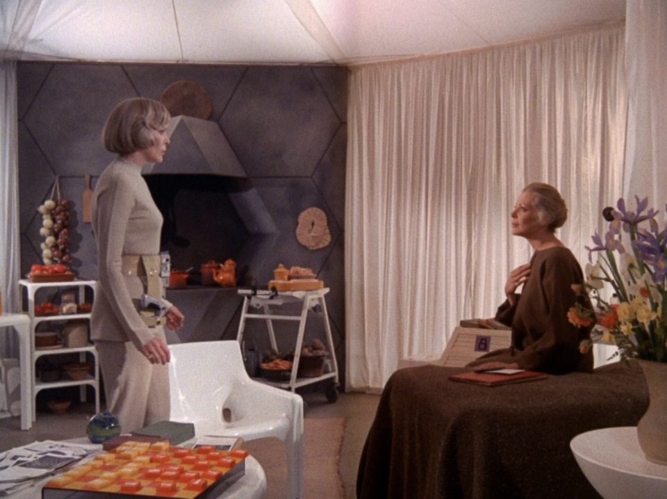
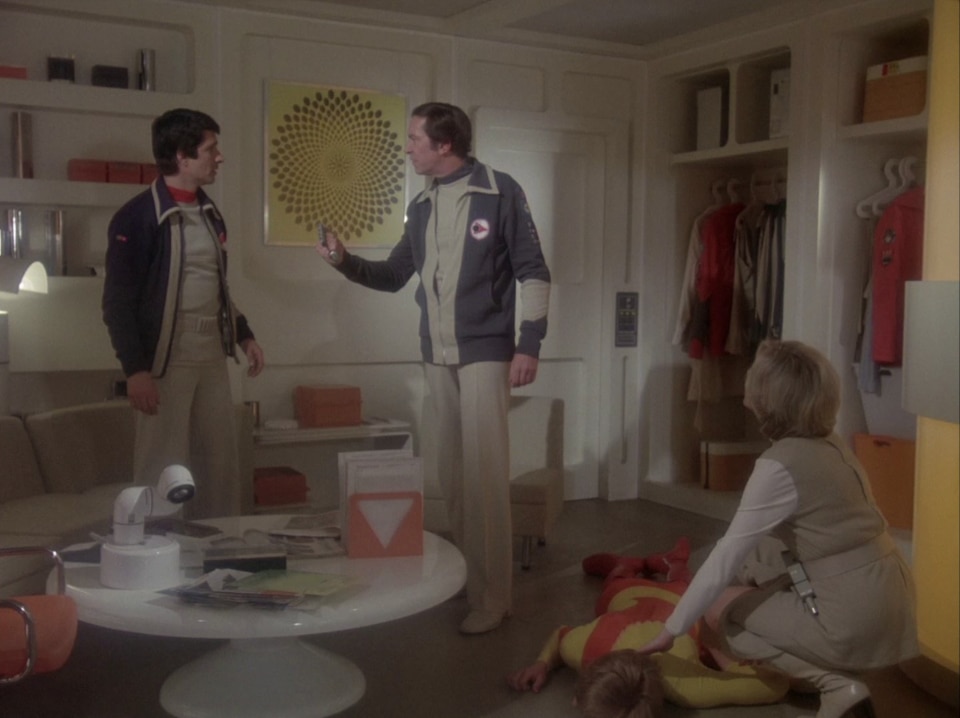
It would indeed be a mistake to overlook how this design freedom belonged to a broader scenario of unconditional enthusiasm towards the future, in which playfulness was transversal both to the artistic sphere and to cinema. Frivolous space heroines, the sparkliness of the sexual liberation and fragments of total Pop nonsense thus found a perfect match with a design that, although not resulting as deliberately ironic as Memphis yet, seemed to come straight out of the pages of a comic strip or a cover of Urania.
Furnishing the Moon
This spirit is reflected in the range of seats used in the series.
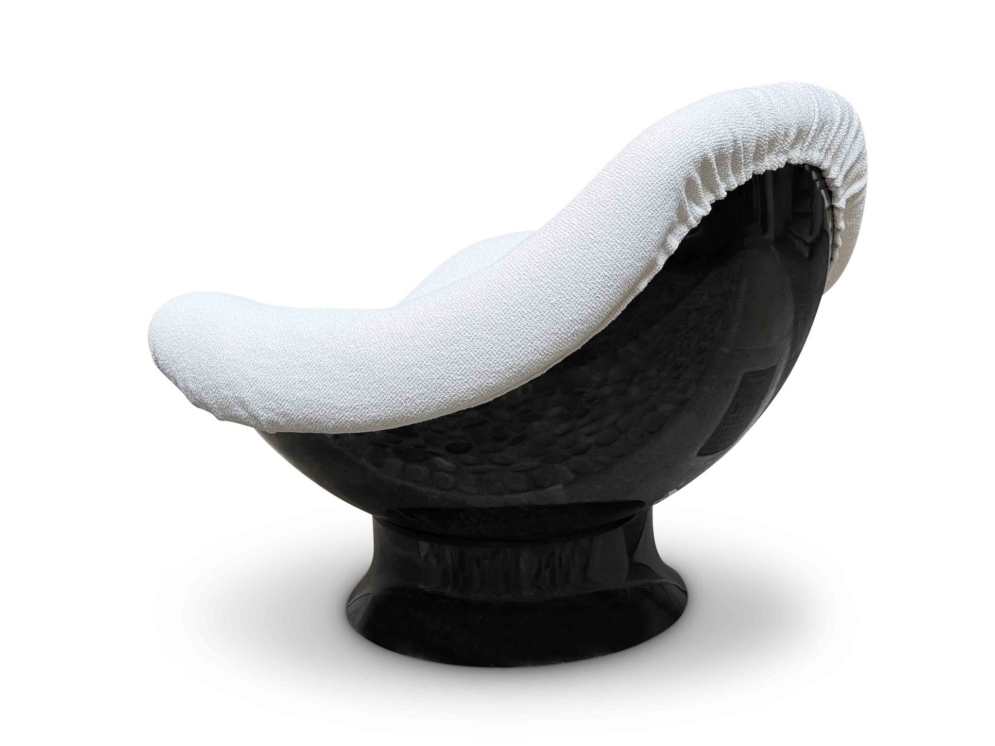
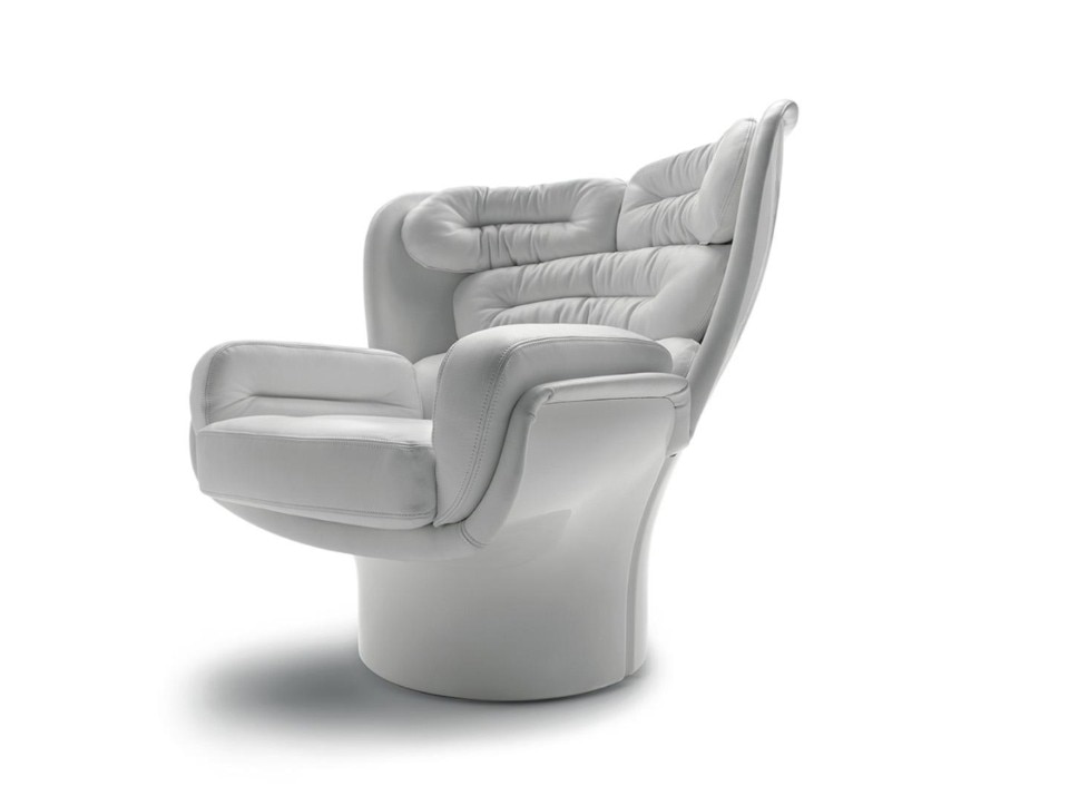
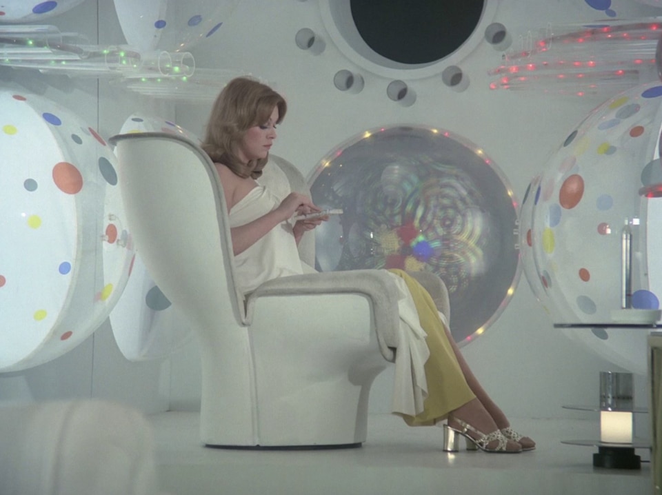
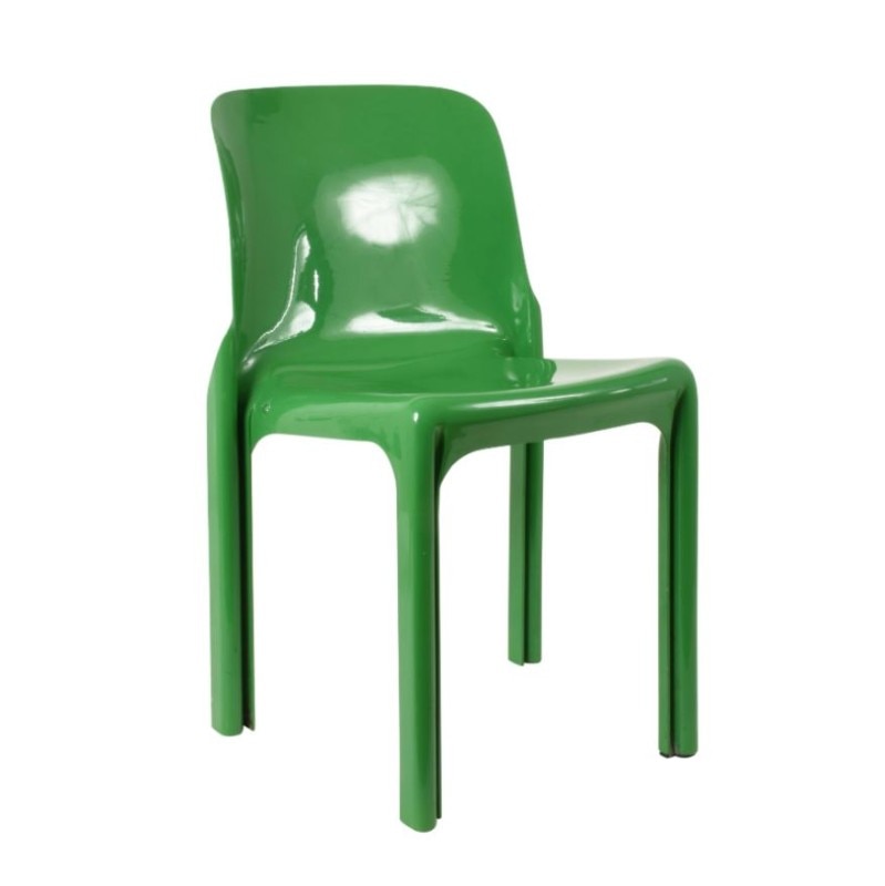
Above all, products such as the Selene chair (1968) by Vico Magistretti for Artemide and the Elda armchair by Joe Colombo, designed as early as 1963 for Comfort (now produced by Fratelli Longhi), encapsulate the Space Age iconography with their fiberglass structures and (the latter) white leather upholstery.
Without neglecting all that ‘minor’ production that looked up to the great masters, like the Domani armchair (1972) by the German firm Odo Close, offering an Op Art and lunar reinterpretation of the famous Lounge Chair by Eames.
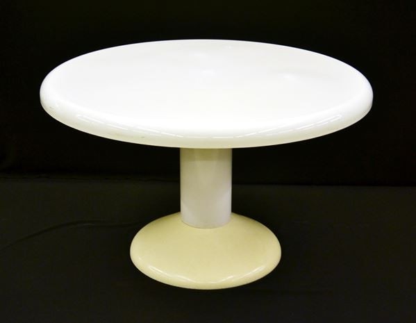
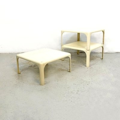
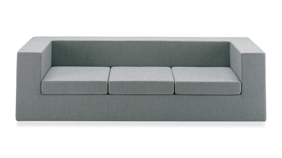
And, again, the Rodica armchair (1968) by Mario Brunu for Comfort, the Ribbon (1966) by Pierre Paulin, the Stadio, Tessera and Mezzatessera tables by Magistretti all from 1966 and for Artemide, the modular sofa system Swany (1970) by Sylvain Joly and Hughes Steiner for Steiner, and the Throwaway sofa (1965) designed by the then editor of Queen magazine and, later, Harper’s Bazaar Willie Landels for Zanotta with a polyurethane structure, one nylon cover layer and a removable one in, needless to say, white leather.
Design as an aesthetic and utilitarian utopia
After all, the great alien revolution brought by Space: 1999 lies in the application of design objects to the daily working environment of the astronauts. Proof that at the time of their initial conception these pieces did generate an extraterrestrial aesthetic fascination in the public, but were also conceived as utilitarian products, in the best tradition of industrial design.
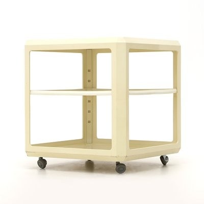
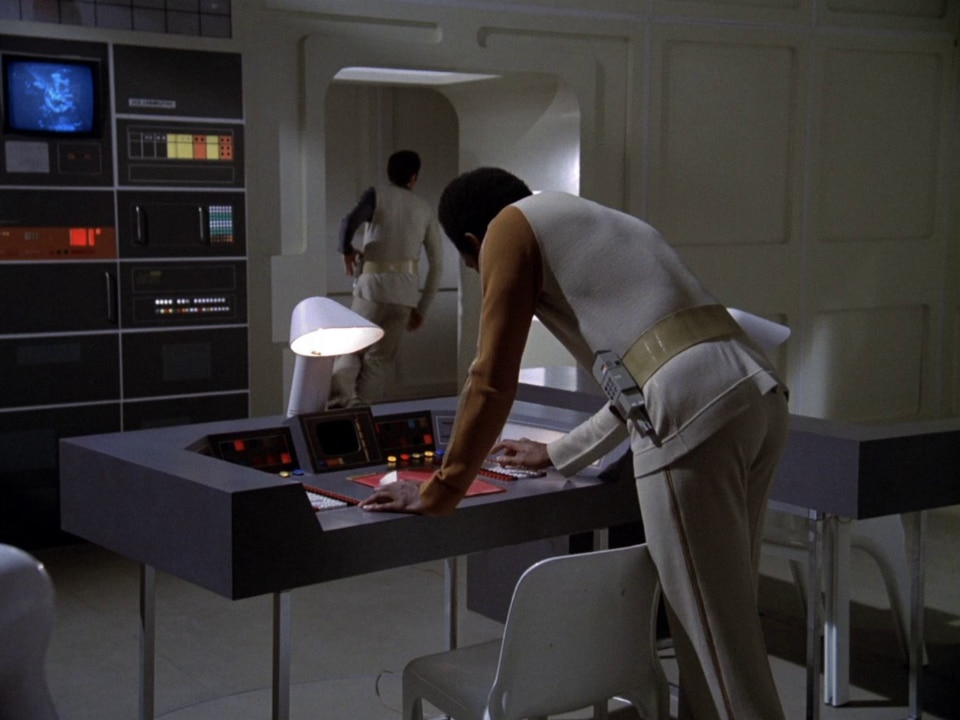
What better example of the use, among others, of the Jarama desk (1969) for Saporiti and the ABS bar trolley (1970) for Kartell, both designed by Alberto Rosselli, one of the founding fathers of the Italian industrial design philosophy. Similarly, such a mentality is demonstrated by the abundant use of the Demetrio 45 shelving system (1965) by Magistretti for Artemide, the classic Boby trolley (1970) by Joe Colombo for B-Line, or the wall shelves by Bisterfeld + Weiss (circa 1972) reinterpreted as shelving units for electronic and medical equipment.
In the TV series, even simple everyday life actions, like sipping a cofee or doing some calculations, match this philosophy according to the mindset of the times. Think of the orange ceramics Gabbianelli cups, the salad bowls and juice press by Gustavberg, or the Sanyo RM5430 (1972) digital clock-cum-radio.

Olivetti products couldn’t obviously miss. The pocket calculator Divisumma 18 by Mario Bellini makes an appearnace, next to the Gabriele 2000 typewriter by German firm Triumph-Adler (later acquired by Italian computing company in the 1980s). Even when it came to calendars paper was replaced by ABS plastic, like in the case of the ‘ring-a-date’ Perpetual Calendar conceived by Brusasco and Torretta Architetti for Euroway in 1970.
Living practices and common objects that, once adapted to these sci-fi settings, now mesmerise even more than at the time of the series' original broadcast, especially when approaching them with the posthumous consciousness of the failure of the elegant and utopian extraterrestrial future the Earth population had envisioned for themselves.
Space: 1999 therefore stands as the celebration of an approach to the design object that has gradually been lost over the years, polarizing the elite production from the economically accessible one and thus alienating entire generations from the development of a tangible taste in matters of interiors.
Interior design as the symbol of countercultural cinema
The use of many of these pieces in other TV series produced by the BBC, such as the aforementioned Doctor Who and The New Avengers (1977), opens a wider window on the centrality of interior design in the cinema of the 60s and 70s, and not just in science fiction.
Influenced by the Roger Vadim's blockbuster Barbarella (1966), many minor productions, such as the several RAI TV dramas of the Seventies, followed suit, absorbing this taste and making it their own.
 lo slancio futuristico del typeface Westminster di Leo Maggs si sposa con la vegetazione, in una concezione di natura come interior design tuttora contemporaneo.")
Among these we recall A come Andromeda (1971), Gamma (1975) and E.S.P. (1974) which stays in the realm of sci-fi touching, by extension, upon the theme of paranormal. Of the many stunning design objects that make an appearance on the set of the four-episode TV series, a great classic of Space Race-influenced design lent to everyday life: the Ericofon telephone (1956) by Ericsson, also known as Cobra for its snake-like shape.
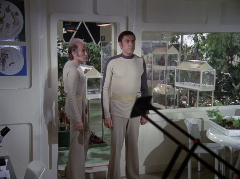
Another RAI miniseries worthy of mention is La Traccia Verde (1975), which offered a noir and science fiction take on the studies of CIA agent Cleve Backster on the alleged extrasensorial properties of plants. The series therefore presented itself as a combination of vegetation and modernist design, which is now more than relevant in the current rediscovery of plants as an element of interior design in accordance with the ultra-aesthetic approach to everyday life promoted by social media. But also with the avant-green idea of soundtracking environments for vegetation, as according to the cult 1976 album by Mort Garson (Mother Earth’s) Plantasia.
Music did in fact contribute, as much as design, to set an enigmatic atmosphere rich in tension for an unknown but after all inspiring future. The E.S.P. soundtrack composed by Egisto Macchi, one of the pioneers of synthetic music in Italy in the 60s and 70s, is a vivid example of this.
 Paola Pitagora indossa una t-shirt dell'etichetta discografica Cramps fondata dal grafico e demiurgo della comunicazione italiana Gianni Sassi. Foto: frame da film.")
These series are also peculiar for presenting design in its broader declinations. Take the character of Margaret (Paola Pitagora) in La Traccia Verde and her t-shirt of Cramps, the visionary record label founded by the graphic designer and guru of 1970s Italian communication Gianni Sassi: as well as demiurge of the famous advert for Busnelli sofas starring a young and psychedelic Franco Battiato.
More generally, cinema highlights the enthusiasm of Europe and – in particular – of Italy for its own design which, in turn, is used on the big and small screen as a vehicle to express refinement, socio-economic wealth and therefore also the aesthetic progress and sexual emancipation of a character.
In addition to the Pop Art milestone Danger: Diabolik (1968) by Mario Bava, the pursuit of modernist design returns in a plethora of sexy comedies, sado-erotic and political films of the time. One example, among many, is the apartment of Gastone Moschin and Maria Grazia Buccella in Sissignore (1968) by Ugo Tognazzi, the Beetle Under the Leaf villa by Nanda Vigo and Gio Ponti in The Night Evelyn Came Out Of The Grave (1972) by Emilio P. Miraglia, or the interiors of La Matriarca (1968) by Pasquale Festa Campanile and those of Escalation (1968) by Roberto Faenza.
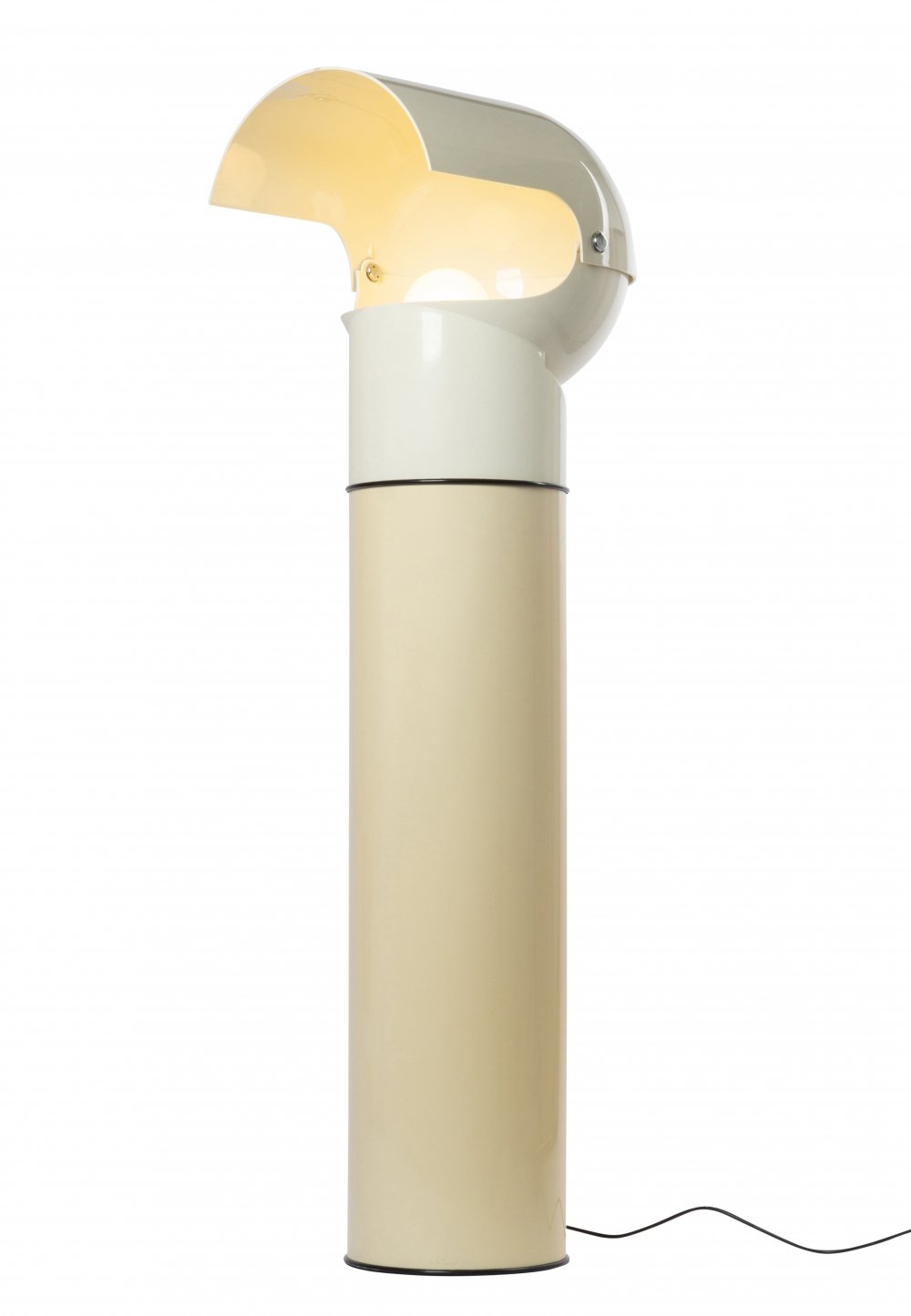
Opening image: Tizio lamp (1971) designed by Richard Sapper for Artemide. Photo courtesy of Artemide.