

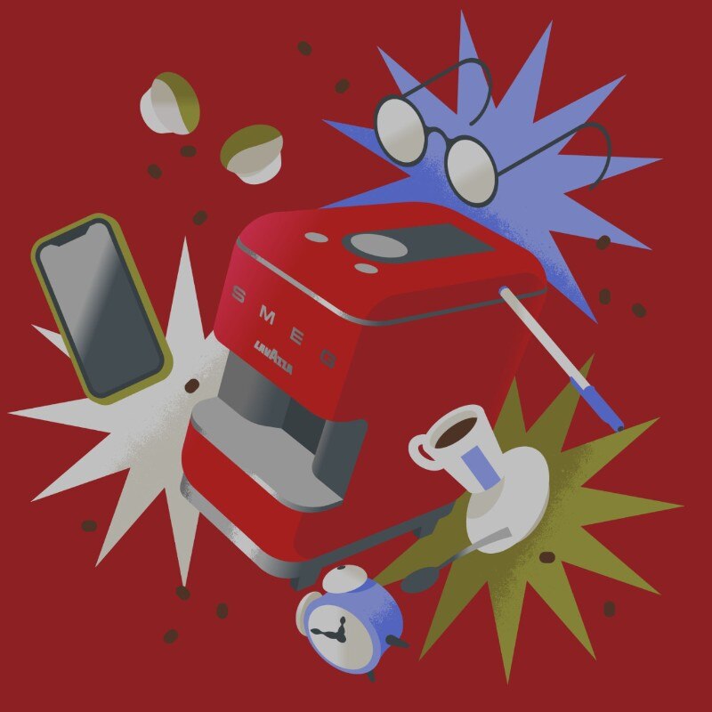
Marco Goran Romano has illustrated the new ritual of espresso with Lavazza A Modo Mio SMEG. We talked about food, design freedom and Depero.
The talented Italian illustrator was chosen by Domus to recount the first Lavazza A Modo Mio SMEG espresso machine. Marco Goran Romano has a past as a graphic designer in Milan, but today he works at Jesi, where he founded his studio. Still in the heart of the Marche region, he founded Sunday Büro with Valentina Alga Casali, specialized in type design. In this interview, Goran tells us what it means to be a design professional today, how he went from technology to food, and how to remain true to yourself in the interpretation of a product.
How did you approach the commission?
The brief was quite clear. There was the desire to put Lavazza A Modo Mio SMEG in a domestic and family context, transposed in the condition we are living in right now. The ritual of drinking an espresso today does not correspond to the experience we had before the pandemic. Representing the new everyday life was therefore indispensable. I re-imagined those moments’ off’, those precious moments of a break from work that we can no longer spend at the bar, thinking of the Lavazza SMEG machine as the centrepiece of our day, inserted among our new habits.
Have you made several proposals, can you tell us about them?
That’s right, the main proposals were simple and developed around this concept, with which I wanted to approach the theme in a more carefree way. For one, in particular, I thought of a sort of family picture, where around the Lavazza SMEG machine, almost a gigantic monolith, several characters are distributed: a father and a little girl playing, a woman on the phone and a middle-aged lady on the sofa, working at the grill. The chosen proposal instead has a more dynamic and abstract composition, starting from the machine itself, seen by three quarters, which seems to float in a colourful limbo of everyday objects.

What struck you about the object?
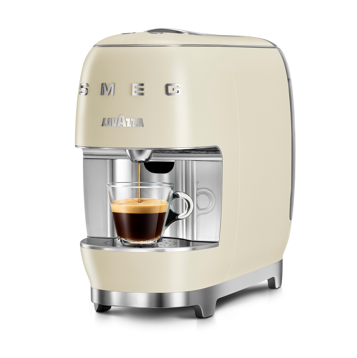
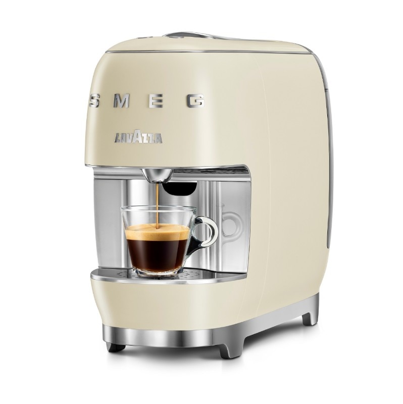
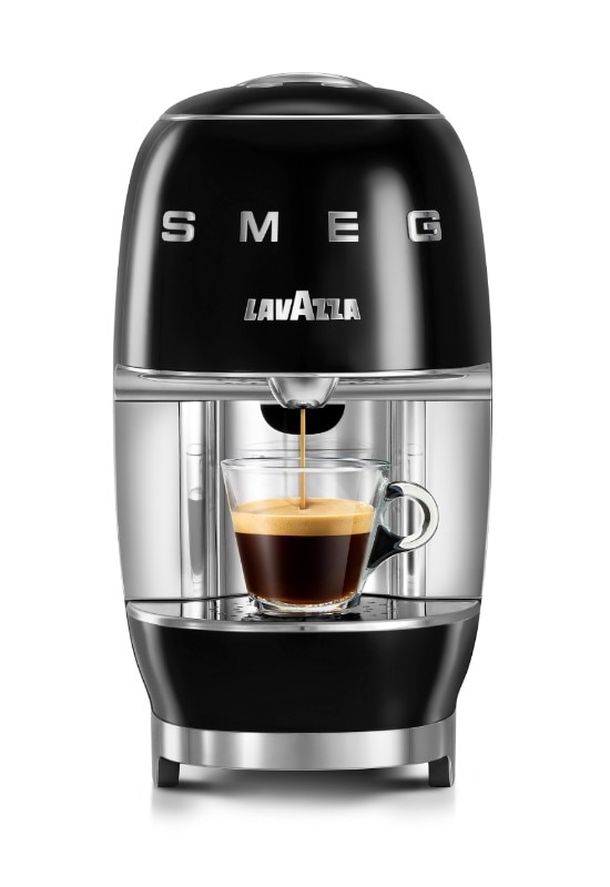
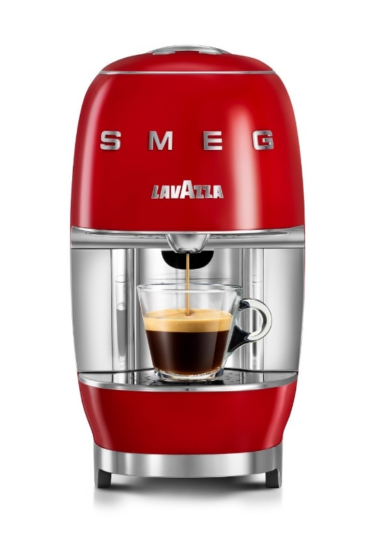
It’s simple: it’s a beautiful object, one that I would like to have at home. SMEG is a brand that you can recognize, and you can see that this machine is the result of a larger project. I like the elements of continuity between different household appliances: the colours that blink at fifties design, the lines and the compactness of the shape given by the casing, a shell that hides what’s inside. Lavazza A Modo Mio SMEG is almost a monolith; it has a scenic presence.
What is your approach to illustration applied to food?
I was born as an illustrator within the editorial staff of a magazine, and for years I was very involved in technology, innovation, crypto values and the internet of things. These are the topics that I have learned to master over time, but only recently, I began to feel the need to illustrate something that belonged to me. Can I brag for a moment? I cook very well, I am the cook of my group of friends. I am always looking for kitchen accessories, I have my pans and brigade pans at home. I am a ‘foodie’ as they said a few years ago: I like good raw materials and choose the right product. Recently I thought of transforming what has always been a passion into an artistic activity. First of all, I started making drawings for myself, then came the first commissions and now, more and more often, I happen to work in this field. Already for me, it is a privilege to draw as a profession, and doing it for this sector is for me the most beautiful thing in the world.
At this point, I really have to ask you about your relationship with espresso.
We are inseparable friends. I am a consumer of a particular blend of coffee, I like consistent and round blends. I come from Salento, where there is a very particular roasting tradition. Quarta, however, is a type of coffee that has a regional distribution, in the provinces of Lecce and Brindisi. Arriving in Milan, not even to do it on purpose, I became fond of Lavazza’s Suerte blend.
How has the profession of illustrator evolved in recent years?
Illustration is a language that has always been used, in the last ten years, it has had a comeback compared to photography. This is because,, we live in the age of the immanent, where many things that govern and influence us are not physical. Today everything is based on the internet, but we do not see it, we do not touch it. Photography has many gifts and manages to represent what is not tangible, but it isn’t easy compared to illustration to tell this world. The latter uses visual metaphors to show the process of generating a cryptocurrency or a particular internet protocol. In a context where complexity has become enveloping, the need to tell it clearly has allowed illustrators to have more space.
What is the difference between working for a brand and working for a magazine?
The work with newspapers, which for an illustrator implies being an interpreter of a subject, is what satisfies me the most. With brands it varies a lot and depends on who you are dealing with: let’s say it is interesting when the right conditions are met. This is a lucky collaboration for A Modo Mio SMEG, because I have been identified as an illustrator and passionate about the subject, food, which suits me well. For those who are illustrators, in general, to be recognized for their design ideas and to be a good interpreter of that theme is important.
Do I see references to Depero in your work, or have I seen it wrong?
I think I’m one of his biggest fans: when the lockdown ended in June, I spent two days at the Futurist Art House in Rovereto. It was the first visit for me and it was dazzling, I had already seen some of his works, but all that production concentrated in the House caused me one Stendhal syndrome after another. I don’t know how Depero managed to conquer that freedom of design, I can imagine it but I have no certainties. For those who, like me, do illustration today this aspect of his work is very fascinating.
Opening image: A Modo Mio, Lavazza and Smeg. Illustration by Marco Goran Romano