

A new color project proposes an integrated system of materials and colors capable of dialoguing with spaces and architecture, transforming color into a continuous, expressive and contemporary design language.
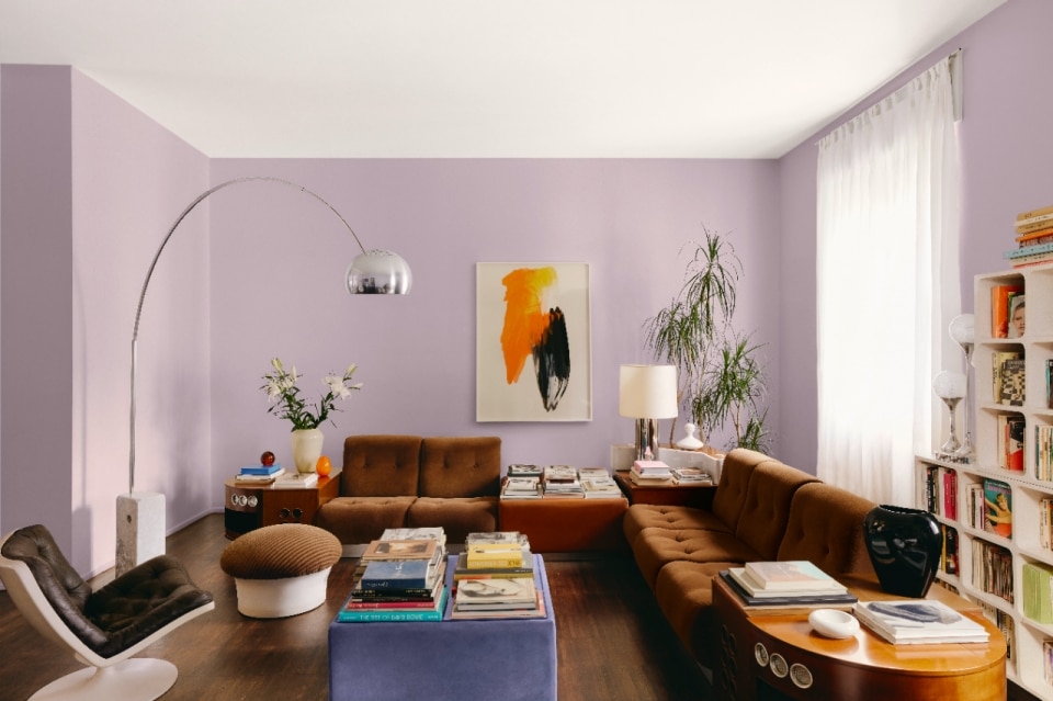
With Kerakoll Colors, color stops being a detail and becomes a real design tool, capable of redefining space with a wide and articulated palette of 1,500 shades for interiors and 1,000 for exteriors. After its preview at Milan Design Week 2025, the brand presents a color system designed to be transversal, intuitive and above all design-oriented, where color dialogues with materials, surfaces and architectural identities.

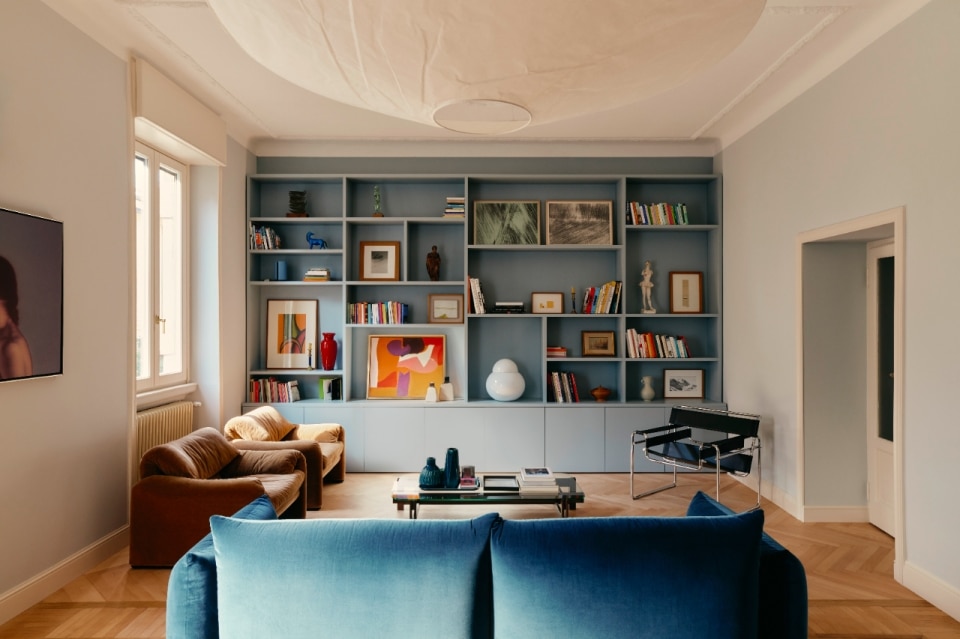
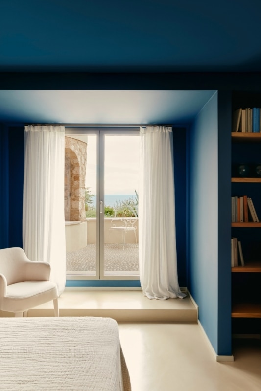
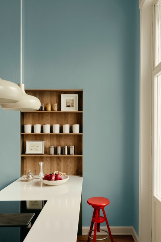
The heart of the project is a handcrafted constructed color selection, based on real juxtapositions and aesthetic research that privileges "beauty and the well-done". The eight Color Charts (Neutral, Blue, Green, Brown, Yellow, Terracotta, Magenta e Purple) become authentic working tools, organized to offer consistency and freedom at the same time. It is a broad but controlled palette, designed to allow the designer to move confidently through a complex chromatic universe.
At the heart of the project is a handcrafted constructed color selection based on real juxtapositions and aesthetic research that prioritizes "beauty and the well-done".
Next to the traditional Light, Mid and Deep scales come the new Bright shades, vibrant and bright, designed for those who wish to give color a more overt role. This extension takes Kerakoll beyond the more discreet aesthetic of previous collections, opening up to more expressive and contemporary languages. While expanding, the palette maintains a precise identity, consistent with the color sensibility that has characterized the company for years.
The offer is made up of different ranges: some products already launched – such as Color Collection, with its technical and decorative resins, micro-films and parquet, and Color Fill for decorative filling and sealing – and others designed exclusively for this new phase, such as Color Interior and Color Exterior for interior and exterior decoration.
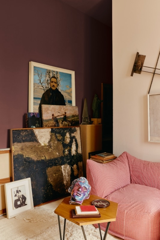
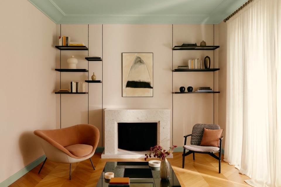
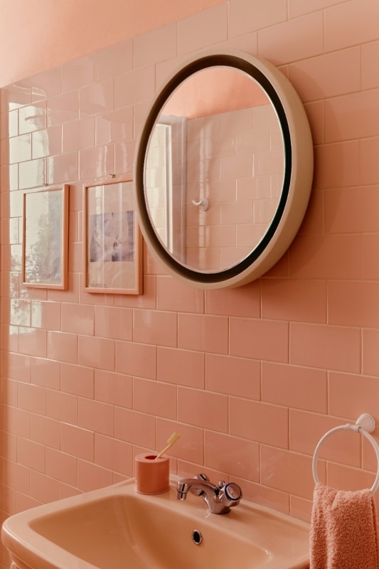
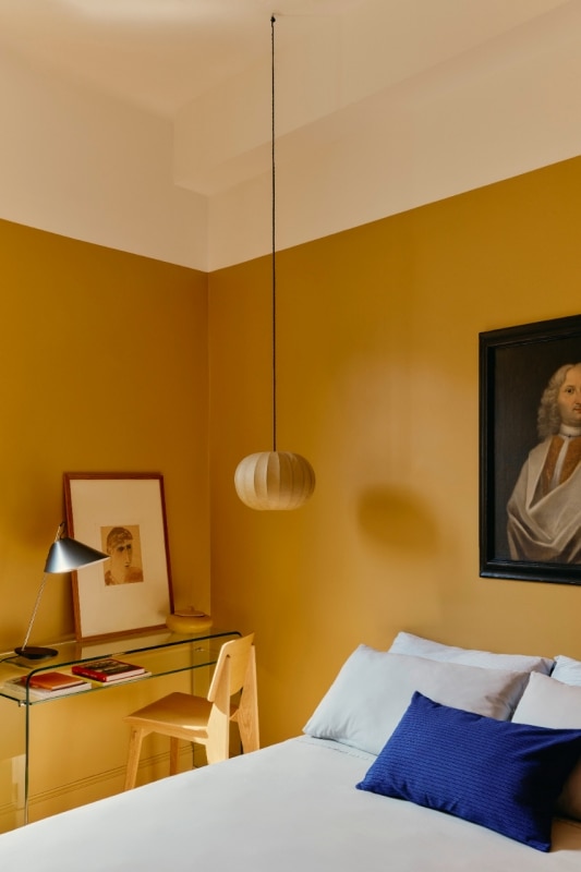
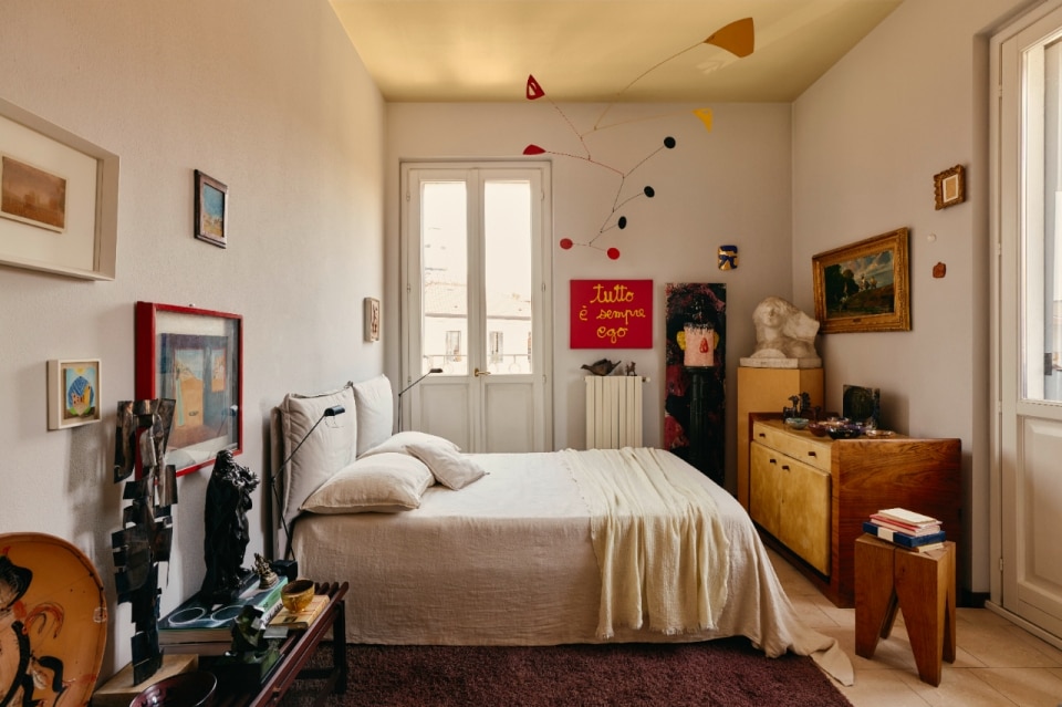
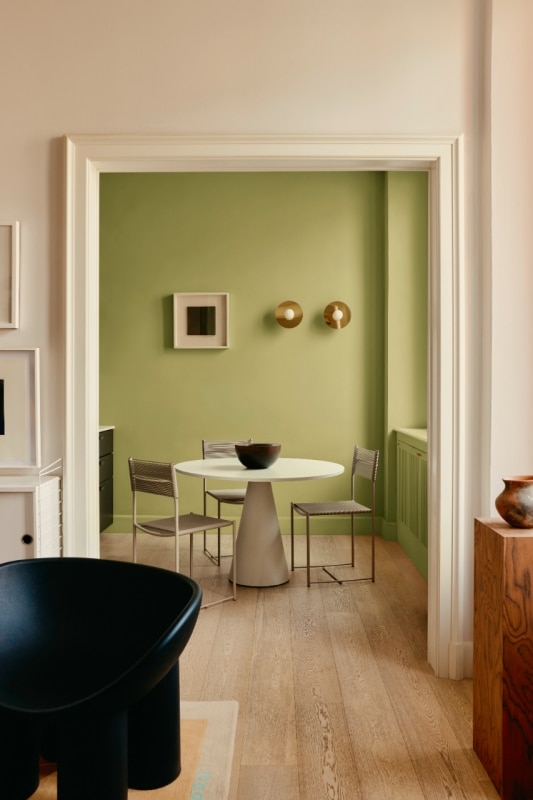
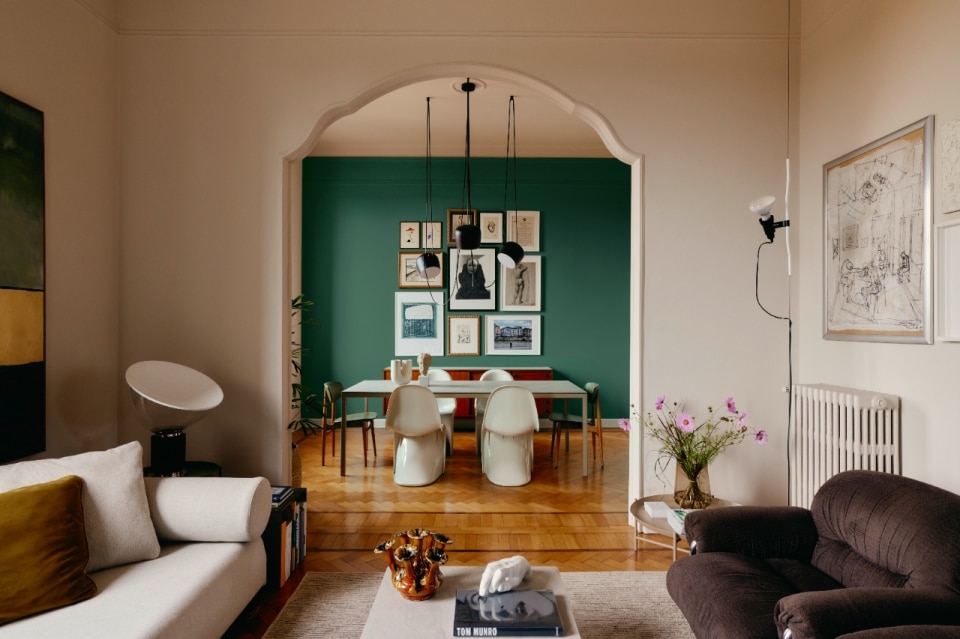
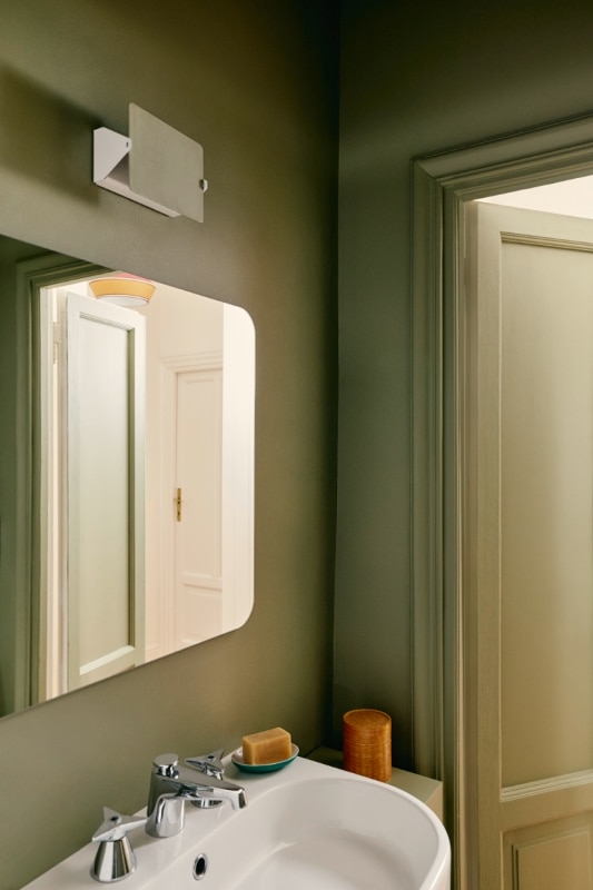
Color Interior is the complete range of paints, primers and enamels created to enrich and personalize interiors in 1,500 colors. The line offers solutions for all types of environments, from residential spaces (such as classic villas, industrial lofts and modern apartments) to commercial ones (such as retail, contract, hospitality and restaurants).
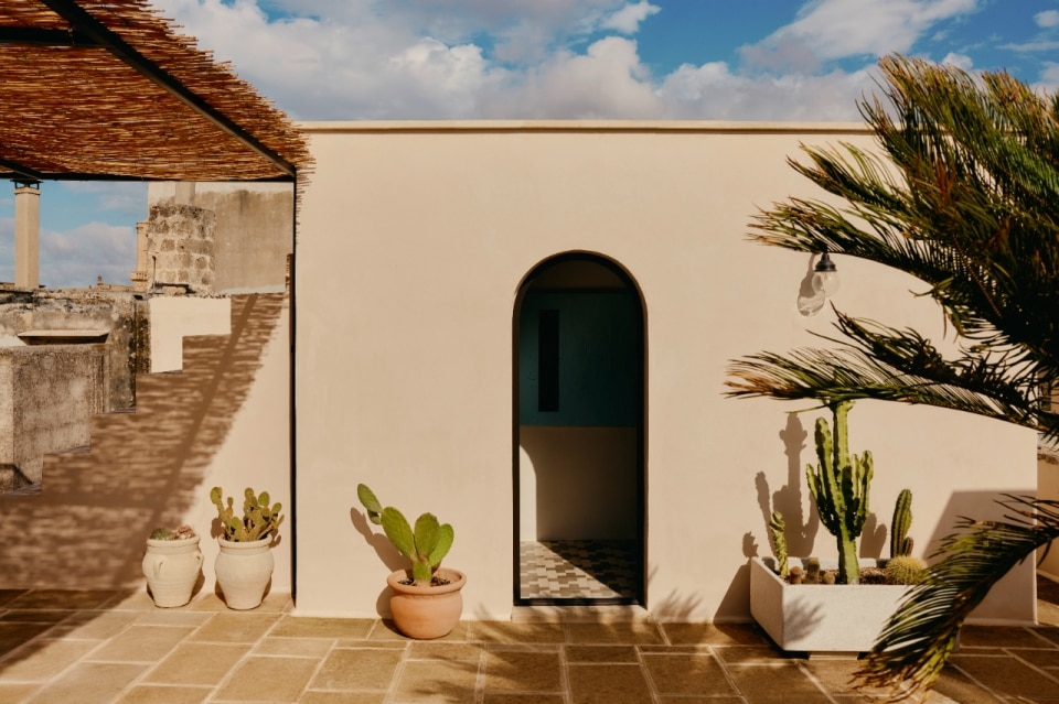
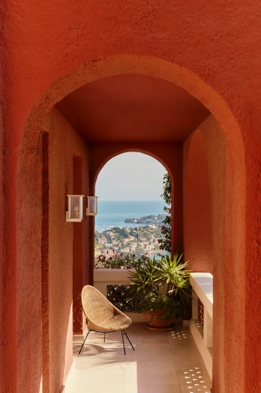
Color Exterior, on the other hand, is the complete line of coatings, paints and enamels designed to protect and decorate façades. Using color as an urbanistic and architectural element, the solutions proposed by Kerakoll preserve the integrity of buildings, ensuring long-lasting resistance. The wide selection of colors – 1,000 of the 1,500 Kerakoll Colors – and finishes allows the creation of visual continuity between interiors and exteriors, even in continuity with existing shades, for harmonious and refined aesthetic results.
Kerakoll invests in a network of services and support dedicated to designers, with technical platforms, specialized consultancy and experiential spaces that allow them to work on color in an immersive and conscious way. The goal is clear: to make color a shared design language, capable of transforming space and, at the same time, the emotions of those who inhabit it.
- Project:
- Kerakoll Colors
- Brand:
- Kerakoll
- Website:
- www.kerakoll.com