

After more than sixty years, Helvetica is ready for a makeover. One of the most famous fonts ever, its linear style and its well-defined letters are perfect for urban signage for public transport, shopping centres and road signs. It all began in 1957 when Max Miedinger, a freelance designer at the Haas type-foundry in Basel, was given a mission: to design an innovative sans serif font that was legible, elegant and essential.
A typography genius, Miedinger succeeded and created Neue Haas Grotesk. A few years later, in 1961, the German company Stempel and Lynotype introduced the first complete set of characters to the market, and named it Helvetica, after its place of birth in Switzerland. It was the beginning of a legend. Between the end of the ‘60s and the beginning of the ‘70s, in a climate of bold experimentation and the desire to exaggerate, Helvetica stood out as a character set which was suitable for interpreting new corporate needs for reliability, solidity and elegance. Advertising agencies offered their clients the sobriety of Helvetica as an antidote to the flaccid and over-sweet style of the ‘60s, and American Airlines and American Apparel made bold use. Among the standard-bearers of the font was an important Italian name, Massimo Vignelli.
As the decades passed, Helvetica continued its progress without hinder. The most famous case is the New York metro, a chaotic world to which the Swiss typeface brought a touch of order and clarity. Milan also adopted it, taking it on board the metro line 1, the “Red” line, in a revisited version by Bob Noorda. Then came the ‘80s. The digital revolution began to gain pace and Helvetica was there to welcome it. 1984 (prophetically) marked a turning point: Apple introduced Helvetica - which by then was almost thirty - among its system fonts, and officially led it into the emerging world of digital graphics. A star by the name of Michael Jackson then chose it for the cover of “Bad”, an album that was a worldwide hit.
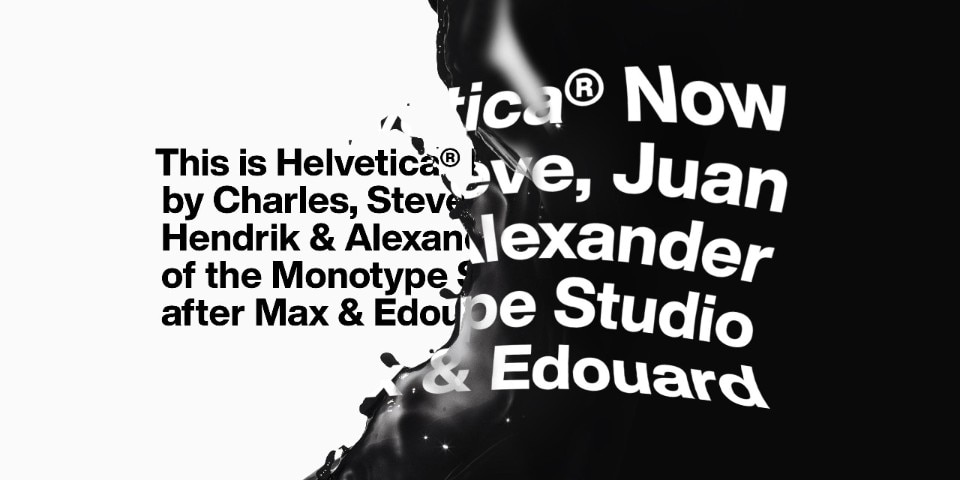
But after 62 years, Helvetica has started to show a few signs of age. Google abandoned it in 2011, closely followed by Apple, IMB and Netflix. This was all too much for Charles Nix, the director of Monotype, the largest typeface company in the world, and the holder of the rights ot Helvetica. Above all, Nix did not like the fact that the letters blended together when printed in smaller dimensions, and that the kerning (the reduction of excess space between specific pairs of letters) was not uniform. Thus, after two years of work, he finally revealed Helvetica Now, a revisited and corrected version which offers 40 thousand characters capable of more easily responding to contemporary needs and tastes.
With Now, Helvetica is balanced in both small and large font sizes, suitable for both posters and smartwatch displays. It is still that cold, architectural precise font of the past, but with a few adjustments which also render it perfect for digital. It is no coincidence that there are three versions. There is Helvetica Now Micro, with bulkier forms, larger spacing and bigger accents, created for small screens. Now Display revisits the kerning for use in large and very large formats, while Now Text is created for public spaces and road signs and has more white space inside and around the letters which renders it more legible. And so Helvetica continues its journey. It is hard to say where it will end up, but simply knowing it is still around will warm the hearts of fans of one of the most loved (and hated) fonts of all time.