

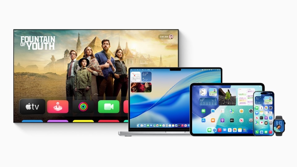
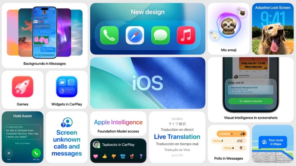

During the opening keynote of the 2025 Worldwide Developer Conference, Apple announced a complete redesign of its software design language across all platforms.
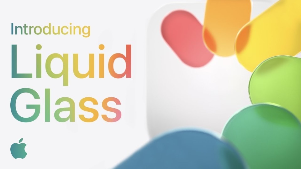
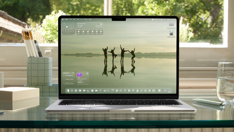
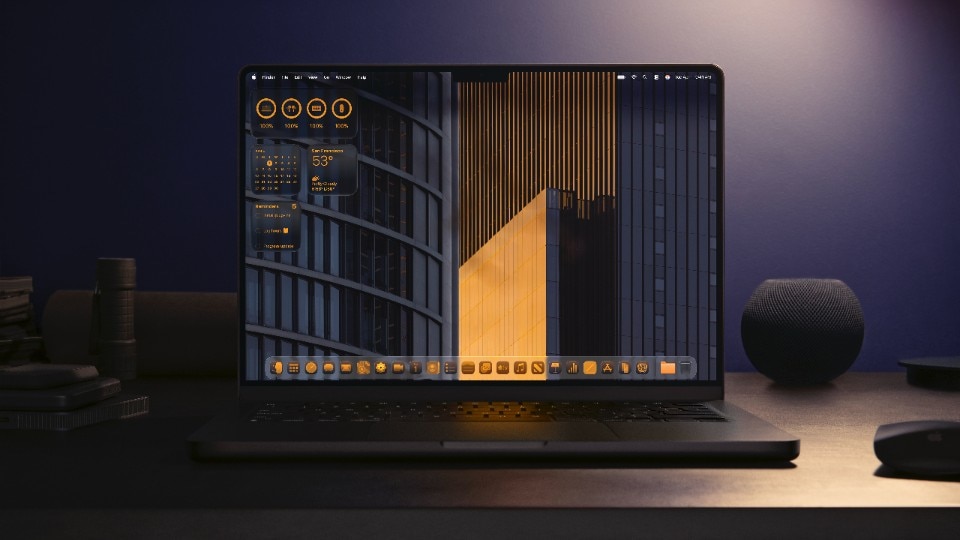
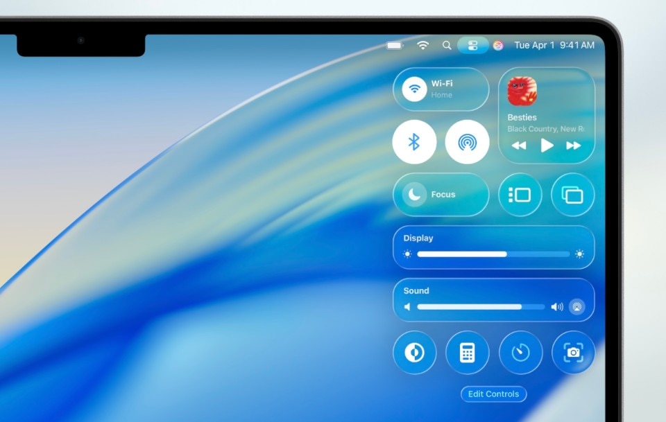
The new user interfaces (UIs) for the iPhone, iPad, Mac, Apple TV and Apple Watch are all based on a new design 'material' that Apple calls Liquid Glass.
Just like real glass, this digital rendition reacts to light by reflecting and diffracting it, while maintaining a fluidity that enables elements and components to adapt to all display sizes and uses.
“At Apple, we’ve always believed in the deep integration of hardware and software that makes interacting with technology intuitive, beautiful, and delightful,” said Alan Dye, Apple’s vice president of Human Interface Design, who presented the new design system during the WWDC opening Keynote. 'This is our broadest software design update ever. Meticulously crafted by rethinking the fundamental elements that make up our software”.

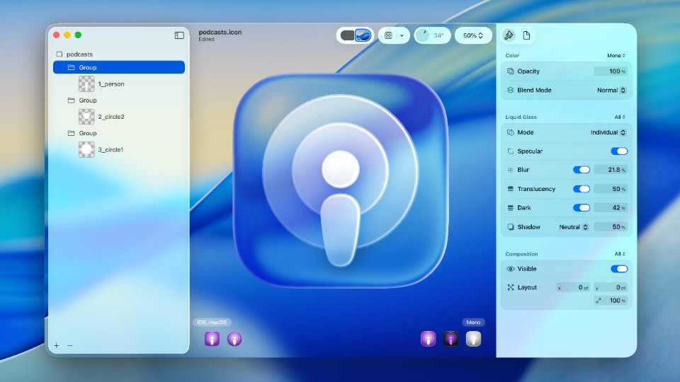
The new design system also relies heavily on transparency to give the components a sense of three-dimensionality. It is no surprise that Apple developed much of the design expertise behind the redesign while working on the Vision Pro's spatial computing paradigm. Liquid Glass takes this further, playing a clear role in bringing some of the 3D effects and spatial awareness of VisionOS to the two-dimensional screens of the iPad, iPhone and Mac.
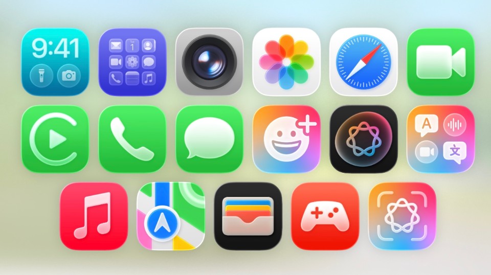
The redesign extends to all major Apple apps, with considerable effort going into adapting controls, floating toolbars and animations to the new design system.
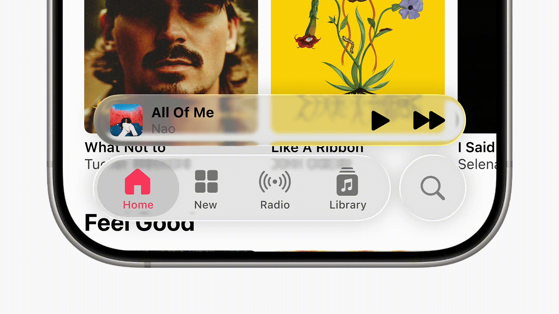
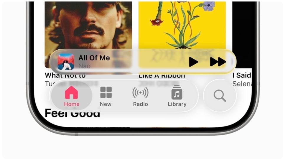
In particular, toolbars have been redesigned as separate translucent sections that now hover over the content more intuitively. Their shape has been redesigned to fit perfectly with the rounded corners of modern hardware and app windows.
These toolbars adapt dynamically to the scrolling action to display the maximum amount of information at the right time while reorganising themselves into a less intrusive configuration as the user navigates through the main content.
On the iPhone, the shape and behaviour of the toolbar now resemble those of the much-discussed Dynamic Island, providing a counterbalance to the pill-shaped black element on the opposite side of the smartphone display.

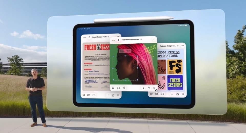
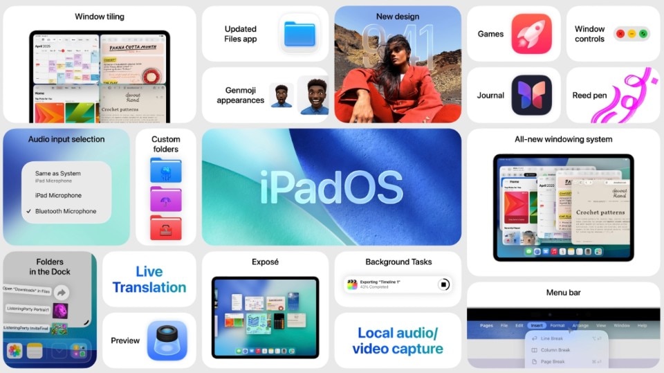
On the iPad, the redesign presented Apple with the opportunity to introduce a series of multitasking functionalities that rely heavily on stacking and hovering. With the next iPadOS, the tablet will introduce the ability to open apps in separate floating and resizeable windows, with Liquid Glass toolbar on the top left corner offering Mac-like buttons to close or minimize them.
On Mac, the redesign takes a subtler approach, readapting the Dock to the new language, and revising the historic menu bar to make it transparent, which should “make the Mac display feel even larger”, according to Apple.
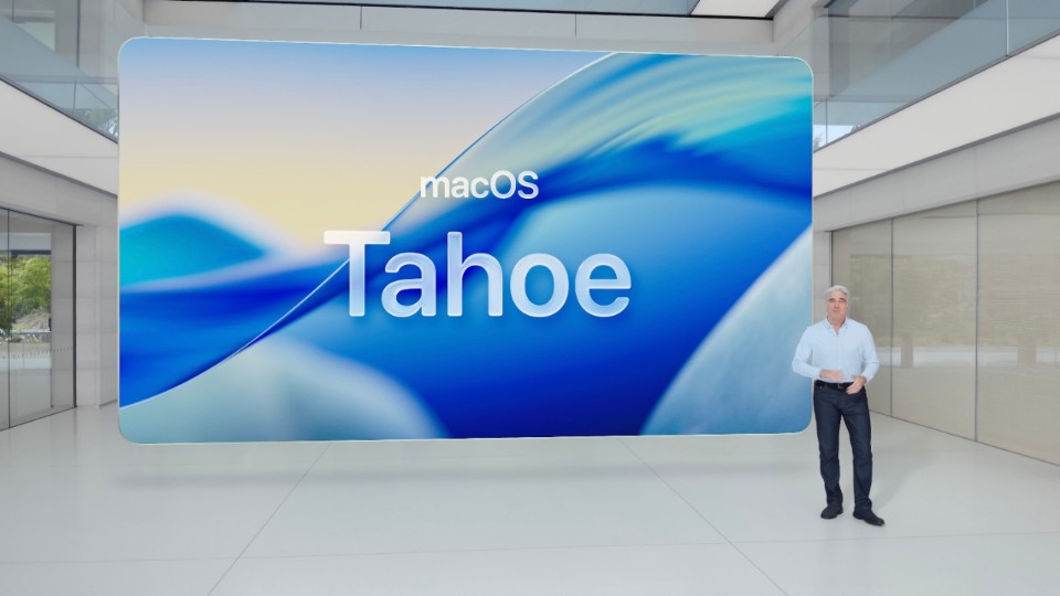
Last but not least, the redesign is marked by an important change in Apple's software naming conventions. From these upgrades onwards, all future Apple operating systems will be numbered according to the year. In the fall, Apple will therefore release iOS 26, iPadOS 26, tvOS 26, watchOS 26 and VisionOS 26. The only partial exception is macOS, which will receive the same treatment while retaining a nature-themed release name. Drawing inspiration from the fluidity and transparency of Liquid Glass, Apple has chosen “macOS 26 Tahoe” as the lake-inspired name the Mac’s new operating system.
Over the coming months, we will test the public betas and gain a better understanding of the new redesign. What we’ve seen so far seems both tasteful, fresh, unapologetic, and deliberate.
While the new design doesn’t radically change the behaviour of the UI, it certainly introduces new UX patterns that users will have to get used to. The only annoyance is the persistence of excessive customization opportunities for the icon colors and their layout, which we still consider a superfluous option that overrides the stylistic choices and the hard work designers put in creating app icons.
As with iOS 7, we expect the new design to be met with an initial wave of shortsighted criticism by non-designers, followed by the new features becoming commonplace, widespread adoption by developers adapting to the new paradigm, and eventually an inevitable blooming of half-baked copycat design systems from other smartphone vendors.