


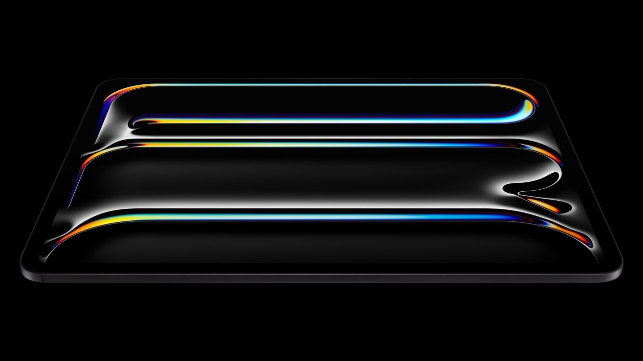


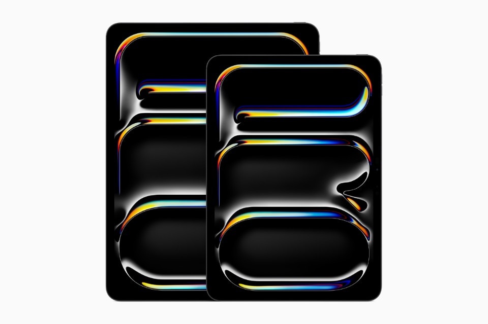
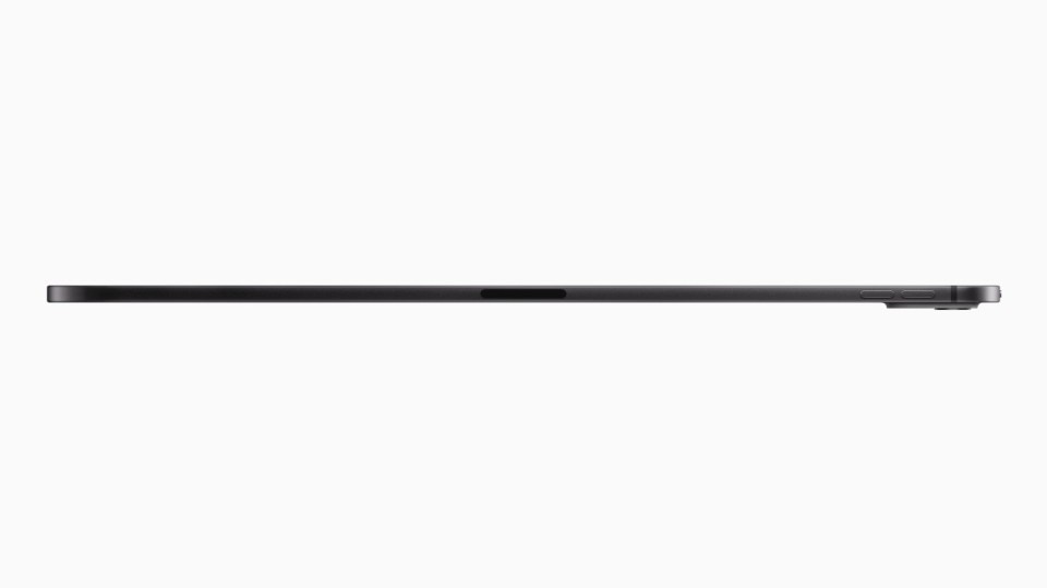
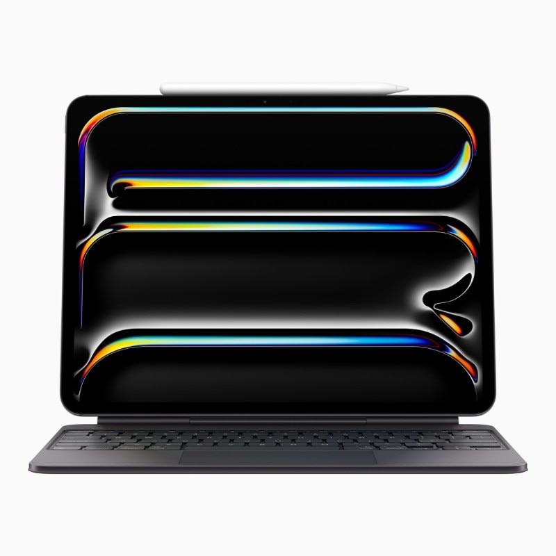
The new iPad Pro M4 is Apple’s thinnest product ever. It’s thinner than all the iPads and MacBook Airs, and it's even thinner than the old iPod Nano, despite being one of the most powerful devices in the company’s current lineups.
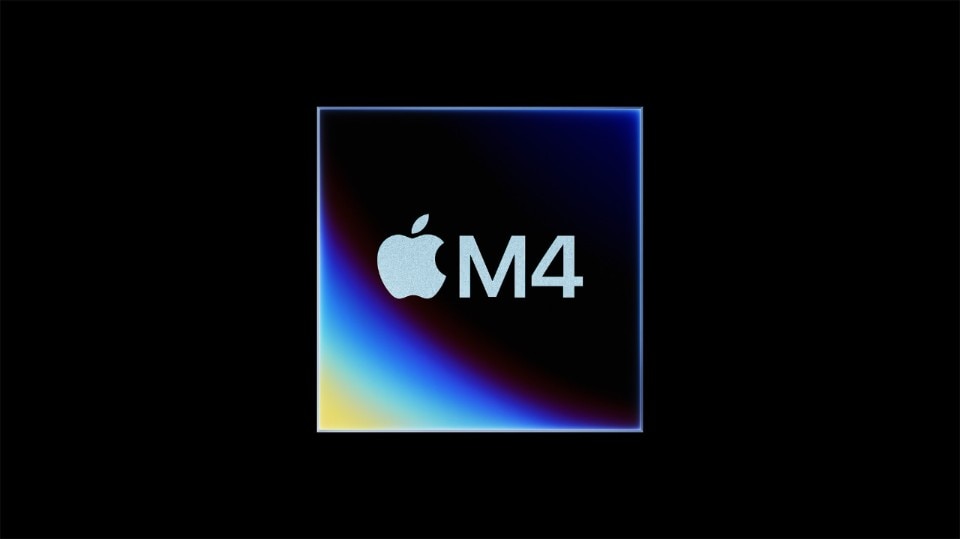
As Apple mentioned multiple times during the iPad Pro’s introduction, the new M4 chip that debuted in the new iPad Pro models is the key enabler of their thin and light design. Without the new chip’s power efficiency and performance-per-watt achievements, the 2024 iPad Pros wouldn't have been possible.
Controlling vertical integration so granularly that you can build a product around a chip and, at the same time, tailor a chip around a product is a unique advantage in a market where design (almost) never commands specs. Rather, it’s the other way around: designers are bound by the limits of what the market can offer and have to adapt to constraints they usually have little to no control over.
What came first, the tablet or the chip?
Yet, a question inevitably arises: was the design team’s vision leading the engineering team toward the M4, or, conversely, was the M4 achievement that opened up new possibilities and inspired the industrial designers? In an conversation with Apple’s Molly Anderson and Stephen Lemay from the Apple Design Studio, as well as Apple veteran Scott Brodrick from the iPad Product Marketing team, we asked this question straight to the source.
“Across all products, we have many goals, and sometimes a technology enables them; sometimes the idea sits there long before it all comes together. I would say that for the iPad Pro, we really had a desire to make it incredibly capable and live up to people’s expectations of a machine they can use all day”, says Apple Industrial Designer Molly Anderson. “That said, the goal of trying to get as thin, light, portable, and basically like a piece of paper is always the goal we chase. We’ve wanted to do it for a long time, but then we needed the M4 and the OLED screen coming together at the same time that has enabled us to hit this level of thinness”.
Apple’s quest for thinness
Apple has a long history of obsession with product thinness and a series of iconic introductions to illustrate how far it would push the envelope in order to achieve it, like when Steve Jobs unveiled the first MacBook Air at MacWorld 2008 by pulling the laptop out of a literal Manila folder.
The first Air was both an incredible innovation and an early adopter’s nightmare. It was underpowered and prone to overheating due to the absence of any ventilation system to cool down its power-hungry Intel chip. In typical Steve Jobs fashion, the narrative of the vision could magically trump the product’s tech limitations. The stunt was so effective that it singlehandedly defined the new ultrabook product category.
Yet, at Apple, thinness has never been for thinness’ sake, nor was it used as a selling point just because it was “possible to have.” That was true back in 2008, and it's true 16 years later. The vision is the same from the Manila Envelope stunt and, two years later, the introduction of Apple's idea of a digital content window: the first-generation iPad.
“If we look back to the design intent of the original iPad in 2010, the goal was always to create this magical sheet of glass, which behaves like an incredible digital piece of paper”, says Anderson. “The new generation of iPad Pro, with its 5.1mm thickness on the 13” version, is the closest expression of that original idea. It's quite a dense product, but we've also managed to make it incredibly light. Both the 13" and 11” weigh about 25% less than the previous generation”.
The dissolving machine
Thinness, as a concept, encapsulates Apple’s long-lasting quest for a machine that dissolves in the background, with hardware becoming the most unobtrusive support to enable a seamless interaction between the user and the software.
“When we think of thinness, on the hardware side, we’re excited by what it opens up when it makes it possible to create a product you can hold for a long time with just one hand. Thinness and lightness are fundamental, making it feel like it’s a piece of paper or a notebook or any other of these analogies”, says Scott Brodrick from the iPad Product Team. “That’s an incredible idea in terms of the freedom it gives the user and the new experiences it can offer. I don't know that we’re there quite yet, but that's still, you know, that’s still a goal that we would love to get to one day. As a creativity tool, we’ve already achieved a lot. Imagine you’re almost feeling the table surface, 5.1mm under your finger or Pencil: there’s no barrier between you and what you're creating, just like when you work on a piece of paper”.
I would have quickly archived this commentary as a well-crafted marketing narrative if I hadn’t tested the iPad Pro M4 for a week before this conversation. It is, of course, marketing, but it's also true that holding a 5.1mm thick slab of glass with one hand or writing on it on a table with the new Apple Pencil Pro is a completely different and enhanced experience, especially in comparison with the bulkiness of the old iPad Pro M2.

iPad Pro as a system
Yet, the iPad is not just a piece of creative digital paper. It’s also a capable all-rounder computer, thanks to its main input peripherals — the Apple Magic Keyboard and the Apple Pencil Pro.
“We started the design process thinking of iPad Pro as a system. So the iPad itself, combined with the magic keyboard and, of course, the Apple Pencil Pro, is a cohesive complete system for creatives”, says Anderson. “If you look at them individually, all elements are more capable than the previous models. Yet, taken all together, they weigh more or less the same as our lightest Mac portable, but with added capability and flexibility of having touch and pencil input.”
The new Magic Keyboard offers a MacBook-level typing experience. As a longtime Magic Keyboard user, the difference was immediately noticeable. Apple designers explain that they’ve worked on the keyboard with the same attention and effort that goes into a Mac laptop. The aluminum construction also contributes to the general feel of sturdiness and, in general, to a much more pleasurable experience.
“The goal was to make every interaction with the surface on the Magic Keyboard feel as exceptional as it is when you work on a MacBook,” adds Anderson. “The way that it feels when you type, the way that it feels when you use the trackpad, the space you have, the interaction with the material on the palm rest — all of those things, combined, make it a much more capable product.”
Apple Pencil Pro
While the Magic Keyboard is a welcome addition to the iPad setup, it’s still a very expensive accessory that more than a few users might not end up adding to their system, favoring cheaper compatible products.
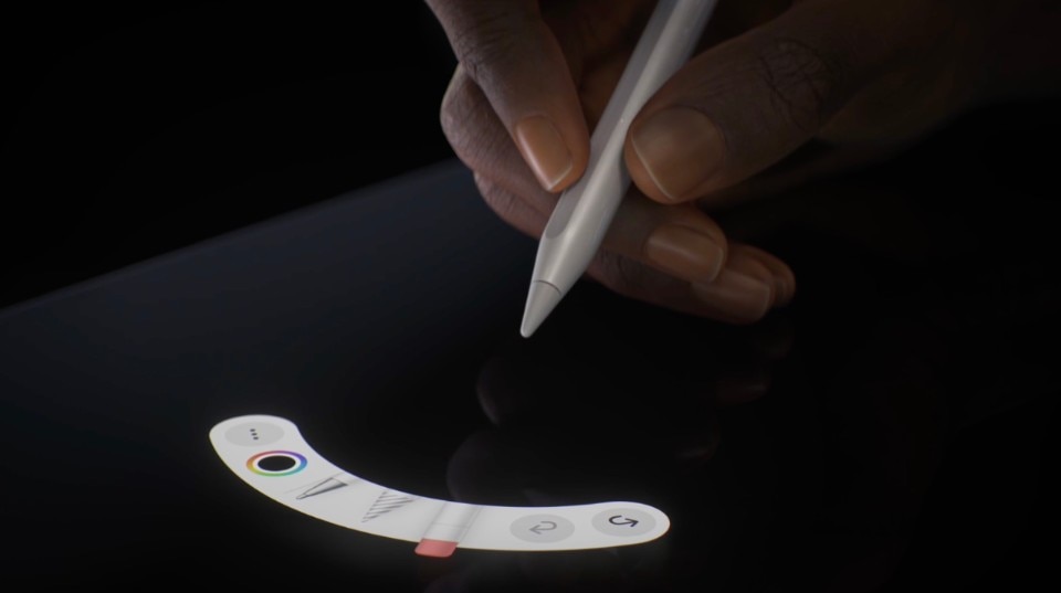
That’s not the case with the new Pencil Pro, Apple’s first update to the iPad stylus in six years. The stylus costs as much as its predecessor while being a technological quantum leap. If you buy a new iPad Pro (or a new iPad Air), you have to invest in adding the Apple Pencil Pro to your purchase. It’s that good, and the reason why, according to Apple’s designers, is due to thorough design iteration, mindful and deliberate feature updates and new UI features seamlessly complementing the hardware through clever interaction design.
If there ever was a stylus that would make Steve Jobs adamantly backtrack on his famous “if you see a stylus, they blew it” quote, that would be the Apple Pencil Pro. From the outside, the new Pencil looks like the Apple Pencil 2 from 2018, yet it’s been completely re-engineered. The old double-tap interaction is still there, but Apple has enabled several new interactions. There’s a new squeeze gesture enabled by a cylindrical pressure sensor and refined by smooth and powerful haptic feedback. Thanks to an internal gyroscope, the Pencil Pro also supports a new barrel roll function that lets the user simply control the tip and the trait on the screen by rotating the stylus in her hand. Last but not least, Apple found space to include the same technology it uses on its AirTag trackers, so now the Pencil can be located through FindMy on any Apple device.
“The fact that the squeeze gesture is based on haptics and there's no physical button means it’s invisible; it’s flush to the Pencil. That’s important because it means it has no fixed orientation. You can pick it up, use it, and squeeze it wherever you want. The button is just everywhere”, says Stephen Lemay, UI Designer from the Apple Design team. “When you use it, you're not thinking about finding a button, so your brain doesn't even process the control similarly.”
The role of UI design
Much effort was put into making the interaction seamless by integrating it with the iPad interface. When using the squeeze gesture on an Apple app such as FreeForm or Notes, users can access a newly designed tool palette just a few pixels away from the Pencils tip. When a tool is selected, there’s another subtle hover cue: a shadow resembling the exact shape of the writing instrument currently selected.
“We spent so much time thinking about every detail, including the tool palette animation. You might have noticed that the palette doesn’t just appear on the side or fade from a corner. It sprays out from the tip straight onto the canvas”, explains Lemay. “On one hand, that's playful, but it plays into this idea that our lizard brain might have—if you squeeze a tube, something comes out. There’s also inertia added to it. We love these nuances of physical reality and try to bring that humanity into our digital products in the best way possible”.
Good vibrations
The vibration accompanying the squeeze is also extremely satisfying and feels natural. It’s a perfect cue to suggest in a non-visual way that an action has been correctly performed, thus speeding up the hand-brain feedback loop. The result is a more holistic experience than the previous pencil, where several physical, visual, and virtual interactions act together to enhance the digital experience. A lot of effort, says Anderson, went into adapting the Taptic Engine to create the perfect vibrational feedback. It’s powerful yet even smaller than the one Apple uses inside the Apple Watch to give haptic accents to screen taps and digital crown menu scrolls.
“Haptics and the UI play a huge part in anticipating an action and making it all feel natural. We are lucky to work very closely as a creative team on the hardware and software side of projects. We also iterate endlessly or as endlessly as the process allows us by prototyping a lot”, says Anderson. “In the Apple Design Studio, we have real masters of understanding haptics, with teams who study ergonomics and human factors. In other words, there’s a real deep research on how to get these interactions to feel so seamless that you don’t have to think about them anymore.”