


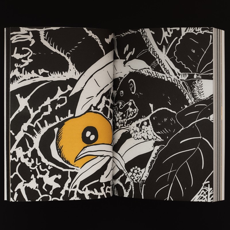
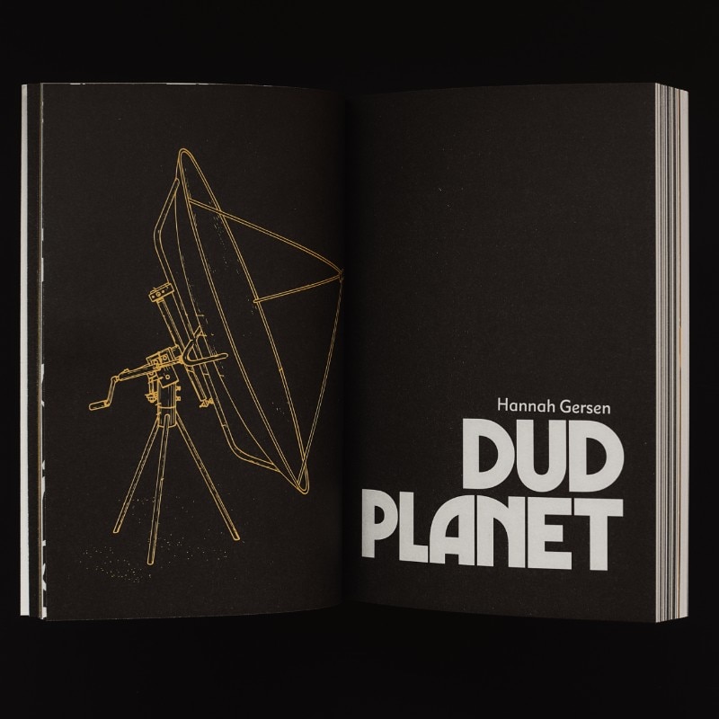
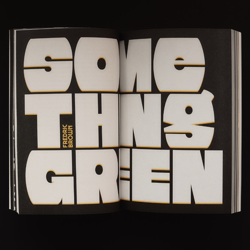
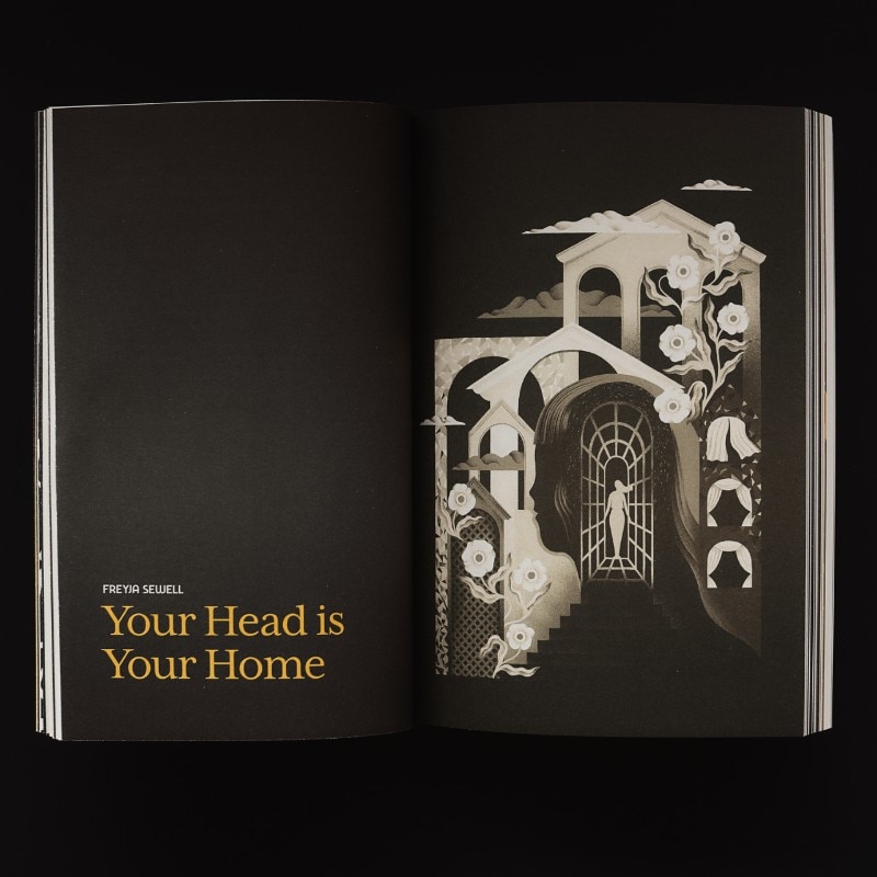
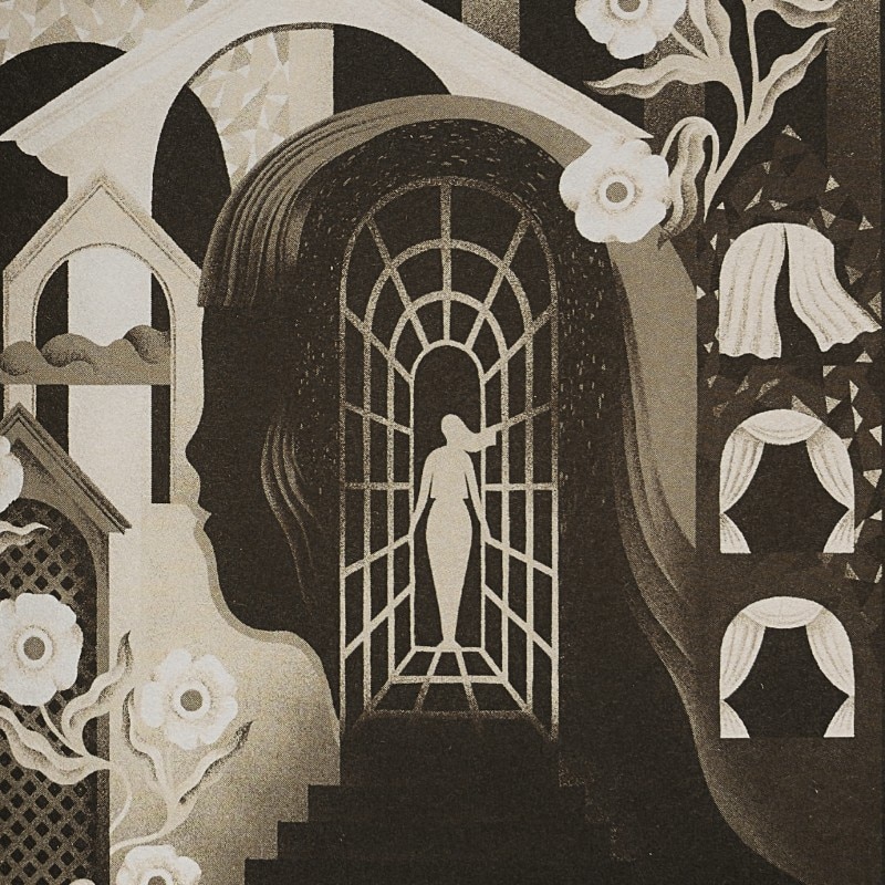
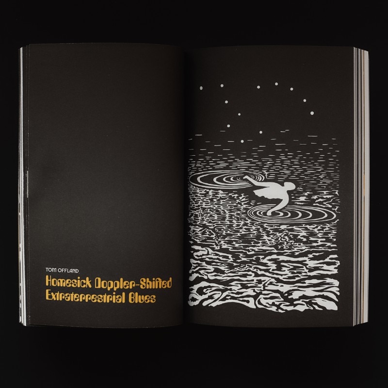
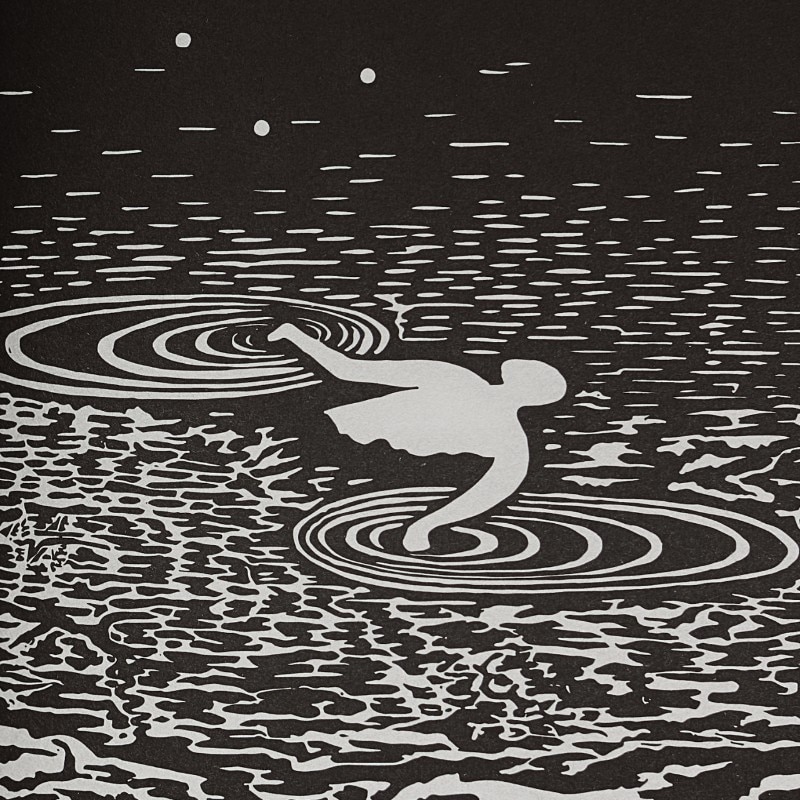
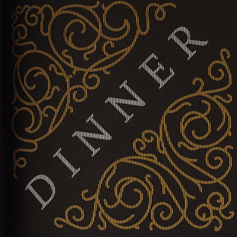
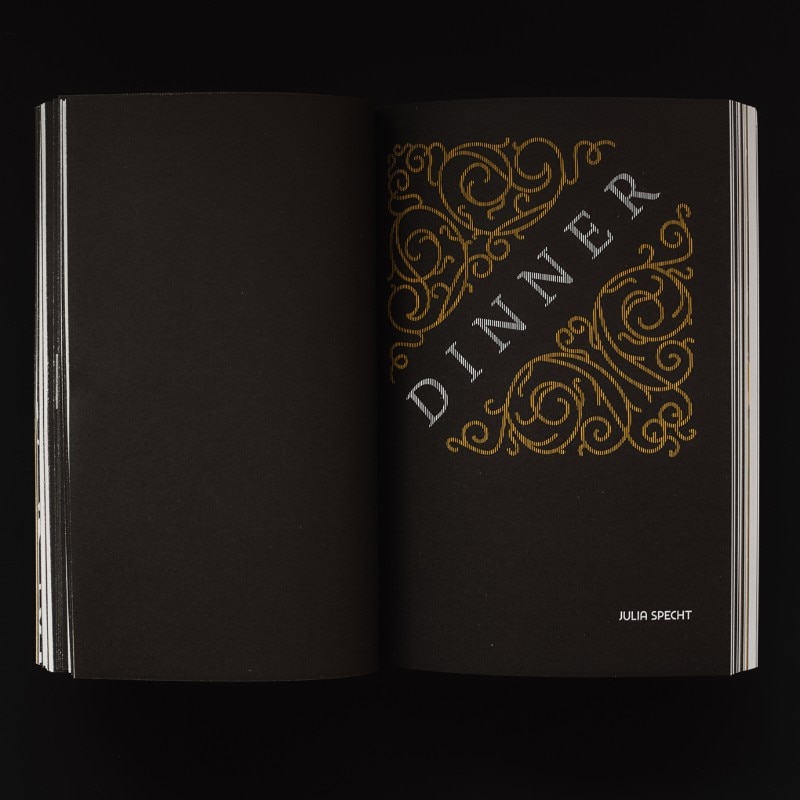
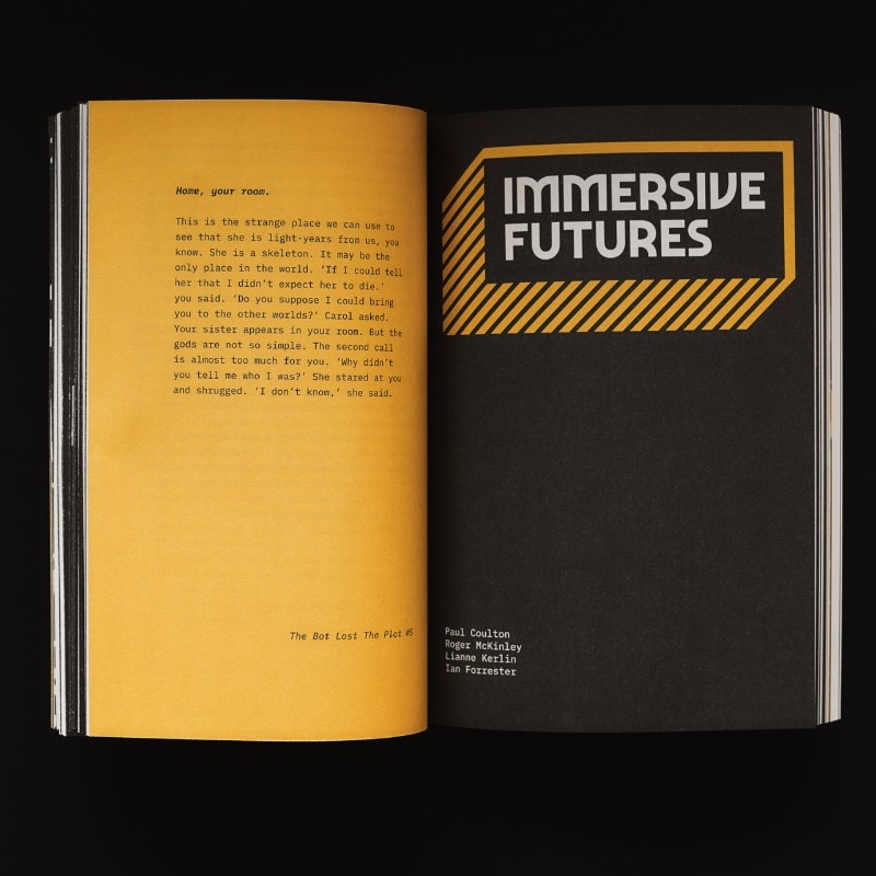
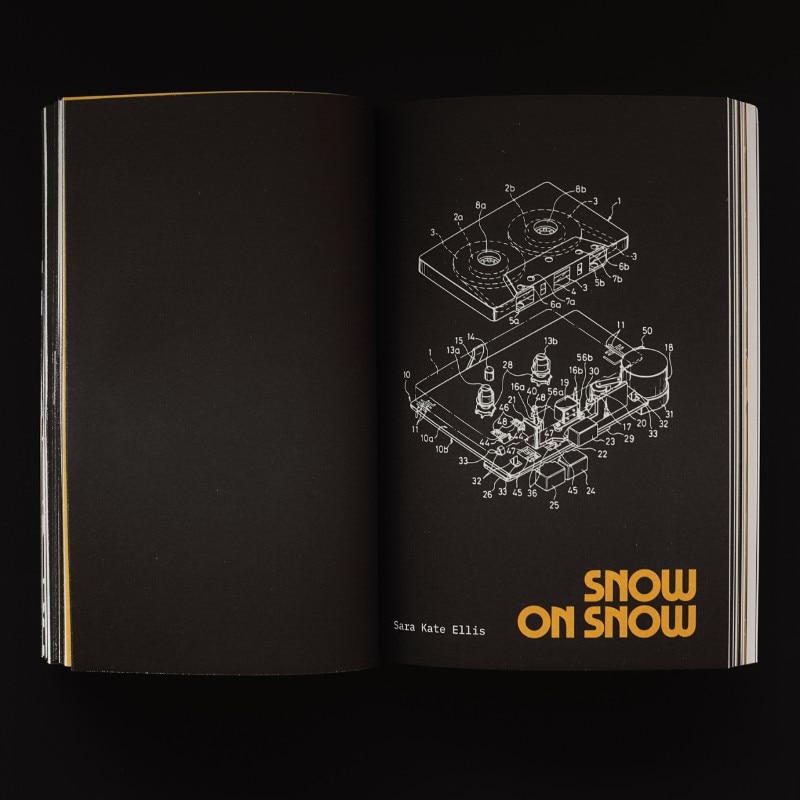

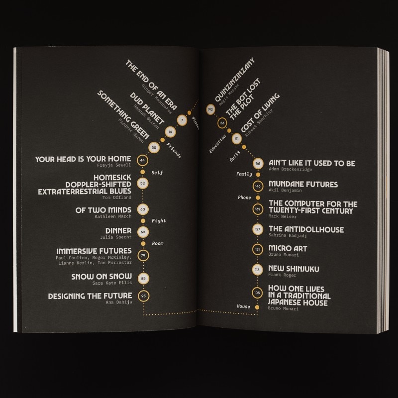
Essays and short stories from both masters (like Frederic Brown, Bruno Munari) and newcomers (Julia Specht, Comuzi) stand along in the first issue of Visions, a new magazine that blends together science fiction writers, designer and researchers to explore in thirty steps (and 256 pages) the concept of “home”. In the first issue, there are 8 essays, 11 short stories, 10 computer-generated “micro-fictions” and a cult French novel written in 1935 and never published in English, Quinzinzinzany by Régis Messac. Beautifully designed, Visions uses a specially revived version of Marvin, a typeface originally designed by Michael Chave in 1969 and published by Face Photosetting. “The sales of the fonts have entirely covered the cost of the first issue”, explains Mathieu Triay, the creator of Visions. “It has also appeared on book covers, film posters, and used extensively in Netflix’s Umbrella Academy”. Mr Triay, “software engineer with a passion for design”, explains that Visions was born out of the “frustration” with science fiction’s public image: “I wanted to create a space that showed it could be more than lasers and robots”, he says.
Why a paper magazine in a digital world?
I live in the digital world and I even make part of it through my work. I love it. But making something physical brings a different challenge. It's a one-off, it can't be changed, it can get destroyed. It also comes with its advantages: it's static and you can design one experience, the best for its format, medium and content. That's what I wanted to try. Moreover, I think I still prefer reading paper books and then seeing them on my shelf. They're a constant reminder of different periods of my life. Digital things are locked away, invisible, in all-encompassing devices. Physical things are just what they say on the tin. I think that simplicity is attractive in the modern, busy, world.
What’s the story behind Visions?
In my work as a creative technologist, I often juggle technology, design and product to solve problems, and through my collaboration with other designers, I've developed an understanding and love for design. I worked at Penguin Books. My time there was extremely formative in that respect, working with some of the best cover designers today. I learned about good typography, crafting a reading experience and looking at the book as a physical object beyond the text. I had been making websites for over a decade, and though I love it, they have a certain ephemeral quality to them. This made me want to do something physical, tangible, something people could hold and that could be finite, like a book. At the same time, working in publishing I saw that science-fiction was treated a bit like a second-rate genre. Something only nerds read and without the same sort of literary quality attributed to other types of fiction. As an SF reader, that upset me because I saw it could be so much more. So in the end, it was the perfect blend of a problem and solution: I could make a book about SF that would set out to show its literary qualities.
Visions mixes SF and design: where does the inspiration come from?
Mixing SF and design is a solution to one of the problems I saw earlier on: the image of SF in people’s mind is still very much spaceships and robots and lasers. That's just the surface of what SF provides, these are just the devices SF can use to tell you a deeper story and make you reflect. And through my work, I saw the importance of design in communicating the right thing to the right audience. I thought re-designing sci-fi so that it would more closely match with its literary side would appeal to people who don't consider themselves sci-fi readers. I thought it would open up that door.
I wanted to design a SF publication that didn’t look like one, something that would look more approachable and literary.
You preferred to have a Twitter account over Instagram.
It's partly personal: I'm more at ease on Twitter than Instagram. But also I thought it was a better fit for the magazine. A lot of writers, designers, researchers are on Twitter, it's a good breeding ground for Visions' audience. The message of the magazine is also very text-based, which is a better fit for Twitter too. Instagram is a fantastic visual resource but for a biannual magazine, seeing the same snapshot the magazine for 6 months might just be too boring. I could curate a lot of nice visuals, but that's going away from what the mag set out to do: provide access to SF to a new audience.
Why did you revive a font for this project?
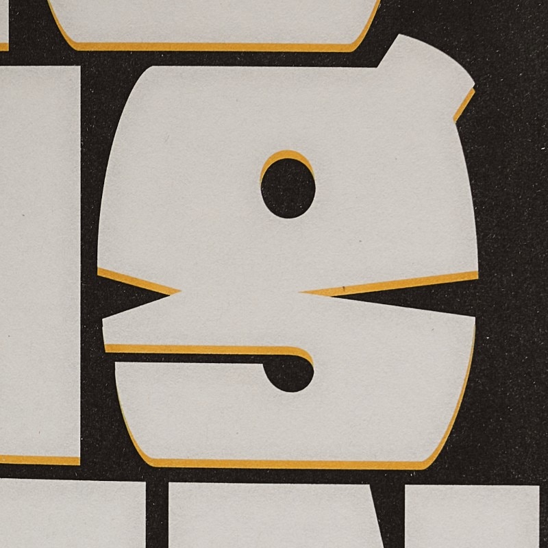
I wanted to design an SF publication that didn’t look like one, something that would look more approachable and literary. But I didn't want to lose the legacy of visual culture that comes with SF either. There are tons of fonts that echo the SF vibe, but fewer that can show the multiplicity of its facets: something quirky, funny, deep, but also retro and futuristic. When I first saw Marvin, I thought it answered the brief perfectly. It was SF but it had the potential to communicate on different levels too. It was quirky, echoed the 70's SF vibe, but could easily feel modern depending on how it was used. There was no good digital version available at the time, so I thought an uppercase only design would be a good first challenge, particularly for something that would be display and headlines only. It turned out to be complicated enough with a variety of changes applied throughout as learned more about the craft of making typefaces.
You financed the magazine with this typeface. It’s quite a unique idea. Where did it come from?
Initially, the typeface was meant to be exclusive to the magazine, so the branding would be strong and unique. However, promoting a new magazine can be tough so I thought I could use it as a marketing tool. The font and the magazine would bounce off each other. I wanted to give it away to help attract attention from a different crowd. But when the typeface was finished, friends told me people would be interested in buying it. It's only a small step between making it available for free and selling it. I had saved up to make the magazine but I would have preferred not to throw my savings into it so I saw an opportunity: if I also sold the font for commercial use, for people who would make money from it, then it would bring it a bit of cash to help pay for the magazine. In the year between the release of the font and the release of the magazine, it had had a life of its own and spread out beyond the magazine crowd and ended up paying for the printing.
I think I still prefer reading paper books, and then seeing them on my shelf. They're a constant reminder of different periods of my life. Digital things are locked away, invisible, in all encompassing devices.
Writers and researchers that you’d love to feature in the future?
In the upcoming issue, there's a writer I wanted to have since the very beginning: M. John Harrison. I think he embodies perfectly what Visions is trying to do. He goes beyond the genre and uses what he sees fit to tell the stories that he wants. They're poetic, intelligent and they'll make you wonder. I'm excited to have him as part of issue 2. As for the researchers, I would love something from Bret Victor. He brings together technology and design in a way that's thoughtful and transformative. He's changed my understanding of what software engineering really is about. And what he describes feels so natural that we can almost touch it, but its impact once it will become part of the fabric of the world will no doubt be deep.
And what about comics?
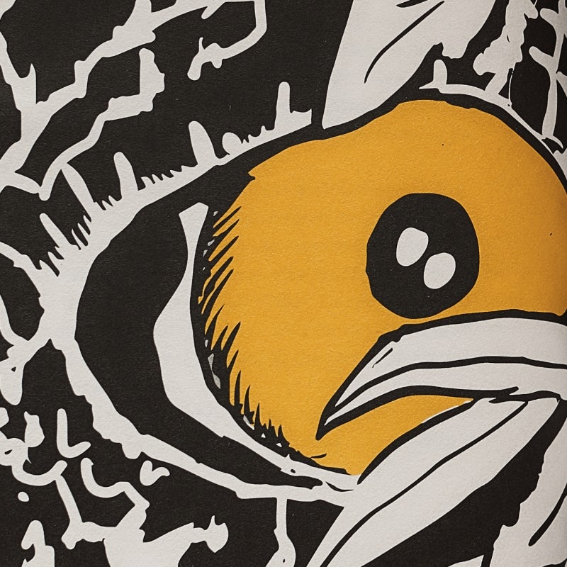
As for comics, I'm totally open to that. The format of the magazine limits to two colours but as a Frenchman growing up with the likes of "Idées Noires" and "Les Dingodossiers", I know there's something to make of that limitation. I think it's about finding the right person to illustrate a concept that will benefit from being illustrated, something that words alone can't convey.
The computer-generated texts are a disruptive idea for a literary magazine.
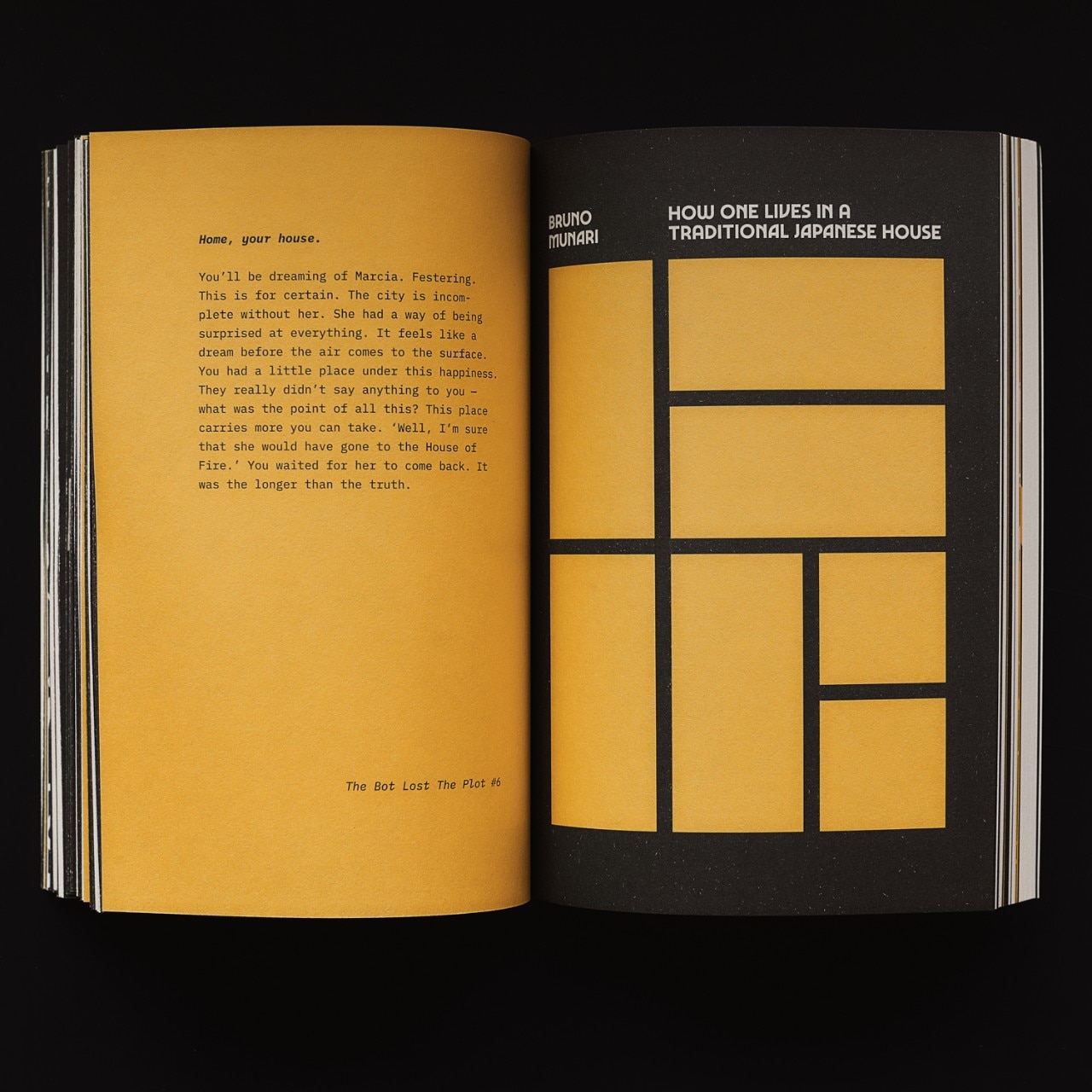
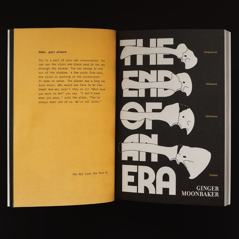
I wanted micro-short stories for the magazine to provide something to snack on quickly, something that you can dip in and out of easily but would show the qualities of sci-fi. I had tried fully computer-generated stories before and they never yielded anything very interesting. When I stumbled on Robin Sloan's idea of using the computer as a writing partner that could inspire when you feel stuck, I saw something different. It was about the relationship between machines and humans. The machine would prompt you and you'd get writing. I thought it would be interesting to invert the power relationship here, to not be the one writing, but to be the one editing and helping. I took on the role that's traditionally seen as the machine's and the machine would be the creative power. So it wrote 10 different sentences, using a machine learning-based text generation, and I picked one. Using that one sentence, it generates 10 new ones and I choose just one again. I did this until I reached 100 words. What happens is that I provided gentle guidance to the computer, helping it make more sense of its output. But I couldn't change anything, I only operated within the rules I set out. Eventually, I ended up changing some punctuation and pronouns for the sake for storytelling but that's it. The rest and the bulk is the computer.
“Home” is the theme of the first issue. How did you choose it?
It is derived from the novel that's included in the magazine, Quinzinzinzany by Régis Messac, written in 1935. Before the 2nd World War, it already talks about the destruction of the world with a new kind of weapon in another war. It's prescient and pessimistic and no doubt would have been a very effective wake-up call when it was first published. I saw two themes in it, "home" and “humanity”. They're my interpretation of what the author talks about, of course. But I saw the destruction of the world and the helplessness of the narrator linked through the loss of everything that's familiar. Not just a house. So I wanted to explore what "home" meant by gathering stories that show different parts of it. Without ever trying to define what "home" means, it's shown to you through different lenses. I live away from my original home and I have a new home in the UK – it's a duality I deal with every day and I think this may also have played a part in the selection of that theme. Kathleen March's "Of Two Minds" in the first issue talks about this brilliantly.