

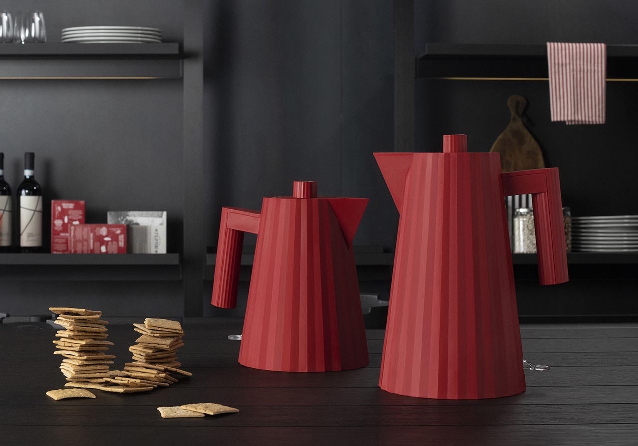
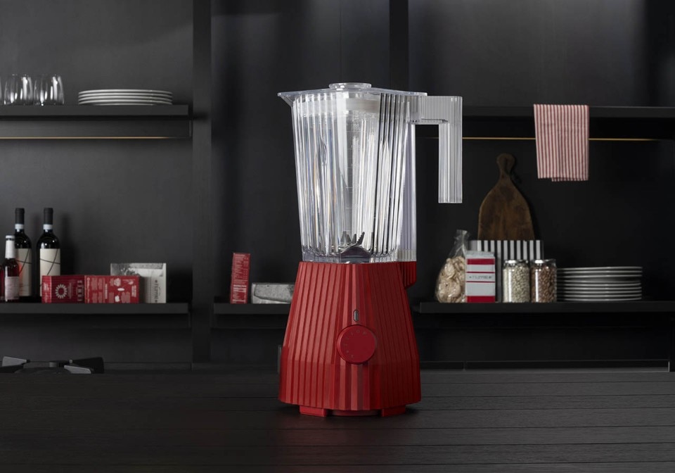
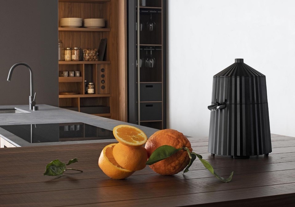
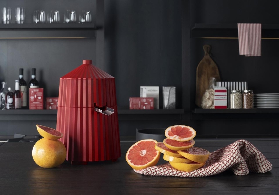

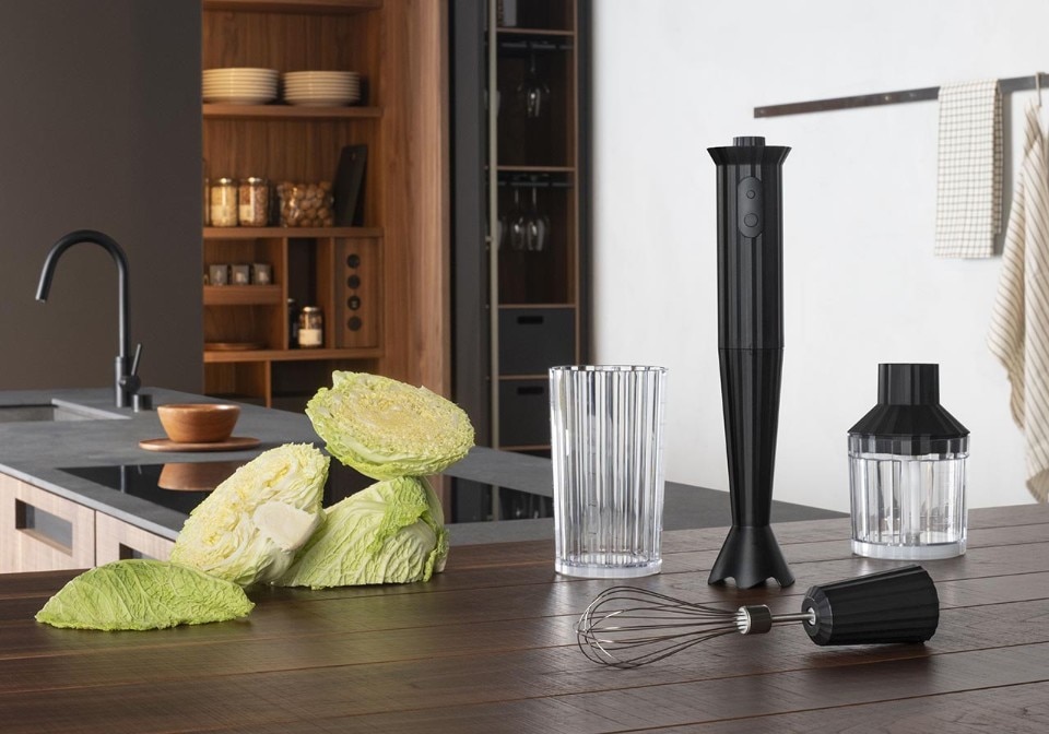
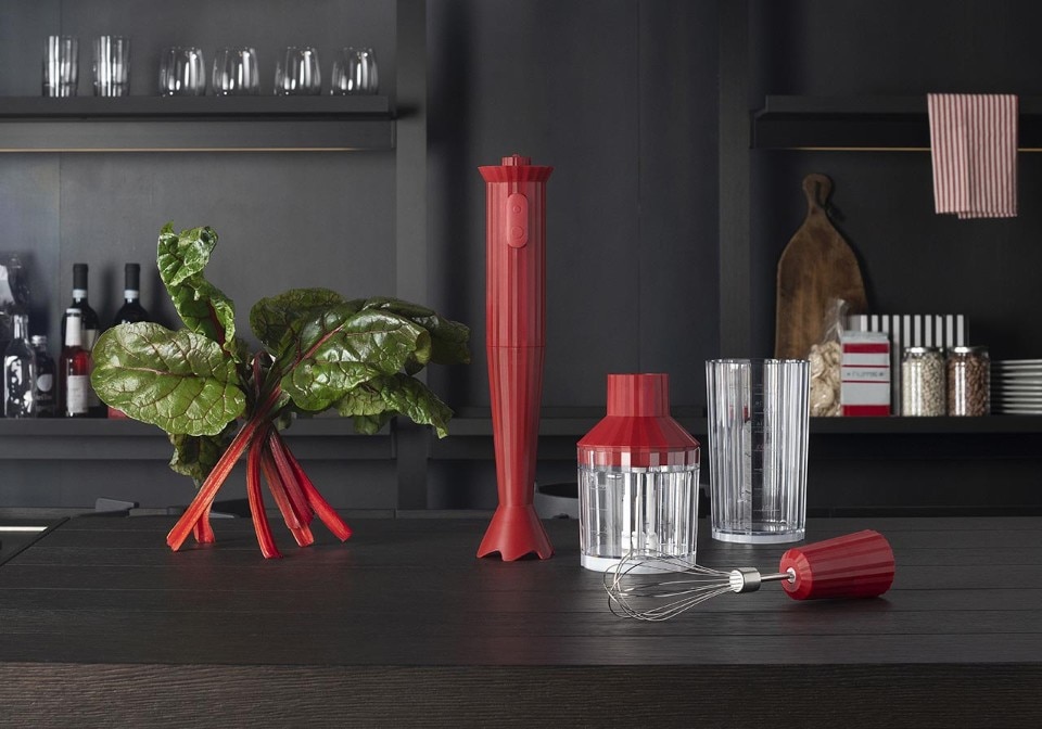
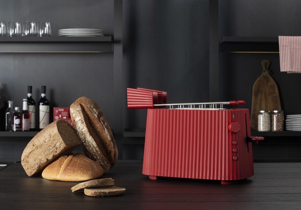
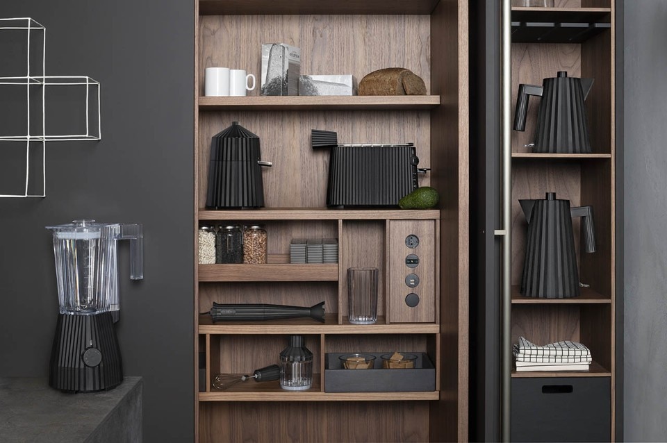
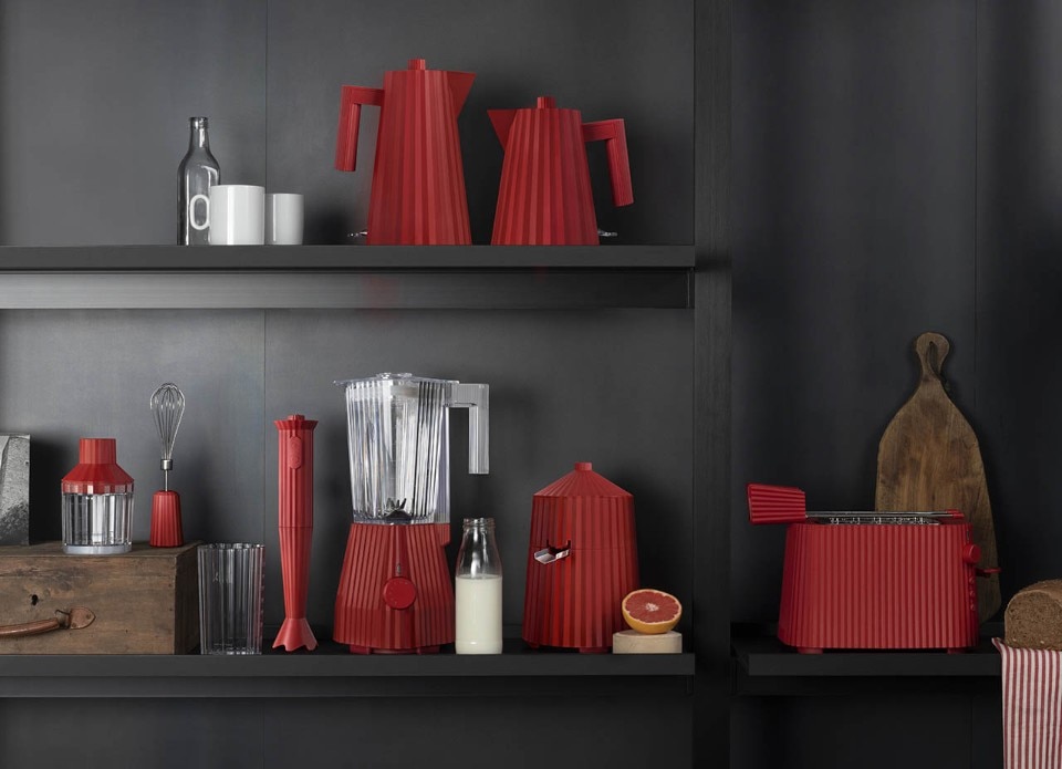
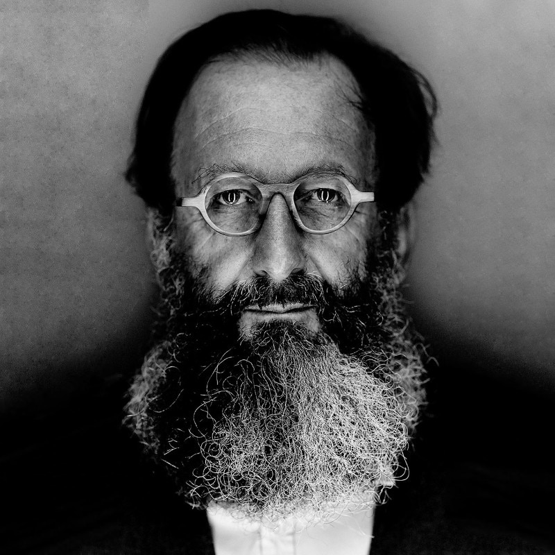
Alessi recently presented Plissé, a collection of small kitchen appliances that includes an electric kettle, a blender, a hand blender, a toaster, and a juicer. Their pleated design, which is an explicit analogy to the iconic pleated fabrics used in fashion, makes them look extremely sober, with an elegant and sculptural look that isn't that easy to find in our kitchens, which are used to more explicit and, at the same time, less formally sophisticated designs. We discussed the origin and identity of these appliances with their creator, Michele De Lucchi, who in this interview gives us a precious account of how, when designing an object, ideas chase each other, and then spontaneously turn into new, comforting presences in our homes.
As its name suggests, Plissé was inspired by the look of pleated skirts and dresses. When you imagined these appliances, which played a greater role? Geometry or fashion? Is it possible for you to separate the two?
I can't say whether I came up with the idea of the pleats right from the beginning or whether it was a process. When you're looking for an idea, an invention, or simply a different way of doing something you've already done, you should never ask yourself what you're doing, because that's when you lose the sense of things, your sensitivity. if I try to remember how an idea was born, most of the time I can't do it. I've been thinking a lot about this, and I'm quite keen on understanding the influence that the conscious and the unconscious have during a creation process, and how to stop limiting our imagination. That's why I'm studying a bit of psychoanalysis, a bit of cognitive science, and a bit about mirror neurons. Lots of authors in these fields talk about a pre-reflective mode, a sort of demon of the mind that kicks in without pre-reflecting rationally or sequentially, but rather in a completely free, chaotic, pre-sequential way.
What about Plissé's origin?
In this case, I needed to find a surface treatment that wasn't smooth, satin, or hammered – all those conventional finishes that are mainly used for metals as well as plastics. You may know that I love sculpting, and I use very rustic tools to do it – even a chainsaw. In the same way, when sketching projects, one should never look for the perfect drawing, but rather draw as fast as possible, letting the hand move freely so that it drags the mind and at the same time is being dragged by it, in an endless circle. Many times, I have realised that the things I did with the most conviction believing that they had already failed, that they were wrong, and that they should be thrown away, were the very things that made me come up with a good idea. Well, for Plissé I wanted to make a sculpted surface that also had some depth. As you know, kitchen appliances cannot have too much depth, because otherwise, dirt will settle on them making them difficult to clean. That's how I had this idea. And here I must also mention my bond with Issey Miyake, a great friend I inherited from Ettore Sottsass who for many years made an entire collection called Plissé. I visit Issey all the time, and if I go to Japan and don't call him, he gets offended. He must have Japanese spies because when I go to Japan and don't call him, he always manages to find out that I've been there.
Many times, I have realised that the things I did with the most conviction believing that they had already failed, that they were wrong, and that they should be thrown away, were the very things that made me come up with a good idea

One could then say that fashion "drags" design.
Of course, this is indisputable: design drags fashion and fashion drags design. We are both dealing with the same subject, which is the life of human beings, their existence, and it is the same for designers, architects, interior designers, and fashion designers. We do not live in different worlds, and we all have the same imagery and the same concerns to deal with. And here lies the problem. Because what we create, even before the products, the constructions, the projects to present to clients, is an imagery that we let fluctuate freely in the air. And here and there, like clouds or fog, imagination causes something to fall to the ground like rain and fertilise the world.
When you're looking for an idea, an invention, or simply a different way of doing something you've already done, you should never ask yourself what you're doing, because that's when you lose the sense of things, your sensitivity
The four colours of the Plissé palette meet well-established expectations for a small household appliance – except for one colour which is much more striking and less obvious. How did you choose the colours?
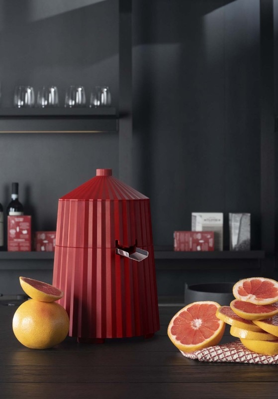
There's a rule in design – the more colours you use, the more colours you miss. I say this jokingly because through colour you can integrate design and commercial needs. On the one hand, there is a stream of thoughts that would like to find the best colours to highlight the quality of the design, and on the other hand, there is another stream of thoughts that says you have to use another colour to see it. In this case, you have to make sure that the two streams, like the Gulf Stream, interpenetrate with the cold waters coming from the North Pole, and a nice temperate climate comes out. Do you know Johannes Itten? At the beginning of each Bauhaus course, he would have his students paint the ugliest colour they could imagine. He would then put these horrible colours together and come up with wonderful artworks. Beautiful and ugly are of course subjective, but what matters above all is the way the colours fit in with the formal image and the narrative of the product. That red came out because I was thinking of the colour of the Berkel, an old slicing machine that has a beautiful colour, the colour of ham. We are all vegetarians now, so we no longer remember ham, but I'm thinking above all of Spilimbergo ham. That's why we came up with a colour somewhere between red and orange, a mix of a Parma ham, a Tuscan ham, and a Spilimbergo ham.
There's a rule in design – the more colours you use, the more colours you miss
Plissé seems to redeem the trivial atmosphere that often afflicts small kitchen appliances. How do you give personality to an object while balancing it with the ergonomic component, which is generally very important and self-evident for these kinds of products?
Certainly, we paid close attention to the ergonomics of the object, whether it was prehensile, with large handles, to keep away from hot surfaces, with a large kettle spout. If I had wanted to stylise the object, I would have tried to integrate the functional parts with the aesthetic ones to a greater extent, but we had set ourselves the task of treating the functional parts with the utmost simplicity, and also of obtaining an almost caricatured size of the individual parts. But there is one important thing to say, and this comes from the teachings of Ettore Sottsass. Objects not only function when they are being used: in most cases, they are objects that clutter up the domestic space. When we are not using them, it is not important whether the handle is large or can be easily grasped; what is much more important is its function as an object in the environment, as a signifying object, as an object that communicates something beyond its function, which is its reason for existing in the world at that moment. Having lived for many years alongside Ettore Sottsass, I remember how he used to explain the Memphis furniture by saying: "You may be sitting on a chair for only half an hour a day!". Many chairs occupy the environment while waiting to be used, and therefore for most of their existence they have other meanings. And we need to work on those other meanings, on the meanings of contemporaneity, of communication, of the ability to express and tell a story. If something doesn't have a story, it's not even interesting! And Plissé's story is the reference to fashion, the iconography of the 1950s, of fluttering skirts, of Marylin Monroe, which are images that take us back to images of happiness. The word that is the opposite of utopia is very fashionable now.
Do you mean dystopia?
Yes, but I dislike this word so much that I don't even want to say it. I want a beautiful, healthy, idealistic utopia.