


Recent work by P+R+V, a Roman interior design office specialised in concepts for fashion and food retail, includes a kosher eating-house in the heart of Rome, in the Jewish quarter, to be precise. At a stone’s throw from the Great Synagogue (or tempio, as the locals call it), the small restaurant represents an interesting phase in the team’s design career.
This is the story: In 2008, the same owners had asked P+R+V to decorate the Kosher Bistrot at the same location on Via Santa Maria del Pianto. Now, ten years later, they decided to transform the old bistrot into the new Pollaria Kosher Food, Coffee and Wine, counting once again on P+R+V for the interior.
We met a partner at P+R+V, to hear what it was like to go back and alter his work after so many years.
Marco Valenti: When you ask an architect to redecorate his own project after ten years, in the same place and for the same clients, is a bit like asking a director to create a remake of his own movie. Perhaps even one of his favourites, one he went back to look at attentively over the course of time. So when we were asked to renew the Kosher Bistrot, an eatery we not only designed but also frequented, we imagined that if it had been a film, we would have had to concentrate on the script, meaning the words. We would have had to tell the same story using a different kind of language. We considered the furniture to be actors on a stage. We imagined keeping some of it for its lived-in appeal. Other pieces were definitely in need of replacement – the ones no longer functional to the new setting or unable to be relevant in the changed neighbourhood context.
The ancient Jewish Ghetto of Rome has steadily become a multifaceted centre of gastronomy thanks to the growing popularity of traditional Hebrew food.
Did this film reference end up working for you? Did you use it as the base for your design?
Along the lines of the analogy with cinematography, we focused on the district where the bistrot is located. Ten years had changed the conditions in which we designed the first interior. The ancient Jewish Ghetto of Rome has steadily become a multifaceted centre of gastronomy thanks to the growing popularity of traditional Hebrew food. Along the way, there have been reinterpretations of typically Roman-Jewish dishes. The famous long-standing trattorie have received modern neighbours that offer newer versions of culinary enjoyment such as fast meals practically eaten standing up, and take-away options. We felt a little nostalgic for the old but not-so-long-ago days of relaxed atmosphere, the memory of which is getting fuzzier with the increasing speed of change being wrought on the historical parts of our cities. Therefore, we decided to turn the Kosher Bistrot into a proclamation of what a small contemporary osteria can be, without wanting to be the least bit vintage. We wanted to evoke the informal, almost domestic hospitality of the old local restaurants. Like a screenwriter using words to give a new meaning to the same story, we, we used many materials and a very large number of colours to tell the tale of Roman conviviality from a different point of view, including both tradition and innovation.
What visual linguistics did you apply exactly?
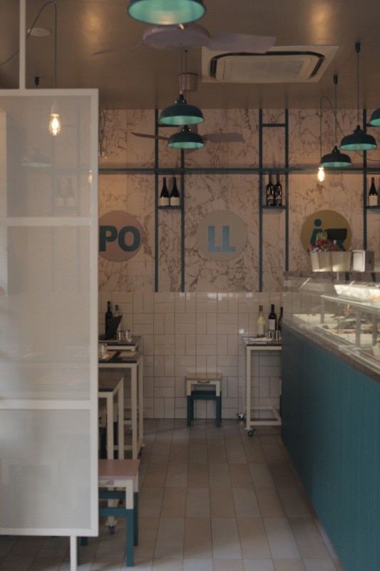
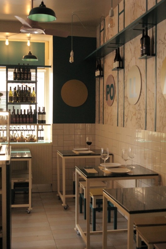
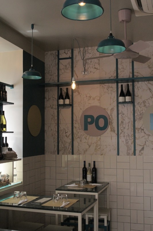
The marble-effect wallcovering is a reference to the owners' background. Until a few years ago, the family ran the oldest kosher butcher shop in the ghetto, a few doors down the road. It featured an impressive counter cladded with slabs of Carrara marble.
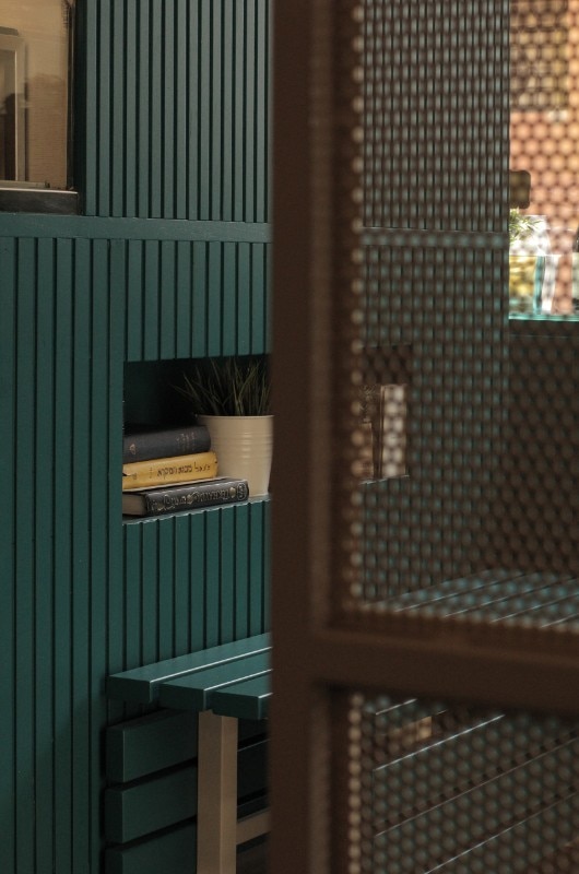
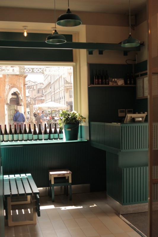
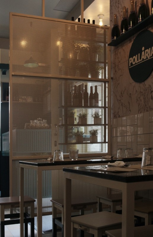
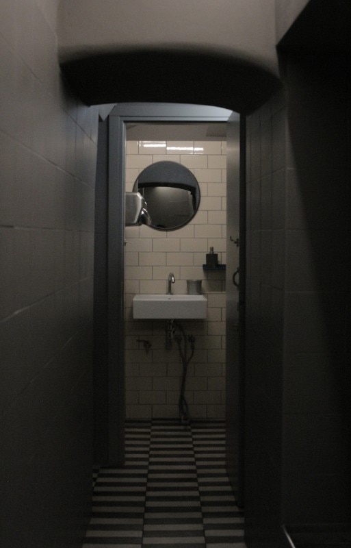
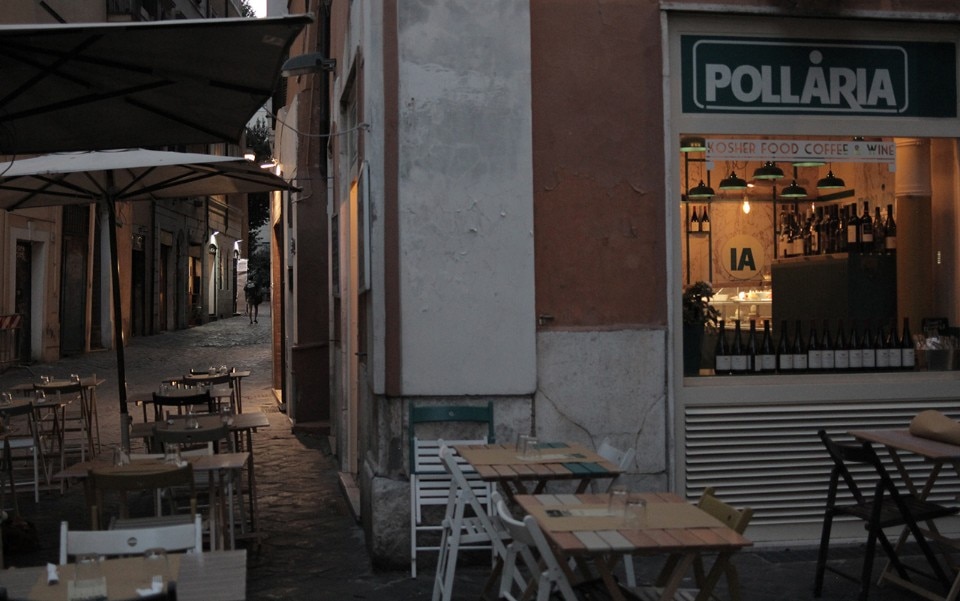
A different marble, called Verde Alpi, was used for the tabletops, which rest on an elementary iron structure painted ivory and equipped with wheels. They take up the central space, substituting the desk-like tables that used to line the walls. They abut against a strip of ceramic tiles that now protects the walls. Like the way things used to be, protection is the foremost function here.
Very simple stools reproduce the chromatic palette of the interior, as if they were colour samples. Neutral shades of sand and cream are combined with brighter shades full of personality. These are called Full Ocean (the restaurant's main colour) and the warm Mild Plum.
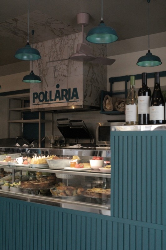
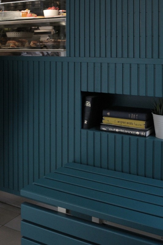
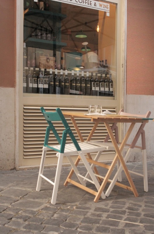
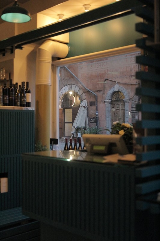
As in the former interior, the counter is the focal element. Its appearance has been renewed by means of varnished wood slats affixed to the exterior, reminiscent of the counters that used to be common in Rome, but have either disappeared or been entirely transformed. The counter is completed by a bench that turns the image of a service counter into a welcoming feature. As for lighting, the choice was for dim and warm, obtained by a serial sequence of monochrome suspension lamps that give rhythm to the verticality of the space, populating it with a graphic effect made up of lines and circles. The outdoor area is the bistrot's main attraction. Without at all being a merit of our design, it looks out on the Portico di Ottavia, framing one of the most magical views to be found in Rome. We wanted the terrace to not detract in any way from the sight, and stuck to folding chairs and osteria tables. Perhaps they are just a bit more colourful than usual.
- Project:
- Pollaria Kosher Food Coffee & Wine
- Architecture:
- P+R+V
- Area:
- 50 sqm
- Location:
- Roma
- Completion:
- 2018