

Richard Hollis
Alan Fletcher was for half a century the most celebrated British graphic designer. “It helps”, said Fletcher, “to be in the right place at the right time.” He was so often in the right place. Training as an illustrator at London’s Central School of Arts and Crafts, he attended the only school where he could learn modern typography. He arrived at the Royal College of Art at a turning point, when the school was veering away from neo-Romanticism and Victorian tradition. Art editor of the college magazine, Fletcher joined like-minded fellow students in their enthusiasm for Italian style (this was the heyday of the espresso bar and the Vespa), American magazines, abstract expressionism; and a rediscovery of Kurt Schwitters and collage.
Fletcher moved on with a scholarship to Yale, another right place. In 1956, at the right time too, and with the right teachers: Josef Albers, Herbert Matter, Paul Rand, Bradbury Thompson. He then worked with Saul Bass in California, before going back to the East Coast, to a job at Fortune magazine. He was part of a visual culture marked by the New Advertising (Doyle Dane Bernbach), the magazines’ celebrated art directors (Alexey Brodovitch at Harper’s Bazaar, Henry Wolf at Esquire) and a young avant garde. The next stop was Milan, a city where some of the great designers of the 20th-century were at work: Albe Steiner, AG Fronzoni, Franco Grignani, Max Huber, Bob Noorda. Noorda designed for Pirelli, where Fletcher worked for several months. As a freelance, before returning to England, he produced his first Domus cover, a velvety abstract collage. Back in London, he found that graphic design hardly existed as a profession. Later, he said that “You had to be out of your mind to be a designer in the 1950s. There were no jobs around.” But he launched himself, and also his colleagues, by collaborating in an exhibition at the Time-Life building in Bond Street in 1959, and the foundation of the Design and Art Direction exhibitions in 1963.
Fletcher was by far the best educated and best informed in the new field. His first-hand experience of the leaders of the young profession and his formidable visual talent and energy made him the archetypal figure of the graphic designer. He knew what graphic design should look like and understood how it could be sold to the client. Before and after his travels Fletcher had acquired a range of styles and techniques. His work in America, covers and booklets, has the variety which could be found in a leading New York design groups such as Chermayeff and Geismar: large coloured letters, cut-outs, torn paper, collage, stencil lettering, printing white on white (black on black became a favourite), overprinting. His adverts for Pirelli designed in London in the early 1960s could have been carried out in Milan; but not the bus poster for slippers. And in spite of the influx of new grotesque typefaces there is little of the prevailing Swiss style. Fletcher, with his own formidable repertoire, was no plagiarist.
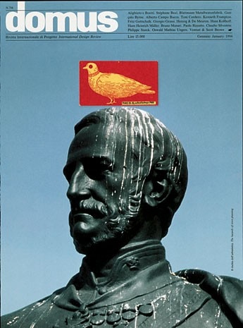
Graphic designers don’t find solutions by manipulating materials, not since the computer replaced their drawing boards, set squares, ruling pens, compasses, and all their old paraphernalia. But Fletcher, notably after leaving the design group Pentagram which he helped to found in 1972, stayed with the physical rather than the digital. He said that the drawings he made for a paper manufacturer’s promotional booklet used “dip pens, rollerballs, ballpoints, fibre-tips, soft pencils and hard leads. Coarse cartridge, smooth cold press, handmade papers, laid and wove stock, blotting paper”. His other tools were brush and ink, scissors and coloured paper, for text as well as images. Scratchy pen lettering, complete with blots, became a recognisable Fletcher idiom. These techniques combined in the visual wit of his Domus covers in the 1990s. Typical too is the 1980 poster for the Best of British Authors: handwriting rather than type for the text, an extension of the illustration.
Drawing letters, or cutting them out of paper, was also part of his stock-in-trade. He made three-dimensional use of his beloved stencil letters in Richard Rogers’s Lloyd’s building in London, in a signage system which not only fitted aesthetically with the high tech expressionism of the architecture but also dealt with its application to the structure. In contrast were the 19th-century ornamental letters he chose as a logo for Flora, a small fashion shop. From the pre-digital time Fletcher brought a favourite technique, namely collage. Collage implies collecting materials and looking for things; this sharpened his already well-trained eye. Book design and collage are alike: both are made of words and images assembled in a structure. Early in his career he had produced an image-led book, Graphic Design: Visual Comparisons put together with his first partners, Colin Forbes and Bob Gill. In his next book Identity Kits, a collaboration with Germano Facetti, Fletcher appears as “an international safecracker wishing to protect his identity.”
The portrait can be taken as a metaphor: the invisible designer plundering the hoard of symbols and techniques. Fletcher knew them all. He used them for his clients, added those he made himself, presented them on the page, and wrote around them, adding aphorisms: “A typeface is an alphabet in a straitjacket”, for example. When he became consultant art director to the London publishers Phaidon in 1994, his experience and authority were brought to bear on individual books – as well as several series – on art, design, architecture and photography. He put his trust in designers he knew and a younger generation whom he admired. Many books were stamped with his personality; some depended on Fletcher’s own initiative, in particular The Art Book, a compendious best-seller. Phaidon published an account of Fletcher’s design work in 1996.
The title Beware Wet Paint refers to Marcel Duchamp’s warning that it took 30 years to assess a work’s value. His largest book is The Art of Looking Sideways. More than 500 pages, a rich compilation from a lifetime of reading, looking and collecting, and a comprehensive review of visual communication and much else besides, it is likely to prove Fletcher’s most significant legacy.
Richard Hollis, designer and writer based in London. His books include Graphic Design: a concise history and Swiss Graphic Design: the origins and growth of an international style 1920-1965.
Alan Fletcher’s legacy
Emily King
Last Autumn Alan Fletcher agreed to donate his archives to the Design Museum in London. Material accumulated over the last 50 years had been stashed away in every corner of his mews-house studio, on the shelves, in the cupboards, even balanced among the rafters. The transfer of this vast but surprisingly orderly collection took several months of time and effort for Fletcher’s assistant Sarah Copplestone and the Design Museum curator Gemma Curtin.
The larger part of Fletcher’s archive is made up of samples of finished work: stationery, posters, book jackets and so on. That it contains very few working drawings is a reflection both of its purpose and of the designer’s temperament. From his early days as a graphic design professional, Fletcher realised that winning his next job depended on publicising and promoting his last. He maintained a store of completed commissions in order to impress and seduce new clients. In 1963 Fletcher/Forbes/Gill, the firm Fletcher started with Colin Forbes and Bob Gill, published a book of their first year’s work. After that Fletcher released portfolio publications at regular intervals. I imagine he would have dismissed showing the protracted cogitation behind design solutions as the height of presumption. Rather than boring his audience with descriptions of his path to brilliance, Fletcher dazzled them with resolved examples of it.
To celebrate this significant acquisition, the Design Museum has scheduled a large-scale retrospective of the designer’s work that will open on 11 November 2006. Very sadly, Fletcher died on the 21 September this year, but not before playing a crucial role in planning the show. His advice and criticism were vital both to me and to the exhibition’s designers Graphic Thought Facility. As late as mid-September we were all engaged in a lively discussion about the appearance of the exhibition lobby. To be candid, Fletcher dismissed our first suggestion as “window dressing”, a comment that made us return to the studio and rethink the entire room. That said, Fletcher was extremely gracious in standing back and allowing the exhibition to be my take on his work. In choosing to show concrete, often unspectacular, graphic objects, I am taking a liberty that designers very rarely allow themselves in the gallery context. Fletcher’s collection is of real things, made in real time for a real purpose, and this exhibition is intended to reflect just that. Working with a freshly acquired archive, often turning pages or opening envelopes that have remained untouched for 40 years, has been an immense privilege. I hope that sense of discovery will come across at the Design Museum.
Emily King is a design historian who lives in London. She is the curator of the exhibition “Alan Fletcher: Fifty Years of Graphic Work (and Play)” at London Design Museum from 11 November to 18 February 2007 (www.designmuseum.org).
 Fletcher used 19th-century-style ornamental characters")

")
")
")
 Fletcher used handwriting rather than type for the text")
 the shadow letters, composing the word ‘Architettura’, are from different historical typefaces")
 together with the “A” of Art, is taken from the contentious opening words of Ernst Gombrich’s The Story of Art, first published by Phaidon in 1949. The pages of the magazine carried a long reportage by Pierre Restany on the 100 years of the Venice Art Biennale")
. Above the title is Fletcher’s collage illustration")

")
. Two chairs, noticed while lying on a beach, prompted the thought that our perceptions are formed by points of view. By slightly moving his head Alan Fletcher noticed that the stacked chairs could be bisected by the horizon")
