


by Ramona Ponzini
Over the decades, vinyl records have featured a variety of visual experimentation—ranging from photography and graphic design to illustration and conceptual abstraction. They amplify the music content and often become part of our collective imagination. While CDs and, more recently, streaming platforms have inherited this tradition, vinyl remains the medium where a musical project’s visual identity can truly shine.
Among the many choices made by designers and artists, images of urban architecture have played a key role. From views of metropolitan cityscapes to bold brutalist blocks, from public housing to towering skyscrapers, buildings have helped shape not only the look of a record, but also its cultural message.
It is a trend that continues today, with many covers drawing inspiration from the urban environment to tell musical stories through the lens of architecture.
Chicago and urban iconography on the covers of Yankee Hotel Foxtrot and Chicago
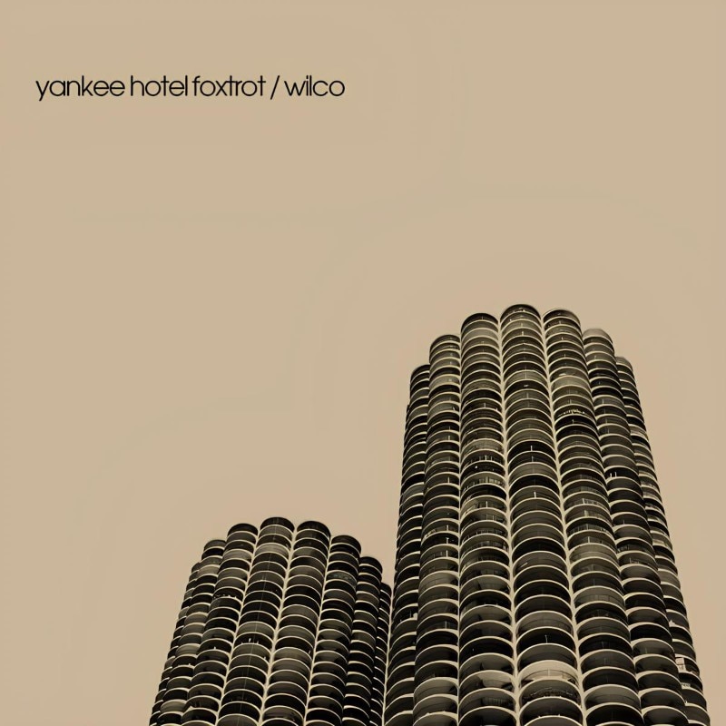
The cover of Yankee Hotel Foxtrot stands out for its iconic photography of the Marina City towers, designed by Bertrand Goldberg and completed in 1964. With their cylindrical shape and height of 179 meters, these towers are a key example of organic modernism—an architectural approach that moves away from orthogonal rigidity to explore new spatial solutions.
The image chosen for the record cover acts as an element in dialogue with the album’s sonic atmosphere. Wilco’s music—balancing experimental rock, deconstructed folk, and layered production—finds a visual echo in the modular repetition of the balconies and the building surfaces. The overall aesthetic and graphic composition evoke a sense of distance and melancholy, enhanced by the absence of prominent text. The image does not describe; it suggests. It becomes a mental landscape, a space suspended between utopia and myth—just as the city of Chicago itself, in its ongoing architectural evolution.
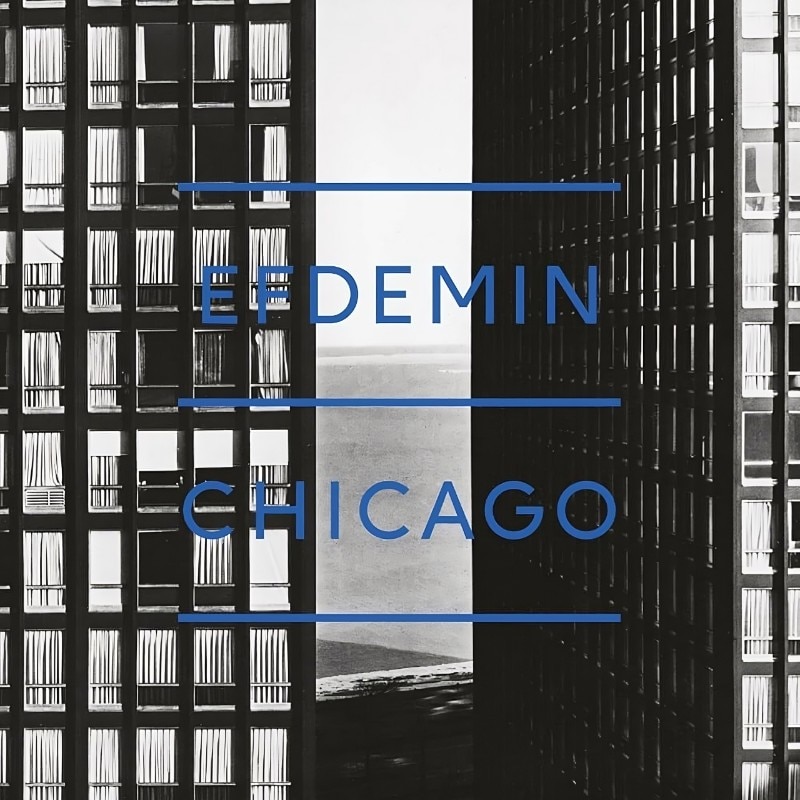
If Yankee Hotel Foxtrot uses Marina City as an urban metaphor for a changing America, Chicago by Efdemin takes a more theoretical approach to the city’s architectural imagination.
Moving away from documentary photography, the record cover opts for a more conceptual graphic representation— drawing on the city’s orthogonal street grid and the minimal structures of the International Style. Implicit is the reference to the Chicago School, the architectural movement that shaped the city between the late 19th and early 20th centuries. With innovations like steel-frame structures and glass surfaces, this movement redefined the concept of skyscrapers.
In this light, Efdemin’s Chicago adopts architectural visual language to construct a musical narrative that reflects the hypnotic, geometric rhythm of the city. The cover becomes a semiotic device—translating the music’s precision and abstraction into image. It reflects the use of acoustic space that resonates with the modularity of urban architecture.
Hotels and urban metaphors: the architecture of isolation and transit
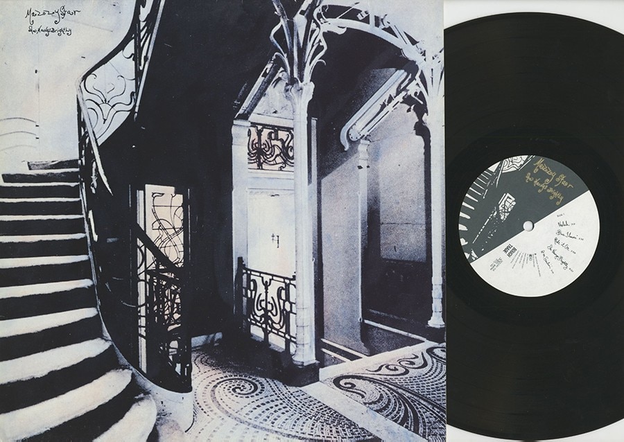
The cover image of She Hangs Brightly, the debut album by Mazzy Star, features an interior shot of Hotel Tassel—one of the masterpieces of Art Nouveau, designed by Victor Horta and completed in 1893 in Brussels. With its fluid spatial layout, organic structure, and sophisticated use of light, Hotel Tassel perfectly embodies the essence of Mazzy Star’s music: ethereal, suspended, and immersed in a hypnotic, melancholic atmosphere.
The choice of Art Nouveau is anything but accidental. This architectural style, with its curved lines and botanical decorations, stands in contrast to the rigidity of classical geometry, suggesting transformation and movement. Similarly, Mazzy Star’s music moves between psychedelic folk and dream pop, dissolving genre boundaries to create a soft blur effect—just as Horta’s architecture blurs the line between structure and ornament.
The soft lighting and framed perspective of the image heighten the sense of mystery and allure, turning the cover into a visual gateway into a sonic world where time seems to slow down.
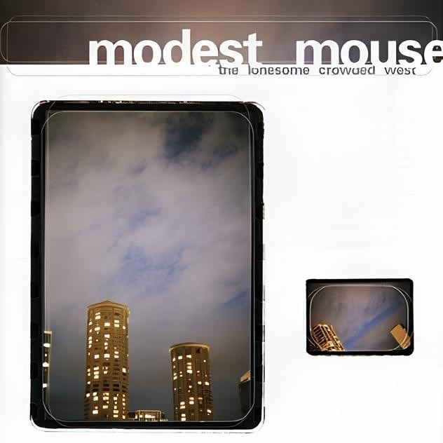
If She Hangs Brightly uses architecture to evoke a dreamy, rarefied aesthetic, The Lonesome Crowded West by Modest Mouse takes the opposite approach—turning the image of a hotel into a visual statement on urban desolation. The record cover features the twin cylindrical towers of the Westin Seattle, one of the city’s most recognizable skylines, with their brutalist, monolithic silhouettes looming over the horizon.
Completed in 1982, the Westin Seattle stands as a symbol of vertical expansion and the aggressive urbanization that marked the United States in the late 20th century. Its distinctive form—with twin curved towers—evokes the uncontrolled growth of modern metropolises.
Shot from below, under a heavy gray sky and with a slightly distorted perspective, the image amplifies a feeling of oppression and alienation. The hotel, traditionally a place of transit, becomes a symbol of an urban landscape that swallows the individual—turning the city into a dehumanizing environment. The tension between the album’s title, The Lonesome Crowded West—an oxymoron that juxtaposes loneliness and density—and the stark cover image underscores the conflict between the illusion of progress and the existential emptiness it can leave behind.
Drawings: architecture as graphic line and conceptual structure
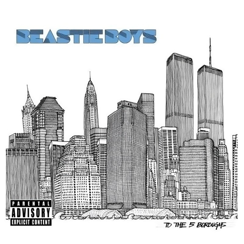
To the 5 Boroughs, the Beastie Boys’ sixth studio album, is a heartfelt tribute to their hometown: New York City. The cover, created by architect and illustrator Matteo Pericoli, features a meticulously detailed drawing of the city’s skyline. Rendered in clean, linear strokes, the image captures both the vastness and density of the metropolis through an essential graphic language.
The depicted skyline offers a unified vision of a city that is both fragmented and deeply interconnected. Pericoli’s linework emphasizes architecture as a visual code, distilling the city’s complexity into an almost cartographic grid that reflects its layered cultural and architectural identity.
Conceptually, the decision to use drawing instead of photography highlights the stylized and abstract nature of the album itself—a record built on decontextualization and sampling, just as New York’s skyline is the result of overlapping eras, styles, and influences. In this way, the simplified graphic skyline becomes a visual echo of the multifaceted energy of the Beastie Boys’ hip-hop.
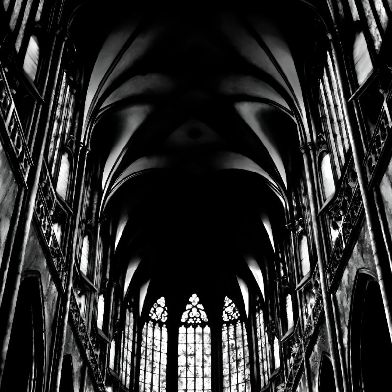
In Ascension: The Sequel by Glenn Branca, drawing becomes a means to intensify and visually convey the grandeur of sound.
The record cover, created by artist Robert Longo, depicts the interior of a Gothic cathedral using his hyperrealistic and dramatic style. Known for his stark black-and-white compositions, Longo masterfully uses charcoal to enhance the contrast between light and shadow, transforming his subjects into emotionally charged, dynamic forms.
The cathedral interior serves as a visual counterpart to the sonic experience of the album. Glenn Branca, a key figure in New York’s musical avant-garde, was renowned for his orchestral compositions for electric guitars—works marked by structural force and a near-architectural approach to sound.
Longo’s towering interior reflects the ascending nature of Branca’s music: a relentless build-up of tension and power, where obsessive repetition of sonic patterns produces an almost mystical effect. The vertical thrust of the nave, the intensity of light and shadow, and the overwhelming sense of elevation all mirror the album’s musical structures, which are based on the superimposition of sound layers in a continuous dynamic expansion.
Made in Italy: Zen Circus – Andate tutti affanculo (2009)
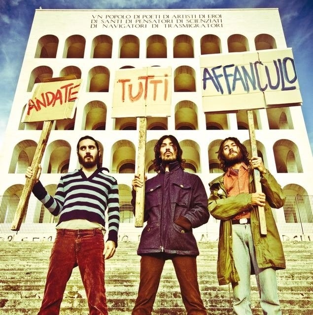
The cover of Andate tutti affanculo by Zen Circus, released in 2009, is undeniably a bold visual choice. It features an image of the Palazzo della Civiltà Italiana—one of the most iconic buildings in Rome’s EUR district and a paradigmatic example of rationalist architecture from Italy’s fascist era. With its modular repetition of arches and abstract monumentality, the building has long been seen as an ambivalent symbol: on the one hand, the rhetoric of grandeur and order imposed by the ideology that birthed it; on the other, a cold, detached form that has since come to represent impersonal power, disconnected from everyday life.
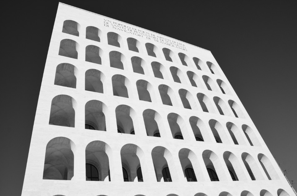
The juxtaposition with the album’s title—Andate tutti affanculo (‘Go f*** yourselves’)—creates a sharp and ironic tension. The formal rigor of the architecture clashes with the expressive violence of the language, producing a contrast that reflects the spirit of the record itself.
While the building, in its history and aesthetics, evokes a vision of Italy as grand and orderly, Zen Circus reclaims it as a symbol of contemporary alienation. The choice of this image is more than mere provocation: it is an act of cultural repurposing. An architecture born to serve another era is now used to narrate a present marked by precarity, frustration, and defiance.
Architectural follies and surreal visions: Aulos and For Your Pleasure
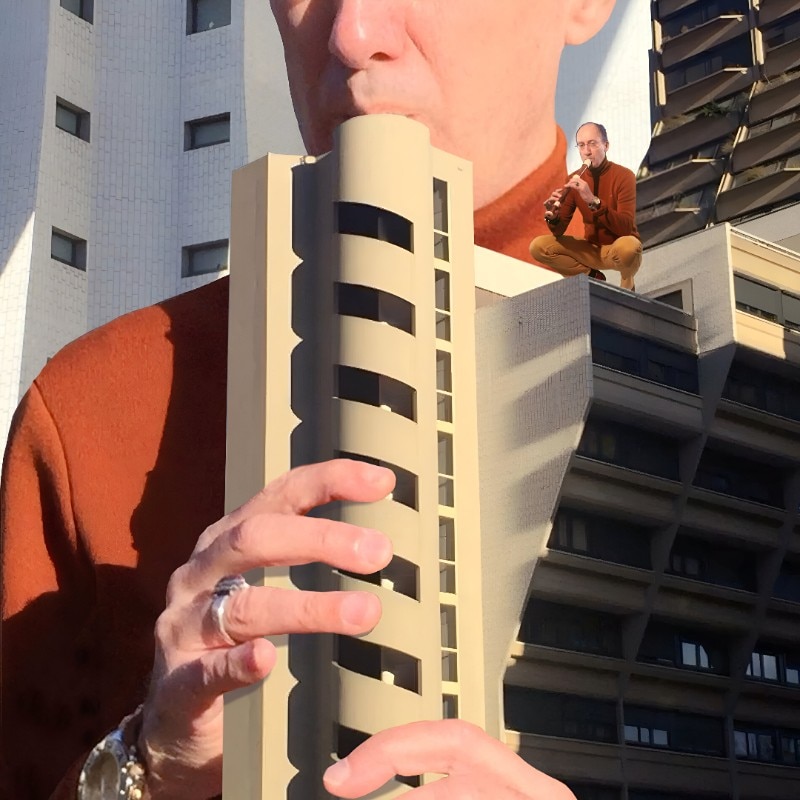
The cover of Aulos by Vladimir Cauchemar reimagines the Parisian residential complex Orgues de Flandre with a surreal and ironic approach, transforming it into a colossal flute. This brutalist architectural ensemble, designed by Martin van Trek and built between 1974 and 1980 in Paris, features cylindrical towers resembling the pipes of an organ, humorously emphasized in the artwork through photomontage.
The visual composition plays with scale: the building is miniaturized into the form of a musical instrument, while the human figure becomes the reference point for its functional reinterpretation. The framing makes use of the rigid, repetitive geometry of brutalism to create a dynamic and well-balanced image. What was conceived as a static urban element becomes, through this reinterpretation, a performative object—flipping our perception of the built environment and suggesting new ways of interacting with the city.
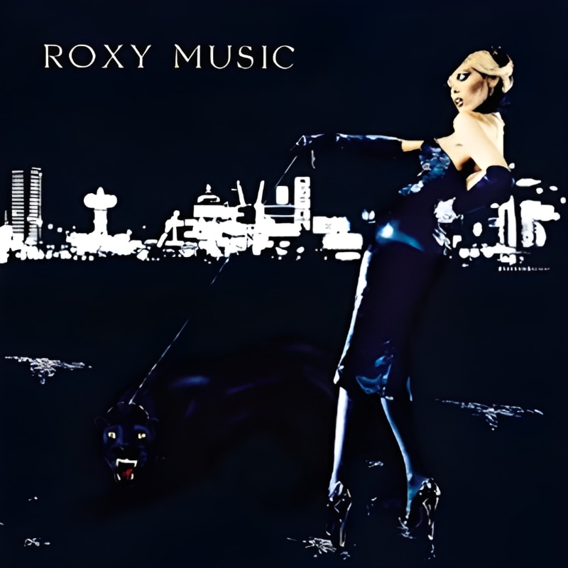
Released in 1973, For Your Pleasure marked the peak of Roxy Music’s glam aesthetic, and its cover—shot by photographer Karl Stoecker—is one of the most iconic ever.
The image shows Amanda Lear in a black evening dress, holding a leash attached to a black panther. In the background, a nighttime urban landscape shrouded in artificial light and haze creates an ambiguous, almost dreamlike setting. Here, architecture plays a minor yet essential role: the city lights, reflections, and distant skyscrapers build a stage that evokes a vision of both elegant and alienating modernity. It could be London or New York City, but is an abstraction, a mental space rather than a geographical one.
The cover conveys a sense of refined decadence, perfectly aligned with Bryan Ferry’s glam rock. The blurred, distant architecture suggests a cold, detached luxury, serving as the ideal backdrop for the album’s mood. The black panther—a symbol of power and seduction—moves through this surreal setting as a disruptive presence, bringing with it a sense of mystery and danger.
The Classics: Animals and Physical Graffiti
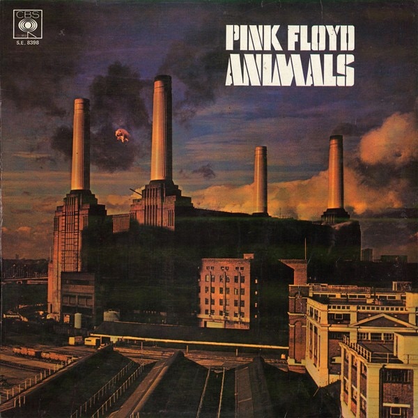
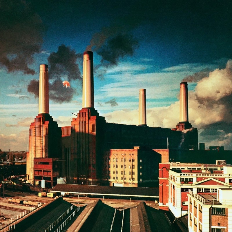
The cover of Animals (1977) is undoubtedly one of the most iconic in rock history. Designed by the Hipgnosis studio with direct input from Roger Waters, it features London’s Battersea Power Station, a towering industrial structure, with a giant inflatable pig floating between its chimneys. The image is both surreal and disturbing, a visual representation of the album’s central themes: social alienation and a scathing critique of capitalism.
With its imposing architecture and deep ties to Britain’s industrial past, the Battersea Power Station becomes a symbol of a decaying world. Built in the 1930s, it stands as a monumental example of industrial design—where functionality meets grandeur. Its looming, bleak presence perfectly mirrors the atmosphere of the album, which portrays society as divided into ‘dogs,’ ‘sheep,’ and ‘pigs’—the ruling and ruled classes, through the band’s critical lens. The visual contribution of Hipgnosis disrupts the rigidity of the building’s form with an unexpected element, emphasizing how power and economic systems distort reality.
Beyond its aesthetic impact, the Animals cover has left a legacy, turning Battersea Power Station into one of pop culture’s most recognizable buildings. In an almost ironic twist, the structure has undergone a luxury redevelopment in recent decades, transforming into a high-end residential and commercial complex—quite the contrast to the album’s message of social critique.
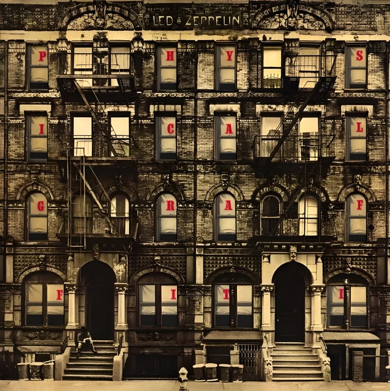
The cover of Physical Graffiti (1975) depicts a double residential building located at 96 and 98 St. Mark’s Place, right in the heart of Manhattan. A classic example of New York brownstone architecture, this East Village building embodies a lived-in, intimate kind of urban space. However, the design work on the cover adds an unexpected twist: the windows have been cut out, allowing glimpses into the interiors.
Like a building filled with different lives and stories, Physical Graffiti is a layered, eclectic, yet cohesive album. The choice of this specific building turned it into a landmark for Led Zeppelin fans, and to this day, it remains a destination for musical pilgrims from around the world.
Going East: brutalist monuments, Soviet utopias, and Japanese minimalism

The cover of Unknown Mortal Orchestra’s debut album of the same name uses a striking and disorienting image: the Monument to the Uprising of the People of Kordun and Banija, located in Petrova Gora, Croatia. Designed in the 1980s by Vojin Bakić, the structure is a memorial installation dedicated to the Yugoslav partisans of World War II.
With its reflective metal surfaces and organic form, this monumental building is a radical example of socialist architectural sculpture. The image chosen by Unknown Mortal Orchestra emphasizes the alien and decaying appearance of the building—now abandoned and in ruins. The connection to the music is palpable: the band’s lo-fi psychedelic sound finds a mirror in this distorted architecture, which evokes a glorious past now replaced by an atmosphere of decay and mystery.
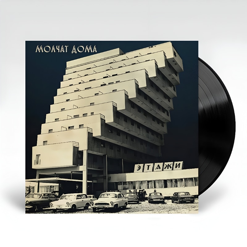
Belarusian band Molchat Doma, formed in 2017, has built its visual identity on the fusion of post-punk, synthwave, and a deep aesthetic connection to post-Soviet architecture. Its record covers, music videos, and advertising material draw directly from the urban landscape of the former USSR: prefabricated housing blocks, brutalist skyscrapers, bare interiors, and bleak atmospheres.
However, this is far from a purely nostalgic choice: the Soviet architectural landscape becomes the perfect symbol of the band’s music, defined by cold, repetitive sonorities that evoke a sense of isolation and urban alienation. Этажи (2018) is a prime example.
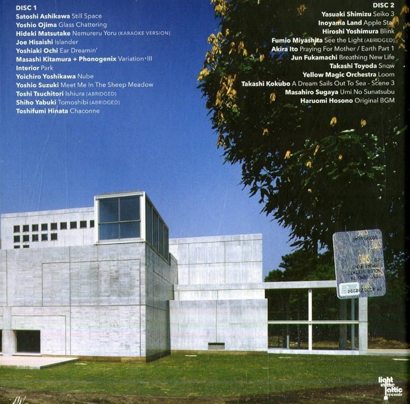
Kankyo Ongaku, a compilation released by Light in the Attic Records in 2019, is a tribute to Japanese ambient music from the 1980s and 1990s. The title translates to ‘environmental music,’ referring to a genre that evolved alongside Japanese architecture and design of the time.
The record cover features an image of the Iwasaki Art Museum, designed by Japanese architect Fumihiko Maki. Characterized by minimalist lines, reflective surfaces, and a masterful use of natural light, the building perfectly embodies the spirit of the music collected in the compilation.
Maki, a key figure in Japanese modernism, pursued an aesthetic rooted in fluid, harmonious space—where architecture does not dominate but rather blends seamlessly into its surroundings. This philosophy is perfectly reflected in the music of Kankyo Ongaku, in its exploration of the relationship between sound and environment.