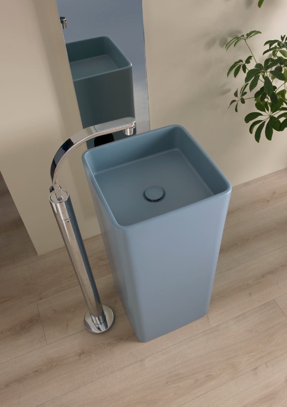
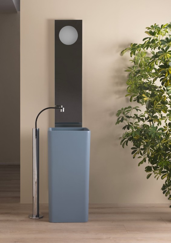
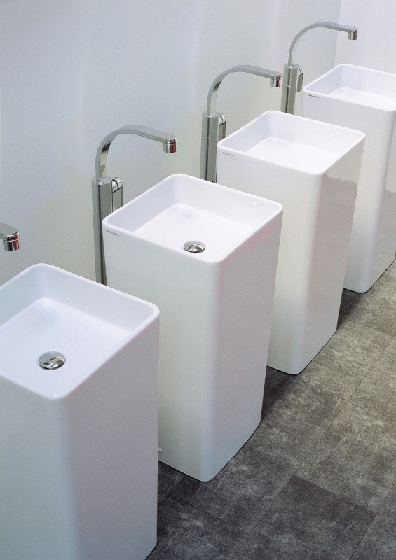
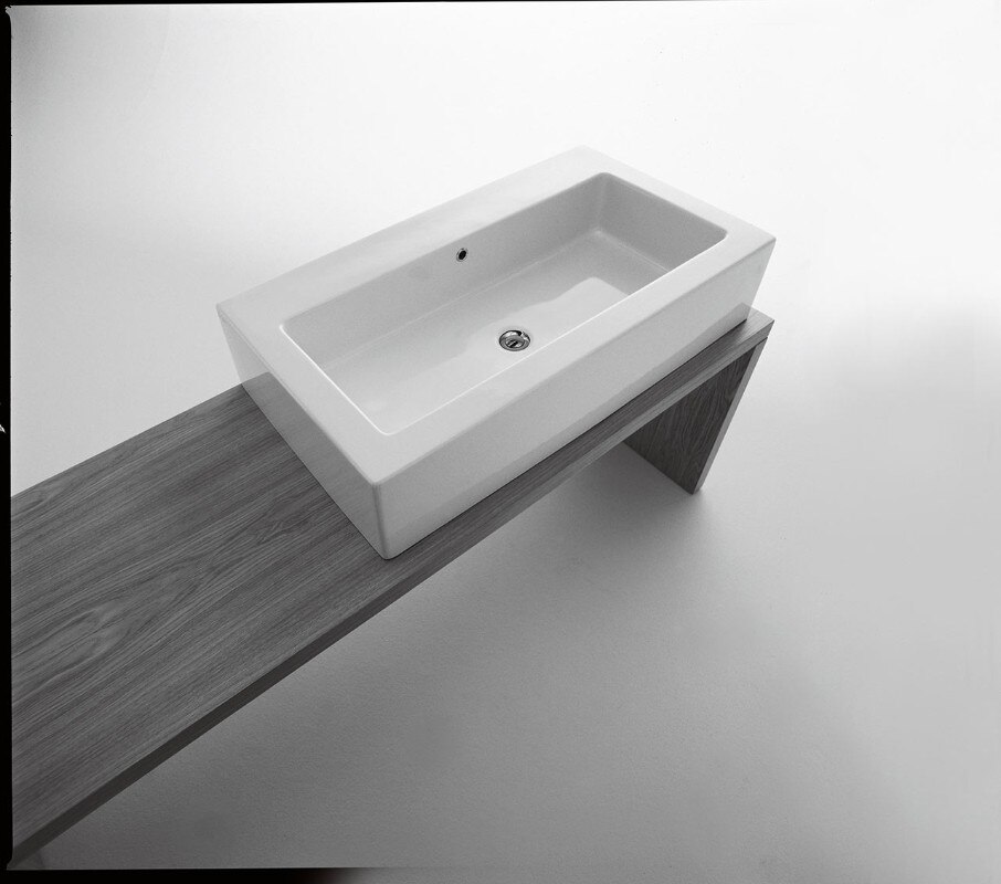
The history of successes accumulated by Ceramica Flaminia over the last twenty years is an example to all. The most important aspect, one which is usually both at the forefront and behind the scenes, is the trust placed in the potential of design. A seriousness of form calibrated to content in net contrast to frequent (design) populism. Was this ever in question? No. But when, at the end of the 1990s, efforts were concentrated on escaping the crisis, no-one explicitly expressed this obvious fact. Not until 1997, when Roberto Palomba suggested working with Giulio Cappellini. He was driven by the idea that one can only escape from an impasse with a new fundamental initiative, even one which is highly extreme: Giulio, who was later to become art director of Flaminia in 2004, knew nothing about ceramics. However, he knew a lot about what constitutes risk, or rather something that has not yet been seen. This was the case with the “masterstroke” of the Acquagrande sink, which quickly subverted all precise and correct associations with bathroom furnishings, beginning with the object which inspired it, a water trough for animals. This also provoked a significant shift in market preferences towards vanity-top models, suddenly rendering column-mounted sinks obsolete. Until a short time before, no-one had imagined being able to do without a “small lake” with a “bridge” on which to place soap and night-creams.
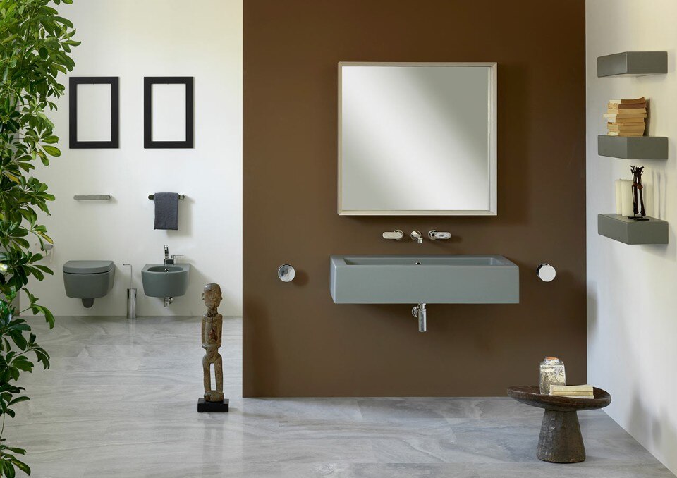
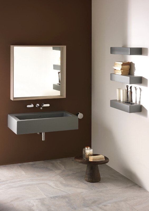
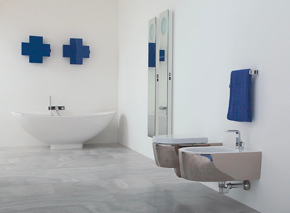
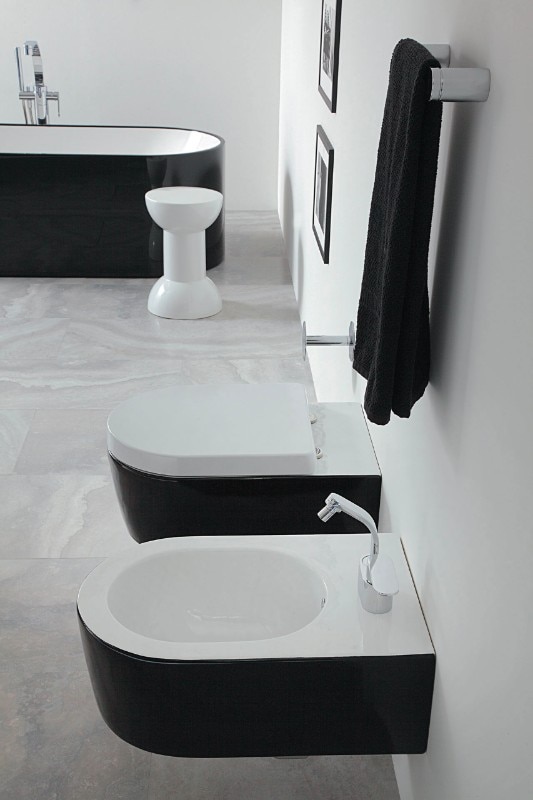
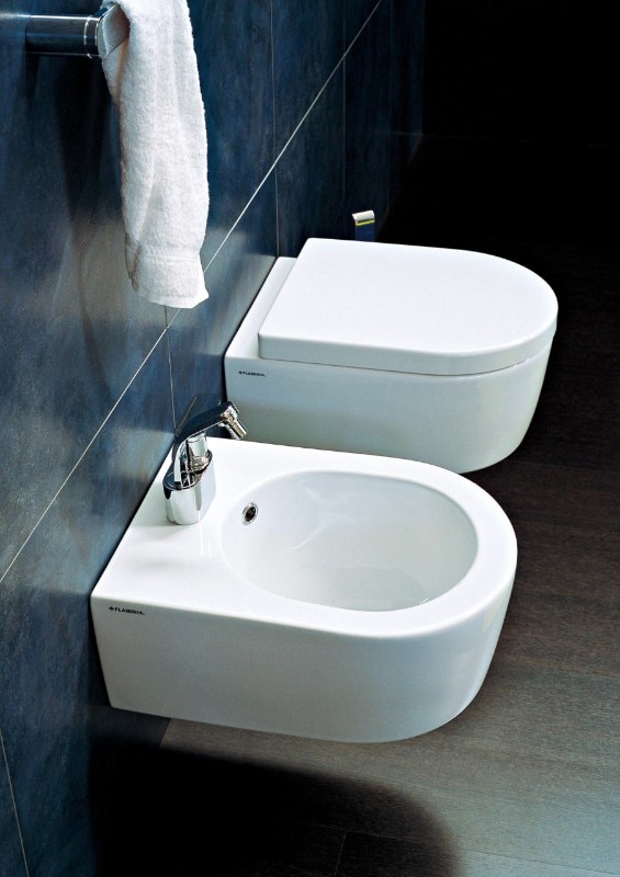
But then, no-one before Ceramica Flaminia had ever managed to design an angular toilet with almost sharp edges. A designer was needed in order to transform it into a status symbol, and Flaminia was the first brand to create a profitable relationship with such a figure. Also famous for a limited-edition collection entrusted to ten important architects and designers, in the meantime Acquagrande has become a highly-imitated iconic object. However, aimed as it was at the toilet and bidet category, perhaps the Link collection has had an even more devastating impact, and just as many imitations, if not more. Cappellini says: “It is undoubtedly the most copied collection of bathroom fittings in the world”. As Palomba adds: “After Link, designers began to create bathrooms, instead of composing them”. In fact, the creative efforts of the two designers was impressive. Together they created the first suspended bathroom fittings. Essential and minimalist, exalted by the complete absence of visible attachments, it was a revolution for 1999. One which is still taking place. And a lesson which, when approached with intelligence - in the case of Link by combining an angular and a round shape – can render even the most ignoble accessory an object of desire.
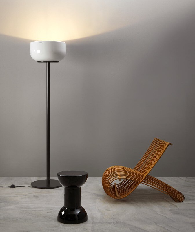
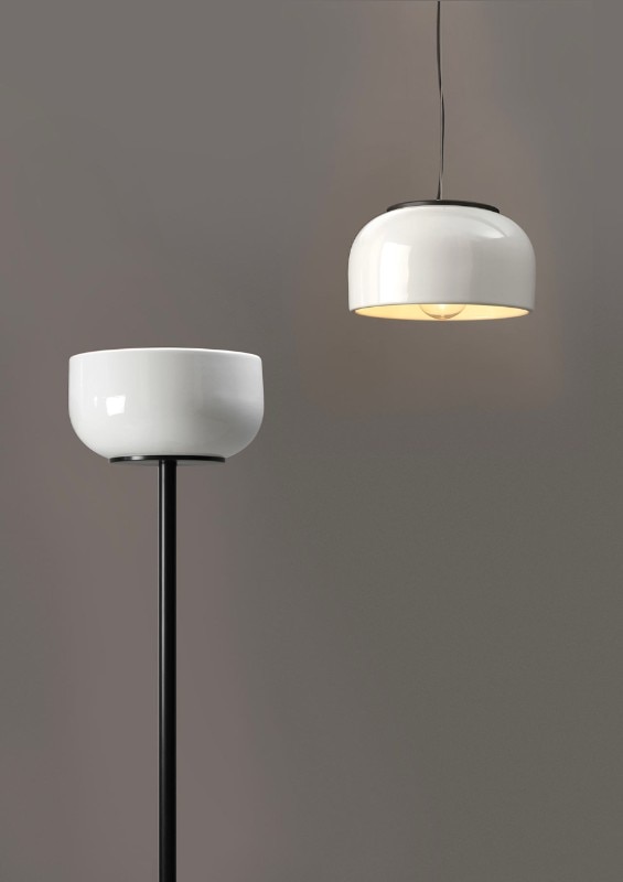
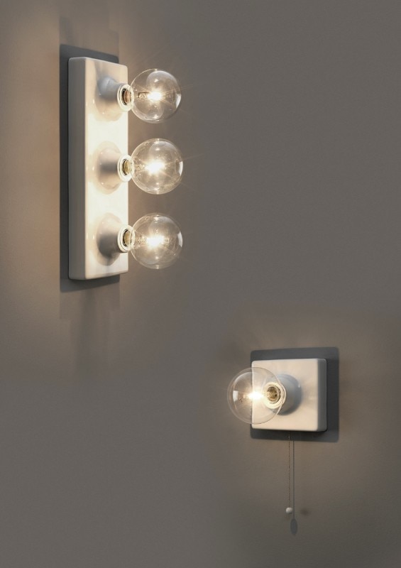
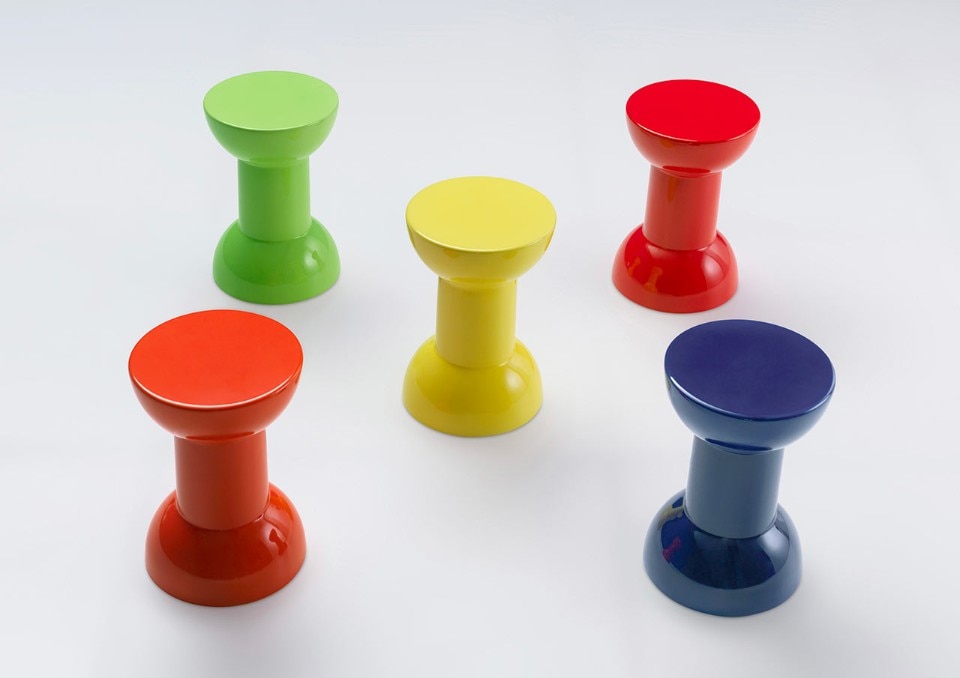
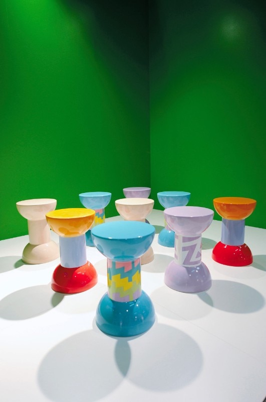
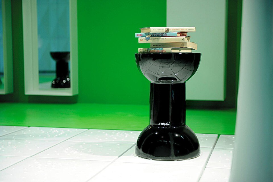
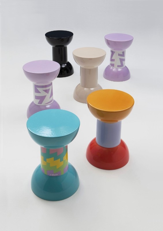
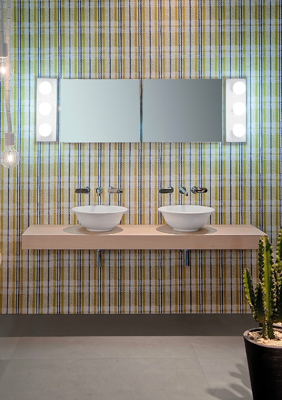
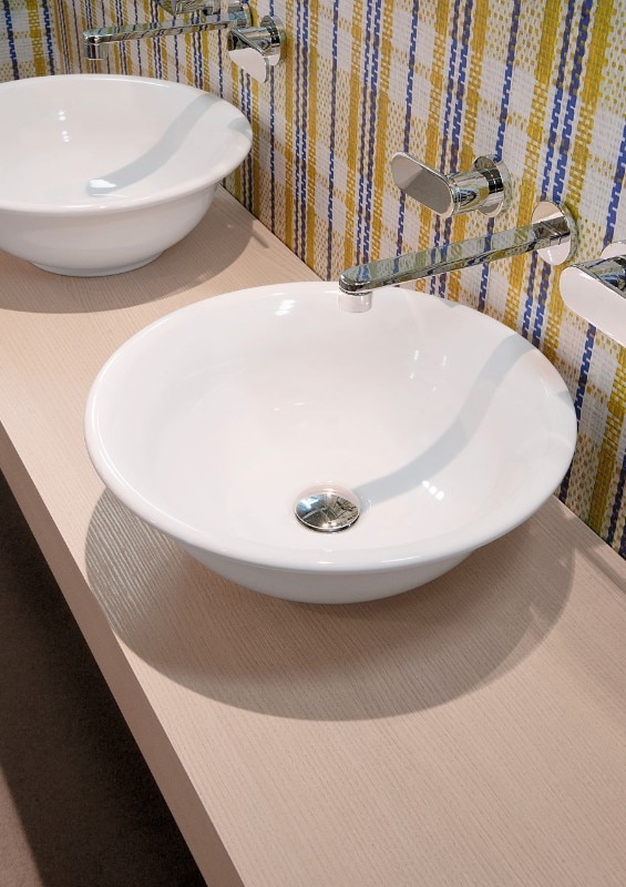
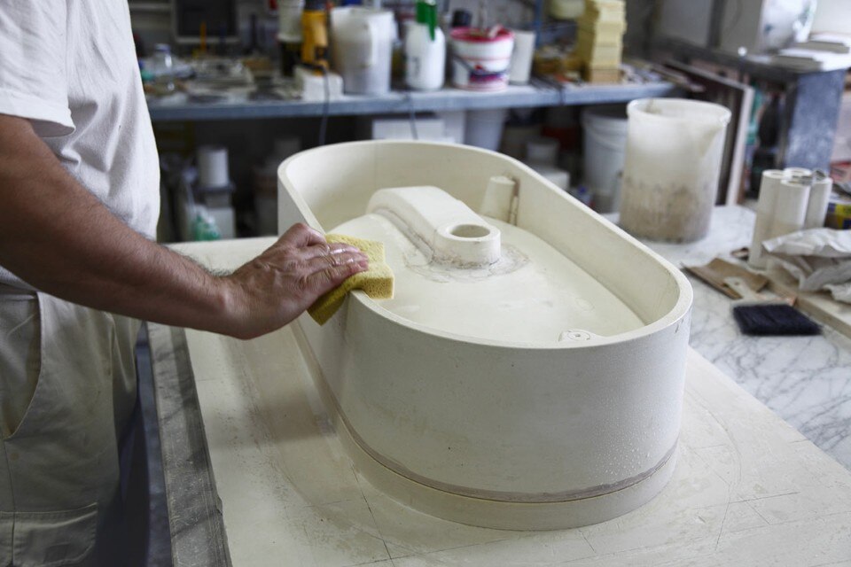
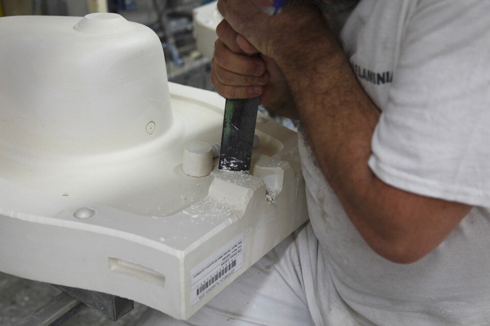
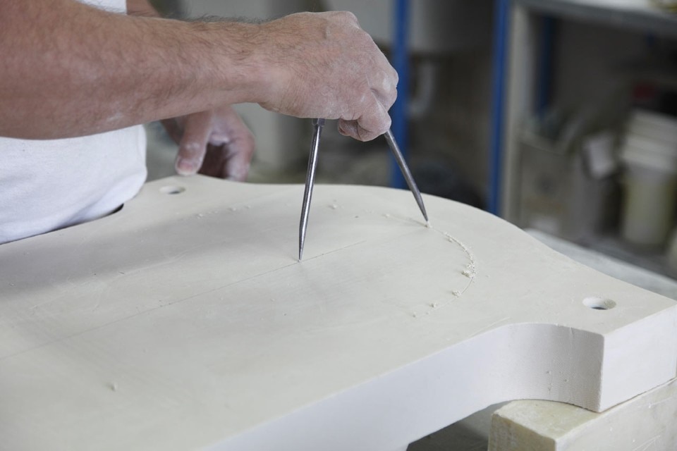
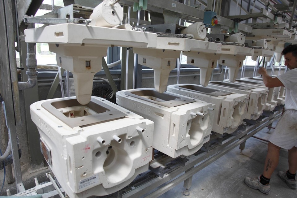
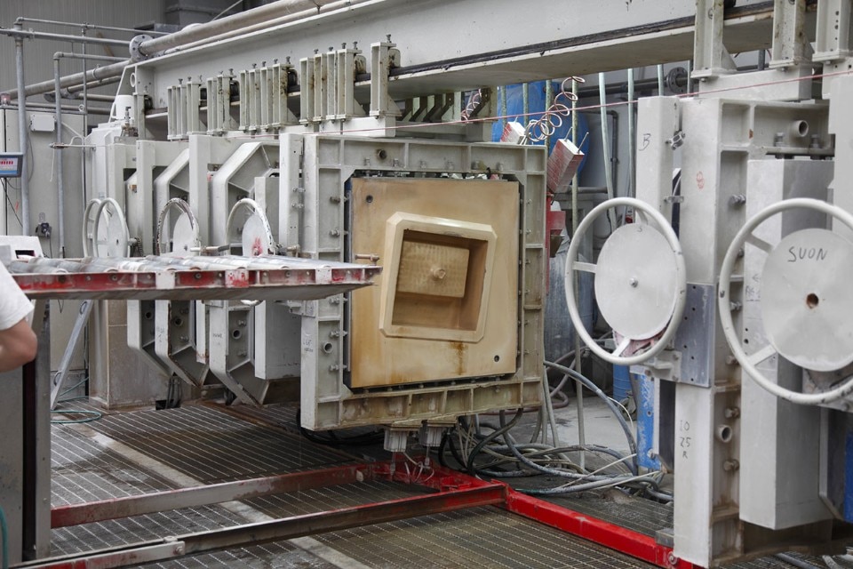
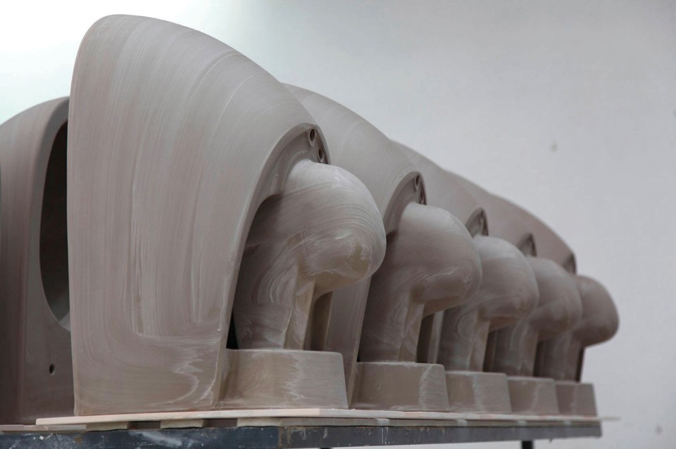
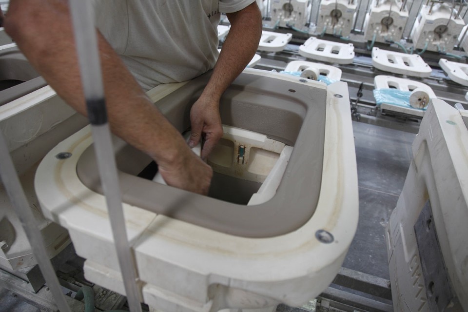
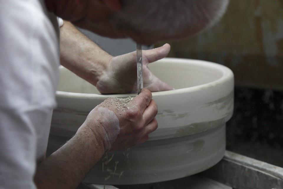
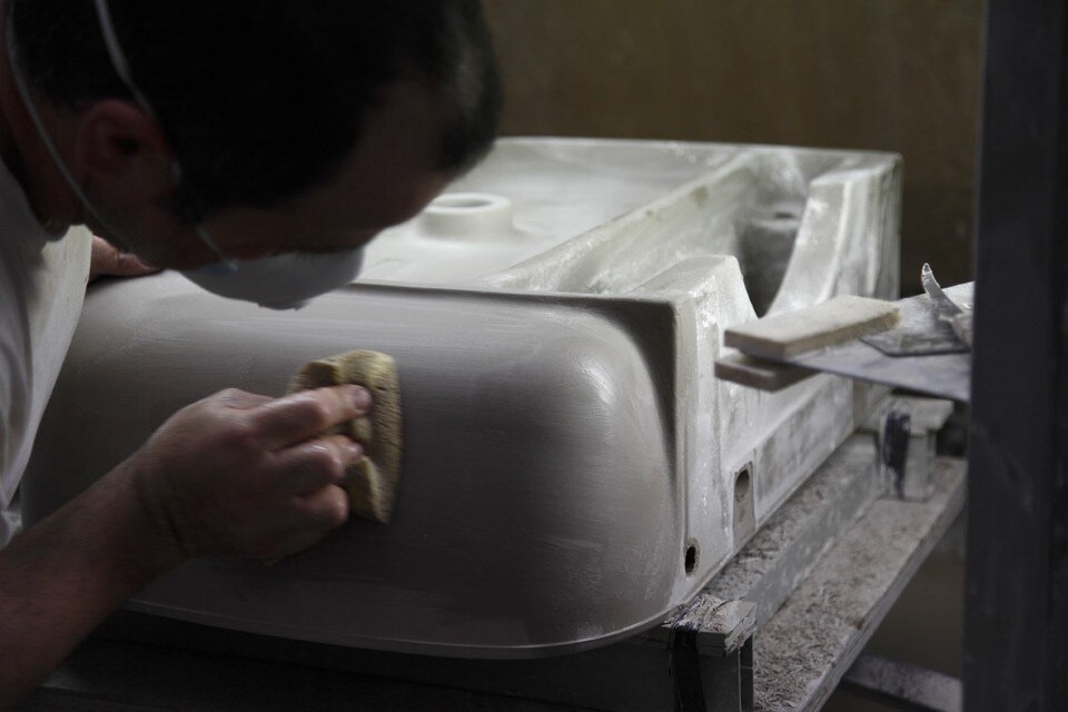
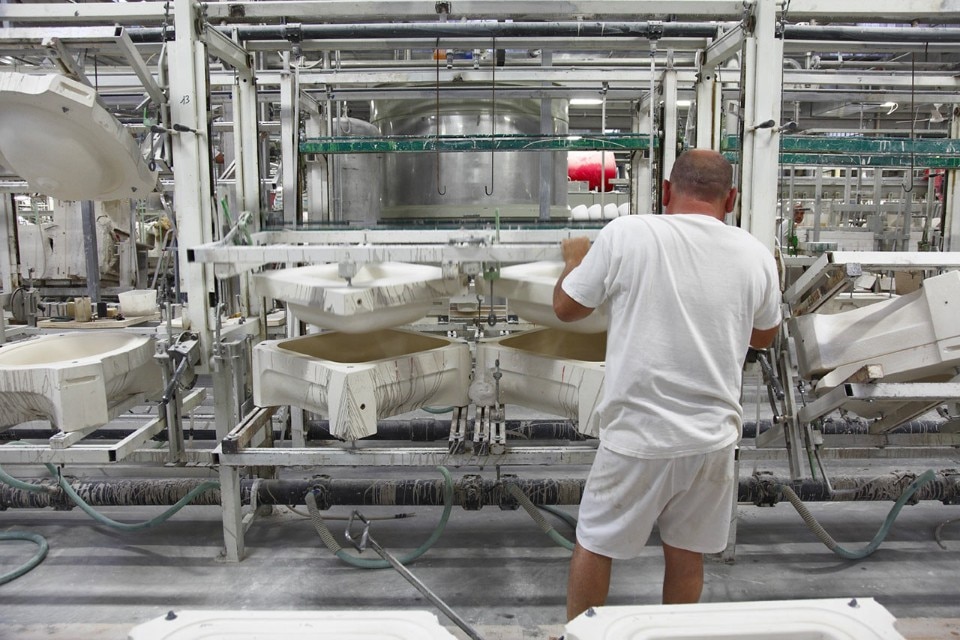
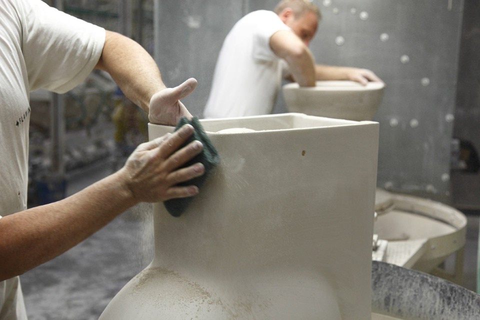
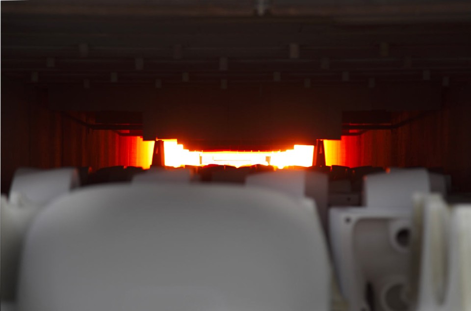
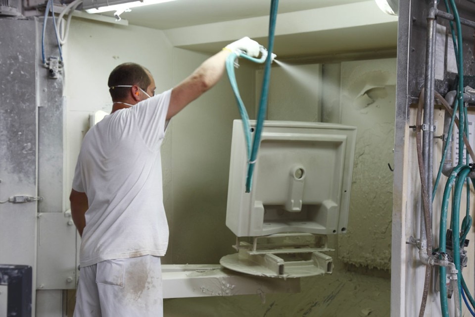
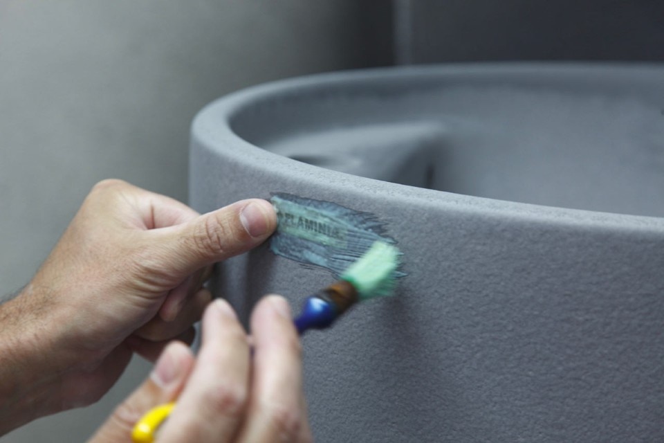
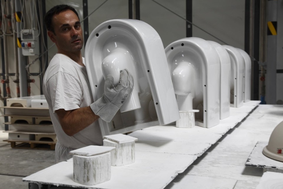
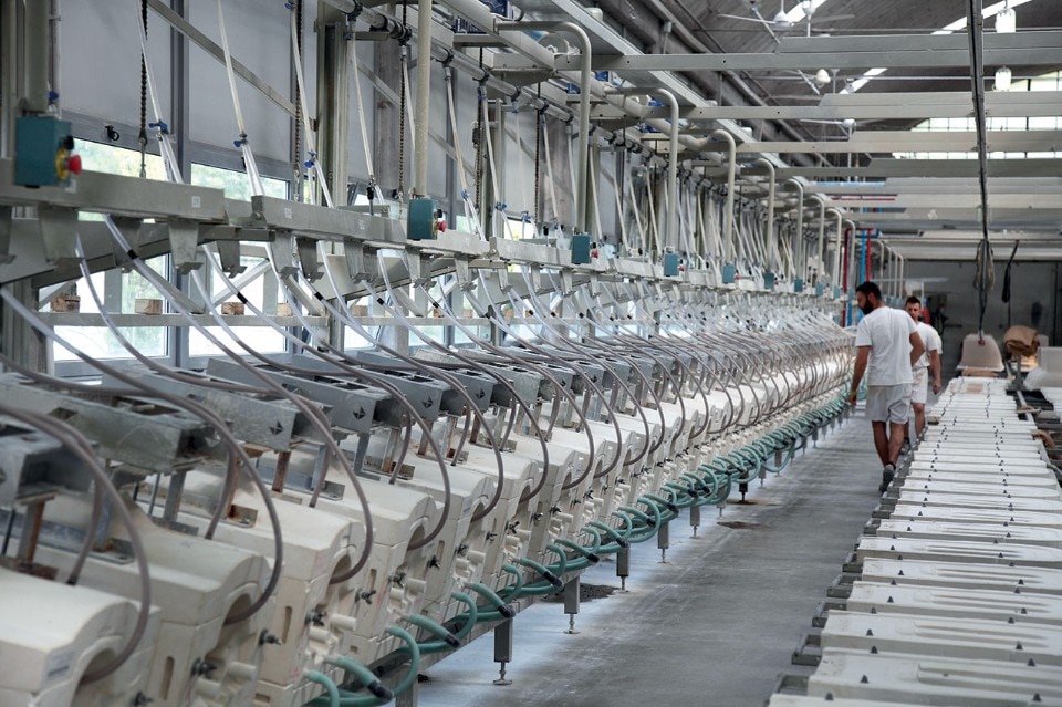
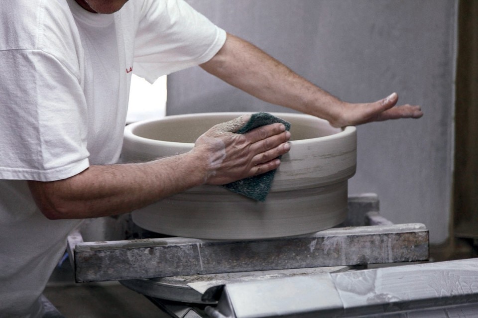
Over time, Giulio has called on the most important names in design, such as Paola Navone and Nendo, as well as Jasper Morrison, thus constructing, step by step, an attractive and varied offer which focuses attention on surfaces and materials. Impressive when used individually, but even more so when mixed, as these are items designed with a view to dialogue between collections. The current challenge, however, is concentrated entirely on variety in finishes. Having established the rigour and skill with which the company makes its products, from the moulds created from a hand-shaped form to the final quality checks, where defects are evaluated as to whether they can be corrected or not, thus allowing for a percentage of rejects, trends in bathroom fittings are moving once again towards a certain attention to decoration, to texture and colour, with gloss and matte, satin, silver and even gold effects. A circularity of language which, between vintage style and the obligatory photogenic nature imposed by social networks, renders the classic white of bathroom fittings practically the least considered option. This is the kind of sensitivity with which Giulio Cappellini defines “ceramica light”, a combination of strategies which, alongside the core business of bathroom fittings, widens the application of materials, consequentially doing the same with the lifestyle concept of the brand. In 2010 it was the turn of the small stool by Alessandro Mendini; last year that of Flaminia Lighting, the first collection of floor, ceiling and wall lights.
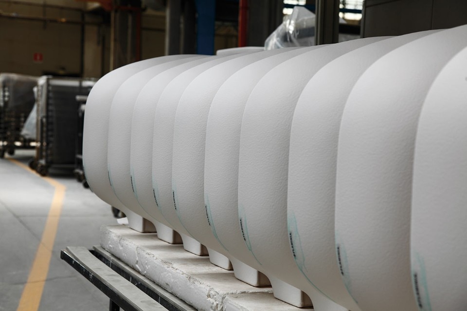
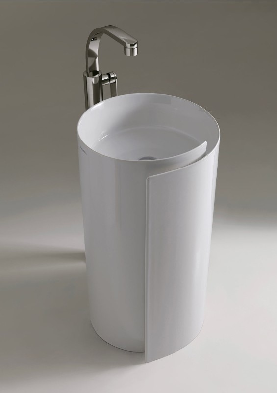
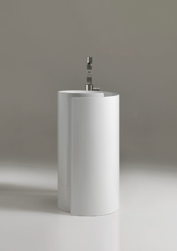
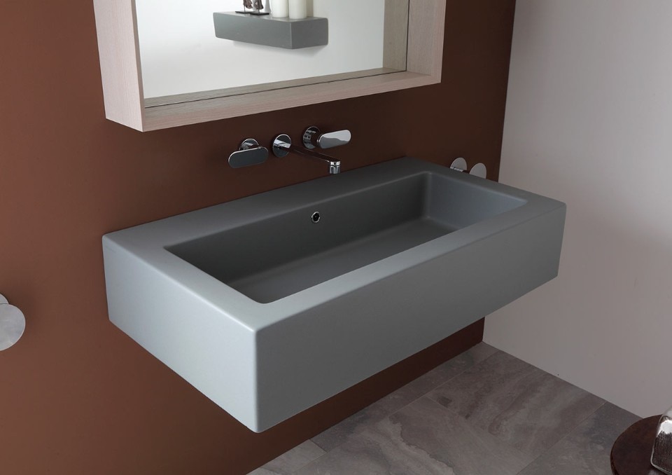
Being “light” does not however mean improvising. It means being ready to respond to requests and having a flexible structure. One which guarantees, for example, the application to 300 articles of a new chrome finish, without however exceeding the average product production time of forty days. It means safely handling oversize items with delicate machines, such as with the Monoroll and Monowash sinks. It also means, not least, studying the performance of colour according to form, as an angular shape can render a colour dull, while another colour could be exalted by a rounded shape. And these are not generic colours, but a range produced in relationship to the history of art. Rubens red, for example, is not just a name, but a colour actually used by the Flemish master. The aim is, as always, to overturn the “conformist” nature of ceramics, and to surprise. This is even achieved through optical illusions via a change in materials. With a touch of bronze the Boll sink by Paola Navone becomes a zinc basin, with graphite, it is a relaxing stone. The choice is yours.