


Yesterday, as Apple was unveiling the new iOS 14 during the WWDC Keynote, Twitter was ablaze with Android fans claiming that their favorite OS had most of those “new features” for years. It’s an old story that keeps repeating itself: what Apple touts as innovative, its detractors will inevitably indicate as a stale copy of something that already existed in some form on other products or softwares.
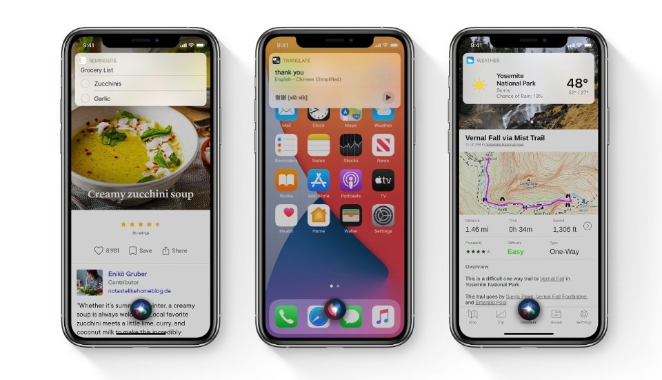
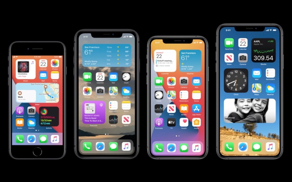
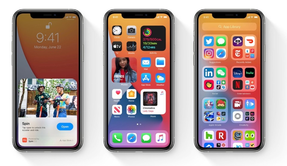
At the center of the debate, yesterday, were the new widgets, which will now be allowed to leave their dedicated section to wander the plains of the iPhone Home Screen, to share the space that was once limited to app icons.
While it’s true that Google’s mobile OS sported this kind of widgets for a while already, these elements are also the quintessential concept that Android aficionados fail to grasp about Apple’s ecosystem.
On Android, the widgets are one of those elements that set apart the design of the system from one phone to another. Each customization of Android has some different kind of opinionated UI design applied to them, and so the widgets become one of many elements of fragmentation. On Apple’s devices, starting with iOS 14, the Widgets will be - as usual - another element of design coherence, carefully crafted to respect a higher set of design rules, thus making them feel natural from the start, even in a virtual space where they have never belonged until now.
It starts with the sizes, and the pixel-perfect positioning in the icons grid. It goes on with the perfect padding, the way you’ll pick the widget out of their “widget parking”, and it ends with the guidelines for developers that will create their own widgets. It’s a concerted design effort that turns an added layer of complexity into a well integrated addendum and not into just another source of UI confusion (that’s exactly what Google tries to do as well, with varying results, on the stock version of Android on its own Pixel smartphones: too bad they’re just a sheer minority of the Android smartphones in use today).
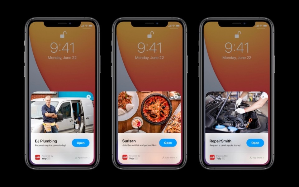
Widgets and many other new elements of iOS 14, such as the new incoming call interface that will appear as a notification banner, or the cards for the new App Clips, all draw from an existing design system that Apple has refined over the years. This is a powerful competitive advantage that is too often overlooked: the reason why iOS is so sticky for the users is that any interface design change is introduce along the lines of what was there before. Each new feature sits on top of one of the strongest visual software design foundations the market has ever seen. Is it enough to make a new feature “successful” or “useful”? Of course not, but this course of action is why Apple, albeit having successfully transitioned from a pure hardware-driven business model to a software and services one, is still very much a design-first company.