


This article was originally published on Domus 1066, March 2022.
The new Live Map of the New York City subway system is an example of how graphics can encapsulate aesthetics and functionality. The linking “and” between the two concepts was, up until a few years ago, an alternative “or”: symbolic clarity or topographic coherence?
In fact, two ideologies for over 50 years have clashed between the colourful lines that cross the silhouette of Manhattan.

On one side, the supporters of the geometric simplification introduced in 1972 by the Italian designer Massimo Vignelli who created a map, where colourful lines – his “spaghetti” – were drawn by following 45-and 90-degree angles, abstracting the turns taken by trains and geography of the terrain. The water was beige, the parks were brown, the neighbourhoods were warped and without landmarks while Central Park was wider than longer. Vignelli’s map was deemed imprecise and later abandoned, yet it has remained an icon of graphic design and is part of MoMA’s collection. On the other side are the champions of the more organic Subway Map made in 1979 by the American graphic designer Michael Hertz and based on geography.
His map includes major streets, neighbourhoods and landmarks and is used even today, though updated and revised various times, gradually expanding as the city grew. Vignelli himself described these two factions as “visual oriented people” and “verbal oriented people”.

The former were those who could easily use his map whereas the latter criticised him and preferred a version overflowing with info and reading levels, to the detriment of simplicity and clarity.
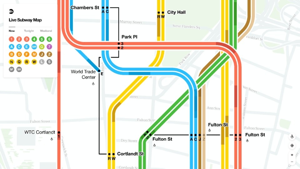
Today, we can include the “digital oriented people” – that is, users who have surpassed this dichotomy and appreciate the technological enhancement introduced over the past months by the design company Work & Co which, for the new MTA map, focused on the enjoyment experience in line with our times.

In their map, the routes taken by the subway respect, from afar, the city’s topographical coherence, but as users approach the map, the lines become abstract, like Vignelli’s “spaghetti” and greater symbolic clarity helps in deciphering them. Digital features allow users to get updates in real time, guaranteeing greater accuracy on hours and train specs, and tracking is geolocalised along the routes. The map by Work & Co reconciles the two historic factions. Peace, finally.
Opening image: MTA Live Subway Map, Work & Co. Courtesy of Work & Co