There is much debate on new exhibition-design methods, permanent and non-, and we have seen a surge in projects and architectural construction but the endless temporary exhibitions of recent years, whether or not in ad hoc spaces, suffer from a climate that bolsters uncertainty. The Milan Triennale has been both prototype and workshop. A dynamic exhibition space created partly to contain inventions and wonders, it has maintained a hybrid nature over the years, updating and making a name for itself as one of the more versatile and pro-active institutions in terms of exhibition-design themes and approaches, and rotating exhibitions with disparate contents and images coexist in a large high and curved space (actually, hard to use and set up).
Today, the Triennale is where experimentation with new exhibition models has become reality. A strong feature of these productions is always that they are not coordinated one with the other but differ according to the concepts and styles of their curator and designer. This occurs both in the exhibitions and the accompanying graphic designs, from exhibition design to catalogue.
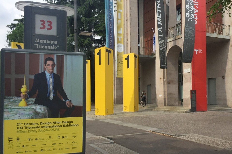
The first impact with the communication model comes in the lobby of the building, after leaving behind a forecourt where towering yellow columns feature parts of the logo. It is a strenuous introduction. Try finding the colophon of the Triennale, that long list of jobs and names that tells you “who did what” (a sort of geography of power); and what is the point of the large territorial map on the wall that is shared with the “Rooms” exhibition? Or the large XX1T logo split between one wall and another...
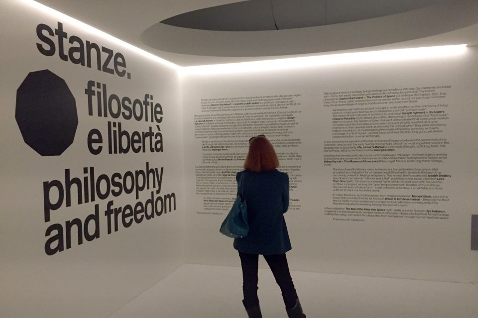
I enter “Rooms”. The first one looks a little like a Korova Milk Bar (that of A Clockwork Orange movie) with much writing on the walls in the dominant font of Helvetica (it nearly always is). The many texts are like a book with a foreword, a preface and then the chapters, which are the specially built rooms. These unfold one beside the other in a hemicycle and include other more specific presentation texts. In some cases, I have to search for them inside and out because they are hidden. The rooms rest one against the other, too close; some can be entered, others cannot but are they liveable places or declared prisons? The juxtaposition does not help and even less so the texts that ought to regulate reading and flow. Do not touch signs begin to appear. What do you mean? I want to touch.
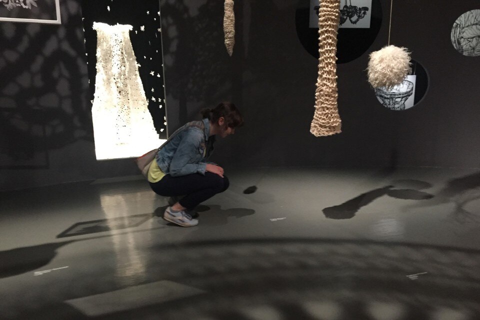
Opposite I find the “Brilliant!” exhibition and its quasi-jewellery shop, with glass cases and captions. It is all white, better than black which is predictable for jewellery. The few texts, readable, are in black and gold on white in an unintentional funeral of luxury.
Beside it, in the central room, is a poorly lit exhibition entitled “The Multicultural Metropolis”. The surrounding walls are hand-decorated, grouping and intersecting the names of the world’s ethnic minorities. Less clear are the central installations: altar-bookcases on which objects and photographs rest. I believe you have to stand in a specific place to match the objects up with the names on the walls but I am not sure. I see no visible captions. A wild exhibition, it is almost a phase transition. Indeed, the visitors I meet pass through it without stopping and dive into the disarray of the international participations alongside.
The exhibition continues, packed with objects like a bazaar with spinning tops, saints on the windows and firmaments, and it is always the same – plenty of captions to walk over. What about the accompanying texts? They are hidden in the general bailamme, almost invisible on the walls but long and not exactly inviting. As often occurs, the exhibition is conceived as a book but this time with mobile pages and if the book falls they are gathered up and arranged randomly. It is too much so for me and I last one hour of the suggested two-hour visit time. I am struck by an unexpected object: the Bacio Perugina by Luisa Spagnoli, 1924 (says the caption).
I have left the “Neo Prehistory – 100 Verbs” (why all these capital letters in the Italian titles...) exhibition for last and am greeted by a single billboard-style introduction and a photographic portrait of the two designers and curators that seems a little like overkill. The entrance is a small dark space that is not easy to adapt to. Another attendant tells me to follow the numbers and to take care because there are so many mirrors. Indeed there are and the exhibition design is alienating (something I discover at the exit which, at a certain point, I start to crave). The only handholds among the glass cases containing objects, the gigantic dolmen introduced for effect and the mirror-walls are tall matt-black totems standing beside the glass cases and bearing progressive numbers. There is a “verb” and a short statement in English, Italian and Japanese and so on up to 100 (verbs).
The point is that these signals clash irremediably with the “uncertain” structure of the exhibition. As well as being functional and fixed points in the darkness, they seem like totems for parties of tourists. The captions are in their proper place in the glass cases but it is the unlikeliness of the whole that rules. Is it the verb or the object that has steered the choices? There is, in fact, a return effect. I come to the verb To take drugs and read on the totem that this means to go beyond the limits to the point of abuse; to drown in bad habits and become addicted. The glass case contains a pile of disposable syringes. What steered what in this unhappy choice? Certainly not an exaggerated generation! and beware of the totems. At a certain stage, you will get lost as happens to the tourists because the signs are badly positioned.
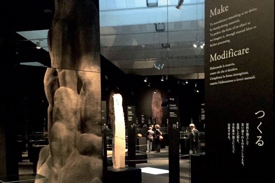
Perhaps one of the two curators wanted to atone and also worked on the adjacent exhibition. “Subtle” is an exhibition about Japanese paper and not part of the XI Triennale programme. Clear-cut and luminous, it has an easy and intuitive route. Comparing the two maps supplied for the exhibitions, the “Neo Prehistory” one makes no sense while the “Subtle” one is useful but remains in my pocket.
We move now to Via Tortona and Mudec, the museum with the horned logo. There, in a building that is closed (on itself), on the exhibition floor – but with no signs – is “Sempering. Process and Pattern in Architecture and Design”, the first exhibition I visit outside the main venue. This is a specialist exhibition developed in theme rooms (with titles in English, why?) and is rigorously designed. Texts do not abound but there are many long compact series of captions positioned 50 cm above the floor, on the vertical sides of shelves, invisible and illegible, or resting directly on the floor. They are quite large and contain what I presume is essential information. People bend down but do not read them. One lady complains under her breath.
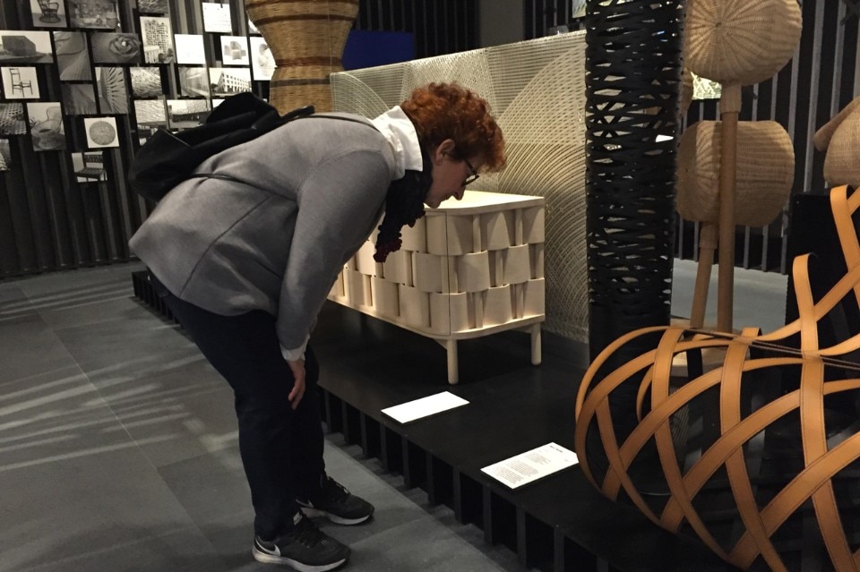
On the other side of Milan, the Fabbrica del Vapore is hosting “New Craft” to showcase how crafts are being redefined thanks to the opportunities offered by technology. The exhibition is packed with videos and an array of multimedia (whereas experience has already swept monitors, touchscreens and sundry technology away from exhibitions because visitors prefer the freedom of reading (or not reading). In place of captions are large monitors set at human height and speaking in a loop. This produces a carousel effect but, and may the person behind it forgive me, the contents are of no help.
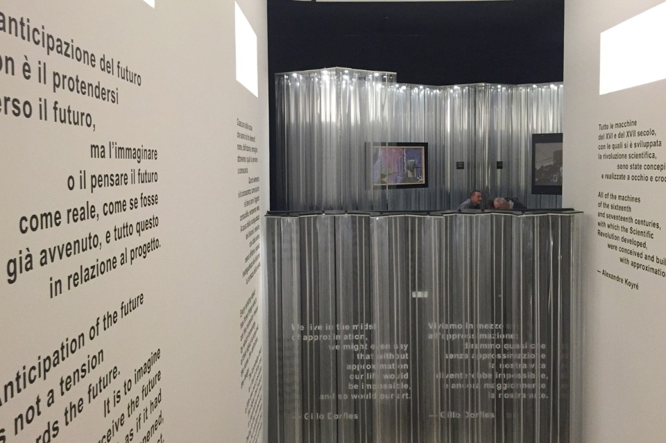
“The Logic of Approximation in Art and Life” exhibition is on at Palazzo della Permanente. After an introductory staircase that is hard to read and one of the usual floor captions comes a short Plexiglas passageway where female visitors’ handbags bump into precariously suspended captions. The exhibition reverberates with light, accosts visitors and echoes of other similar ones in which the choice of objects seems dictated by a premeditated and obsessive randomness.
Those in search of absurd experiences should visit “Call Over 35” at the Accademia di Brera. Impossible to find (no signs) and tucked away on the ground floor, it lacks all coherence despite being the product of a Call by the Triennale itself. When approximation wins, the graphic design goes all over the place as occurs at the Museo della Scienza e della Tecnologia, which is holding “Confluence” in homage to the general theme. You could spend a couple of hours reading the walls of captions and texts in the room, impossible. Next comes a block of stands (as we shall call these international participations of erratic quality), the impact of which falls midway between the tourist office and the avant-garde.
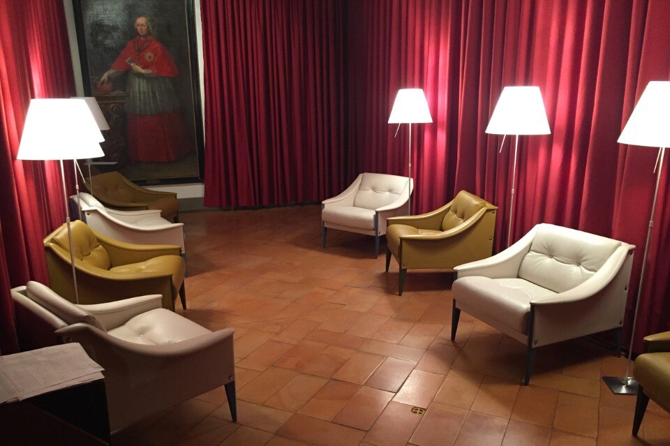
“Design Behind Design” at the Museo Diocesano is a completely different kettle of fish. An exhibition packed with crosses and miscellaneous holy objects, it has all too many captions, grouped together and difficult to read – and route ends in a Music Room that could have come straight out of Twin Peaks.
My last stop is at the HangarBicocca, on the outskirts of Milan, to visit “Architecture as Art”. This is, unexpectedly, the external exhibition most like those at the main venue, in terms of complexity and production effort, and it is well suited to the post-industrial magniloquence of the spaces, surrounded by Kiefer’s towers and Höller’s carousels. Despite an attempt to divide the entrances, the truth is that the whole is experienced in continuity, with total disregard of the experiment. Or, perhaps, the experiment lies in this flowing from one cathedral to the next, passing through, touching and ending up confused. There are few texts but, as is customary, a small free catalogue – the specialization of the host venue – does the job simply but exhaustively.
I shall stop here because my exploration has ended, although it remains incomplete. Exhibition captions and texts are agony for all: for the curators who want them (and bilingual), for the stressed editors and for the designers who snub them, for the contractors who lose them and for the graphic designers who insert them at the last minute. Once the exhibition is open, they are then the visitors wretched aids. As a post-binge pick-me-up, we recommend Alan Bennett’s Going to the Pictures.


