


Paul Rand, the American graphic design legend of the 20th century, had always been a staunch defender of the timelessness of modernism, even when the advent of postmodernism and computer graphics started to make people question his position. His vigorous convictions, described by many as stubborn, did not stem from mere formal admiration for the rarefied aesthetics of Swiss graphic design – he helped to establish the so-called Swiss Style of design in the United States. On the contrary, he believed that abstraction was necessary to serve the social function of his profession. It is no coincidence that design was a way for Rand to turn a few signs and symbols into something remarkable and unforgettable. By appealing to the collective imagination, design allowed him to satisfy every commercial need.
It was in his father's grocery store that a young Paul Rand, born Peretz Rosenbaum, began to improve his composition skills by designing signs and small ads. Even though Paul attended the Pratt Institute in New York and Parsons School of Design (without ever graduating), he has always considered himself to be self-taught: he learnt the ropes of graphic design at a very young age, when he began working for newspapers and occasional clients. His desire to change his real name to Paul Rand dates back to this period: he wanted to hide his Jewish origins by using a WASP name, but also to synthesize and make his name more effective, thanks to the symmetry of the four letters of name and surname. His name sounded almost like a brand.
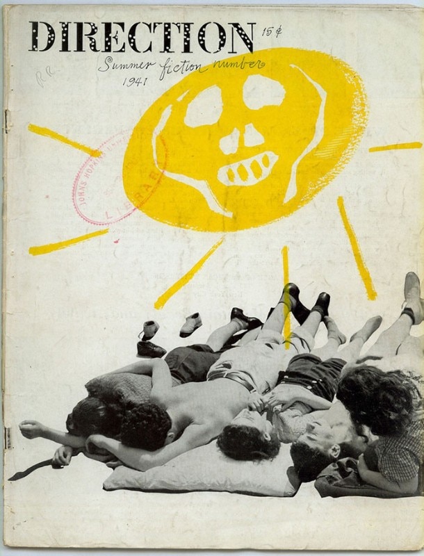
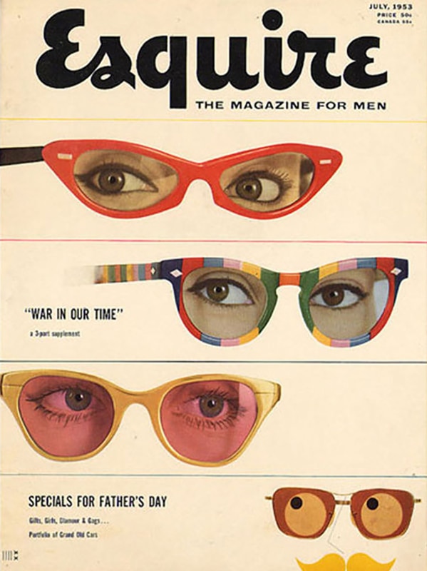
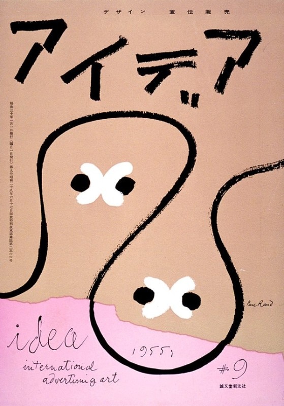
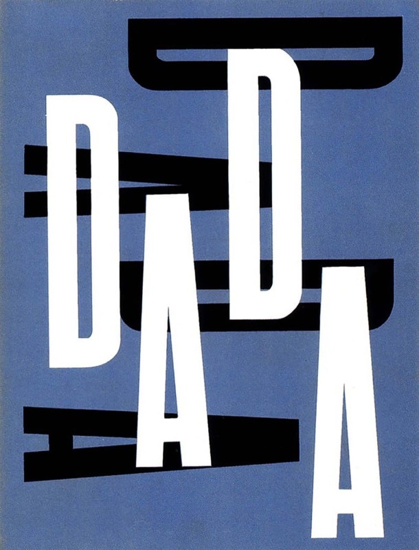
Rand’s work will always be linked to the creation of the greatest American brand identities, characterized by abstract designs, which were all influenced by the greats artistic influences of all time - first and foremost by the movements of De Stijl and Russian Constructivism, but also by the famous German Bauhaus school, and by the works of artists such as Paul Klee, Alexander Calder and Joan Miró. His projects were extremely precise and accurate, and he also had a great passion for typography: Rand loved to experiment with it, together with the techniques of collage and editing, especially on the occasion of the many editorial collaborations for catalogues and newspapers, which include Esquire-Coronet, Apparel Arts and, above all, Direction. Rand often carried out these assignments, in particular those for Direction, for free - provided that he could express his creativity freely, without any constraints.
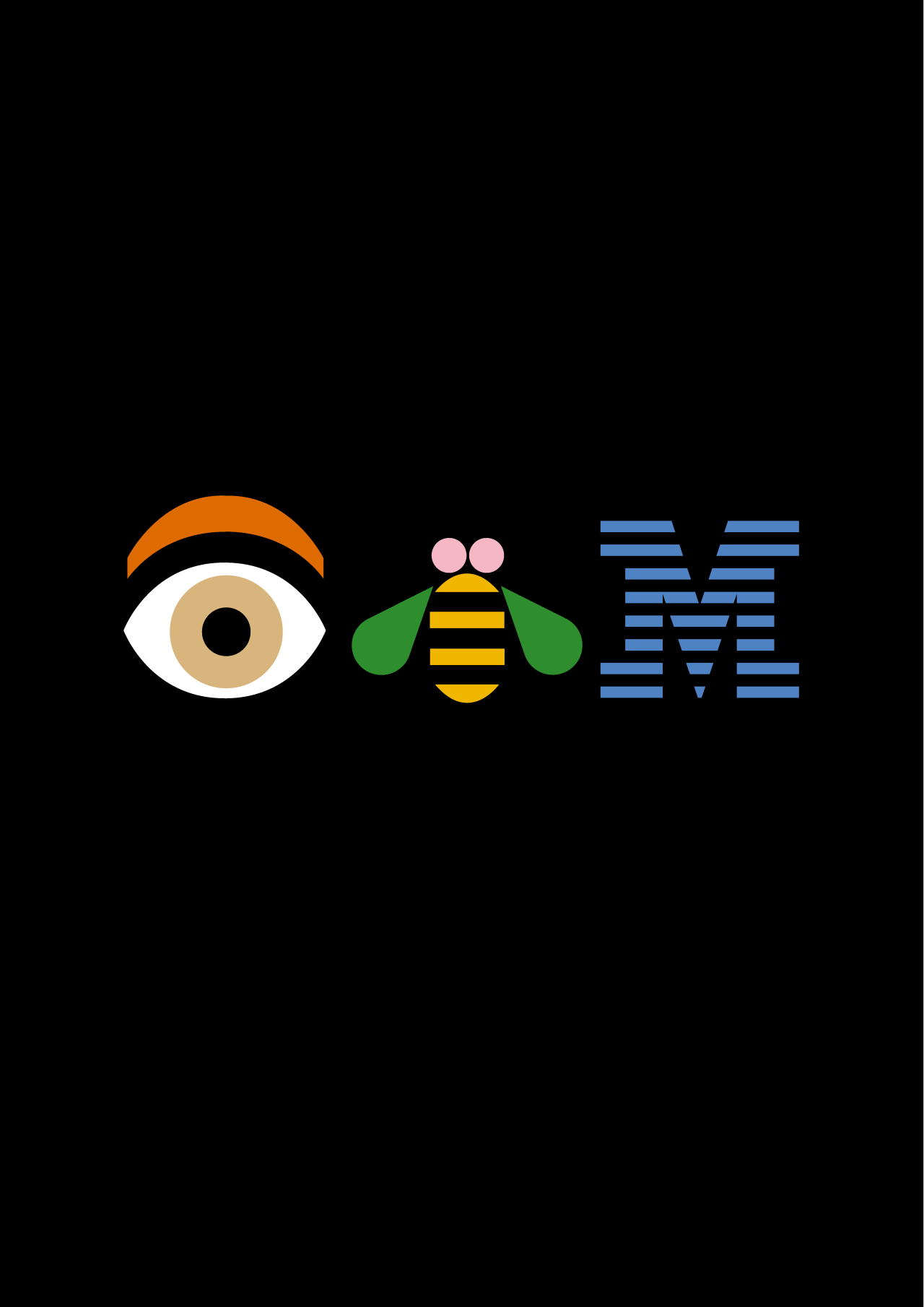


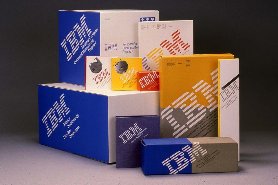
Among his best-known corporate identities, the most famous would probably be the IBM logo. He designed the first version of the logo in 1956, but he wasn’t totally happy with it. Finally, in 1972, two versions later, he designed the very same logo that IBM still uses today. Here, he introduced eight horizontal strips that gave more dynamism and speed to the logo... and, more pragmatically, the printers of the time were able to reproduce this logo in a much better quality. Paul Rand had been an IBM consultant for decades, together with a group of exceptional designers such as Charles and Ray Eames and Eero Saarineen. In 1981, Rand designed for IBM his most iconic and influential poster - perhaps one of the most famous posters of the graphic design of the 20th century. The rebus used pictures to represent the letters of IBM: the I was replaced by the stylized design of an eye, and the B by a bee: the pronunciation “EYE-BEE-M” corresponded to the acronym of the company.
Many of Rand’s designs are now integrant part of the daily life and imagination of many Americans, including the logo of the ABC cable channel, the one he designed for UPS - even though it is no longer used today - and the one for Westinghouse. All the logos he designed could never be immediately linked to the sector in which the brands operated: Rand took the liberty of designing original logos that, thanks to their uniqueness, managed to stand out from the competitors. For the presentation of the new visual identity of Steve Jobs’ NeXT Computers, Rand developed a proposal book that showed every step of his work, from the conceptual process to the final outcome. Steve Jobs soon fell in love with Rand’s approach, which was offering a “one-option design” instead of a number of potential solutions, and soon became one of the biggest admirers of his vision.
Even though the highest visibility came from his corporate logo designs, it is also important to emphasize his didactic activities and research at university level, when he worked at Yale University from 1956 to 1992. The main design manifesto of Paul Rand, “Thoughts on Design”, was first published in 1947, and reprinted in un updated edition in 1970. In this book, he described the sense of universality to which the best graphic designer must aspire, by effortlessly integrating form and function and conveying vivid concepts with simplicity and modesty. Design must not be eccentric, but capable transform prose into poetry through visually elegant and conceptually effective symbols.
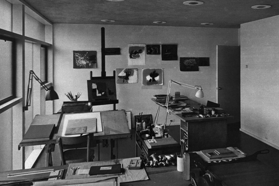
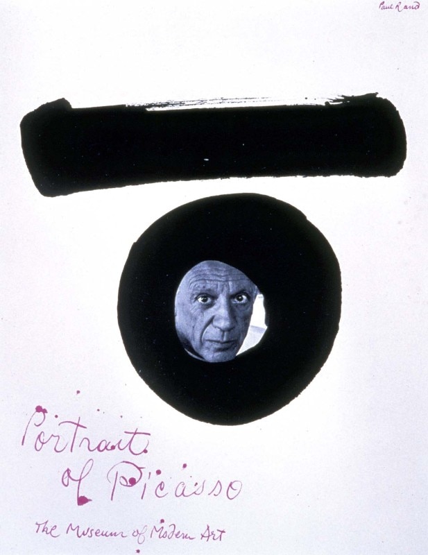
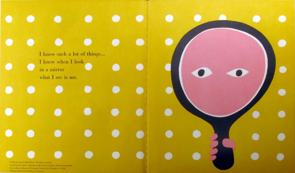
Rand also made a significant contribution to the world of architecture. He designed the Rand House in the early 1950s together with his first wife Ann Binkley Rand, an architect and author who studied with Ludwig Mies van der Rohe at the Illinois Institute of Technology. The home is a stunning example of Mid-Century architecture. This intimate and welcoming house, with stone walls and full-height windows, seems to communicate with the surrounding nature. Here, after the birth of their daughter Catherine, the couple started to work together on a successful line of children’s books, of which “I Know a Lot of Things” (1957) and “Little One” (1962) are the most popular ones. Until 1996, the year of his death, Rand continued to live and work in the woods of Connecticut, far away from the city of New York, which had always represented the epicentre of his professional activity. He received numerous awards throughout his career: in 1953, the Royal Society for Art of London awarded him with the Royal Designers for Industry award, while in 1972 he was inducted into the New York Art Directors Club Hall of Fame. His projects are now displayed in the most important museum institutions in the world, including the Smithsonian and the Museum of Modern Art in New York.
He is an idealist and a realist, using the language of the poet and businessman
László Moholy-Nagy