results
No results
Please enter a long search term
Weingart Typography
The Museum für Gestaltung presents the first comprehensive exhibition in Switzerland of Wolfgang Weingart’s work and teaching.
Wolfgang Weingart is regarded as the “enfant terrible” of modern Swiss typography.
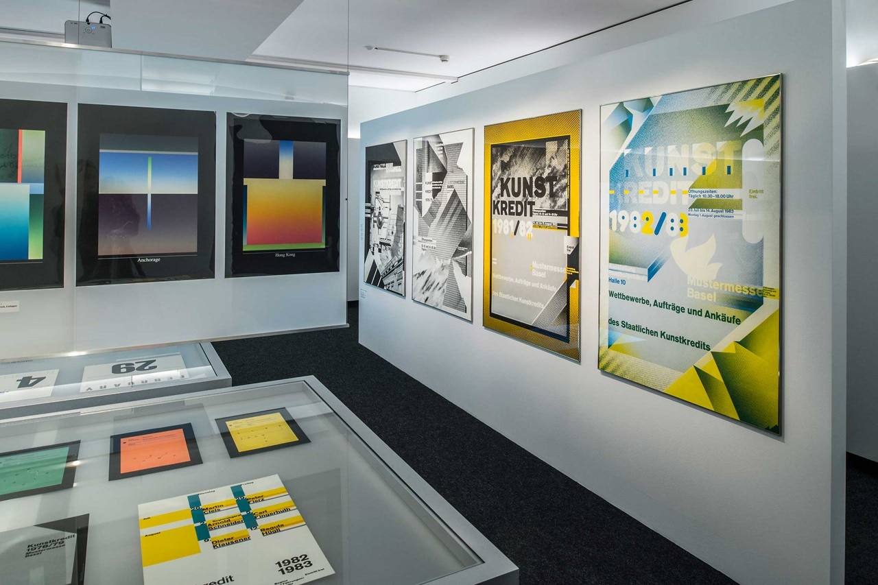
As early as the mid-1960s he began to break the established rules. He liberated letters from the corset of the right angle, spaced, underlined or reshaped them and reorganised typesetting. In the 1970s he began to translate halftone films into collages, in this way anticipating the digital sampling of the post-modern “New Wave”.
As a typography teacher at Schule fur Gestaltung Basel Weingart shaped several generations of designers from 1968 onwards. They came from throughout the world and helped him achieve international reputation. Today both Weingart’s experimental design approach and his call for the combination of analogous and digital techniques are once again highly topical. His life work is being shown for the first time in Switzerland and juxtaposed with works by his students. All the exhibits come from the Museum’s own collections, as the designer donated a major part of his archive to the Museum. In the meantime this material has been electronically recorded and systematically analyzed as part of a research project supported by the Swiss National Science Foundation.
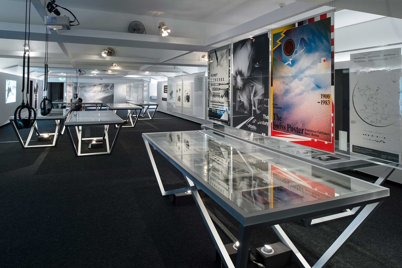
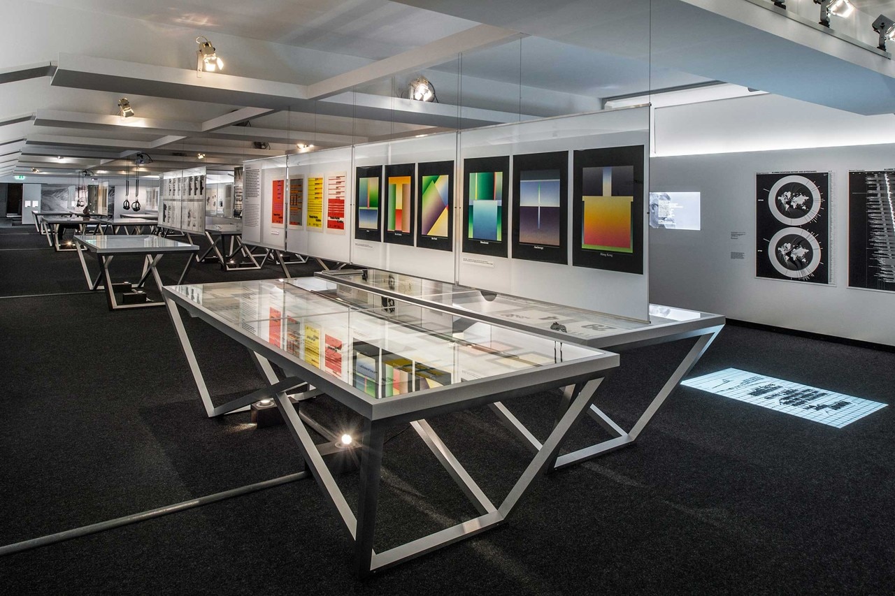
Twelve thematic “islands” with original material, a number of slide and film projections, and in-formation graphics introduce Wolfgang Weingart’s work and teaching to visitors. These thematic islands focus on formal, technical and content-related aspects. This allows visitors to trace the development of themes that reoccur over a period of several years, for instance his experimental “Round Compositions”, “Line Pictures” and “The Letter M”. And certain design processes can be looked at in detail, such as the use of collage and the combination of different techniques, which were characteristic of the work of Weingart and his students.
The aim of the exhibition, which was developed in collaboration with Wolfgang Weingart, is not to show only results, but also to illustrate the work processes themselves. In addition to original material the exhibition presents a film portrait of Weingart and filmed discussions about his teaching activity in Basel. In addition information graphics offer an insight into the professional careers of former students from Weingart’s Advanced Class.
View gallery
SHARE
PIN IT
SHARE
PIN IT
SHARE
PIN IT
Ausstellungsdokumentation: Weingart_Typografie_Museum fuer Gestaltung 7.5. bis 28.9.2014
until September 28, 2014 Weingart Typography
curated by Barbara Junod
scenography by Mathis Fussler Museum fur Gestaltung Zurich
Ausstellungsstrasse 60, Zurich