The new White Cube Bermondsey is an event: it stands out for its importance within the world art market; it stands out within the urban and district transformation process — with a programme which goes far beyond a commercial gallery can encompass: there're a bookshop, an auditorium, an archive. It stands out (also) for being an architectural work of singular beauty, designed by the Casper Mueller Kneer Architects based in Berlin and London. Domus met Marianne Mueller and Olaf Kneer, in their glass studio space at the heart of the Barbican, to get to know more closely their work.
Large, certainly, in comparison with other private galleries, the new White Cube is also large in relation to the street and to the borough's scale: it's a sort of spatial pause which breaks the pattern of the tight urban pace within a dense and tiny urban fabric with residential areas, shops and small restaurants. The old perimeter's small brick wall is replaced in the design project with a partially transparent edge: a fence of 151 steel fins, placed vertically on a base large enough to become a seat on the inside. The fins close and open to ever changing sights, along the angle and the point of view. As you look from an oblique angle, the fins resemble a wall, as you come closer the fence opens up till almost disappearing.
The yard is paved in light grey granite, opportunely designed to sustain weight and manoeuvres of loading and unloading. Actually, that waiting space makes one think — even before entering — of installations and open-air exhibitions, and in that empty breath, which defines the entrance to the gallery, a large white modern canopy stands out, cantilevering 6,5 metres without any columns, dignifying the industrial look with just one gesture. A single architectural sign — strictly speaking — visible from the outside, the canopy introduces the strategies of volumes, of spaces and of fragments of space, which lie ahead at the inside.
It is in through the revealing and concealing, within the fading out that the architects see the true emotion of the design project. Architecture is entrusted to art
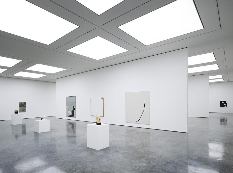
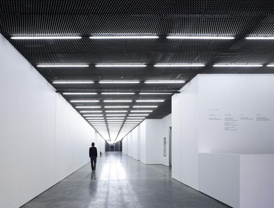
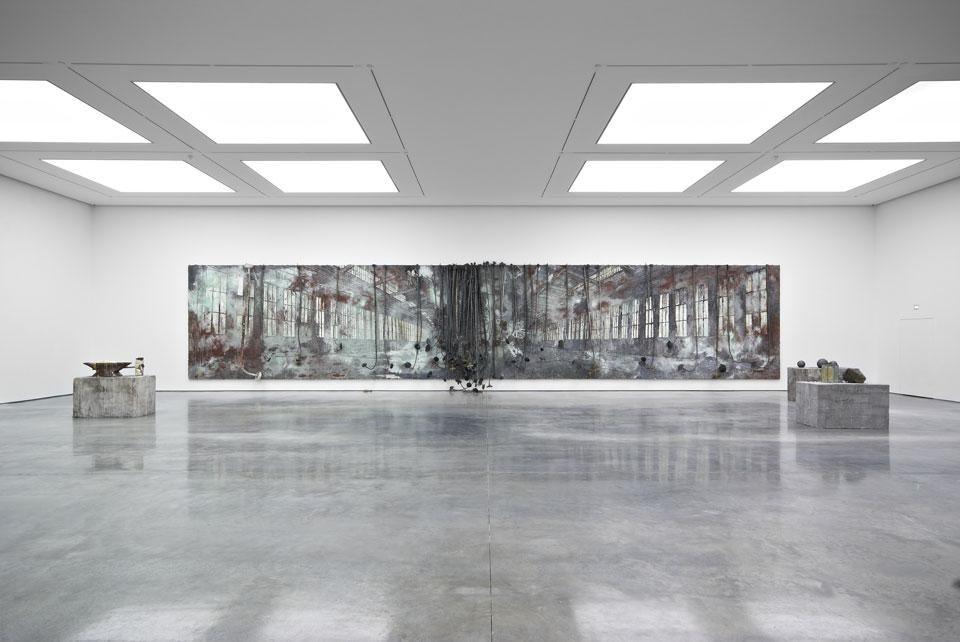
CMK Scale is what drove the project. Space and light were the two most important elements we discovered within the existing building. Large areas without columns and a roof with a regular pattern of roof lights allowed us to use natural daylight, a rare condition for an art gallery. A key idea was to maintain long views across the building internally, views of nearly 70 meters. The idea of the large corridor, of a path or passage - 5.5 meters wide - has been absolutely important for the project.
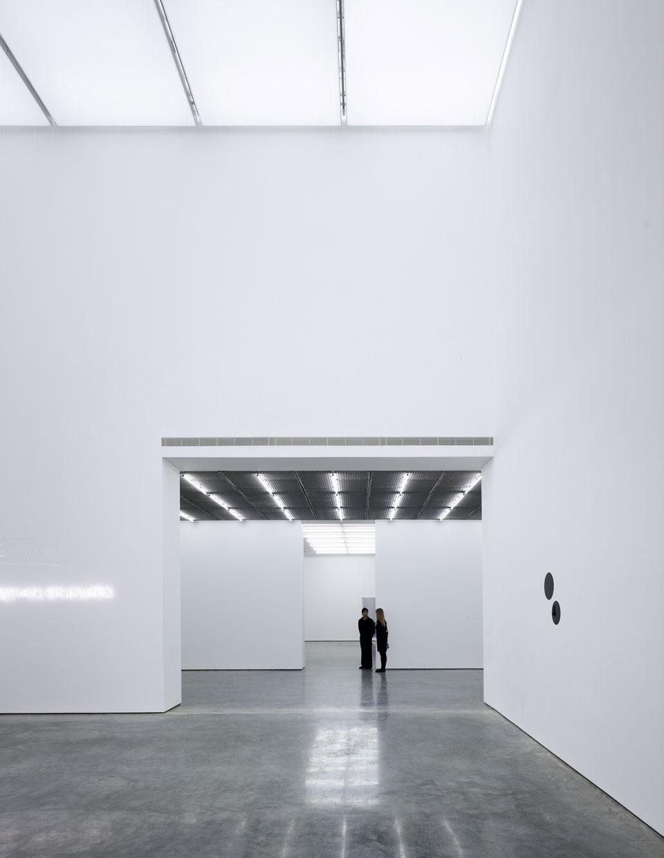
The three main exhibition areas are arranged on the two sides of this corridor, each one with its own character. Art can be displayed in different conditions. The galleries have different scale, aesthetics, proportion and lighting. The North Gallery is more experimental in character, it has fluorescent lights and can be subdivided into relatively small cabinets. The 9x9x9 is naturally top-lit and has cubic proportions. The South Gallery is large, wide and open. Perhaps the truly important aspect of the project is the play of volumes and how they work with each other in a sequence.
The central axis is like a street, a street on which spaces and volumes overlook each other and different types of aggregation are possible, like urban scenarios. The experience of walking along the corridor space, is like a city, an abstract city. Within the dynamic relationship between path, street and spaces – the rooms - to whom one has access, one realizes the ideal interaction between visitor and gallery space, becoming spectator and main character at the same time. The corridor space is an abstract space, a potentially infinite axis, without beginning nor end, which allows us to penetrate into a space-other, almost metaphysical but also real and concrete, characterized by industrial materials: the ceiling is a steel mesh and the floor is concrete. A space which one doesn't simply cross through but rather experiences. The atmosphere is almost magical, it's an atmosphere one needs to become part of. This world of art, particularly here in London, places itself side by side people's everyday lives. The entrance void acquires the role of a cathartic space: it makes us forget the real world, it frees us from the city, the noises, the views, the urban relations, and then introduces us into the interior space which actually is like an exterior space, though an exterior of another world.
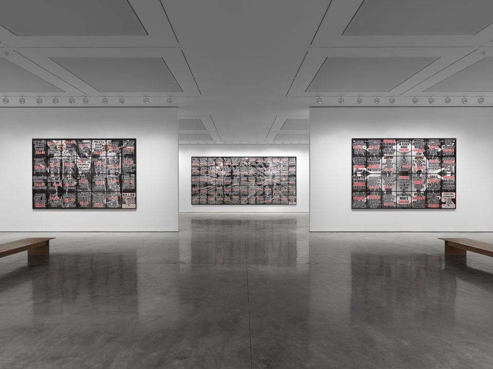
CMK If there is a theme that characterises the many discussions, it was the invisibility of things. How do you make a space so abstract and so invisible so that it "dissolves"? It requires an extraordinary discipline to make this invisibility possible. The relationship between the external building envelope and its internal spaces is also influced by this strategy: it is intentional that once inside there's no memory of the building you left on the outside. It's a complete disconnection.
Yet there's a strong materiality to counterpoint the immateriality of the space; there's the concreteness and tangibility in many elements. Observing closely, passing through the rooms, one discovers details and differences, shifted elements, variations, staggered joints and rotations which make the space more real and bring us to a materiality which add depth, contrasting with the bi-dimensional abstractness; and we comprehend that the goal of the designers was that hidden and subtle complexity of the whole, rather than a minimalist or unreal pureness.
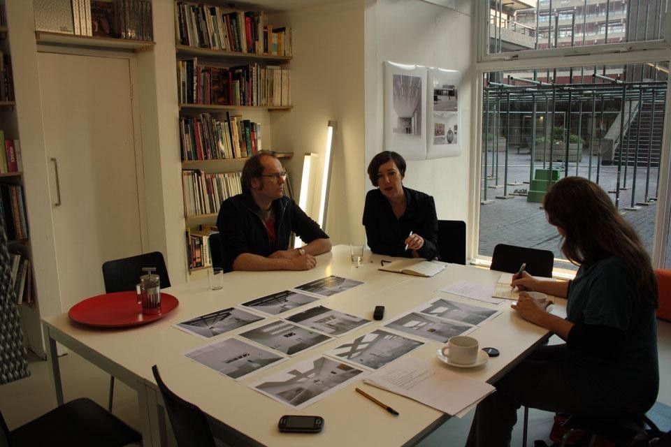
Eventually the design then reveals itself to be much more than expected, more of what it seemed to manifest at the entrance where everything seemed visible and already disclosed, and which seemed similar to other spaces — the other White Cube or other contemporary places with whom it yet shares language and use of materials. It is more because this design project has the power to catch us and bring us back to distant and magical spaces which interweave relations with the imaginary of the city and the visions of the city in art — as those by De Chirico or, in the cinema, those of the Eur by Felllini — and which show an unreal city, which then becomes real, because it represents its primordial idea.


