

Helped by a panel of expert advisors that included graphic design critics, designers, and historians, we based our decisions on the same criteria — ranging from aesthetics to historical relevancy, from functionality to social significance, from technological ingenuity to economy — that we use when evaluating objects. We paid particular attention to the synthesis of goals, means, and elegance that we always seek in modern design.
, 1992. Digital typeface, Variable. Gift of FSI FontShop International. The letterforms of FF Blur—fuzzy around the edges like an out-of-focus photograph—seem to celebrate their own imperfection, speaking to his unique background. FF Blur resembles type that has been reproduced cheaply on a Xerox machine—degenerated through copying and recopying.")
, 1995. Digital typeface, variable. Gift of Carter & Cone Type Inc. Commissioned for exclusive use by the Walker Art Center in Minneapolis, Walker is versatile enough to be used by the museum's in-house graphic designers for all of the institution's diverse programming needs and yet is instantly and reliably recognizable as part of an image and brand.")
• American Type Founders OCR-A (1966)
• Wim Crouwel New Alphabet (1967)
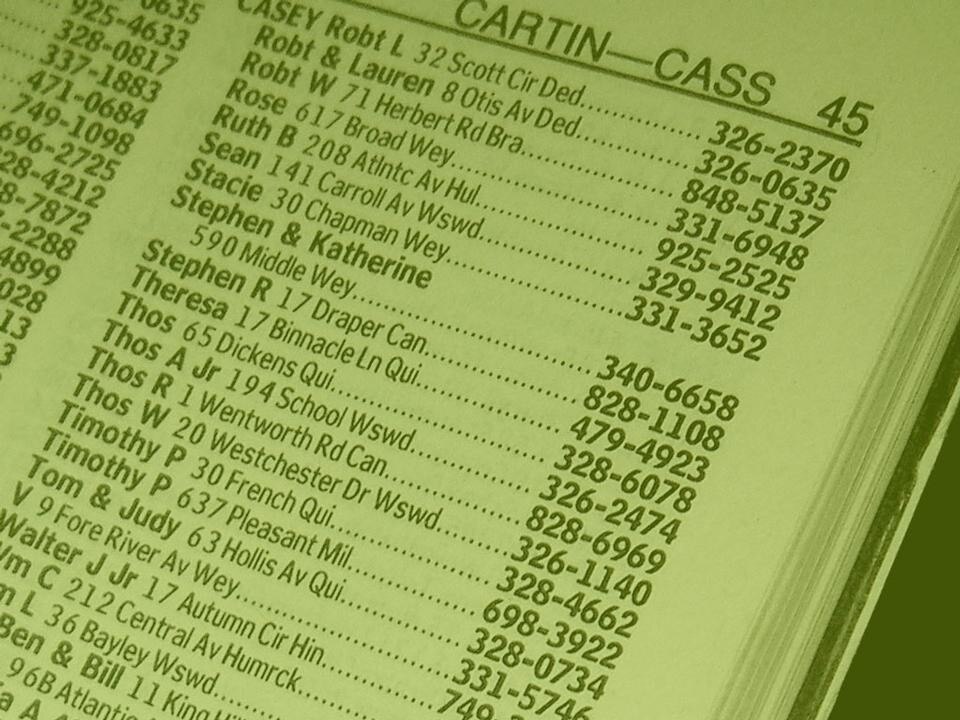
• Matthew Carter Bell Centennial (1976-78)
• Matthew Carter ITC Galliard (1978)
• Erik Spiekermann FF Meta (1984-1991)
• Zuzana Licko Oakland (1985)
• Jeffery Keedy Keedy Sans (1991)
• Erik van Blokland and Just van Rossum FF Beowolf (1990)
• Barry Deck Template Gothic (1990)
• P. Scott Makela Dead History (1990)
• Jonathan Hoefler HTF Didot (1991)
• Neville Brody FF Blur (1992)
• Jonathan Barnbrook Mason (1992)
• Matthew Carter Mantinia (1993)
• Tobias Frere-Jones Interstate (1993-95)
• Matthew Carter Big Caslon (1994)
• Albert-Jan Pool FF DIN (1995)
• Matthew Carter Walker (1995)
• Matthew Carter Verdana (1996)
• Jonathan Hoefler and Tobias Frere-Jones Mercury (1996)
• Matthew Carter Miller (1997)
• Jonathan Hoefler & Tobias Frere-Jones Retina (1999)
• Jonathan Hoefler & Tobias Frere-Jones Gotham (2000)
, 1967. Digital typeface, Variable. Gift of Foundry Types Ltd. Early computer screens—cathode ray tube (CRT) monitors—rendered images in fairly large pixels, making traditional curvilinear letterforms difficult to reconstruct, and so Crouwel set out to redesign the alphabet using only horizontal lines. New Alphabet is, in Crouwel's words, \"over-the-top and never meant to be really used,\" a statement on the impact of new technologies on centuries of typographic tradition.")