Stefania Garassini: Do you think the public is ready to grasp this type of language?
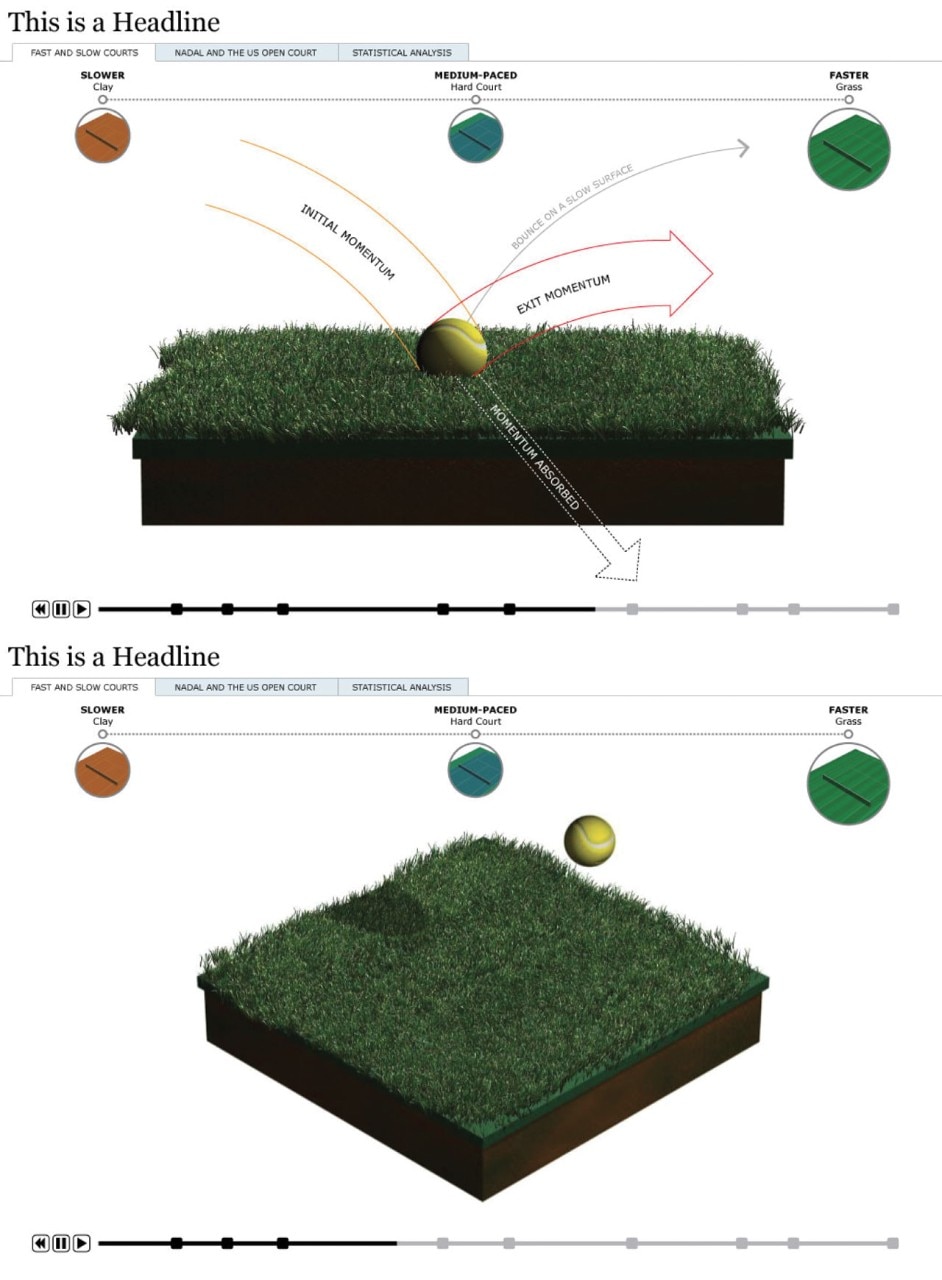
Alberto Cairo: I am convinced they are. The first results from datajournalism experiments reveal the huge success of these initiatives which, in some cases, have generated up to a third of the traffic on the hosting newspaper websites. Months ago, The New York Times produced a report on an avalanche in Washington State. Extremely complex, expensive and of huge visual impact, the report generated an enormous number of hits on the website.
This is, by the way, not a completely new language. The basic visualisation techniques date from the late 19th century and followed the evolution of graphs and maps. The difference between those early experiments and today’s complex interactive animations is only quantitative. Today, we have an infinitely larger amount of data and new technological tools to cope with it.
Stefania Garassini: Is the person responsible for visualisation an architect, an engineer, a graphic artist or a journalist?
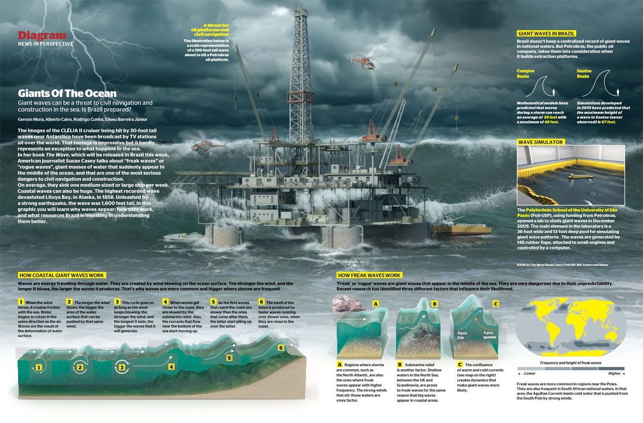
Alberto Cairo: That depends on what you want to do with the data. If you are using graphics to organise them and make them easier to grasp, then scientific and statistic knowledge are a must. If, on the other hand, you want to communicate via the data, you have to knit numerous skills together: journalism, graphic design, programming, interaction design, ergonomics and cartography. You have to know the fundamentals of these disciplines and then specialise. Journalism is my area of specialisation, for example. The end product will always come from teamwork. Data never talk by themselves... you always need an editorial voice. They are a source to which you must ask questions, like any other.
Stefania Garassini: What first drew you to data visualisation?
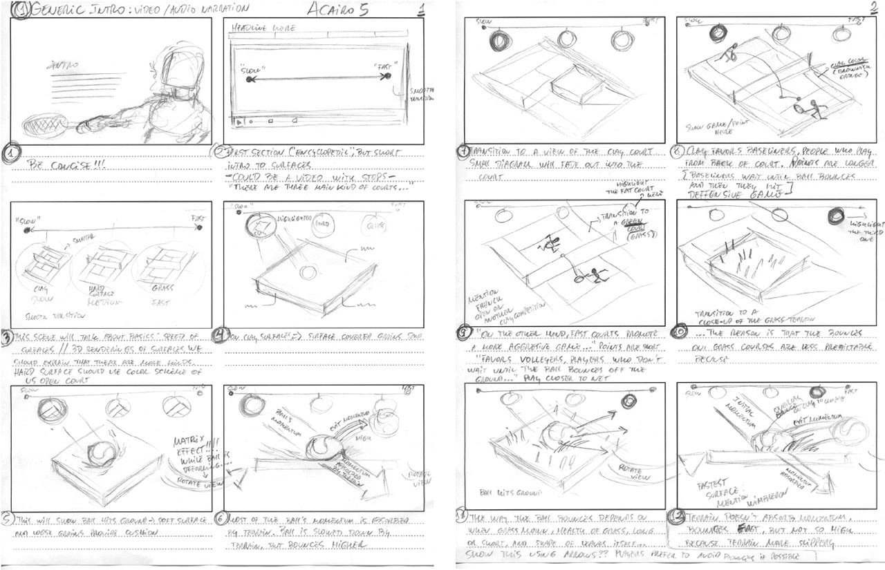
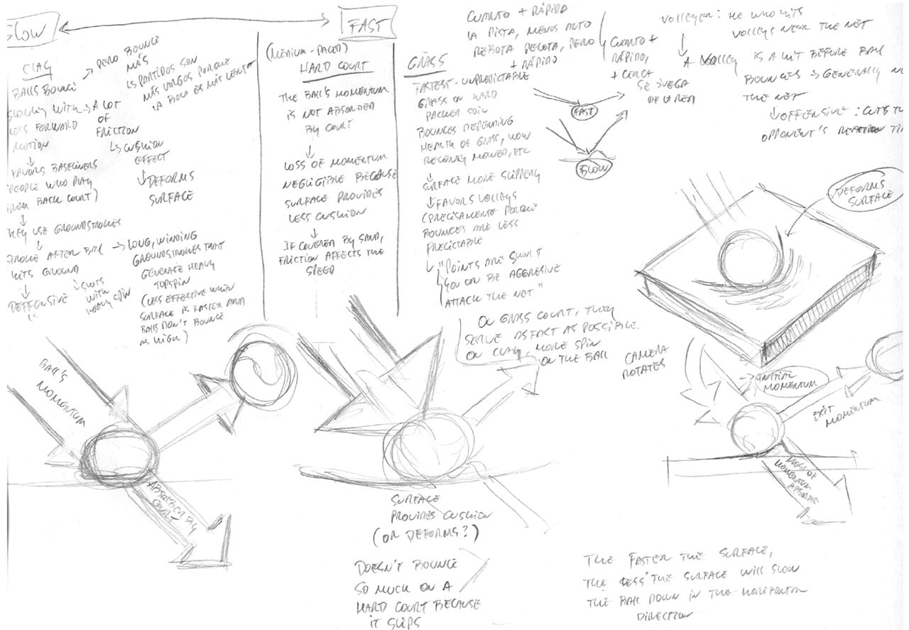
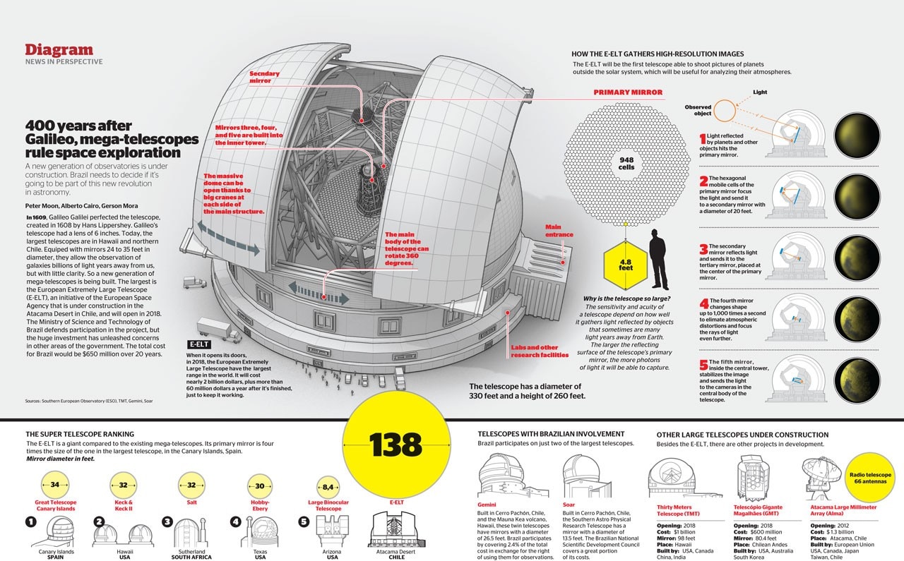
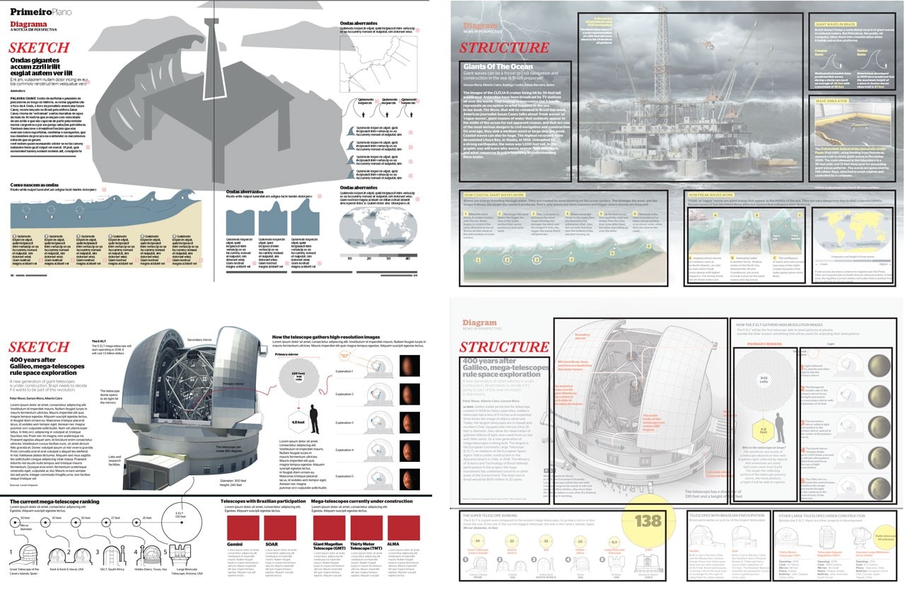
Alberto Cairo: I started out as a journalist in 1997and worked in radio for a while; then, La Voz de Galicia was looking for someone like me who could write but also translate a story or set of data into a visual representation. My main work still consists in creating a general diagram of how to address a subject. I don’t produce the illustrations myself nor do I do the programming but I create a sort of conceptual map of how to structure the information, bearing in mind always that we have to tell a story, write a piece of journalism. The ability to think visually is within everyone’s grasp. It’s a matter of learning to make diagrams and all you need is pen and paper; the software and technology come later. I am currently working to build bridges between different areas. I want those in charge of data visualisation to understand the importance of traditional infographics and vice versa, and to help journalists learn to think visually so that they can work better with those responsible for the graphics.
Stefania Garassini: Do you see any interesting experiences in this field in Italy?
Alberto Cairo: There is a great deal of experimentation in newspapers – both paper and online. I see a much commotion in terms of innovation. Perhaps, in some cases, these are slightly over-ambitious attempts still hard for the public to understand but I believe they are on the right track. It is a case of broadening the horizons and increasing the possibilities of using data to tell stories. Very interesting solutions are emerging, in some cases.


