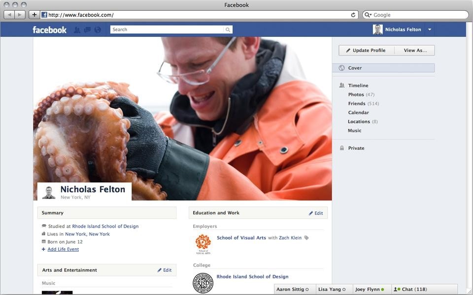
Dan Hill: How long did the process of designing and developing Timeline take, from start to finish? How much of a blank canvas was there to work from?
Nicholas Felton: The full narrative of Timeline started well before before I joined Facebook. The technology under the hood that makes it all possible had been underway for several months and the design team had already explored several presentation formats.
Ryan Case (my partner from Daytum) and I arrived in April and while everyone was eager to build something for a Summer release, the quality bar was set very high and in our first days we were invited to reconsider the product and propose the Timeline we would like build.
How big is the design team, and what kind of disciplines are directly working together on a project like Timeline at Facebook?
There are about 35 product designers at Facebook and four designers worked exclusively on Timeline. In addition to designers, there are engineers, product managers, researchers, content-strategists and of course Mark Zuckerberg and Chris Cox who nursed the product from an idea to its unveiling on stage at F8.
The playful fluidity of your Feltron Annual Reports is partly enabled by the bespoke nature of editorial design, in which content can be shaped for each layout. Obviously, web design is an entirely different proposition, based on flexible structures that try to anticipate the form of unpredictable content. What could you practically draw from the Annual Reports in terms of visual design?
Fortunately, Ryan and I had been considering this problem for several years before starting at Facebook. Daytum.com was sparked by the desire to bring something resembling the Annual Reports to a broader audience and to create a tool that allowed creative expression within strictly controlled boundaries. Facebook clearly offers many more avenues for self-expression, but we found that some of the same design patterns were successful with Timeline.

Did you look at any historical precedents or other inspirations in terms of timelines specifically? (For instance, Minard's chart of Napoleon's march, Qing Dynasty scrolls etc … Or more basic historical timelines?)
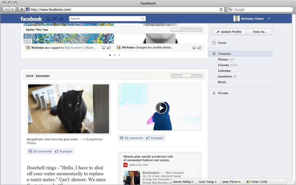
I've found that Minard's treatment fits very few sets of data, but your average horizontal historical timeline was a key reference at a critical point in our development. As we wrestled with how to make the historical relationship of units clearer, Mark suggested that we think of this example rotated 90 degrees and introduce a central spine to our layout. After a weekend of tinkering with this idea, the current layout with units pointing to a time line appeared to be a viable way of solving the chronology problem.
Technically, how do you sketch or visually develop and share ideas? You've said you use Processing - do you find it easy to 'sketch' in code? Does that code get ported to developers for re-writing/refactoring, or is it simply a sketching tool? If you use Photoshop/Illustrator, how do you meaningfully exchange ideas with engineers? When do you plug in the real Facebook content streams into the layouts?
As much as I love Processing, it has not been a part of my work-flow at Facebook. My tools-of-choice are generally a sketchbook and Photoshop. For some of the more complicated interactions, Ryan will sometimes build clickable prototypes in JavaScript. More than anything, we talk a LOT about the dependencies and downstream effects of various product decisions. Some things you absolutely need to see in Photoshop or play with in a development environment, but by operating with as much information as possible we try to minimize surprises.

This was one of the most challenging aspects of Timeline's development. Apart from showcasing your photos, status updates and other posts on Facebook, we needed to integrate shared content like song listens, runs and news reads. Some of these are frequent and light weight, while others are less frequent and more meaningful. While your posts on Timeline should appear in a predictable way, we designed a few channels of varying determinism for this content that would allow it to appear without over-running the page. For example, your most recent song listen will have its cover art shown in the music tile in the navigation, then the listen will appear in a recent activity section and be counted when the aggregate report is created. This song can also appear in ticker on the News Feed, and if it collects any likes or comments here or in the recent activity then it may be considered important enough to appear as a dedicated unit on Timeline.
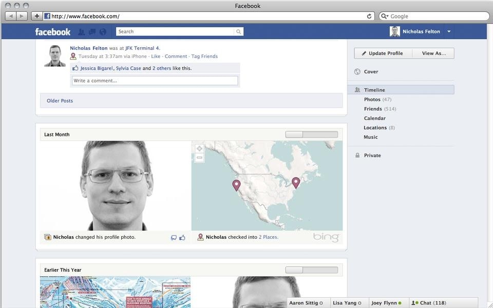
I'd like to think that Timeline succeeds at representing your history in a way that mirrors personal memory. The most recent section are your freshest memories and are all apparent. As you travel back in time the years become abbreviated and only the highlights are initially visible

I'd like to think that Timeline succeeds at representing your history in a way that mirrors personal memory. The most recent section are your freshest memories and are all apparent. As you travel back in time the years become abbreviated and only the highlights are initially visible. For users who have filled out time periods before they joined Facebook, it's witness to what they or others remember about their past and starts to form a collective memory as classmates post their 2nd grade photos or parents tag their children.
Finally, has working on Timeline affected the way you're thinking about your Annual Report project?
Absolutely. The data collection rules were in place well before I started here, but learning to see the world through a social lens has informed the representation of the information this year, and inspired new approaches for the 2012 Annual Report.
[ Read our review of the Facebook Timeline.]


